Some design tropes have a mainline right into the dopamine-rich approval section of my brain. Field Notes brand is the manifestation of that. This Appalachian Trail map journal was inspired by the eyewatering clarity and Futura-fun of their notebooks, and the infinitely useful, almost magical, TripTiks that I’d flip through on college road trips. Another influence was the elegantly spartan concept and aesthetic of Travis White’s River Atlas.

Erich Rainville, a user experience designer (and confirmed Field Notes aficionado), and I were chatting about this sort of design and how it could be used for trail map references/journals. This map quickly poured out of that conversation.
HOW TO
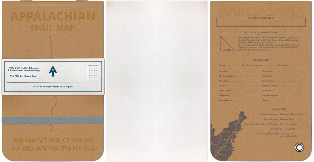
The die-cut embossed kraft paper cover was designed and stamped in Adobe. The cartography was tenderly crafted, printed, and bound, in ArcGIS Pro.
Texture Assets
I started by taking pictures of some paper materials with my phone.
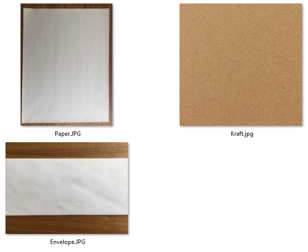
In Adobe I whipped them up into the rounded and top-fold stapled Kraft cover, 70# white accordion-folded notebook paper, and crisp white packaging band.
That was most of the work, actually. The rest was just a rip-roaring adventure in Pro cartography.
Layout Setup
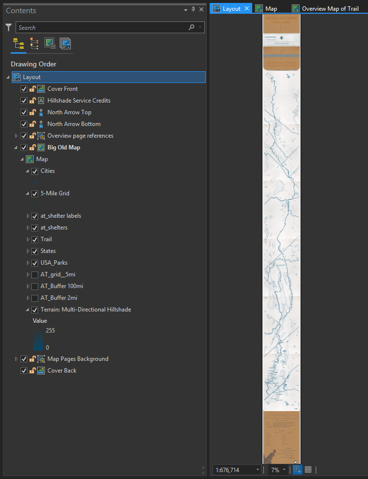
In Pro, I made a mega-tall 12″ x 144″ layout and stuffed the covers and sheets of paper into it (insert > picture).
Atop a vertical stack of six empty pages, I inserted my map. Snug between the top and bottom covers, zoomed and panned to fit just so.
Map Data
For this map I am using Appalachian Trail detailed center-line and shelter locations, both provided by the National Park Service via ArcGIS Online.
The basemap content is comprised of US state polygons provided by Natural Earth, a USA Parks (state and national parks and forests) feature layer available in the Living Atlas, and a hillshade imagery service also available in the Living Atlas.
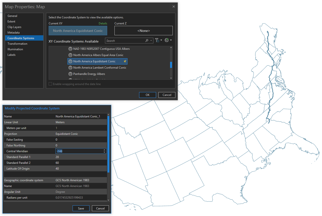
Projection
An equal-distance projection was important in this case, since I wanted the trail’s true length to be consistent along from start to finish. I chose North American Equidistant Conic. I modified the central meridian until the trail was vertical (a nice little hack for re-orienting conic projections).
Symbology
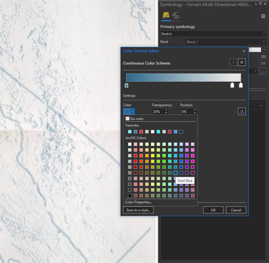
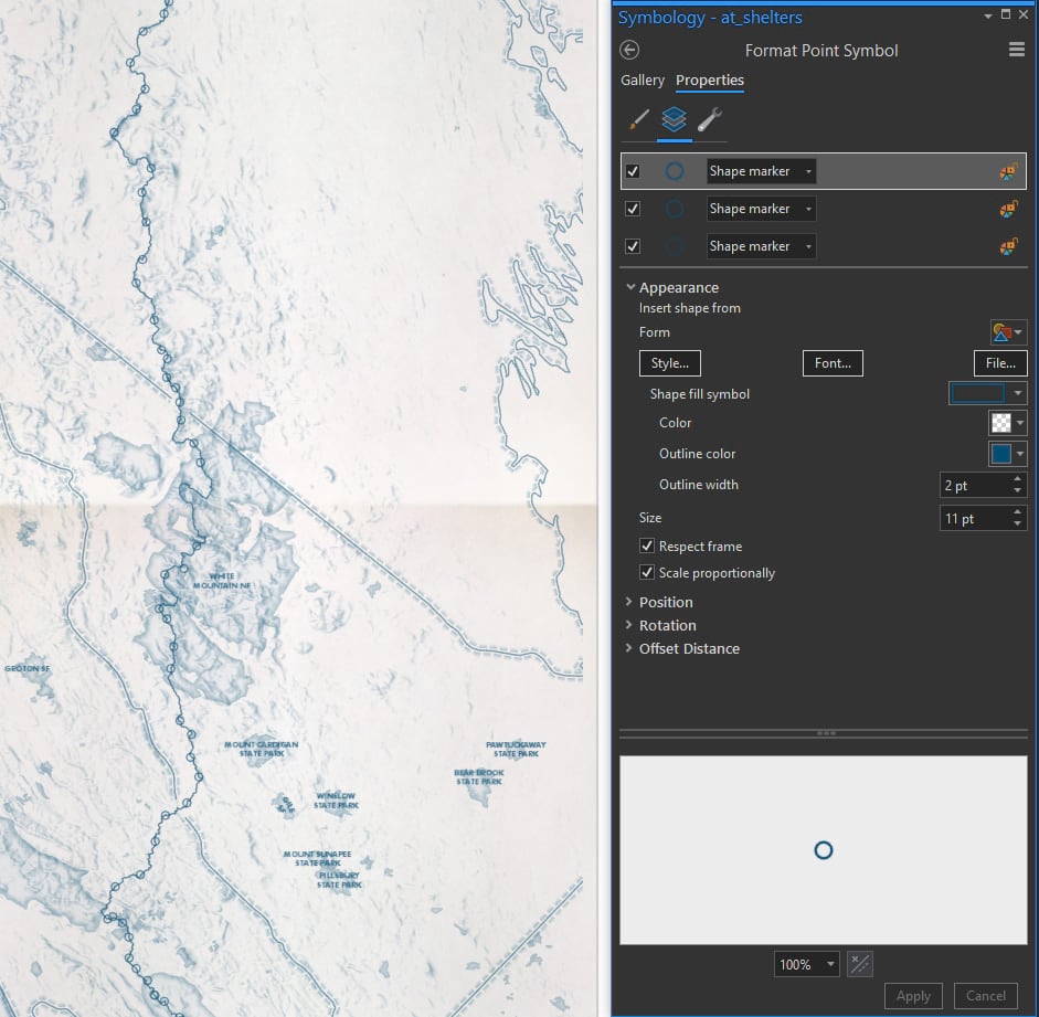
I decided to go minimal with the cartography, following the clean sensibility of Field Notes and also as an opportunity to go Full Huffman (monochrome). The implication is that the map, while a handy reference, is neutral enough to encourage journaling right atop. You know, if it were real. I chose to fill my ink well with “steel blue”, which is #004C73. All map elements will be that, with more or less opacity.
I found the challenge of squeezing all I could from a monochrome palette to be fun and rewarding. For real, if you haven’t seen this presentation by Daniel, I’ll wait here.
Because the nature of this map is an inherently winding linear feature, I found that I had to push the symbology of referential state borders to something quite different. I like the dashed effect of political borders (representing their purely cultural significance), but I found that by using an inner gradient on that dashed line, I helped communicate neighboring “things” and also differentiated the occasional appearance of an ocean coast.
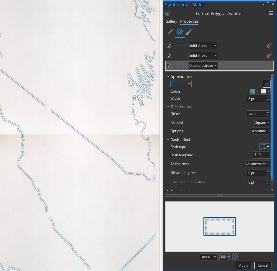
You might notice the occasional gap in those state lines. To reduce the visual complexity of where the Appalachian Trail crosses over state lines, I made a buffer of the trail and used it to mask the state layer (appearance > masking).
The topography is a somewhat muted reference for the terrain along the trail. I started out with contour lines, but I find often contour lines a bit more complex than is necessary. In this map, hillshade seemed to do a good job of indicating the terrain of the journey without overwhelming the map (or its owner). I gave the hillshade image service a color gradient of opaque in the shadows to transparent in the highlights. Has a nice clean appearance to it. Monochrome!
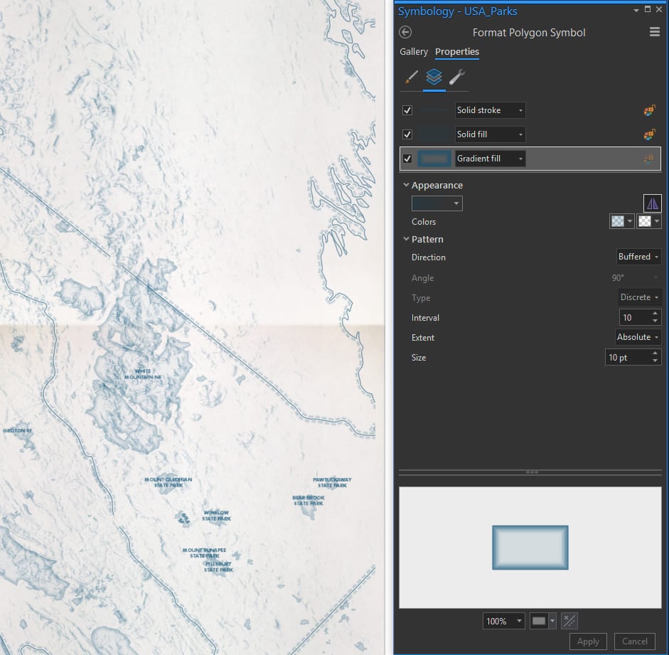
I tried to be pretty stingy with what content made it into the map. But if I’m hiking the AT and journaling along the way, I’m certainly going to want to know where parkland and forestland is. These areas were given a very faint fill and inner boundary gradient.
Lastly, and certainly not leastly, is the trail itself. And official active shelters. All these symbols used the same steel blue, of course, but I gave them a slight blur effect to try to replicate the bleed of printed ink on paper. They are composed of stacks of duplicated semi-transparent symbols, each slightly thicker than the other.
Scale or Distance Reference
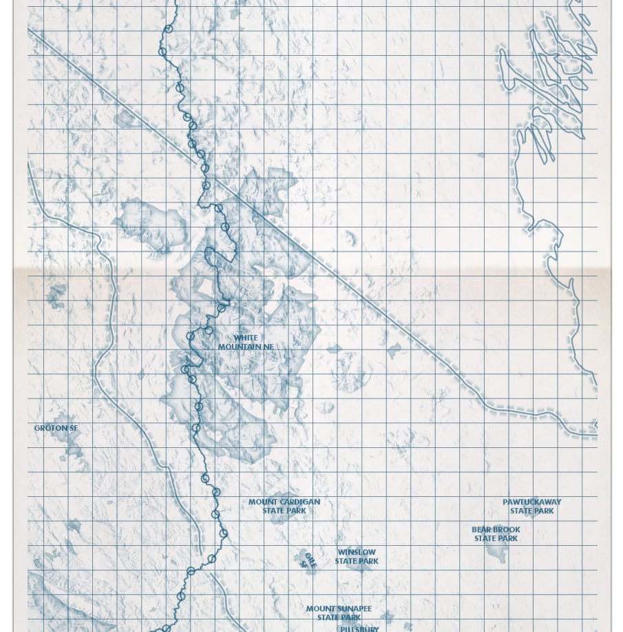
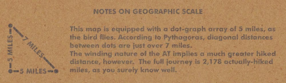
Using the “Generate Tessallation” tool, as I am wont to do, I created a grid of 25 square-mile cells on the map. This means I get a line every five miles. That seems like a handy reference for a hiking map of this scale. And it means we don’t have to make a lame scalebar.
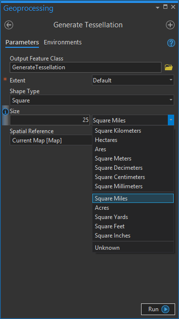
Believe me, it was weird not to choose a hexagonal option.
Anyway, here it is on the map…
One of the more charming things about the Field Notes notebooks is their “dot-graph” option for gridded paper. Graph paper is wonderful, but the full length of the grid lines aren’t generally necessary. A reference grid constructed of dots at the grid intersections is just as effective and greatly reduces visual noise. This map needs a dot grid. So I ran the “Feature-to-Point” tool to drop a dot in the middle of each cell, instead.
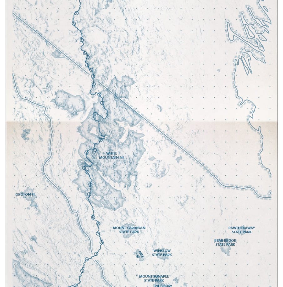
Wayyyyy better. Dot grids rule. And it was a fun opportunity to add a little note on distances on the back cover.
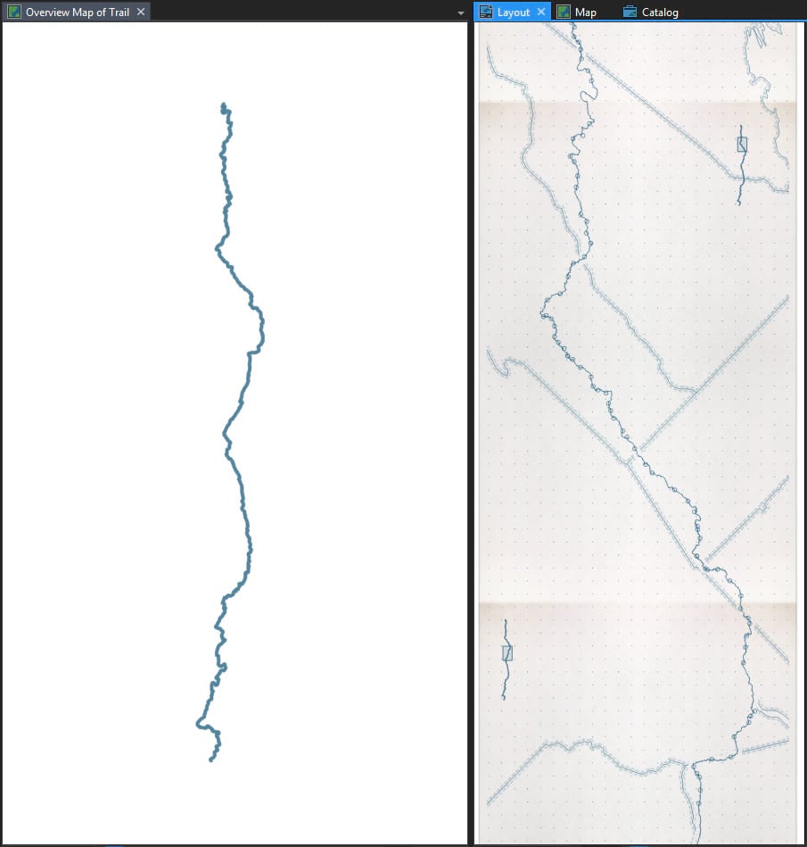
Overview Reference
Since the idea is that this is a tall fold-out map, the imaginary map user/hiker would fold the map to their current location. So a small reference should be added to each page view. In a separate map in the Pro project I generalized the line, and added six instances of it to the layout, positioning each appropriately. Then I drew a rectangle (insert > rectangle) over each page’s extent.
Labels
All text in this map, including the cover, is Futura. Futura is just such a crisp authoritative font. You can almost read it in the fast nasaly tone of a tobacco stained 1940s government public announcement film. Field Notes uses Futura in almost all of their notebooks. Just a good look. Makes me want to wear wool pants and leather oxford boots.
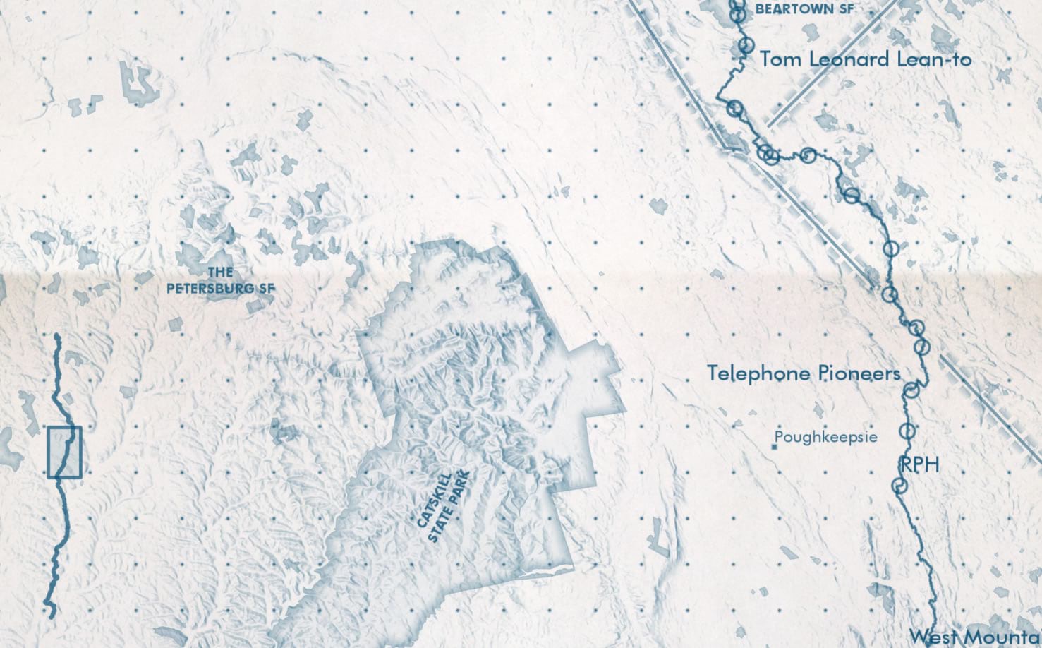
Huh. One of the labels just told me there’s a place called “Beartown State Forest.” I’ll have to tell my son Bear about that. He’d be a celebrity there.
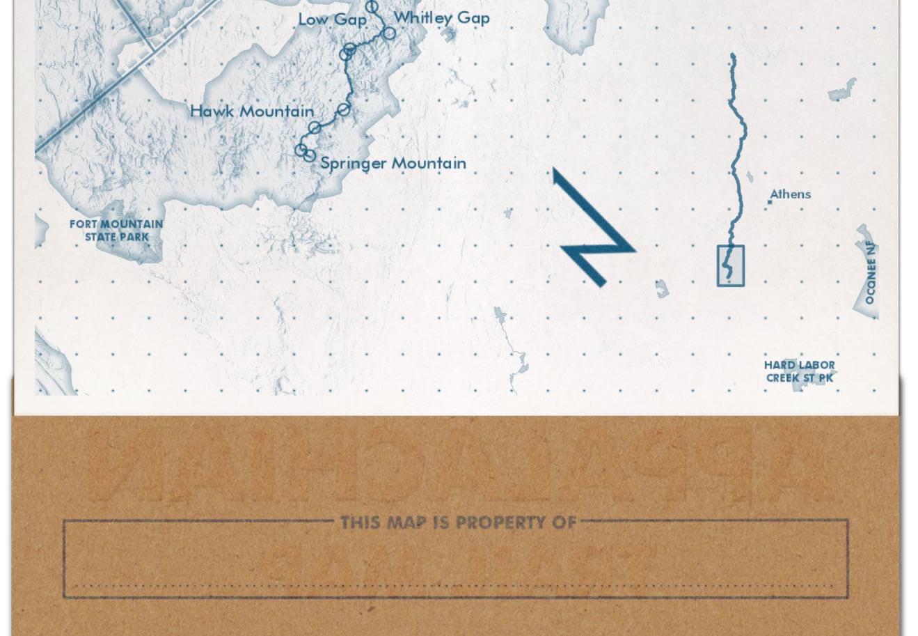
North Arrow
Ok ok, clearly this map is not North-is-up. It is rotated geographically to conform the long (and conveniently rather straight) trail line to an optimal print dimension to maximize detail. So an indication of north is a more important consideration that I normally have to weigh. This makes two maps in a row where I’ve needed a north arrow. What’s happening to me??
I drew a north arrow in Adobe and gave it a nice grainy inky print bleed, so it looks like it belongs. To add a home-spun north arrow image in Pro, go to the Insert menu and choose north arrow, then drop it where you want. Double-click to open its properties and swap out the graphic for a picture marker, then navigate to the image file.

I put one at the top of the map and one at the bottom of the map, so it would be initially apparent for hikers starting at either end. Did you know that most through-hikers go from south to north?
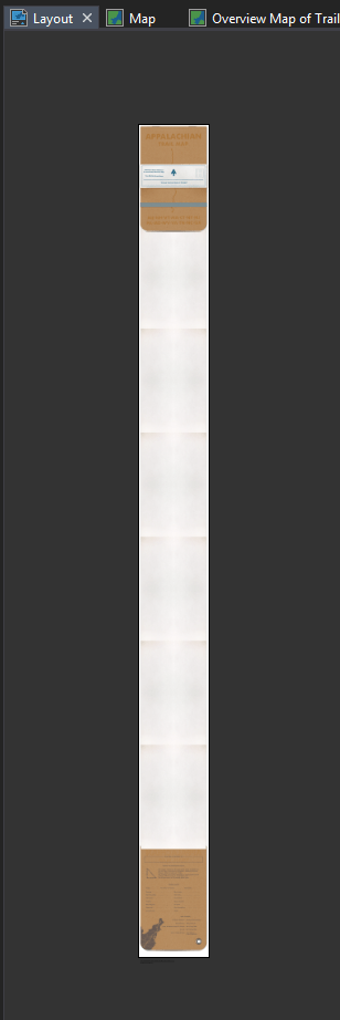
That’s that! I hope you learned a couple things and got inspired to make something you’ve been curious about. To map is an awfully big adventure. Here’s another look at the whole map.
Happy Hiking! John

Commenting is not enabled for this article.