I find that vector items floating above a complex basemap can sometimes be hard to see. An imagery basemap will have light patches and dark patches. So what’s a vector to do?
Let’s see…
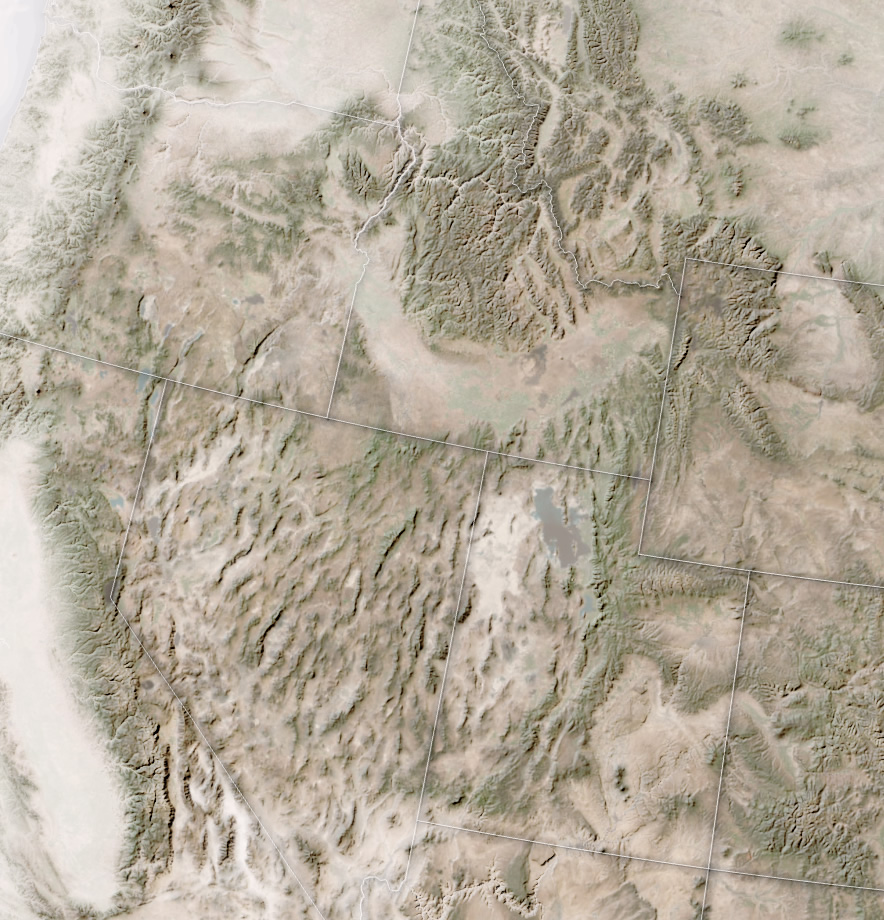
Here is a layer of US state boundaries. In black.
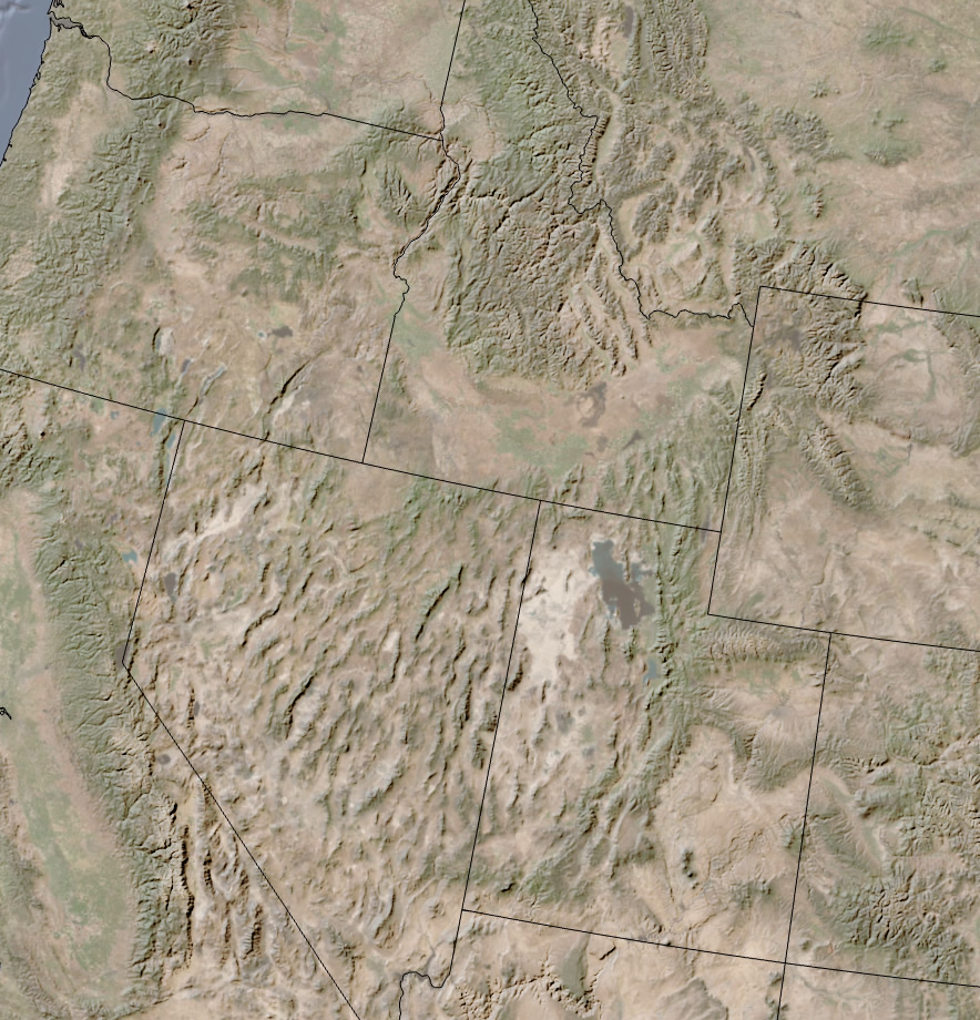
Eh. Feels a little defaulty and maybe a bit stark. Let’s try gray…
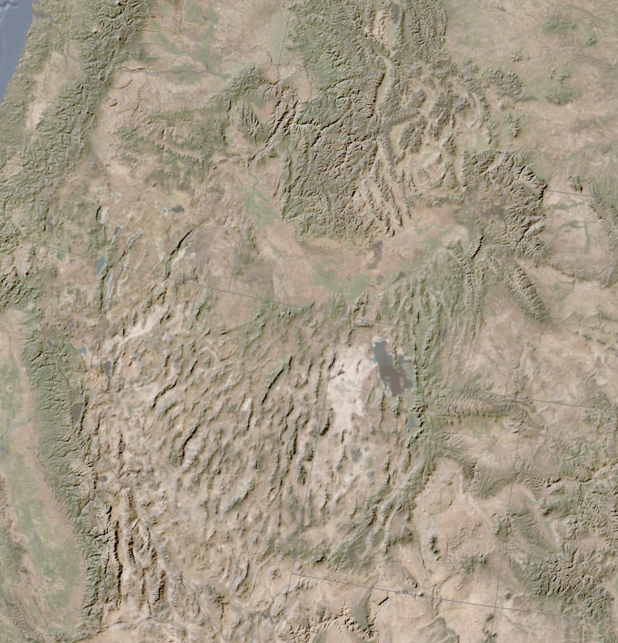
Ow, my eyes! It’s almost impossible to see. Blends right in with the mid-tones of the imagery. Well, how about white?
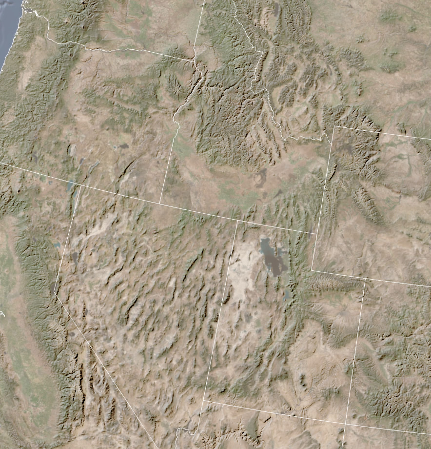
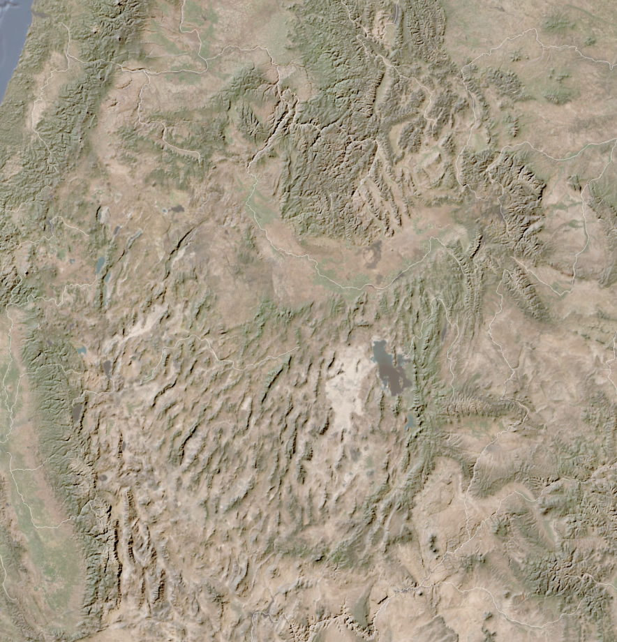
That’s better. But do you know what would really rule? If these borders had a faint dropshadow. That way the white borders would be visible over darker areas and the dropshadow would help it stand out over lighter areas.
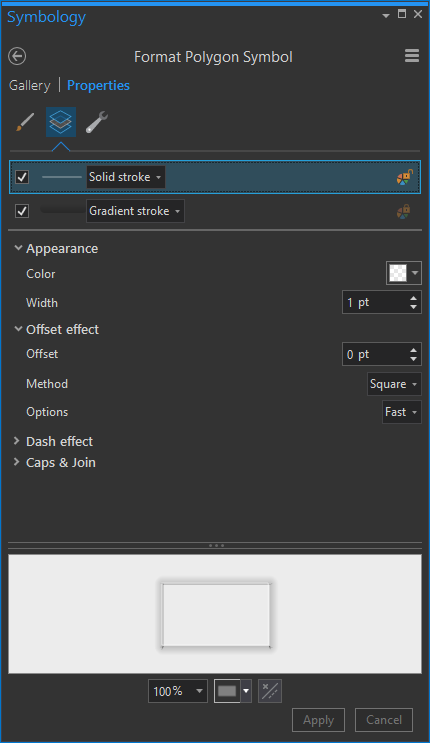
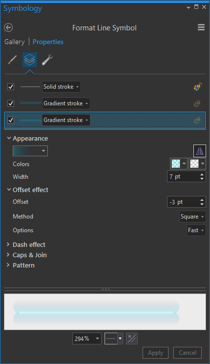
So let’s use the unfathomable powers of Symbol Layers in ArcGIS Pro. I’m going to add two symbol layers.
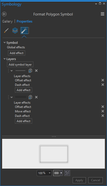
And here are the style details about these two symbol layers…
The topmost layer is a 1pt stroke, white, with a transparency of 50.
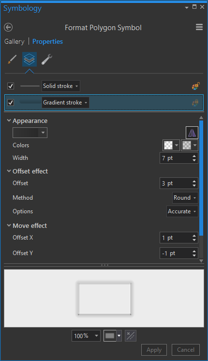
Now for the dropshadow effect. This is a gradient stroke. I give the inner color 80% transparent black, and the outer color 100% transparent black. The line has a relatively thick stroke of 7pt. There is a 3pt offset so that it draws “outside” of the boundary. I nudge it down and to the right 1 pixel using the “move” effect.
Ok, now I have a soft white border and a graceful little dropshadow under it!

This works with only one gradient stroke because the states all touch their neighbors and the outer gradient appears to go in each direction.
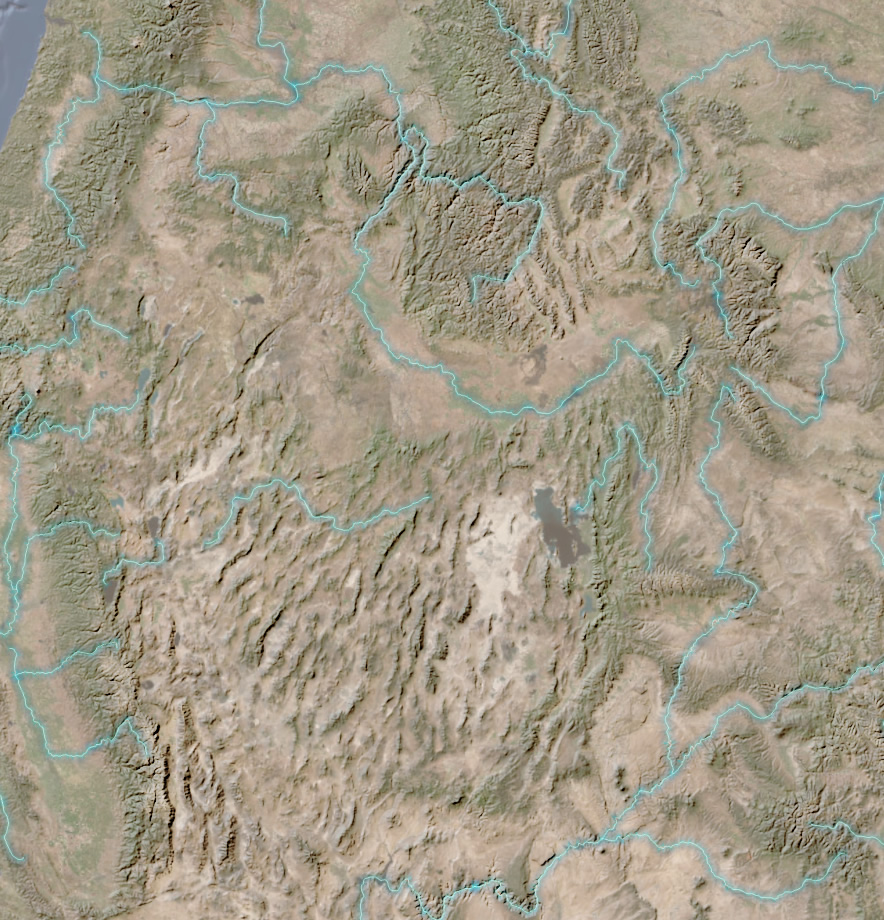
But if you have a polygon layer that doesn’t have contiguous neighbors or if you have line files like rivers or trails, then you just add a second gradient, with a reversed color scheme, offset in the opposite direction. I’ll show you with rivers…
Here are some pretty faint rivers.
If I want a shadow gradient extending on either side of a line, I just use two gradient strokes. Each offset the opposite distance.

It’s comprised of the regular old solid stroke…
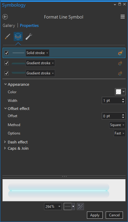
A gradient extending in one direction…

And a flipped version going in the other direction…
And all together, you get shadows. Blue shadows in this case because why not? You’ll do a much better job choosing colors.
So anyway, that’s how you get a dropshadow effect for line features in Pro! Now you have this cartographic power. With great cartographic power comes great cartographic responsibility.
Happy Shadow Mapping! John
P.S. Extra credit if you can get your shadowed lines to dive over and under a mysterious mist!
Say, do you wonder what this basemap is that I’ve been using in this illustration? Check it here.


Article Discussion: