In 2012 I made a map of all known deaths in Grand Canyon based on the book ‘Over the Edge: Death in Grand Canyon’ by Michael Ghiglieri and Thomas Myers. The web map was fairly rudimentary at the time but still provided a fascinating way to zoom into the canyon and explore all of the heartrending stories of the souls who have lost their lives in this beautiful, yet hostile place. To date it’s been viewed nearly 120,000 times (what???). I also made a print version of the map which we printed as a mega map and displayed at the User Conference for a few years (hmm…where is that map now?).
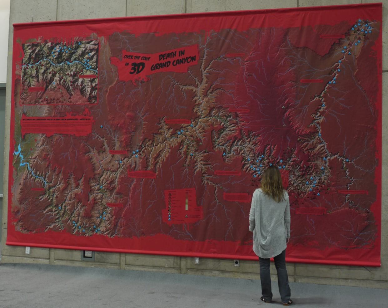
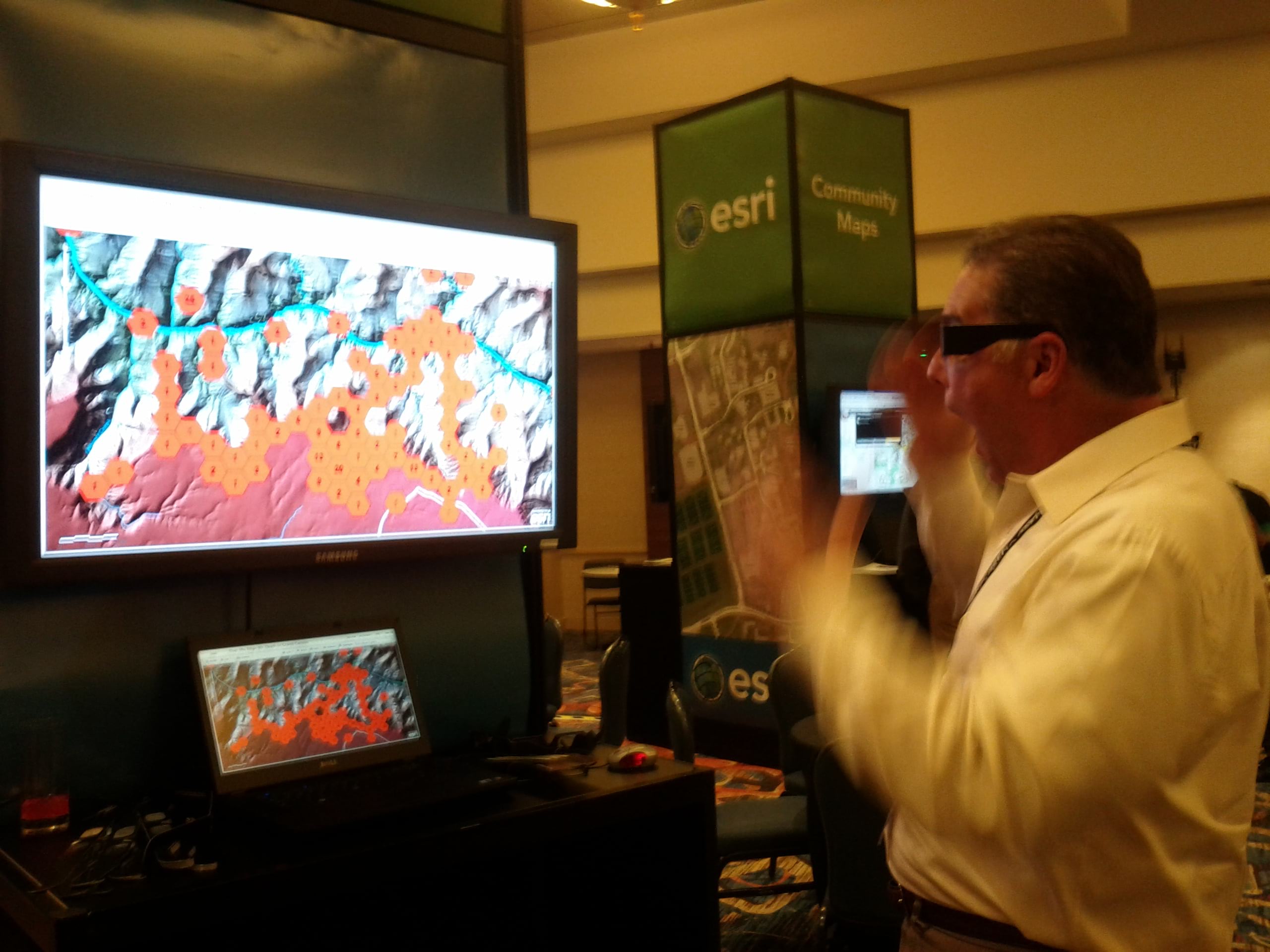
One of the reasons for making the map was to experiment with chromastereoscopic colours, to render the map as a 3D hologram when viewed through special glasses that contain thousands of tiny prisms. That’s why the map had so much red on it. Red appears closest to your eyes, blue furthest away so you get an impression of the canyon disappearing into its own depths.
Despite the macabre subject matter I always liked the map, but was never really satisfied with a number of design elements that limited what I envisaged.
In late 2018 I contacted the Grand Canyon National Park Service who kindly sent me updated data on the deaths that have occurred since the end of Ghiglieri and Myers’ book – for 2011 to end of 2018. Around the same time I was also contacted by a production company who were making a film of Will Smith’s 50th birthday bungee jump in Grand Canyon. They wanted to use the map. A perfect opportunity to give it an update though I was somewhat concerned at the possibility of having to add Mr Smith to the map if things didn’t go to plan!
The big difference between 2012 and now, of course, is I can use ArcGIS Pro. Beginning with my old ArcMap MXDs I could simply import them into a new ArcGIS Pro project and get to work. I completely redesigned the chromastereoscopic colour scheme to make the colours more vivid. Instead of covering the entire map in hues of bright red I made an area of focus and could use line symbol improvements to style the border in halftone to give the impression of a focused map area.
Many of the triangular symbols on the previous print version of the map had to use leader lines to situate them without unsightly overlaps. Triangles don’t tessellate easily (well, they do, but I didn’t want inverted symbols) so…hexagons! I could now tessellate my symbols much more effectively and remove the need for any leader lines. I still used binning to aggregate deathly incidents in the most congested areas but I tidied it up a lot.
Labeling the thematic layers on a 2012 web map was also difficult. they had to be baked into the map and that meant building raster layers to publish online. And how did I do popups back then if the map was simply a slippy set of images? I published features with invisible symbology. These were what you clicked on to get details in a pop-up. All-in-all, a fair few hacks but not any more. All the thematic data are feature services. Labels publish and scale fine. Colour and transparency are fully supported. I can finally make the map I had in my mind’s eye.
And so, today, on the anniversary of the Centennial of Grand Canyon National Park I’m releasing a new web map…
and a new print map…
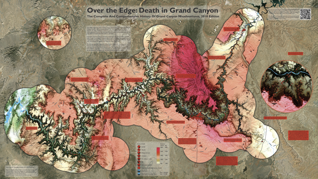
They are both improvements, and I hope you’ll agree. What it evidences more than anything is the enormous leaps that have been made in cartographic technology even in a few short years.
The map I made in 2012 was pushing things fairly hard. There was a lot of difficult work behind the scenes to get the map working on the web because ArcGIS Online was in its formative years. Using ArcGIS Pro has given me a massively expanded palette of design choices, particularly for symbology and customisation of the look and feel of the map. Getting the new map on the web was easy because ArcGIS Online and ArcGIS Pro are hooked up to support effortless publishing. I can use WebAppbuilder for ArcGIS to totally customise the way my map is delivered in the browser, declutterring it from all but what I think is necessary.
We’ve made huge strides in the cartographic capabilities of the technology and I’m delighted to be able to share these new maps. So, grab yourself a pair of chromastereoscopic glasses and take a brand new look at the map.
View the web map at esriurl.com/DeathInGrandCanyon
Download and print a PDF of the map at esriurl.com/DeathInGrandCanyonPrint
Oh…and what of the map’s appearance in the Will Smith bungee jump film? Well, he made the jump. My map made the cutting room floor. That’s probably the right way round. Maybe next time eh, Fresh Prince?
Ken

Commenting is not enabled for this article.