By Aileen Buckley, Mapping Center Lead
Cartographers apply many design principles when compiling their maps and constructing page layouts. Five of the main design principles are legibility, visual contrast, figure-ground, hierarchical organization, and balance. Together these form a system for seeing and understanding the relative importance of the content in the map and on the page. Without these, map-based communication will fail. Together visual contrast and legibility provide the basis for seeing the contents on the map. Figure-ground, hierarchical organization, and balance lead the map reader through the contents to determine the importance of things and ultimately find patterns.
In this blog entry, we introduce these five principles of map design and explain their importance in cartography. It’s worth noting that these principles are not applied in isolation but instead are complementary to each other. Collectively they help cartographers create maps that successfully communicate geographic information.
Visual Contrast
Visual contrast which relates to how map features and page elements contrast with each other and their background. To understand this principle at work, consider your inability to see well in a dark environment. Your eyes are not receiving much reflected light so there is little visual contrast between features and you cannot easily distinguish objects from one another or from their surroundings. Add more light and you are now able to contrast features from the background. This concept of visual contrast also applies in cartography (figure 1). A well-designed map with a high degree of visual contrast can result in a crisp, clean, sharp-looking map. The higher the contrast between features, the more something will stand out, usually the feature that is darker or brighter. Conversely, a map that has low visual contrast can be used to promote a more subtle impression. Features that have less contrast will appear to belong together.
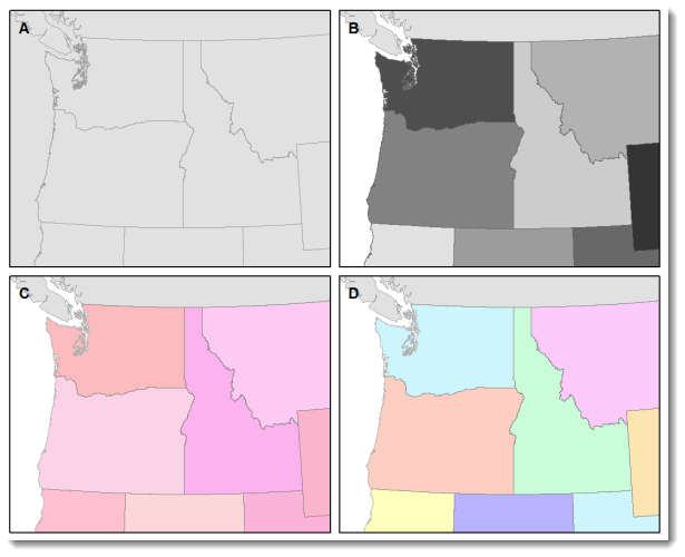
Figure 1. When there is no variation in visual contrast (A), the map reader has a hard time distinguishing features from the background. For quantitative distributions (B), there must be enough contrast between tones for the reader to distinguish unique classes. For qualitative distributions (C),using variations of a single color hue (e.g., red) does not provide as much contrast as using a variety of hues (e.g., red, green, blue, etc.)
Legibility
Legibility is “the ability to be seen and understood”. Many people work to make their map contents and page elements easily seen, but it is also important that they can be understood. Legibility depends on good decision-making for selecting symbols that are familiar and choosing appropriate sizes so that the results are effortlessly seen and easily understood (figure 1). Geometric symbols are easier to read at smaller sizes; more complex symbols require larger amounts of space to be legible.
Visual contrast and legibility are the basis for seeing. In addition to being able to distinguish features from one another and the background, the features need to be large enough to be seen and to be understood in order for your mind to decipher what you eyes are detecting. Visual contrast and legibility can also be used to promote the other design principles: figure-ground, hierarchical organization, and balance.
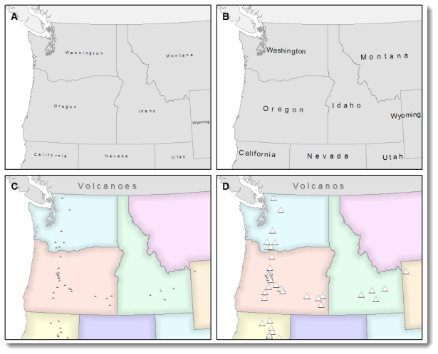
Figure 2. Text and symbols (A and C) that are too small cannot be seen. Once able to be seen (B and D), they must also be understood.
Figure-ground
Figure-ground organization is the spontaneous separation of the figure in the foreground from an “amorphous” background. Cartographers use this design principle to help their map readers find the area of the map or page to focus on. There are many to promote figure-ground organization, such as adding detail to the map or using a white wash, a drop shadow, or feathering.
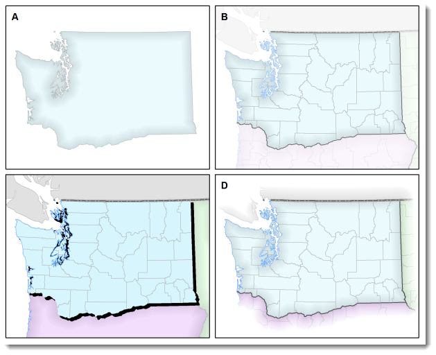
Figure 3. Using closed forms (A), a white wash (B) , a drop shadow (C), or feathering (D) will promote figure-ground organization on your map.
Hierarchical Organization
One of the major objectives in map making is to “separate meaningful characteristics and to portray likenesses, differences, and interrelationships” (Robinson, et al,. 1995, p. 327). The internal graphic structuring of the map (and the page layout more generally) is fundamental to helping people read your map. You can think of a hierarchy as the visual separation of your map into layers of information. Some types of features will be seen as more important than other kinds of features, and some features will seem more important than other features of the same type. Some page elements (e.g., the map) will seem more important than others (e.g., the title or legend). This visual layering of information within the map and on the page helps readers focus on what is important and enables them to identify patterns.
Hierarchical organization on reference maps (those that show the location of a variety of physical and cultural features, such as terrain, roads, boundaries, and settlements) works differently than on thematic maps (maps that concentrate on the distribution of a single attribute or the relationship among several attributes). For reference maps, many of the features should be no more important than one another and so, visually, they should lie on essentially the same visual plane. In reference maps, hierarchy is usually more subtle and the map reader brings elements to the forefront by focusing attention on them. For thematic maps, the theme is more important than the base that provides geographic context.
Balance
Balance involves the organization of the map and other elements on the page. A well-balanced map page results in an impression of equilibrium and harmony. We can also use balance in different ways to promote “edginess” or “tension” or create an impression that is more “organic”. Balance results from two primary factors, visual weight and visual direction. If you imagine that the center of your map page is balancing on a fulcrum, the factors that will “tip” the map in a particular direction include the relative location, shape, size, and subject matter of elements on the page.
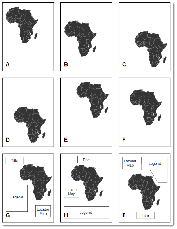
Figure 4. Which of the top six maps seems most balanced? It should appear that (F) has visual equilibrium, usually achieved by placing the central figure slightly above center on the page. However, the addition of page elements, such as the title and legend, will modify the visual impression, so all content on the page should be evaluated together to judge balance.
Together these five cartographic design principles have a significant impact on your map. How they are used will either draw the attention of your map readers or potentially repel them. Giving careful thought to the design of your maps using these principles will help you to assure that your maps are ones people will want to look at!
Further Reading
To learn more, check out the cartography textbooks below which provide more in-depth discussions of these design principles and their application in cartography:
- Dent, Borden D., Jeffrey S. Torguson, and Thomas H. Hodler. 2009. Cartography: Thematic Map Design, Sixth Edition. Boston, MA: WCB-McGraw Hill, 336 pages, ISBN-13 978-0-07-294382-5, ISBN-10 0-07-294382-3. Pages 207-222.
- Robinson, Arthur H., Joel L. Morrison, Phillip C. Muehrcke, A. Jon Kimerling and Stephen C. Guptill. 1995. Elements of Cartography, Fifth Edition. New York, NY: John Wiley & Sons, Inc., 674 pages, ISBN 0-471-55579-7. Pages 324-330.
- Slocum, Terry, Robert B. McMaster, Fritz C. Kessler, and Hugh H. Howard. 2009. Thematic Cartography and Geographic Visualization, Third Edition. Upper Saddle River, NJ: Pearson Prentice Hall, 561 pages, ISBN-10 0-13-229834-1, ISBN-13 978-0-13-22984-6. Pages 212-221.

Article Discussion: