Visually communicating scientific research can be a daunting task. A good research poster needs to distill a potentially complicated study into accessible language, compelling graphics, and a layout that can be understood at a glance (often from arm’s length). Accommodating maps, charts, explanatory text, references, and other supporting information into a relatively small space often requires some design gymnastics.
Fortunately, we can refer to several principles of geographic storytelling to solve (or at least mitigate) these conceptual and design challenges. By combining a few basic ideas about hierarchy, composition, consistency, and visual storytelling with some clever workflows in ArcGIS Pro’s layout view, it’s possible to transform a complex scientific study into a communication product that is clear, engaging, elegant, and memorable.
Whether you’re presenting your research at a conference or simply printing a poster to adorn your fridge, the following principles can serve as useful guides, and the associated tools in ArcGIS Pro can aid in implementation. Click the links below to jump to the corresponding sections.
- Hierarchy
- Compositional balance
- Visual consistency and cohesion
- Accessibility and engagement
- Providing a next step
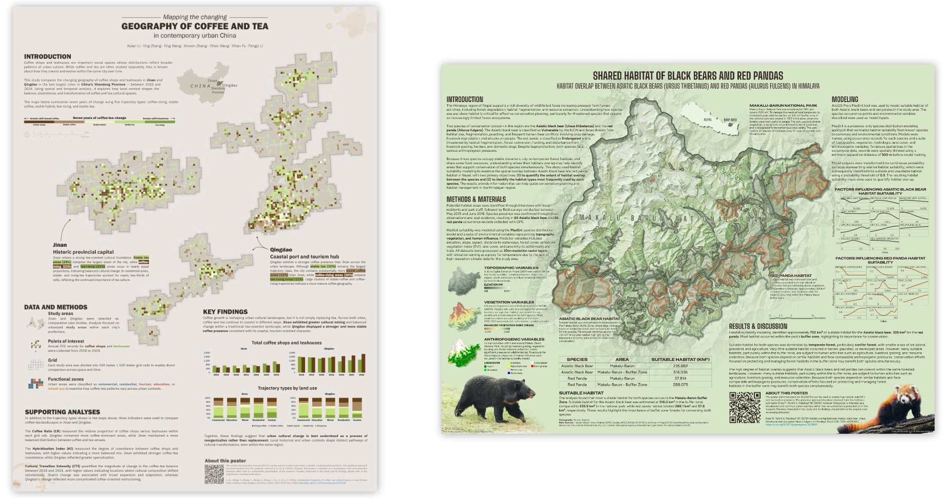
To demonstrate these principles in action, we’ve prepared two example posters derived from open-access scientific studies. If you’d like to deconstruct these posters, you can download the ArcGIS Pro projects at the links below:
1. Establish a clear hierarchy
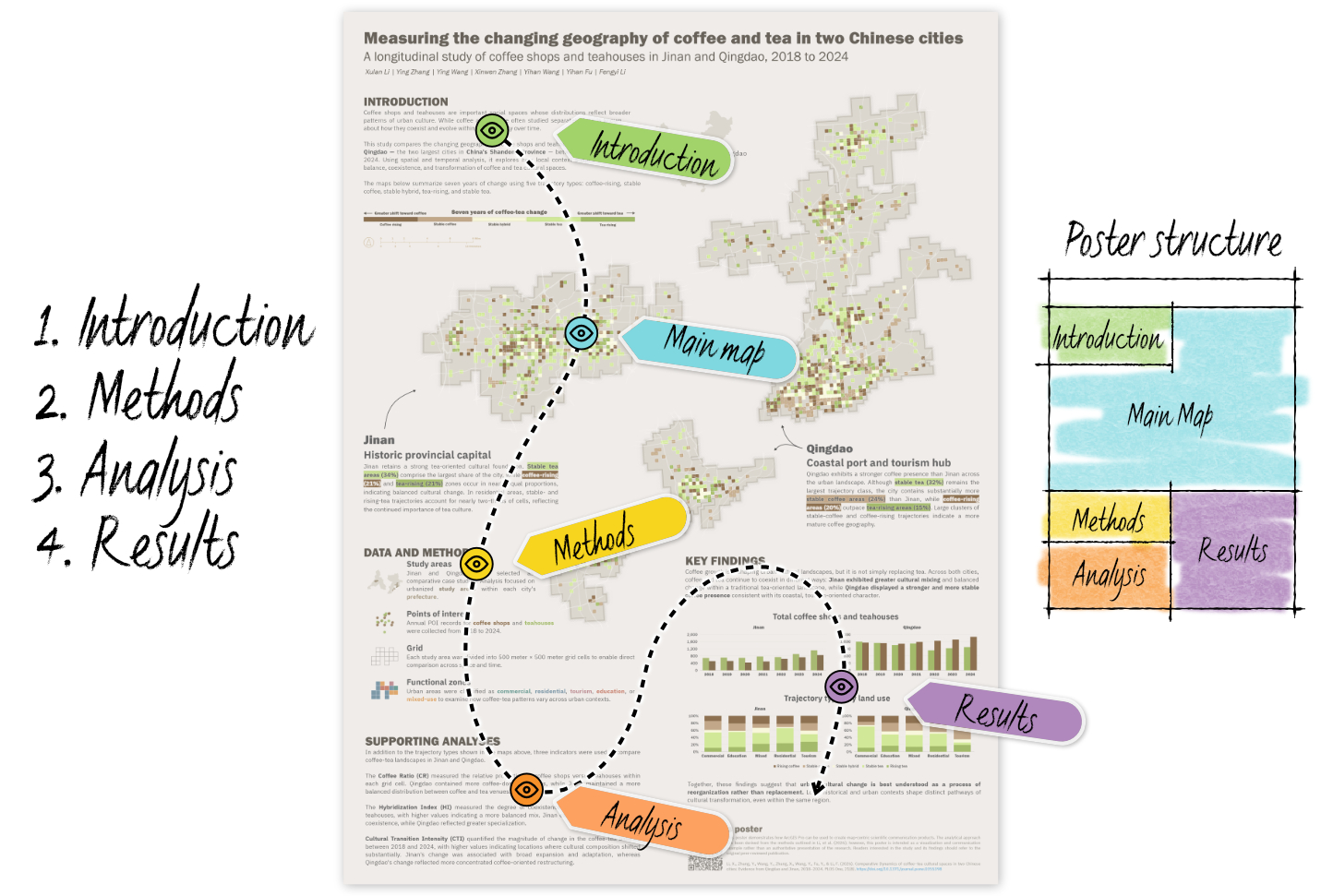
Just as a story or film script needs a compelling narrative arc, a scientific poster should have a visual order that guides readers through the research. Research papers typically follow a familiar progression from Introduction → Methods → Analysis → Results → Discussion, moving from the problem being investigated to the evidence and conclusions. A successful poster should make that story easy to follow through thoughtful layout design.
Not every element is equally important, so your layout and design should reflect the relative importance of the information being presented. It’s helpful to start by identifying the information or elements that you most want your readers to notice. Your title and primary findings — including maps — should be visually prominent, while supporting information such as methods, references, and credits can probably assume a less prominent role. Within each section, differences in size, weight, position, and color can establish or reinforce relationships between elements and indicate where readers should look next.
While research articles often follow a prescribed structure, that sequence may not always be the structure that’s easiest for an audience to follow. Don’t be afraid to reorganize and adapt your poster to focus on the central thesis or question to draw readers in.
ArcGIS Pro tip
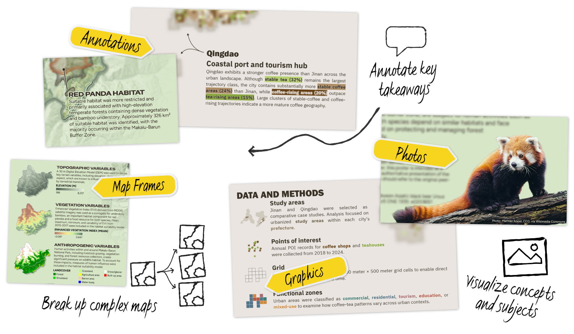
Text formatting tags such as <CLR> (color), <FNT> (font), and <BGD> (background) can help establish hierarchy within running text. You can use these tags to create headings, highlight key words or numbers, or even design mini legends, without having to manage an unwieldy number of individual text elements.
2. Create a balanced composition
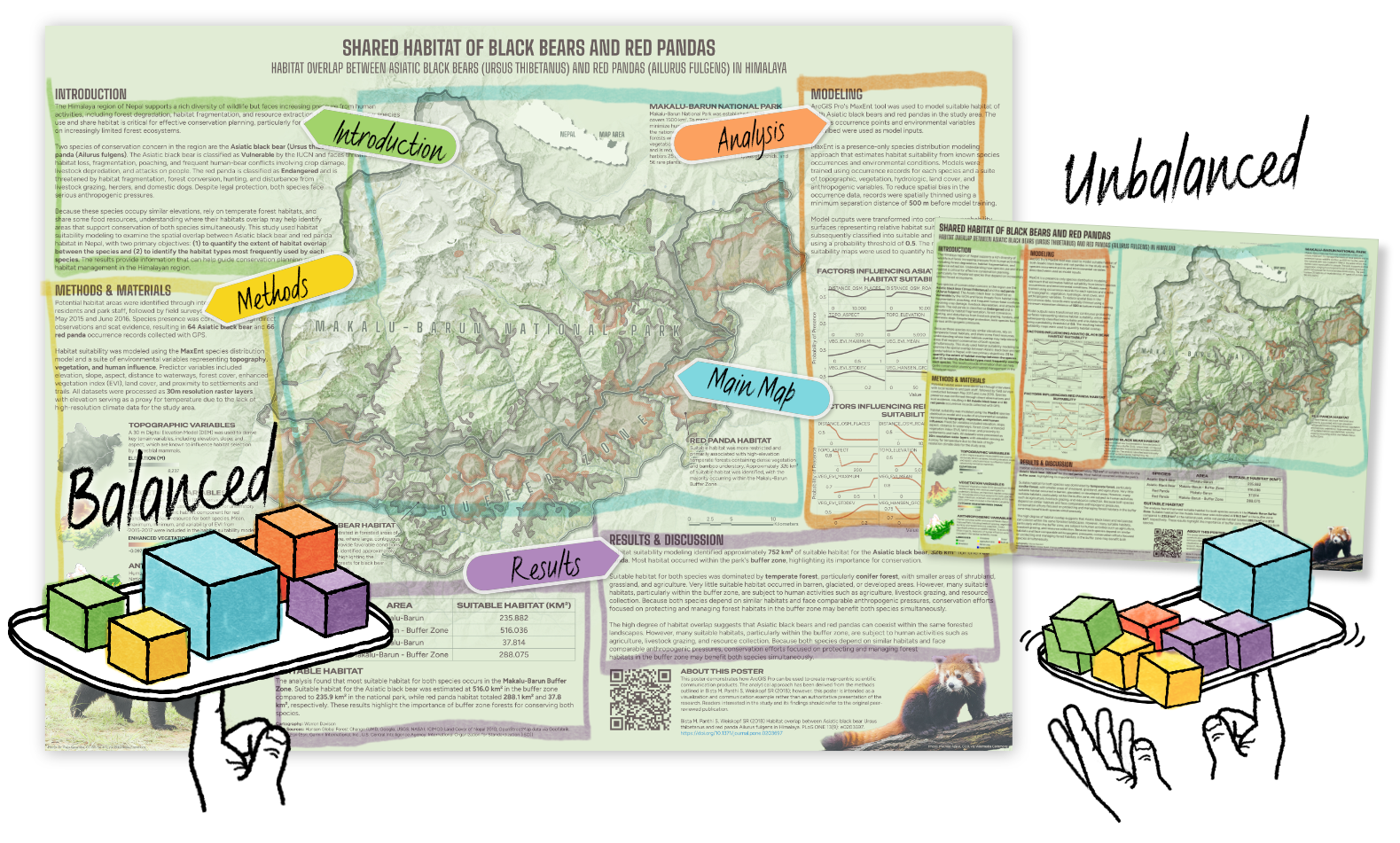
Once you know what information needs to be emphasized, consider how the individual elements in your poster should work together as a whole. A well-designed poster should feel visually balanced, with maps, text, charts, and other elements distributed in a way that keeps the composition from feeling heavier on one side or the other. One way to think about this is to imagine holding the poster from the bottom like a lunch tray: You don’t want all the weight concentrated on one side, causing the whole thing to tip.
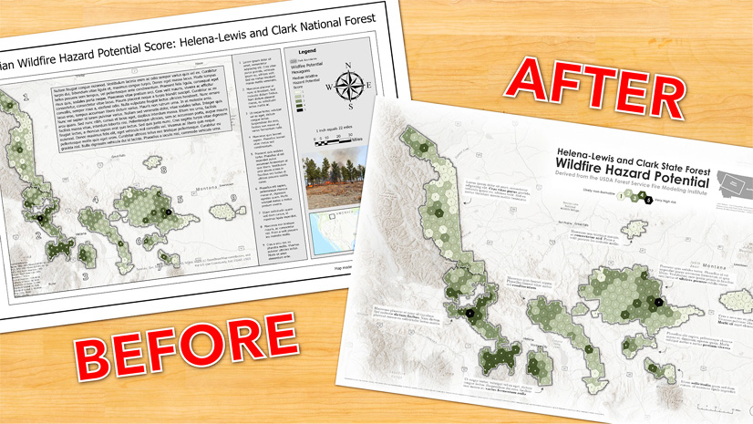
Of course, balance doesn’t mean that everything needs to be symmetrical or evenly distributed; in fact, asymmetry can make a composition feel more dynamic, and can help reinforce a visual hierarchy. What matters is the overall visual weight of the composition, and how that weight directs the reader’s attention.
3. Ensure visual consistency and cohesion
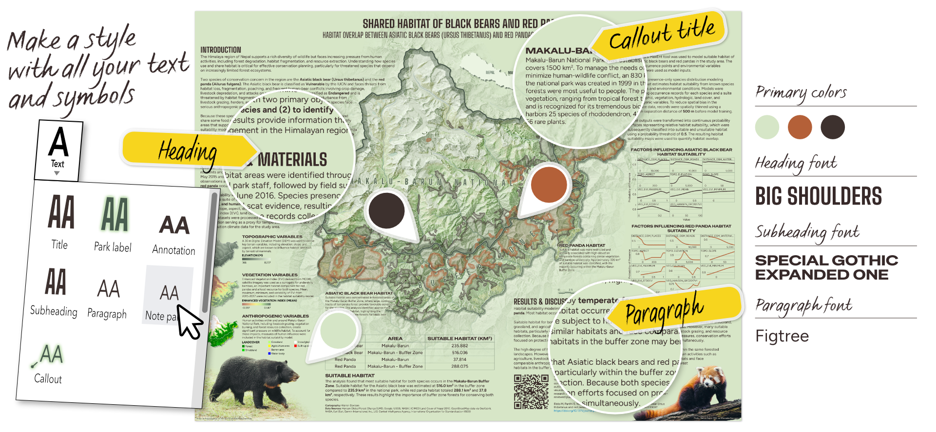
Your poster will likely contain many different types of information, but they should still feel like parts of the same story. Consistent colors, typefaces, spacing, and layout conventions help ensure visual cohesion.
Choose a limited color palette and use it deliberately. Similarly, establish a small set of type styles for titles, headings, body text, and other recurring elements, rather than designing each element individually. You don’t need a large collection of fonts or decorative styles to make a poster interesting — in most cases, one or two typefaces, combined with differences in size and weight, are enough to create the variety needed to establish a visual hierarchy while still feeling cohesive.
You can also reinforce a sense of cohesion by allowing elements to interact with one another, rather than treating every map, text box, and graphic as an isolated object. Borders and neatlines can help organize information, but too many boxes can make a poster feel fragmented. Allowing elements to overlap, wrap around one another, or extend beyond conventional boundaries can transform a collection of discrete elements into a unified design.
ArcGIS Pro tip
Styles can help you establish and reuse consistent symbols, colors, text formatting, and other design elements throughout a project.
ArcGIS Pro tip
You can edit the vertices of map frames, text boxes, and other layout elements to create more organic shapes. This can help create a composition that feels less constrained by a traditional grid. If you ever want to return the element to a more regular form, the Reshape tool provides an easy way to replace the shape of your element while keeping its content.
4. Make the research accessible and engaging
Scientific research can be complicated — in fact, that’s often the point — but your poster can clarify key insights. Use language that is appropriate for your audience, and be deliberate about how much information you include. A poster isn’t a research paper pasted onto a big sheet of paper — it’s a distillation of research that elevates important takeaways. Readers will likely encounter your poster while standing at a distance, often alongside many other posters, so they should be able to understand the basic premise and major findings without having to read every word.
This also means paying attention to text size. If readers need to squint to read your poster, the text is probably too small. Prioritize the information that readers actually need, and remove or reduce anything that doesn’t contribute to the story.
Of course, it can be difficult to recognize when your own writing is too technical or dense for a general audience. Before printing your poster, ask a colleague who is unfamiliar with the research for a quick review. If they can’t explain the basic idea after looking at it for a few minutes, that can be a useful clue that the content or visual hierarchy needs another pass.
Accessibility also applies to maps and graphics. Use color combinations that are distinguishable and provide sufficient contrast, and avoid relying on color alone to communicate important information.
ArcGIS Pro tip
The color vision deficiency simulator tools (CVS) built into ArcGIS Pro can simulate a poster’s appearance for readers of all abilities.
ArcGIS Pro tip
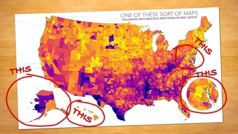
Map frames can be created from the same source map and configured with Map Frame Layer visibility overrides. This allows a complex map to be broken into a series of smaller, more focused views that highlight individual themes, variables, or intermediate results without duplicating data. Combined with map frame constraints, these maps can remain synchronized to the same geographic extent, helping readers understand one concept at a time while building toward the larger story and conclusions of the analysis.
ArcGIS Pro tip
Consider incorporating photos, illustrations, or other supporting graphics that reinforce the story. Strong visuals help capture attention and create an immediate connection between the audience and the subject of the research. These visuals can help readers understand what or who the research is about, making the science more approachable and memorable.
5. Give readers a next step
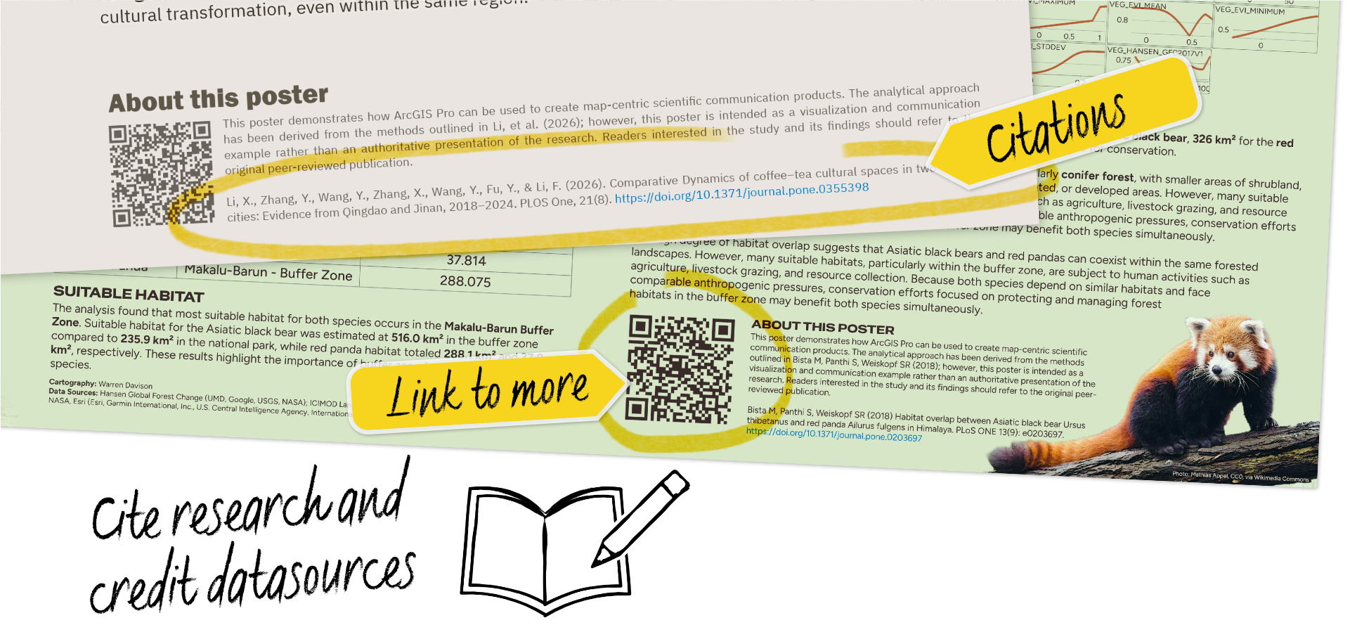
Your poster probably won’t tell the whole story — and that’s okay — but you shouldn’t leave readers wondering. Think of your poster as an entry point into the research, rather than its final destination, and provide readers with an opportunity to learn more. A QR code can link to the full paper, an interactive map, or additional documentation. You can also include a short URL or other relevant resources.
The important thing is to make the next step obvious and easy to follow. Someone who has just spent several minutes exploring your poster should know where they can go if they want to dig deeper.
Putting the pieces together
The storytelling principles discussed in this article aren’t limited to scientific posters; hierarchy, composition, consistency, and accessibility can strengthen almost any form of science communication, from maps and reports to presentations, websites, and — of course — interactive geographic stories. Furthermore, you don’t need to be a professional designer or cartographer to put these principles into practice. Whether you’re creating your first research poster or your hundredth, thinking deliberately about how your audience will encounter and interpret your work can make the final product more effective, irrespective of your technical proficiency.
For more guidance on working with maps in ArcGIS Pro, check out the related articles posts below.


Article Discussion: