In a previous post, I walked through the creation of a hand drawn map. In the process I picked up some insights on what it was about the tangible graphite, ink, paint, and paper map that I appreciated. I had plenty of time to focus on the various textures of these materials and speculated about how I could make digital textures to wield all digital-like.
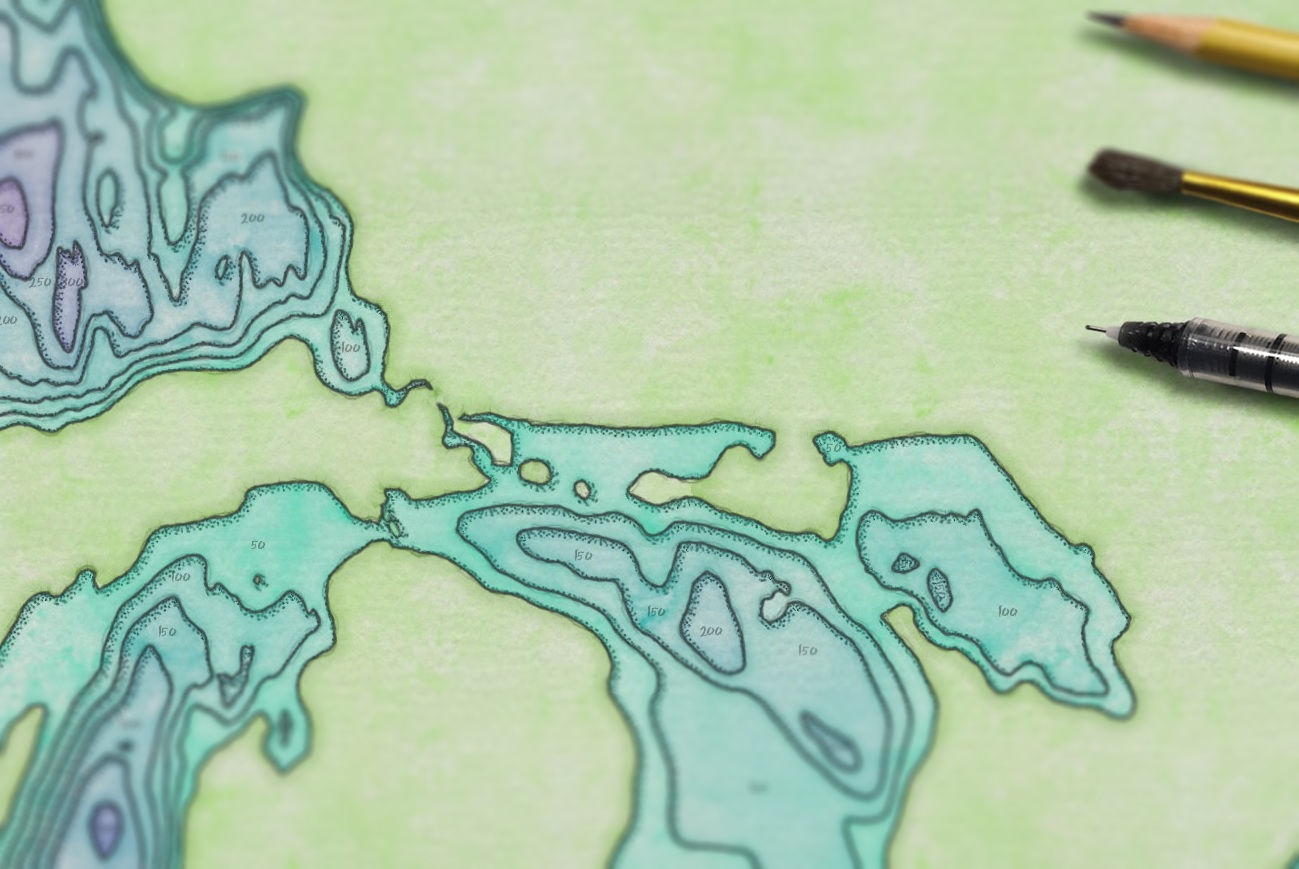
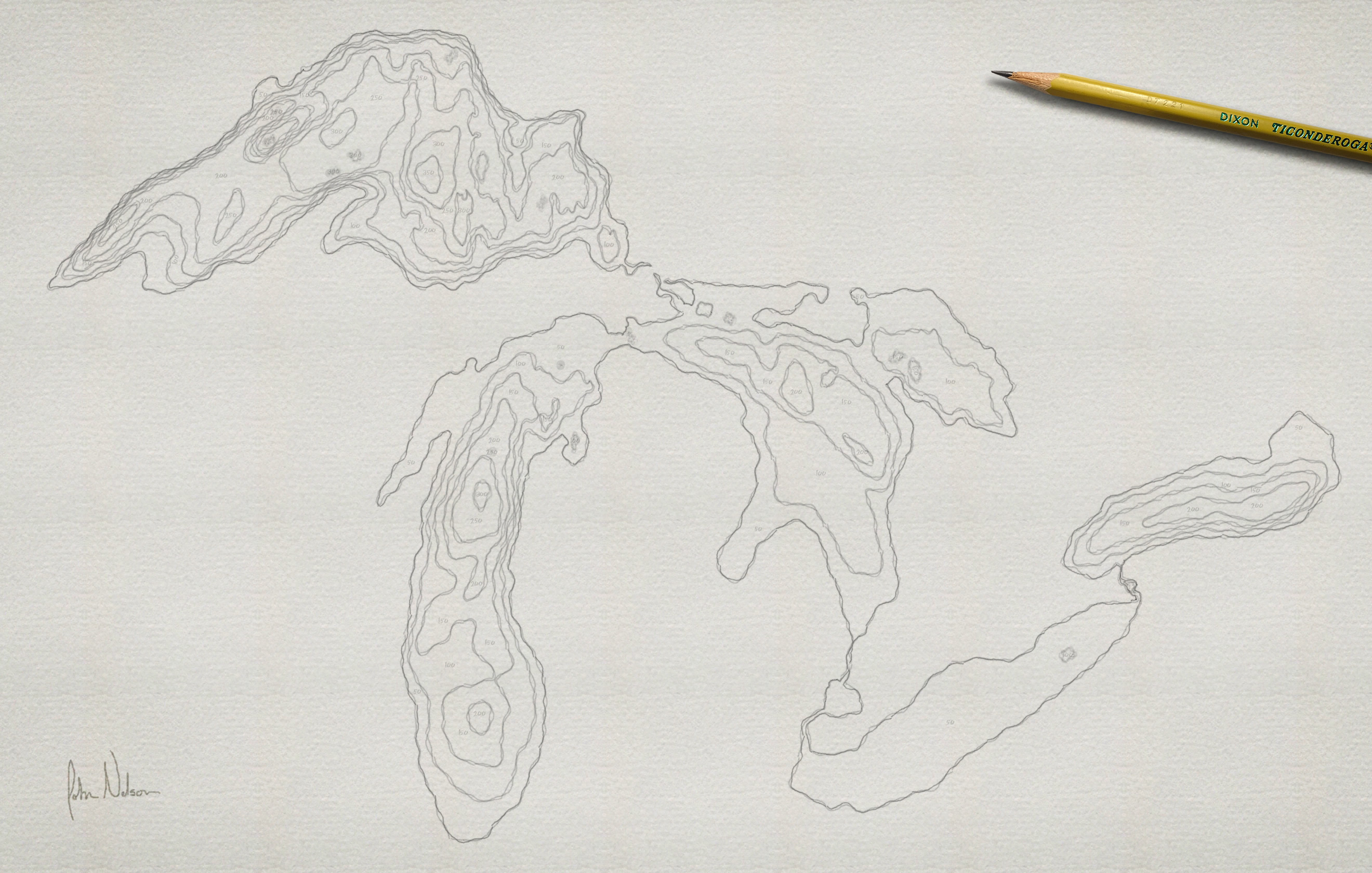
Here is the (actually) hand drawn map:
Some of the textures that I note in this map:
- The watercolor paper is a pressed fibrous surface heaping with texture that shows through the paint.
- The watercolor itself has an irregular organic quality, is mostly transparent.
- The baseline pencil sketch, and the final pen tracing, is irregular (hey, what can I say, I did my best) and has multiple imperfectly-layered strokes.
- The pen stipple is a bold, slightly irregular, speckling with an offset to the lower-right, a stylized cast-shadow.
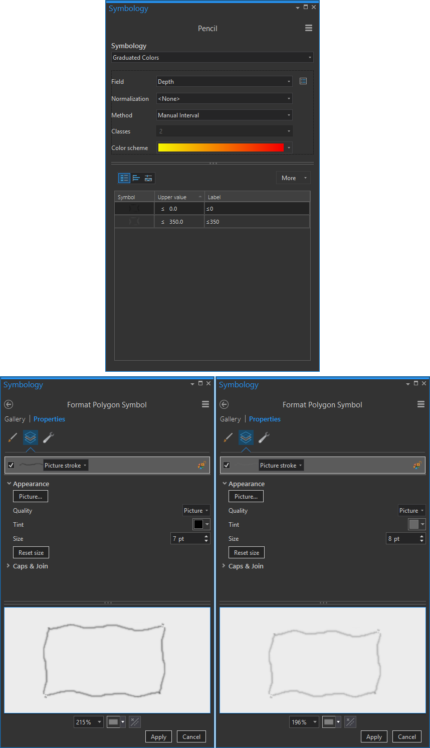
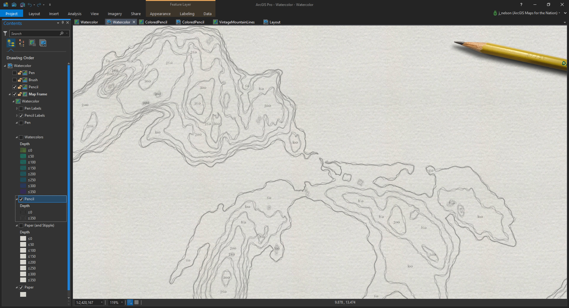
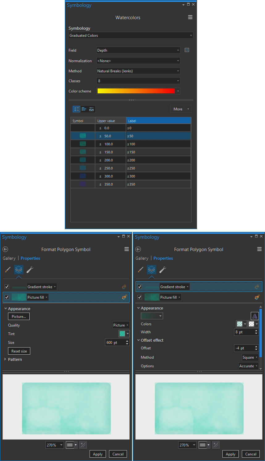
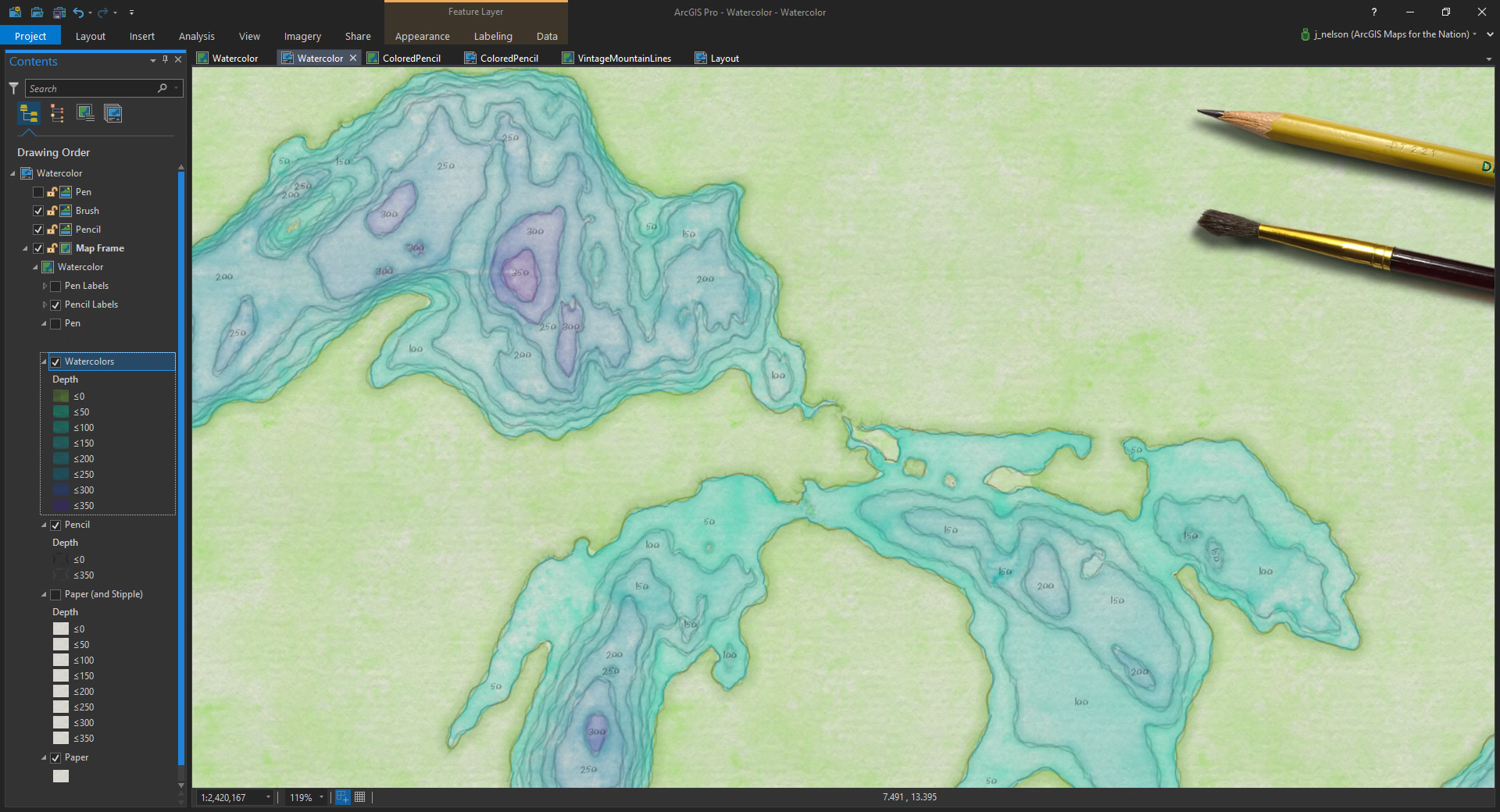
I had some bathymetric data laying around from a previous project. So I loaded it into ArcGIS Pro (if you’d like to follow along directly in Pro, here is the project). To the lines, I applied a picture stroke that I drew in Adobe Creative Cloud. This is the picture (It looks invisible because it’s white. You can save this directly to steal it for your own maps)…
![]()
The wobble of the line texture, coupled with its overlappedness (owing to the image symbol being longer than the line segments) gives it a sketchy quality that works perfectly. Here is how I applied it to the stroke symbology in Pro. I isolated the coastline by creating two ranges, one of 0 depth (coast) and everything else. To the coastal picture stroke I applied a larger size and darker graphite color. The bathymetric lines are lighter and leaner.
And I really liked how it looked! Super easy, you should give that image up there a try on all sorts of data. By the way, a pencil-sketched stroke has a lot of potential as a representation of geographic uncertainty. Put that in your cartographic toolbox.
Amirite??
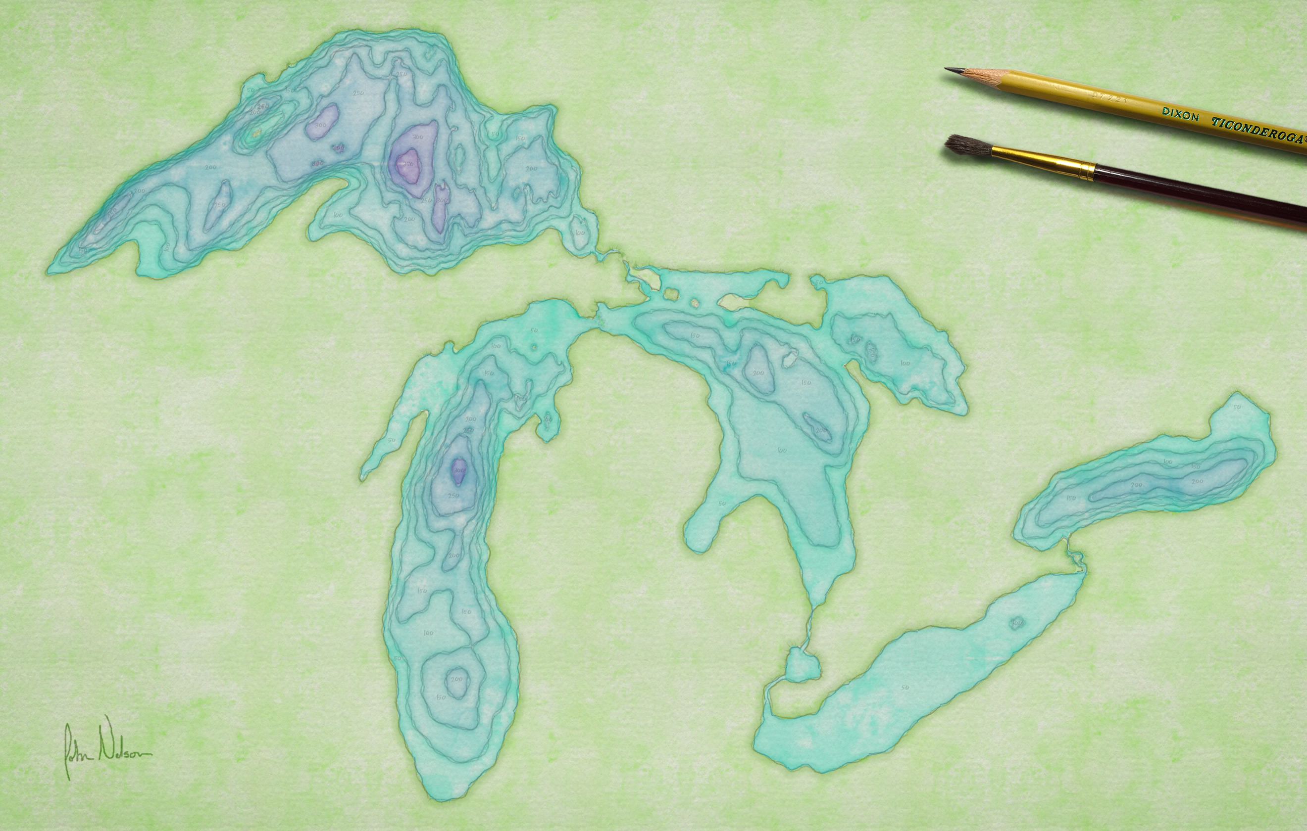
Onward! In my hand drawn map I followed the pencil sketch with a timid foray into watercolor. I was pretty awful at watercolor. As it happens, I am a much better watercolorer in ArcGIS Pro than I am in the analog world.
I created a repeatable watercolor texture in Adobe Creative Cloud. The thing with watercolor is that it is pseudo-random in its opacity and has abrupt, organic, variations in the depth of hue. Some textures are easy to create (line the pencil line, above). This was not one of them. Here it is, for what it’s worth (again, it looks invisible because it’s white):

In Pro, you can apply a tint to a picture fill. Any whiteness in the picture inherits the tint. I love Pro. I may be in love with Pro. So I used symbol layers to apply a picture fill to the areas I wanted to “paint” and a faint gradient stroke at the edges, to replicate the osmosis accumulation of pigment at the dry edge of a watercolor blob.
It looked like this:
Let me assure you, this digital watercolor was much easier to control than were my fumblings with an actual brush.
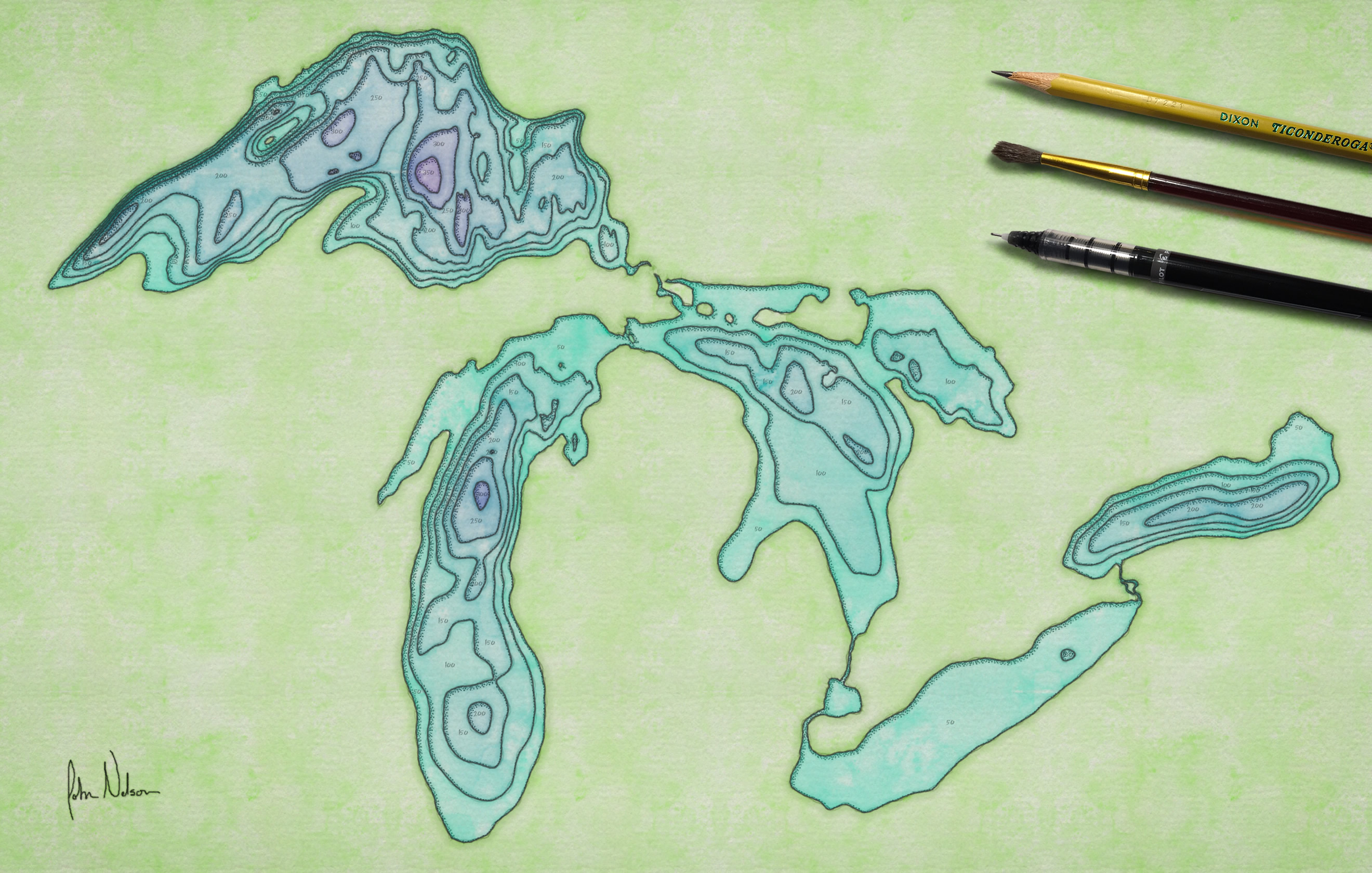
In the digital environment I think I’d call it good at this point. Done. But when I was making the hand drawn map my watercolor was super disappointing so I decided to pick up a pen and start defining the contours. Give them some punch.
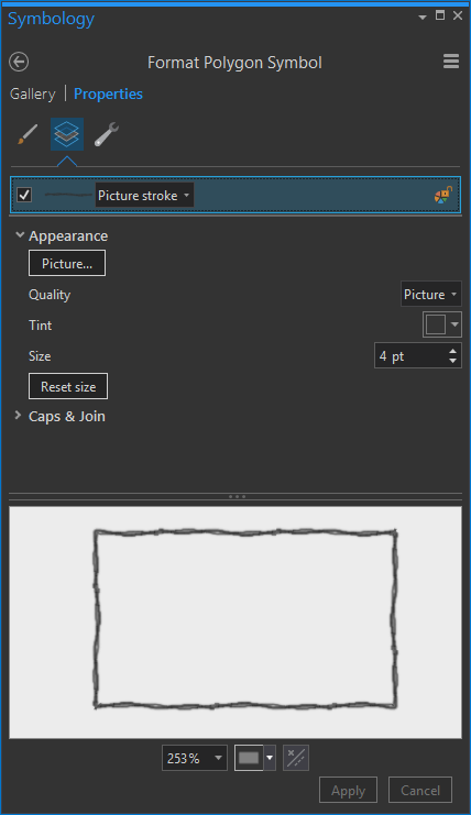
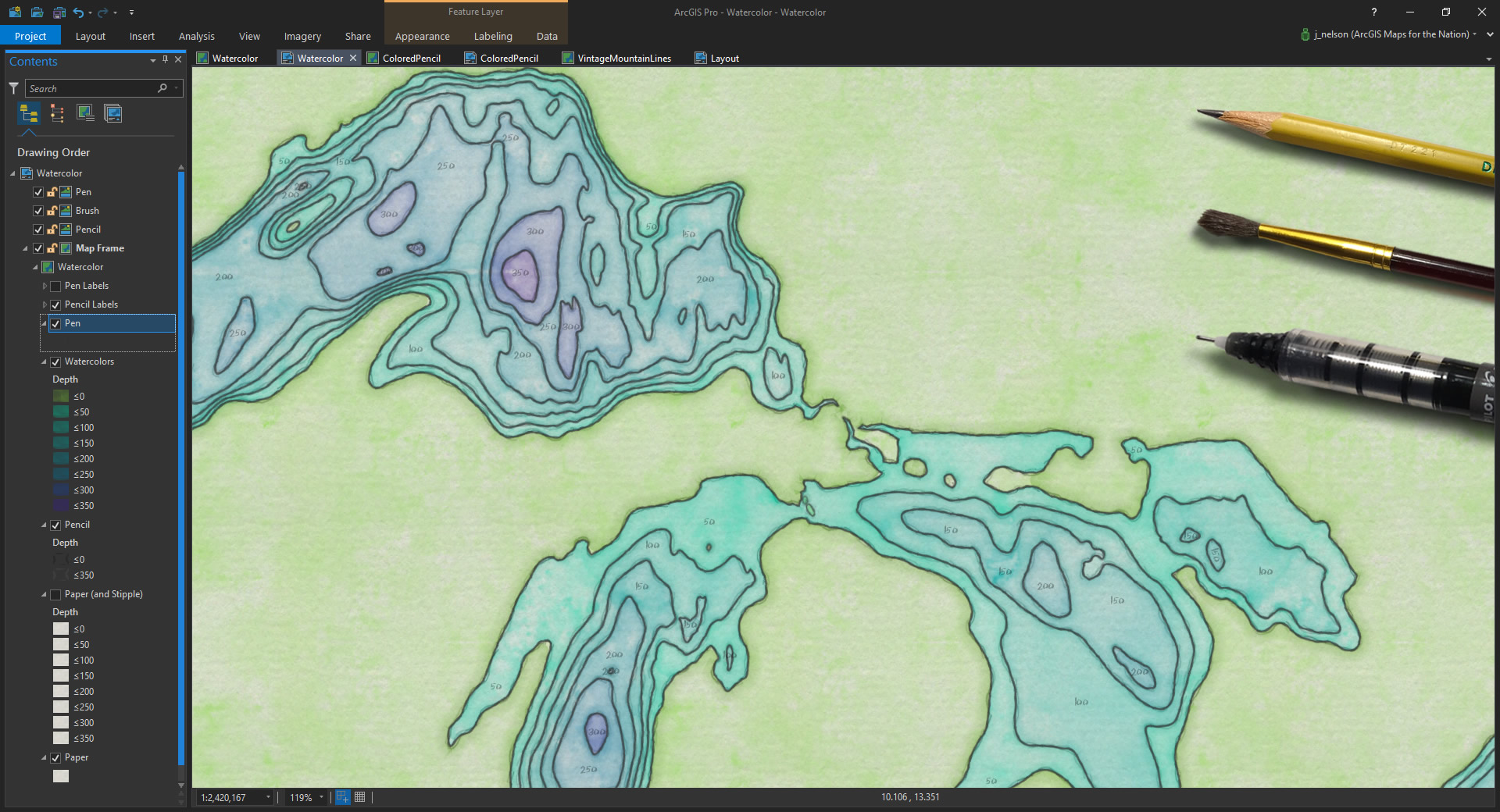
To replicate this step in Pro, made a copy of the contours layer then I created a pen texture (in Adobe CC) to apply to the contour strokes. Here it is:
![]()
I gave it a black tint in the symbology panel.
Looked reasonably convincing.
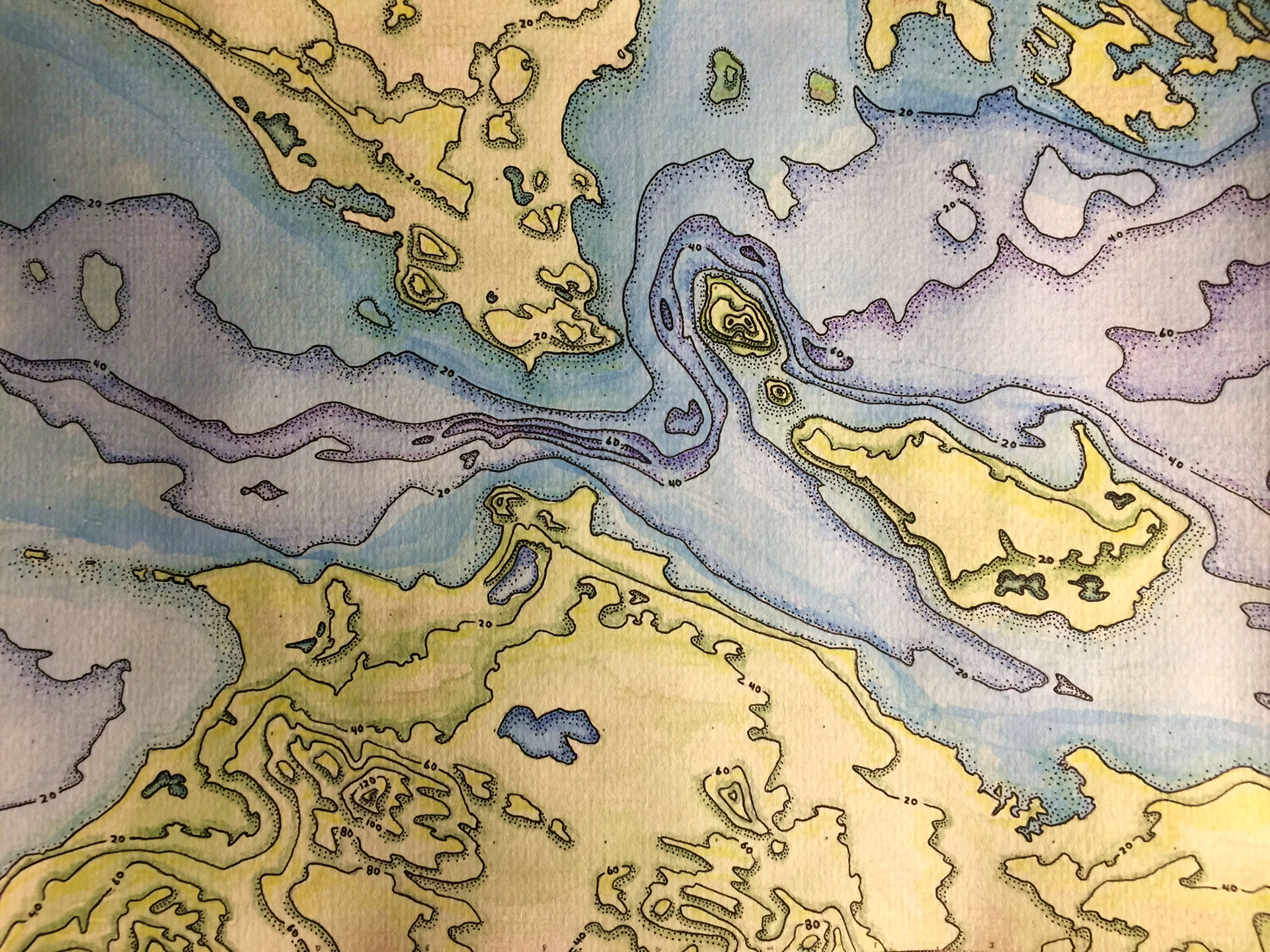
Now, the part of the hand drawn map that I am most proud of is the stippled shading. I was influenced by the work of Matthew Maury and Shel Silverstein. Over the course of hours I tapped away at the southwest-facing sides of the laminar contours to pick them up off the paper. Believe me when I tell you, it was a divine pleasure to replace this stippling with the click of a mouse. Here’s the texture I used:
![]()
And the fill for each contour area was a tidy little photo I snapped of my actual watercolor paper.
And here’s how I applied them in the Pro symbology panel:
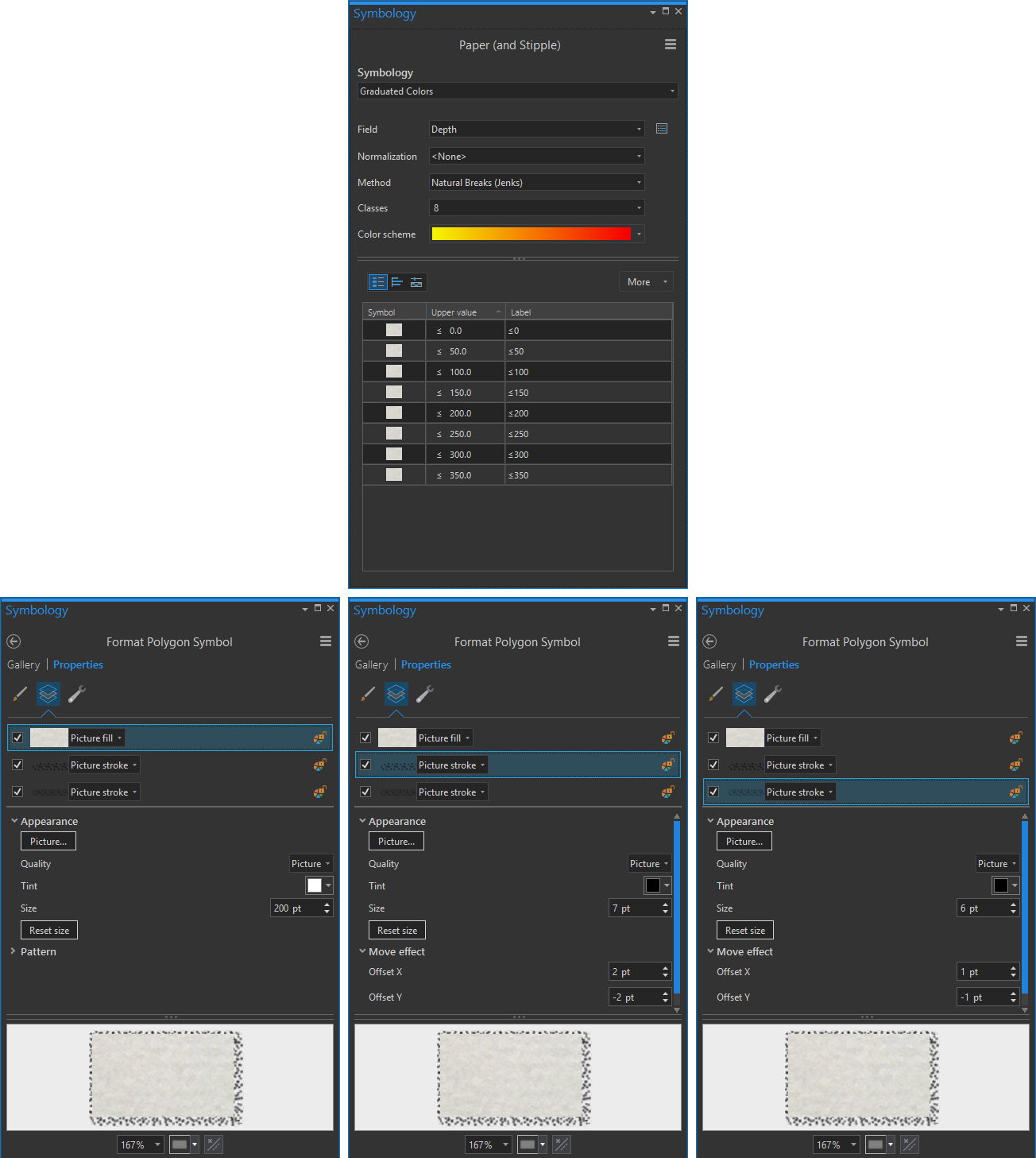
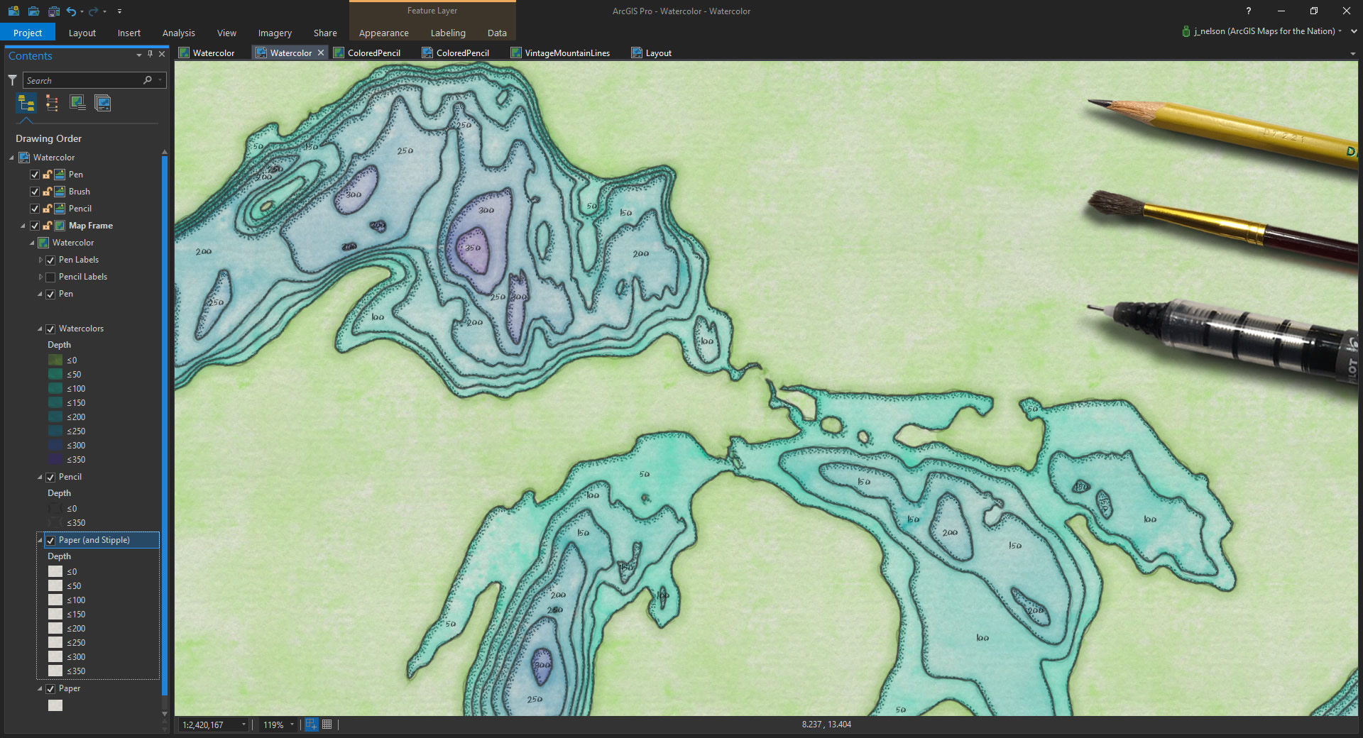
See what I did there? Because I only wanted the stippling to appear on the lower-right side of elevation polygons, I used symbol layers to stack up, within each elevation zone, a watercolor paper texture fill, a stipple shadow with a “move” effect, and a second, smaller, less moved, version of the stipple. In order to make the contours look truly stacked, I used symbol layer drawing to ensure that higher elevation contours drew on top of lower elevation contours. It worked like gangbusters:
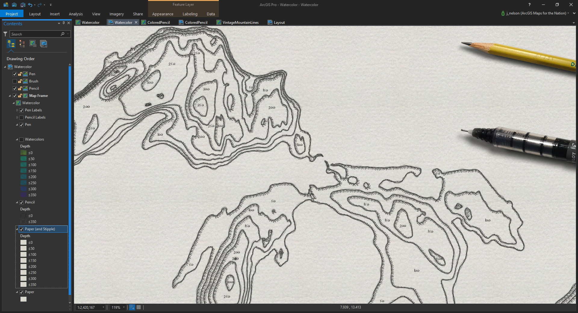
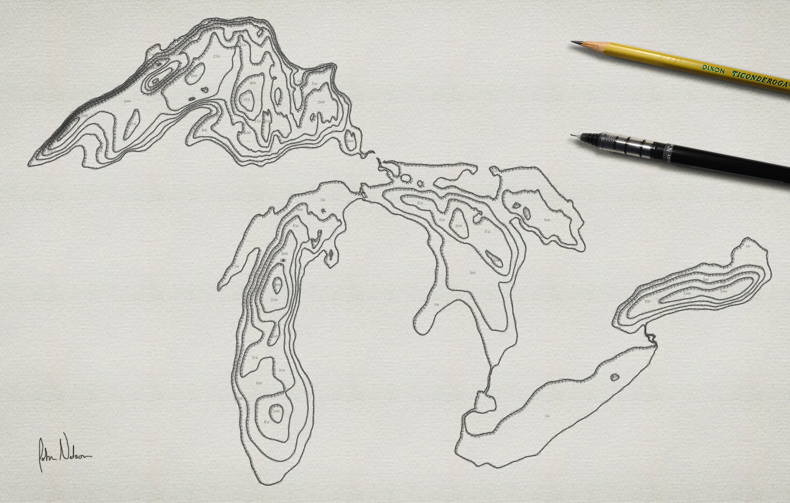
An additional bit of magic, when it comes to the digital environment, is the ability to turn layers on and off! Not really possible in the hand drawn world. So, here’s what it looks like without watercolor, just a pen-and-ink drawing. I like it!
This reminds me, did you know that Porgs, in The Last Jedi, were created because it was easier than digitally erasing all the actual birds on Skellig Michael?
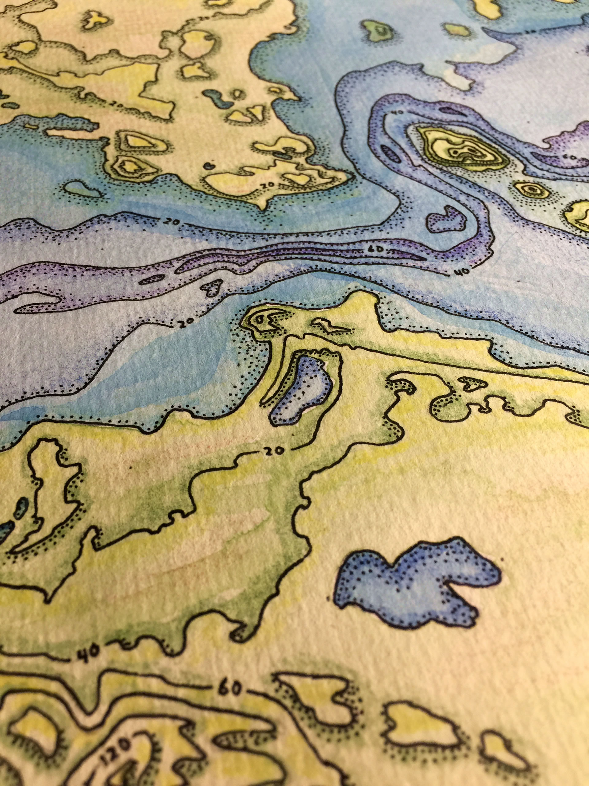
Anyway, here are some actually exported images from this process. All ArcGIS Pro. Embiggen them, to get a closer look.

And, for giggles, here is a version in just pen-and-ink, Shel Silverstein style:
Fore posterity (oh, I actually mean that literally), here is the map I drew for my dad that was the model for this digital incarnation of the aesthetic:
Full circle! From digital to hand and back again.
Lessons
Makers make because they have to. That includes you. Whether it is crunching numbers to distill a compelling vision of a phenomenon, bending spatial analytics to you will, or layering in a static or interactive cartographic product, we make because there is a spark in us that would begin to consume us if we didn’t feed it. We make maps because we must.
The tools that we use to accomplish this are avenues that connect our ideas and goals to tangible results. Sometimes that looks like a sheet of watercolor and ink, sometimes it’s a PDF map, sometimes it’s an application that walks through a narrative or allows for unbounded exploration. Maps are amazing. What other field pulls so richly from a broad spectrum of knowledge? What other field manifests itself in such a myriad fashion? What other field is this much fun?
Like any creative process, the experience that I enjoyed in one form factor fed directly into the application of another, seemingly unrelated, form factor. I do hope you give hand drawing a map a shot, and see what insights begin to creep into your GIS realm. The divisions between these, and other, creative applications are much thinner than maybe you think.
Get a head start by downloading this ArcGIS Pro project.
Happy Mapping (of any sort)! John


Article Discussion: