Here is a merging of hillshade, hand-painted by Herwig G. Schutzler in 1965, with modern NASA imagery.

Say, what’s going on here? What you are witnessing is a temporal wormhole allowing cartographers of today to collaborate with cartographers of the past.
Before we slang massless ephemeral pixels about with unprecedented ease, cartographers would hone for years the craftsmanship of hand etched and painted layers that would be merged in a tedious photographic process. In the rarefied air of peak cartographic craft, artists would paint topographic hillshade with graphite or air brush, using the impossibly complex algorithmic wet-works of their brains and hands.
Herwig G. Schutzler painted this hillshade component of a United States print map in 1965. Tom Patterson makes it, and a host of gorgeous siblings, available here. Many are georeferenced already.
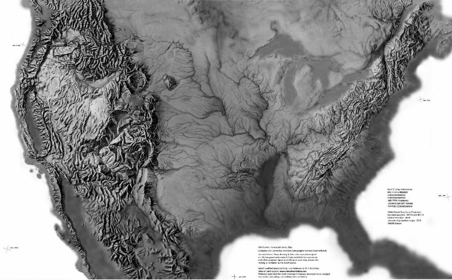
It would have been photographically merged with other layered components like landcover hues and natural & cultural features. It’s a thing of absolute beauty. Getting hillshade right at large (zoomed out) scales like this is tricky, for sure. There is a painterly aesthetic and a grain that give this hillshade a charming tactile quality. I wondered, as I do, regarding stuff like this, if I could capture some of Schutzler’s hand in my own maps. Specifically, I wondered if I could play with the monochrome palette to adapt the hillshade as an overlay companion to modern satellite imagery.
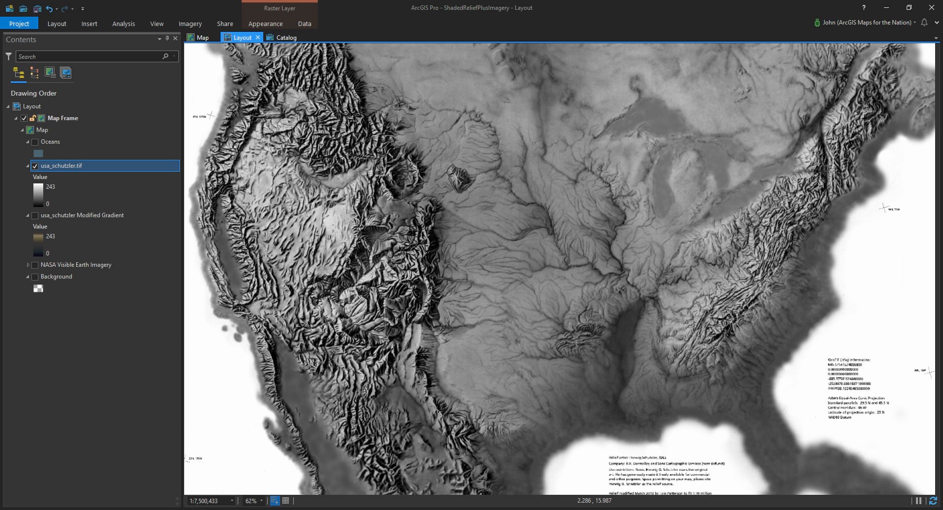
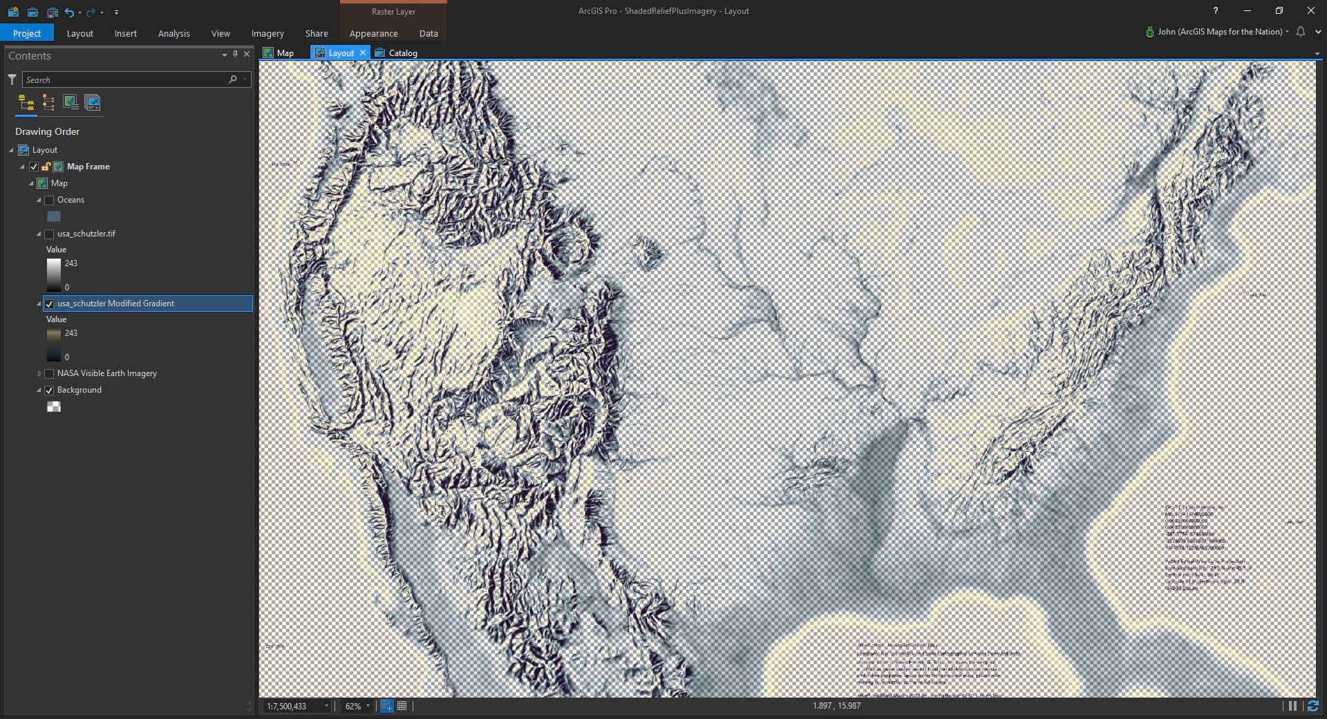
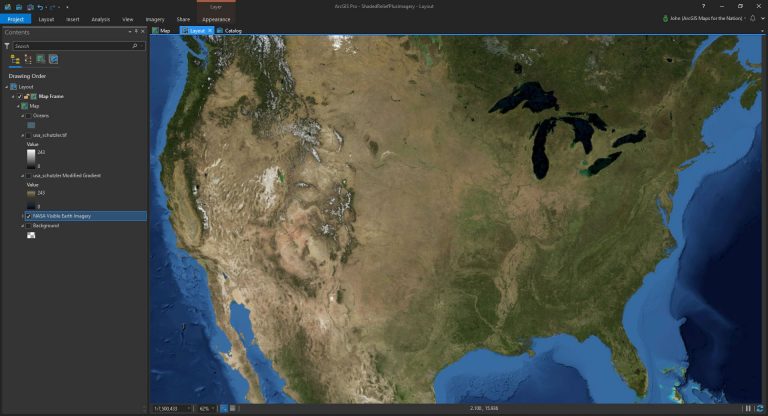
Cracking open the symbology panel, I can play with the gradient. It starts as a standard gray-scale gradient but you can play with the color stops to change the hue and transparency of any step across the color scheme (my favorite feature of ArcGIS Pro). I gave the shadows a cool deep plum, transitioned to fully transparent in the mid-tones, and gave the sunlit slopes a faint butter hue. The brightest tone I left fully transparent because that lived mainly in the unpainted paper background.
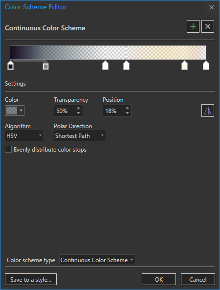
The result is a hand-painted hillshade map of the past with some coloration and, most importantly, transparent mid-tones.
Let’s turn that layer off for a moment and add some satellite imagery from NASA’s Blue Marble project. I love this imagery because, as a mosaic of a bunch of separate cloud-free images, it does a beautiful job of providing topographic texture and hue that is just right at this scale. Often mosaic imagery is compiled from data captured at much closer scales, which, when blended at this level can result in a busy image. This imagery looks like how you’d see Earth from above. I dig it.
But how does it look when you turn on the tweaked vintage hillshade? It looks sweet!
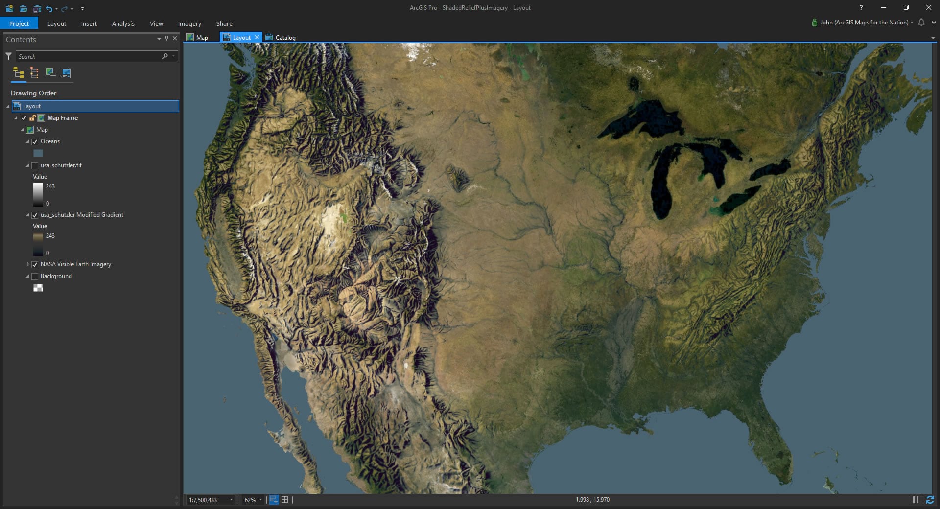
And there is just something satisfying about collaborating across the generations. Retro hand-wrought hillshade atop modern satellite imagery. And Schutzle’s work lines up perfectly with an enviable glimpse of Earth that nobody had seen yet. So much to like about that.
I hope that you visit the Shaded Relief Archive and pull in some of these amazing works into your own projects. To get you started I’ve shared my ArcGIS Pro project, so you’ll have a head start on the NASA imagery and the adjusted hillshade palette. So bust it open and pull in other hillshade images. Do your thing, and give a virtual high five to Tom Patterson and the Cartographers that he’s connected us to.
Happy Cross-Generational Mapping! John Nelson
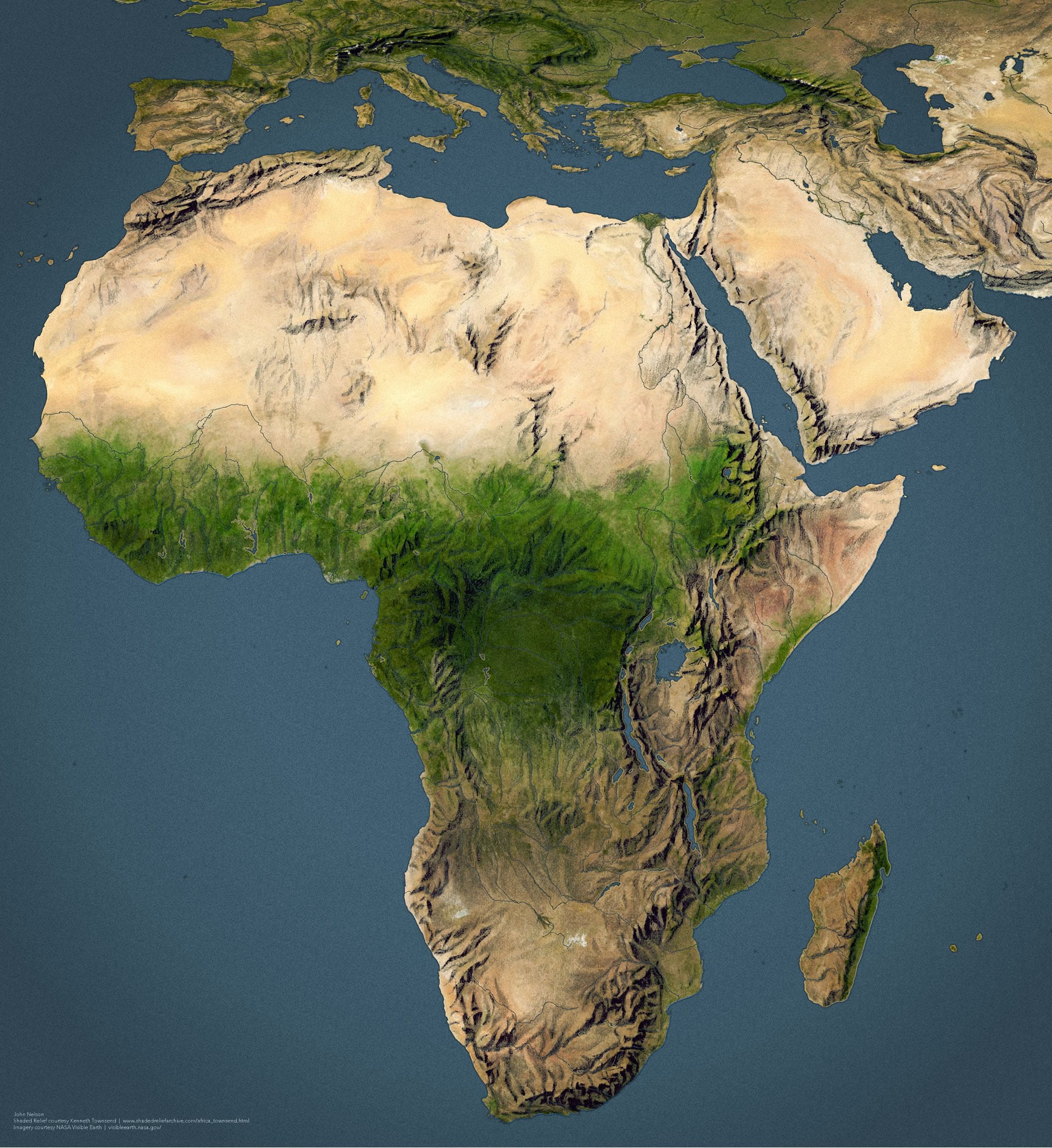
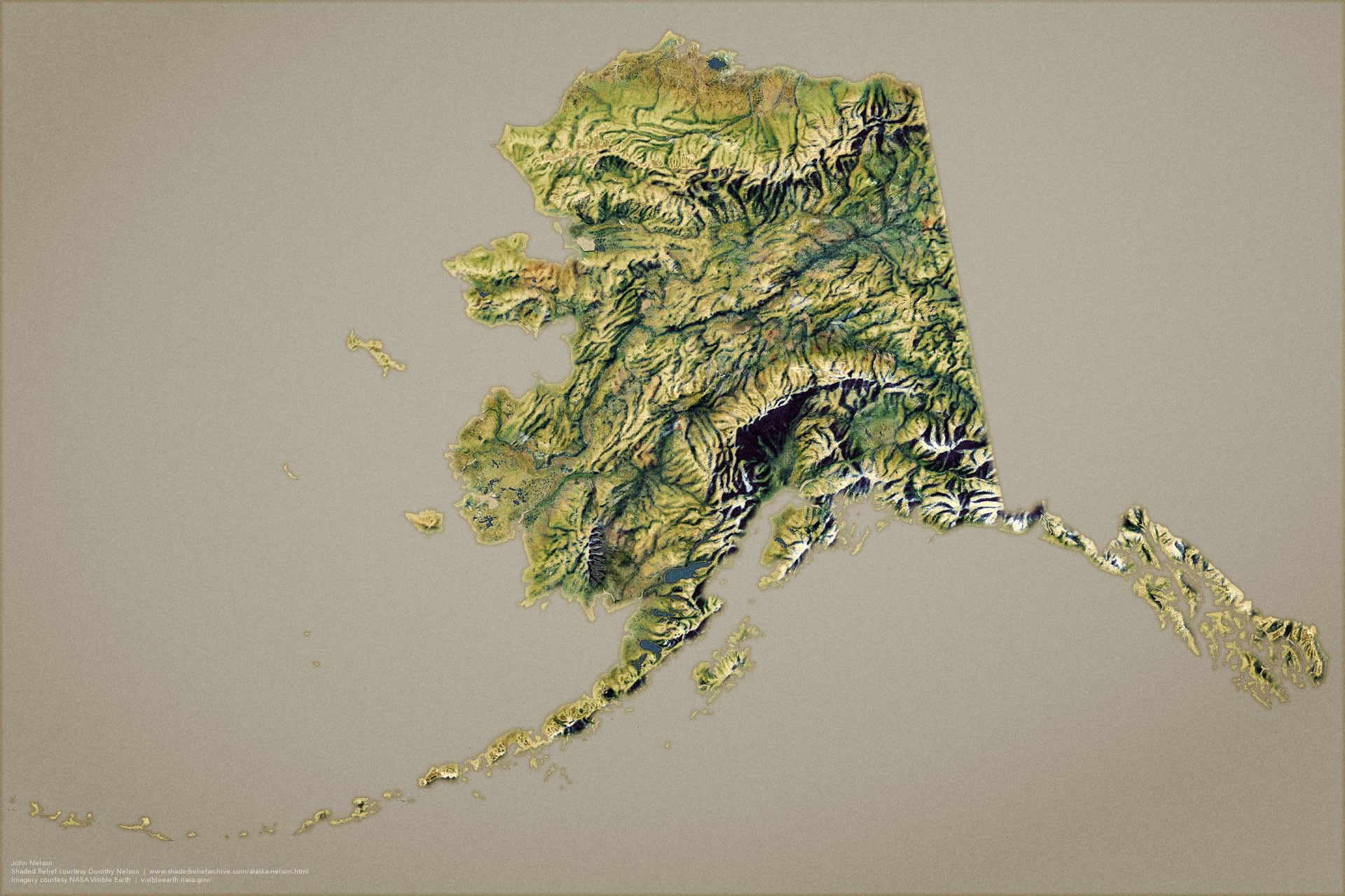
P.S. Here is a version of Africa, with hillshade painted by Kenneth Townsend (date unknown) and Alaska, with hillshade painted by Dorothy Nelson (date unknown).


Commenting is not enabled for this article.