John Snow’s map of the 1854 London cholera outbreak was revolutionary in that it clearly drew a visual connection between deaths and the locations of well pumps. It helped contribute to the idea that cholera was a water-borne disease and effectively marks the creation of the field of epidemiology.


I’ll reimagine/remake this map to even more directly connect the fatalities to the wells, using a bevvy of geoprocessing tools to estimate walkable neighborhoods served by each well, aggregate the fatalities within each neighborhood, and visualize the wells by that aggregate: connecting two separate phenomena that aren’t actually all that separate.

There is no one right way to make a map. The exercise of re-creating even classic maps, such as this, helps us focus our thinking about what we want to communicate in our work, how to truthfully to represent a phenomenon, and ultimately how to go about it. This was the theme of a presentation with colleagues Kenneth Field and Sarah Bell. You can find Ken’s work here and Sarah’s here.
Here is the process, and my reasoning, for this version…
0:00 Lets take a look at the amazing original map
1:28 How to overlay the original map and see through to the basemap (and change its color!)
2:20 The visual (and moral) problem of overlapping data points
3:13 Slightly shuffling the visual placement of overlapping points (for the greater good)
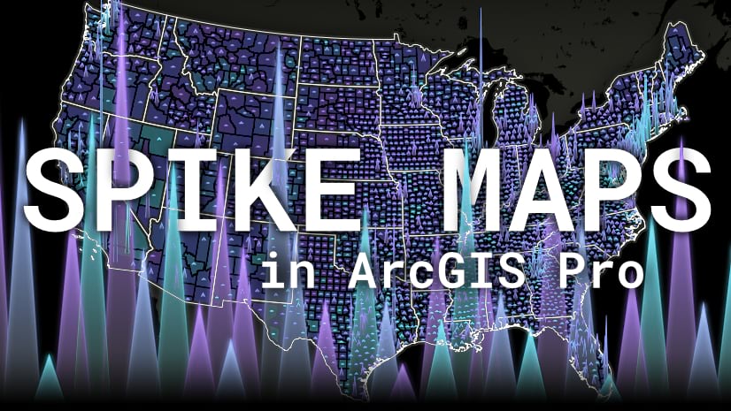
4:41 Creating walkability zones around water pumps
7:11 Aggregating cholera deaths into water pump neighborhoods
7:46 Transferring these aggregates to the water pump points
8:43 Visualizing water pumps as vertical extrusions
11:07 Creating a shadow effect for the extrusions
11:52 Making a monochromatic minimalist basemap
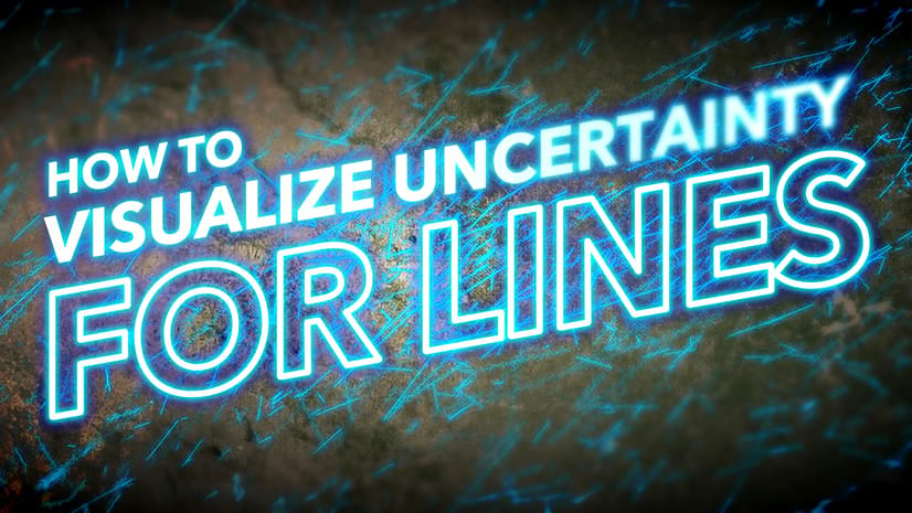
13:10 Visualizing uncertainty by making boundaries wavy
14:00 Creating a layout
14:46 Adding graphical label and title
16:56 Visiting the garden and feeding Kip the rabbit some kale
…
I hope there are some techniques here that you find useful in your own work. Also I hope for you the confidence to look at a classic map and ask yourself what you might do differently and what faucet of the phenomenon you might highlight. It can be tempting to hold maps like this as cannon and something that can’t be approached or altered or personalized, but each of us bears a unique perspective and set of skills to recognize a novel aspect of the subject and shine our light on it. In so doing we encourage others, and ourselves, to think deeply about what it is we map and what we want to reveal in the process…even if it’s just an exercise in creative thinking or an opportunity to try out a new approach. You’ll be better for it and the lessons you share make the community better too.
Love, John


Article Discussion: