If there are positives to take from 2020 (a big ask I know but bear with me), the spotlight has shone brightly on the use of maps, charts, and data that help us understand COVID-19. It’s quite literally been a viral moment for geography and cartography. Not that maps weren’t vital visual and analytical tools beforehand, but they have taken centre stage this year. And of course, examining the role of geography, and cartography in contemporary infectious disease epidemiology has also meant looking at the past for examples. There’s definitely been something in the water in 2020 as inevitably the story of Dr John Snow and his map of cholera showing the outbreak in Soho, London in 1854 has frequently been recounted. You may know the story. Or you may think you know the story. Let’s see.
The commonly told story goes that during the cholera outbreak in 1854 in Soho, London, a smart local physician called John Snow noticed a pattern in the distribution of those dying from the disease. He made a map, and determined that it was polluted water being supplied by the pump on Broad Street that was causing the epidemic. He ripped off the handle of the pump, and in the process the outbreak abated, lives were saved, modern thematic mapping and disease-mapping was born, the principles of GIS were established through his ingenious layered map, and he invented epidemiology. Quite an achievement!
Despite it being a great story, unfortunately it’s not really how it played out. Both the use of the famous map and the story surrounding it have become somewhat modified through the passage of time. But facts matter, so let’s dig into a more truthful version…
Dr John Snow was indeed a physician, In fact he was the anaesthetist to Queen Victoria and pioneered the development of modern anaesthesia (pretty impressive in its own right). He was also interested in the mode of transmission of cholera and skeptical of the dominant theory of miasma at the time which suggested cholera was airborne. He published his own theory of its transmission in his 1849 essay On the mode of Communication of Cholera. So he already had a hunch, and some evidence cholera was waterborne some 5 years prior to the outbreak of 1854, and the essay didn’t contain any maps. What the Soho outbreak in 1854 gave him was further data and led to a more detailed version of his essay that would eventually be regarded as a more persuasive argument for his waterborne theory.
Snow’s 1854 investigations in Soho were based on mortality reports issued by the Registrar General Office in London, rather than any first hand surveys he undertook, though he did back up the statistical reports with evidence from Reverend Henry Whitehead who had talked to local residents. These data explorations led him to identify a common factor, that victims, who had begun to die in early August 1854, were drinking water from the pump on Broad Street. The local authority responded to Snow’s findings by removing the pump handle on 7th September, some time after the outbreak had begun. This act did not actually stop the outbreak. The epidemic was likely already in decline, and most of the over 600 victims had already perished. Snow wasn’t directly responsible for ridding cholera from Soho. And what of the map that was supposed to have led to his eureka moment? It hadn’t even yet been made. What? But…but…

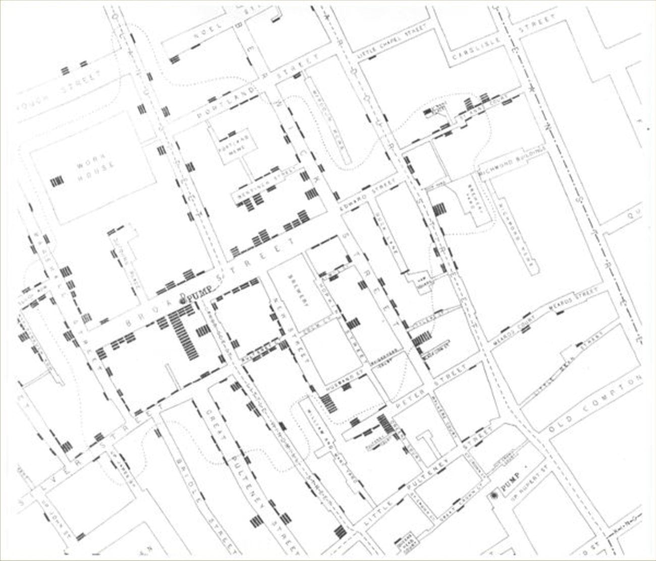
The famous map you see above was produced later, first shown at a meeting of the London Epidemiological Society in December 1854 but didn’t in, and of itself get used in any way to identify the pattern of the outbreak at the time. But what Snow had done with the map was add to a body of work that was already suggesting cholera was a waterborne disease. The water supply for the Broad Street pump was sourced from works that were polluted from a nearby cesspit, and a soiled cloth nappy from a child who had contracted cholera was discovered as the ultimate cause. Snow didn’t single-handedly prove that cholera was waterborne, or use a map to prove his theory, but he certainly contributed to the discovery over several years of research, and his map became a useful way to illustrate the Soho data.
But the mythology surrounding Snow’s map doesn’t end there. It is a beautiful and well-known map, and one of the most famous and often cited thematic maps showing incidence of cholera as individual dots (well, small stacked lines), yet his use of dots to help illustrate patterns of disease was also not the first. What? But…but…
Snow didn’t invent this thematic mapping technique. A 1798 study of a New York City outbreak of yellow fever by Valentine Seaman used much the same approach nearly 60 years earlier, and such maps had become fairly commonplace by the 1830s in epidemiological research.
.jpg)
So Snow isn’t responsible for the creation of the mapping technique either, or thematic mapping more generally. Layering thematic data on top of topographic maps pre-dated his work. What he had arguably done as a meticulous evidence-based researcher was stay on top of developments in his field, and deploy them with effect to illustrate his published essay and reinforce his hypothesis.
Except there’s one last myth to counter. The map is constantly referred to as John Snow’s work. Technically, it’s not. What? But…but…
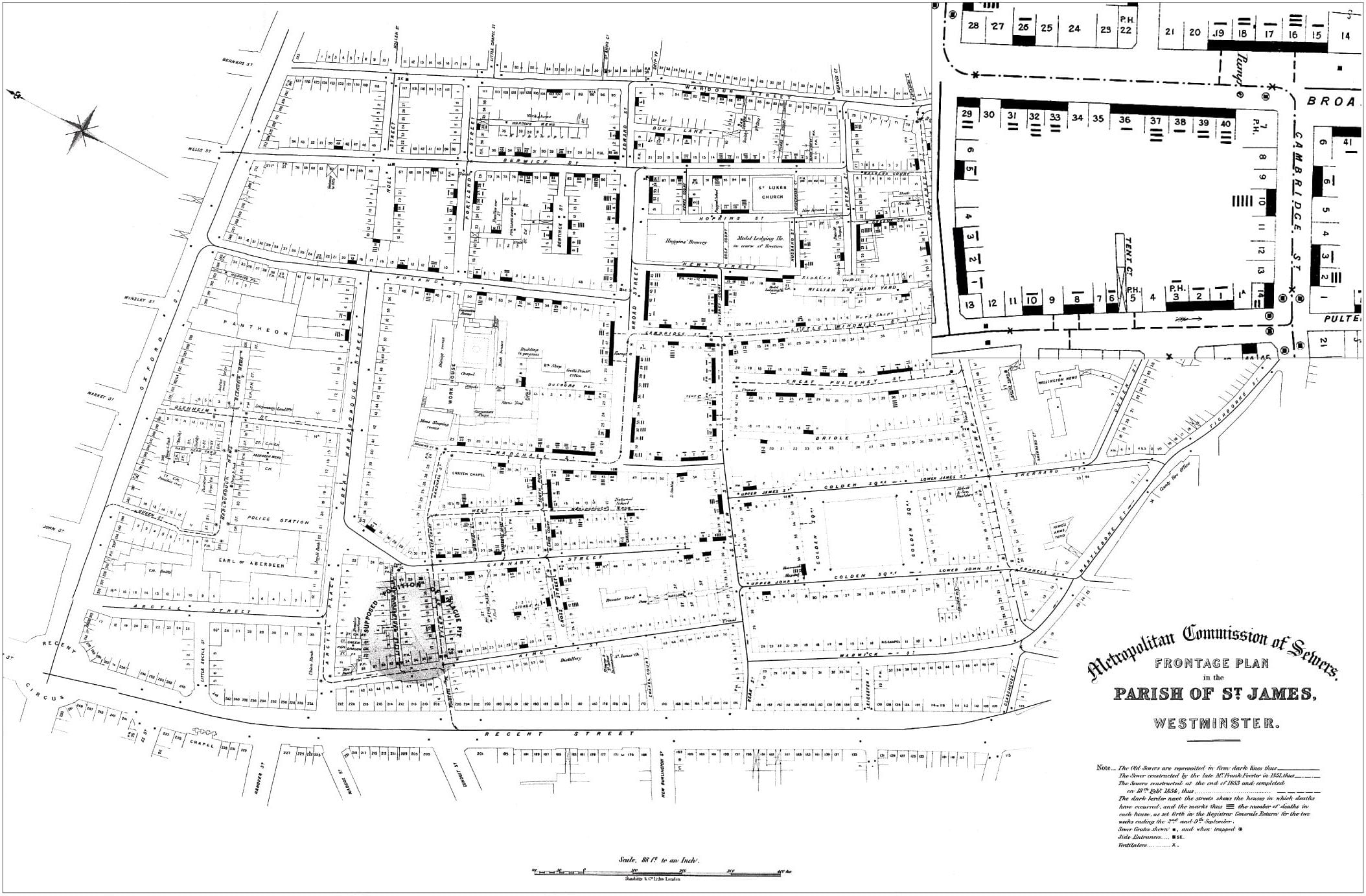
The drawing and lithography was done by Charles Cheffins, and like most cartographic and illustrative work in scientific publications of the time (and, to an extent, also the present day), the true author of the map remains largely unknown to the reader of the work in which it’s presented. Yes, it’s in Snow’s publication but as with the rest of his research and the story in general, there are many more people involved than just this one person. So did Snow dictate that the map should use dots because he’d seen Seaman’s map or some other similar map? Or did Cheffins take the data and, like any good cartographer, determine an appropriate way to represent it to effectively communicate the message? Or possibly they copied another map? This map was drawn by Edmund Cooper for the Metropolitan Commission of Sewers before Snow started his version. Looks familiar eh?
Whatever the truth of how Snow and/or Cheffins got their idea, and here’s the real punch, that map we know of and treasure as THE map of cholera by John Snow, wait for it…is one of TWO versions. What? But…but…
The version we most commonly see and recognise was the one shown to the Epidemiological Society in late 1854. But the version published in the 1855 updated version of Snow’s On the mode… was different. It firstly corrected a rather important error on the original by repositioning the Broad Street pump to its correct location several yards away from where it had been placed on the first map. A small but significant detail. Secondly, it contained an additional layer which was an isochrone line showing the boundary of those households where walking to the Broad Street pump was closer than alternative pumps (effectively a voronoi diagram). This effectively wrapped a boundary around the marks on the map and further reinforced the notion that the deceased would have likely contracted cholera from water at the Broad Street pump.
It’s likely we’ll never know the answer to many detailed questions about the map (of whichever version!) but what it certainly illustrates is that collaboration was key. Snow didn’t work alone. He drew expertise from different people to help create persuasive arguments. The map was one such example. It illustrated his reporting, and he in fact never claimed to have used any map to identify the cause of the outbreak. The map was never used for any hypothesis generation. But in his 1855 version of On the mode… he was able to use the map to illustrate his spatial hypothesis: that addresses that reported deaths were in the vicinity of the Broad Street pump which was the source of the contagion. It was a well-crafted spatial argument that ensured the map went some way to ensuring the shift from an understanding of cholera as airborne to waterborne. The purpose to which Snow put the map certainly reinforces the value of putting data on a map to help readers see the patterns revealed, and this is as important to contemporary thematic mapping as it always has been. So, John Snow can at least be credited as the sole identifier of cholera as waterborne. Not so fast….
It’s often the case with research that several people reach similar conclusions simultaneously or at least in short order. Snow was not alone. Another physician, Dr John Simon wrote a report on deaths from cholera in 1854 and noted that ‘‘when the 211 deaths are mapped upon a house-plan of the City (as may conveniently be done by stamping a black ink mark at each place where one of them has occurred) the broad features of the epidemic are rendered visible at a glance’’. This was before Snow had commissioned Cheffins to make his map. Simon never made a map but clearly evidenced spatial thinking. It’s likely Snow knew of these comments given he was deeply involved in the epidemiological research community, and that possibly they even provided a design idea for the map that he asked Cheffins to implement, or which Cheffins decided was a great way to map the data.
Ultimately, Dr John Snow didn’t know everything. But he certainly couldn’t be accused of knowing nothing. The mythology surrounding his work, the 1854 epidemic, and specifically the role of the map are a fine story, but much of it is retold according to the version many seem happy to believe rather than what really happened. But the real story is just as interesting. There are plenty of excellent longer form discussions of the story in which you may be interested. In particular, Kari McLeod’s excellent article that goes into detail about the various myths, and an article by Tom Koch and Kenneth Denike also goes into detail about the true order of events.
And of course, the map has been re-made many times, including by me in July 2019 before any of us knew we’d have such a focus on the spatial epidemiology of infectious disease in 2020. I re-made it simply to experiment with 3D cartography using vertically offset 3D cylinders that acted as stacked chips for the spatially coincident household counts. Explore it yourself and click on various objects to discover information about the true story of Dr John Snow and the map (click here for full screen)
You know everything John Snow
And as happened around the time of Drs. Snow, and Simon, and likely others working along parallel lines at the same time in the mid 1800s, it became apparent that my colleague Raluca Nicola was also reimagining the very same map at the very same time. Here’s Raluca’s version (click here for full screen). We both were experimenting with turning the planimetric map into 3D.
The cholera map that changed the world
And that’s the more truthful story of Dr John Snow and his famous map(s). With thanks to RJ Andrews for comments on an earlier version of this blog.

Article Discussion: