So the other day I saw this delightful teaser tweet about an upcoming Lord of the Rings series on Amazon Prime.
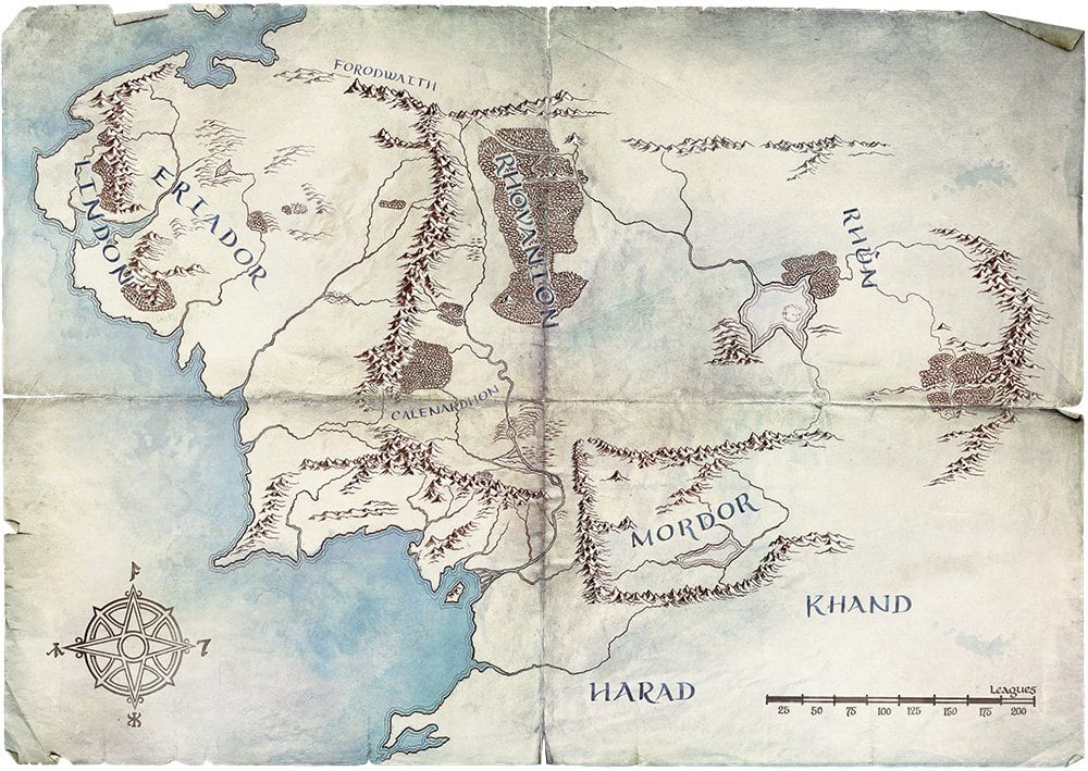
It’s a beaut. Clearly a take-off from the beloved Christopher Tolkien illustrated map in the sleeves of hardcover LOTR books (including my well-worn set), but with a bit more details in the features. And because this map was made by a print designer for a studio, regarding high fantasy, it naturally has a sweet weathered and creased paper texture.
I thought I’d like to create a similar sort of folded paper resource for cartographers so I looked around on the internet for a free tattered paper texture. When I realized I could make my very own in like three minutes I put down the mouse and ripped out a sheet of old drawing paper, tattered it up, rubbed a bit of olive oil into it, and folded it into map panels and scratched up the creases.
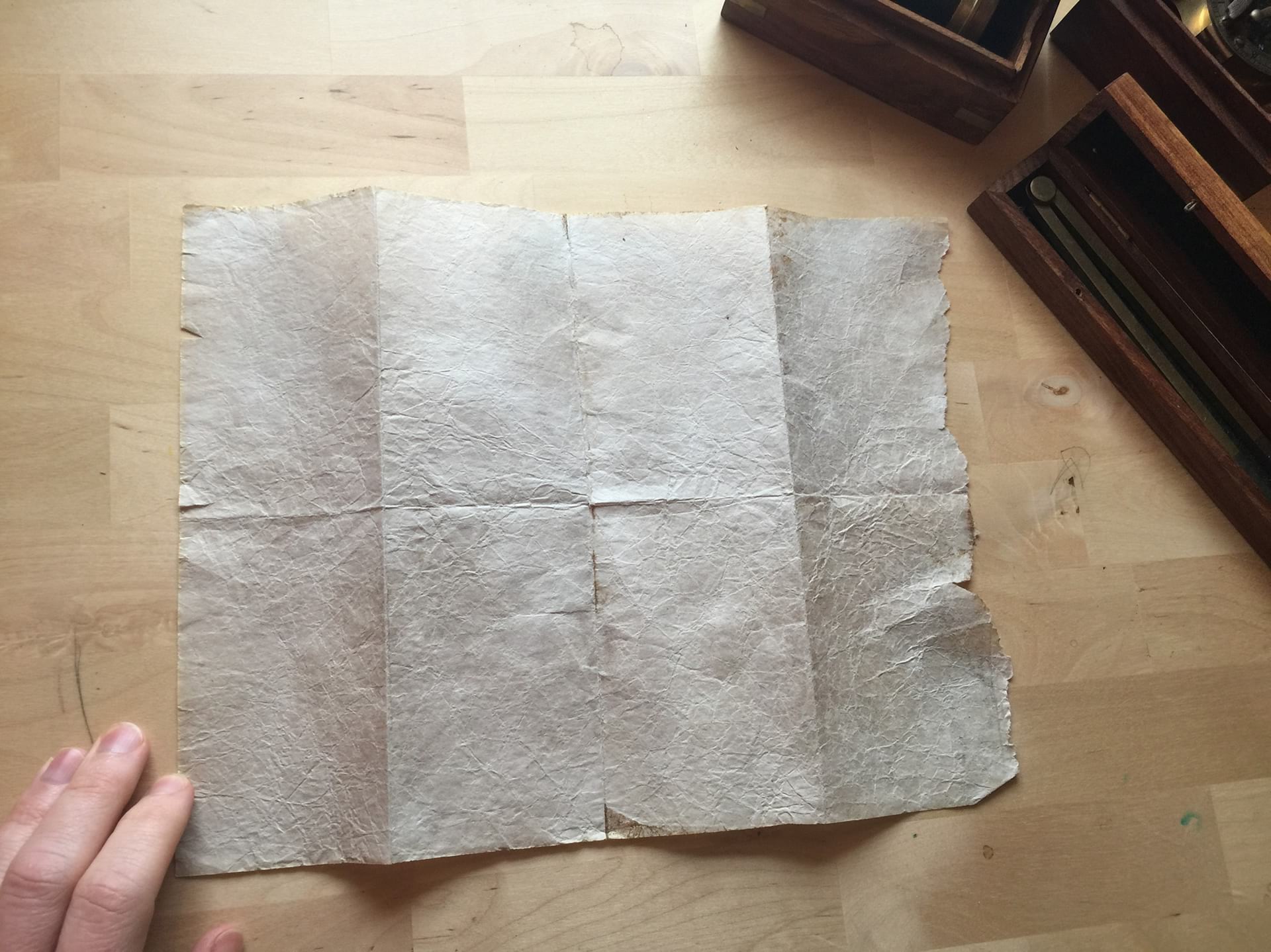
Pretty convincing! I need to get into the forgery business.
Then in PhotoShop I cleaned, cropped, and magic-wanded out the background. I evened out the tones a bit and give it a nice little vignette. Choice.
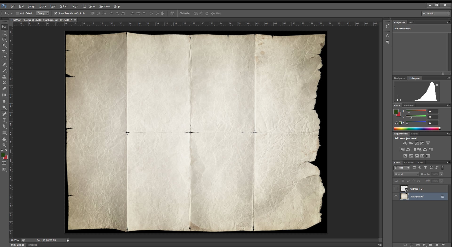
I also created a version that’s masked around the edges and creases, and otherwise transparent. This is to use as a sneaky overlay, to sit on top of your map content, in a layout. Makes things look realzzzz in a hurry.
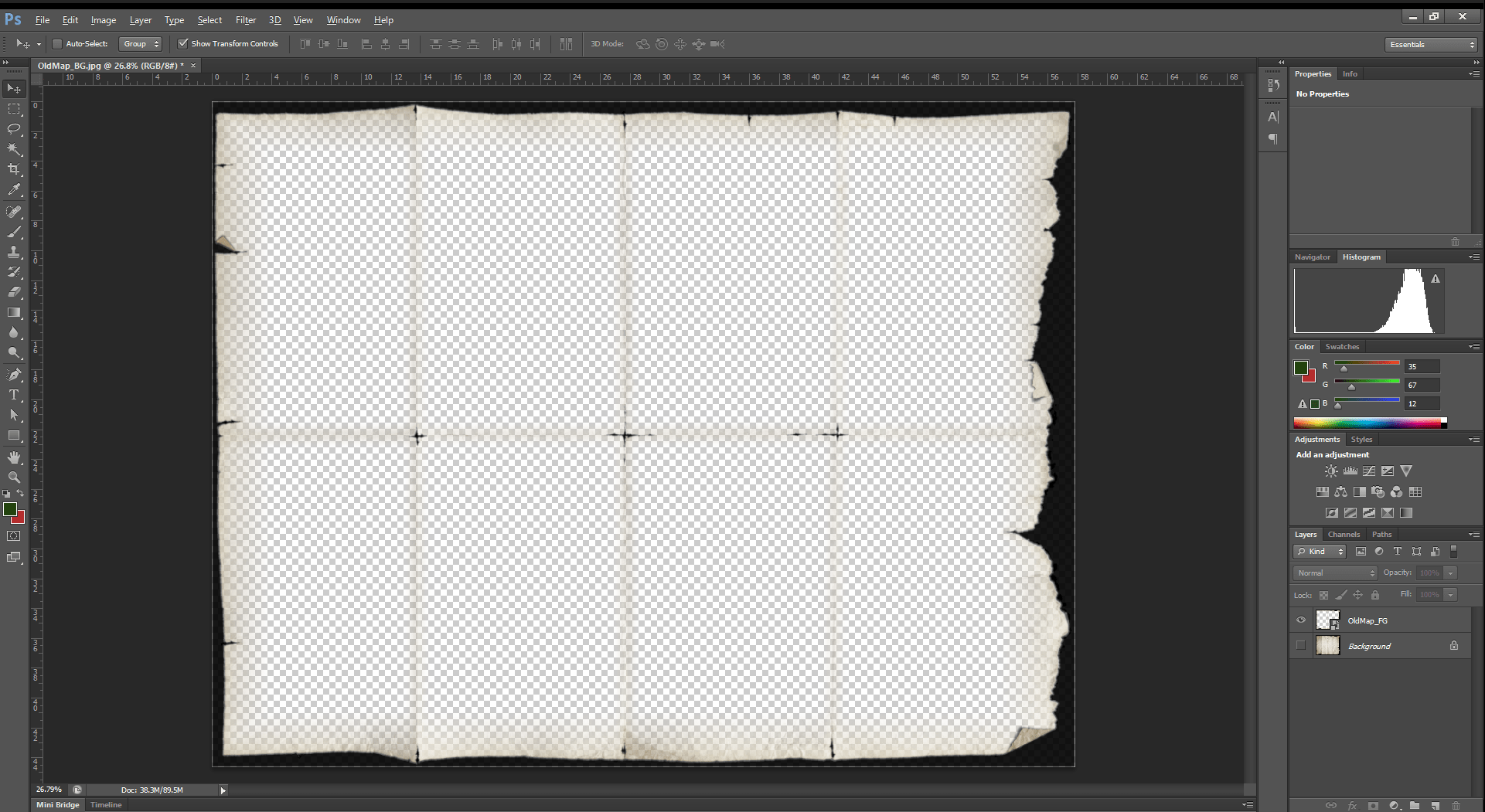
I made two flavors, white and black, depending on which you prefer. Download these images here (34MB zip file).
How
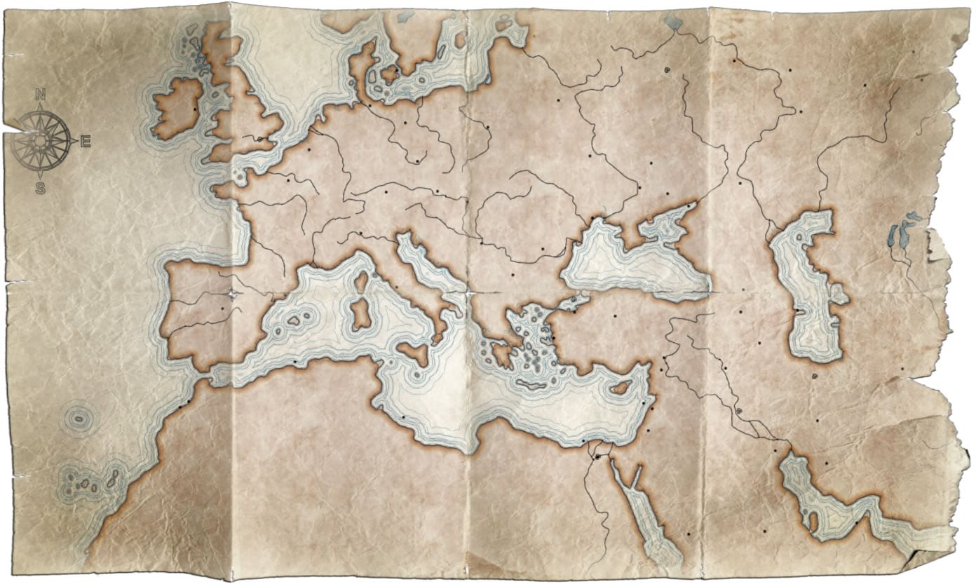
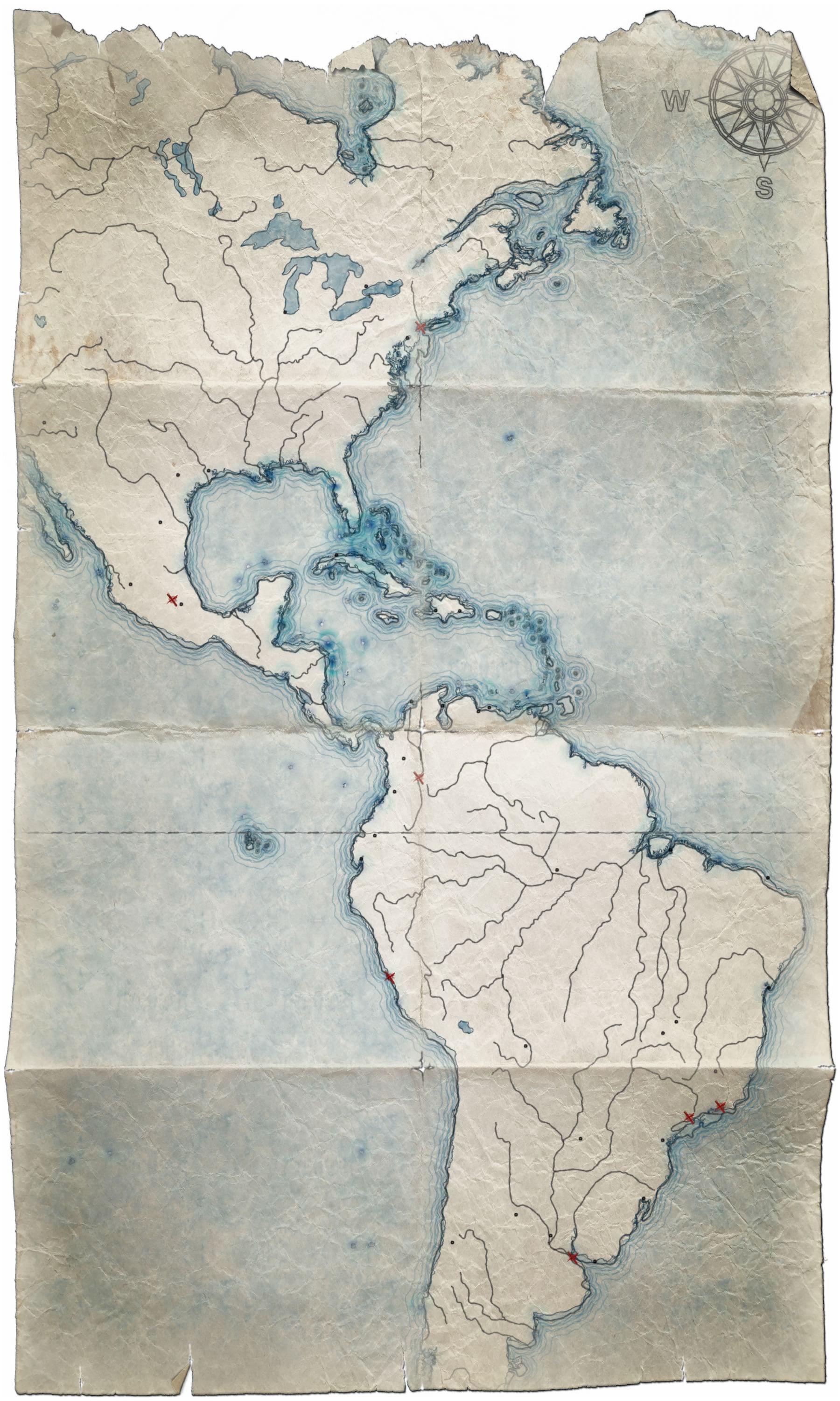
Here is an ArcGIS Pro map I made using Moriarty Hand layers and the “Pirate” style for Pro. Looks pretty meh. Certainly not ready for elves and dwarves and humans to gather around.
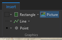
It’s because it doesn’t look like it’s printed on old tattered paper! Not to worry. In the layout, insert the paper background image (called OldMap_BG.jpg) I’m sure you just downloaded.
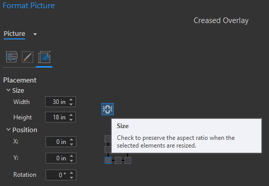
Be sure to unlock the aspect ratio, so that you can stretch the image to fit whatever your layout dimensions are. The chain icon should look broken. That’s a good thing.
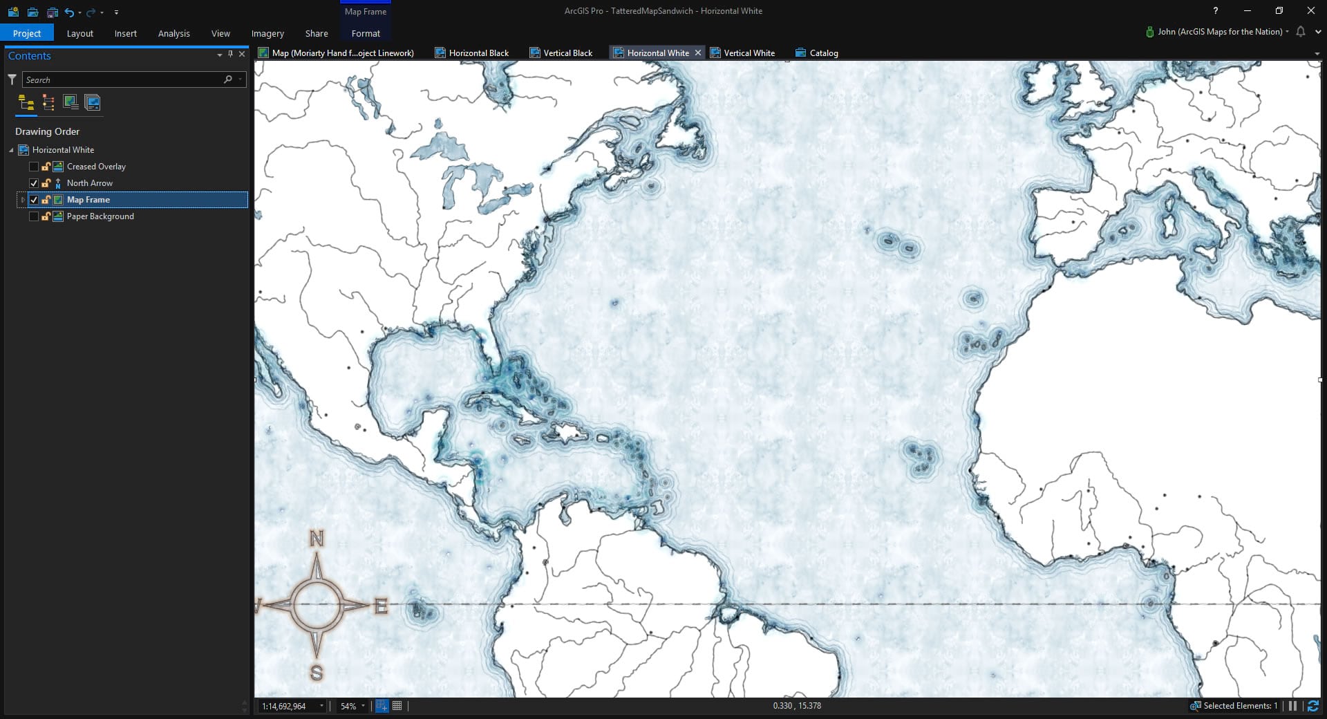
Ok, here’s what we’ve got when we drag that image beneath the map frame…
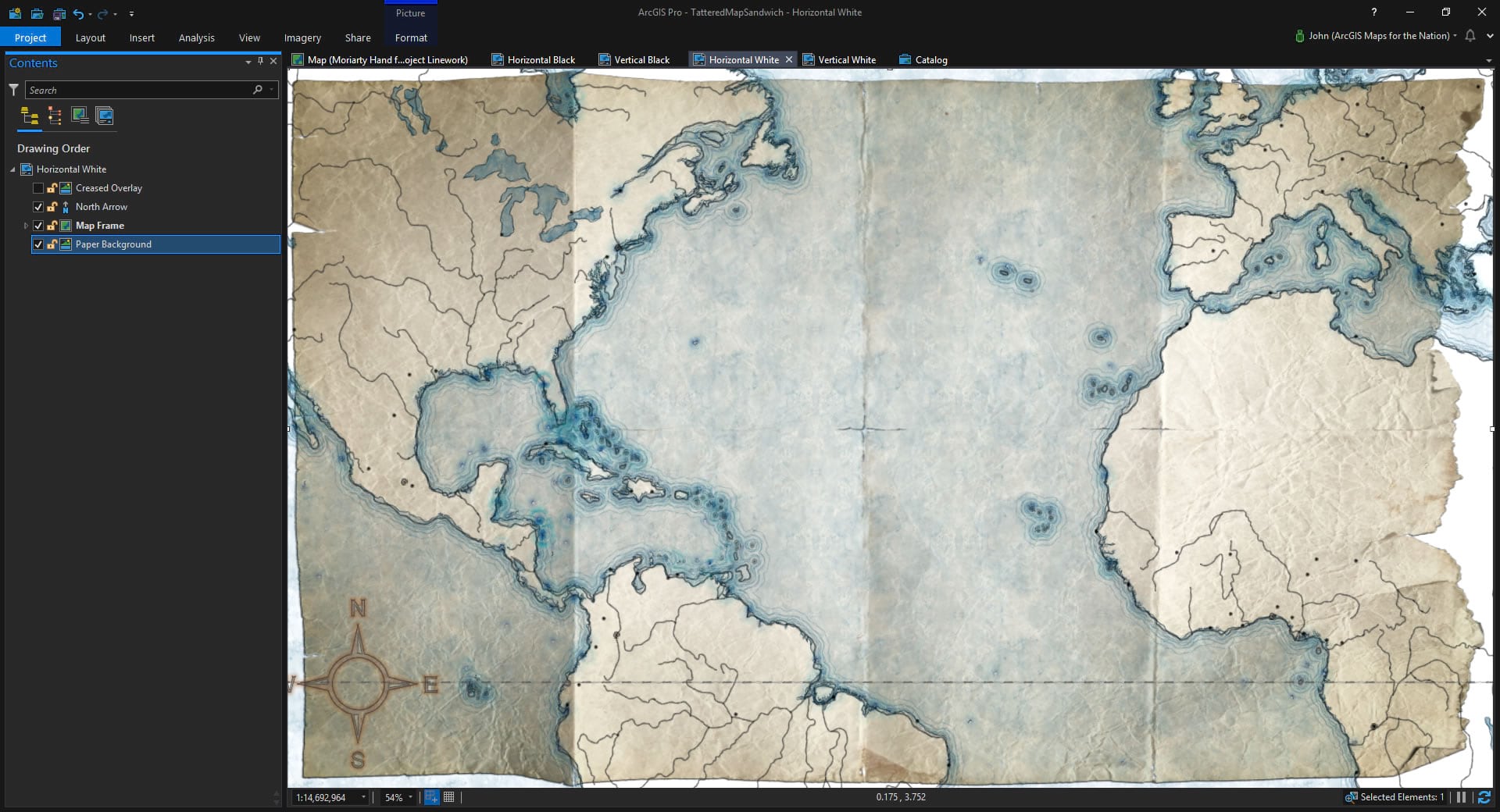
Yes! Now we’re talking. But we are only half done. See how the map spills over the edge of the paper image? That simply will not do. Now it’s time to duplicate this image, drag it all the way to the top, above the map frame, then switch the picture to the overlay one (called OldMap_FG.png). Or just insert the other image like you did the first one, so long as you make it the same size.
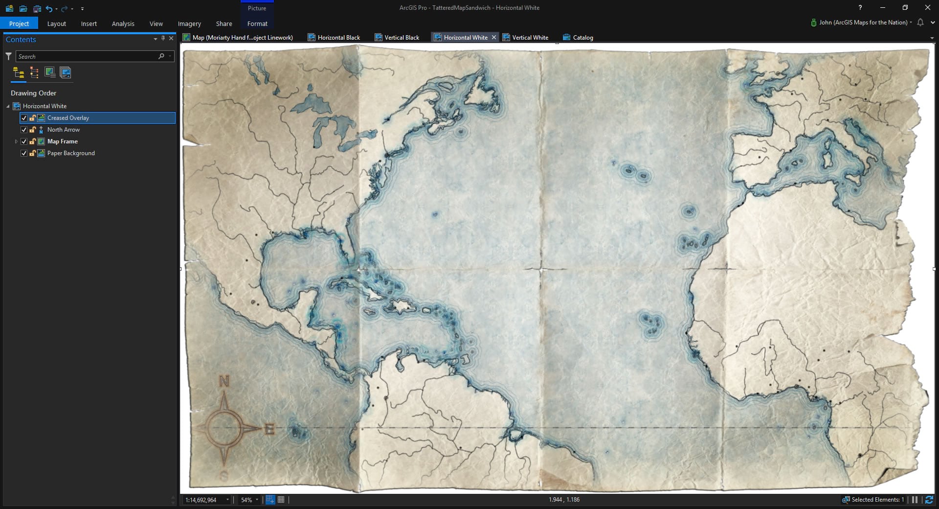
Excellent! Now all the bits that spill over are covered up by the overlay image. The map sort of fades at the edges and is worn away a bit at the creases. Check out how I pulled the north arrow off the edge. I love that. This looks legit; the folks who made the Lord of the Rings map above would have to admit that it’s an effective hack (and probably how they made theirs look tattered).
That’s it! Use these images above and below your hand-drawn-looking maps. A tattered map sandwich.
Once more, here’s a link to the Pirate style I used on the map layers.
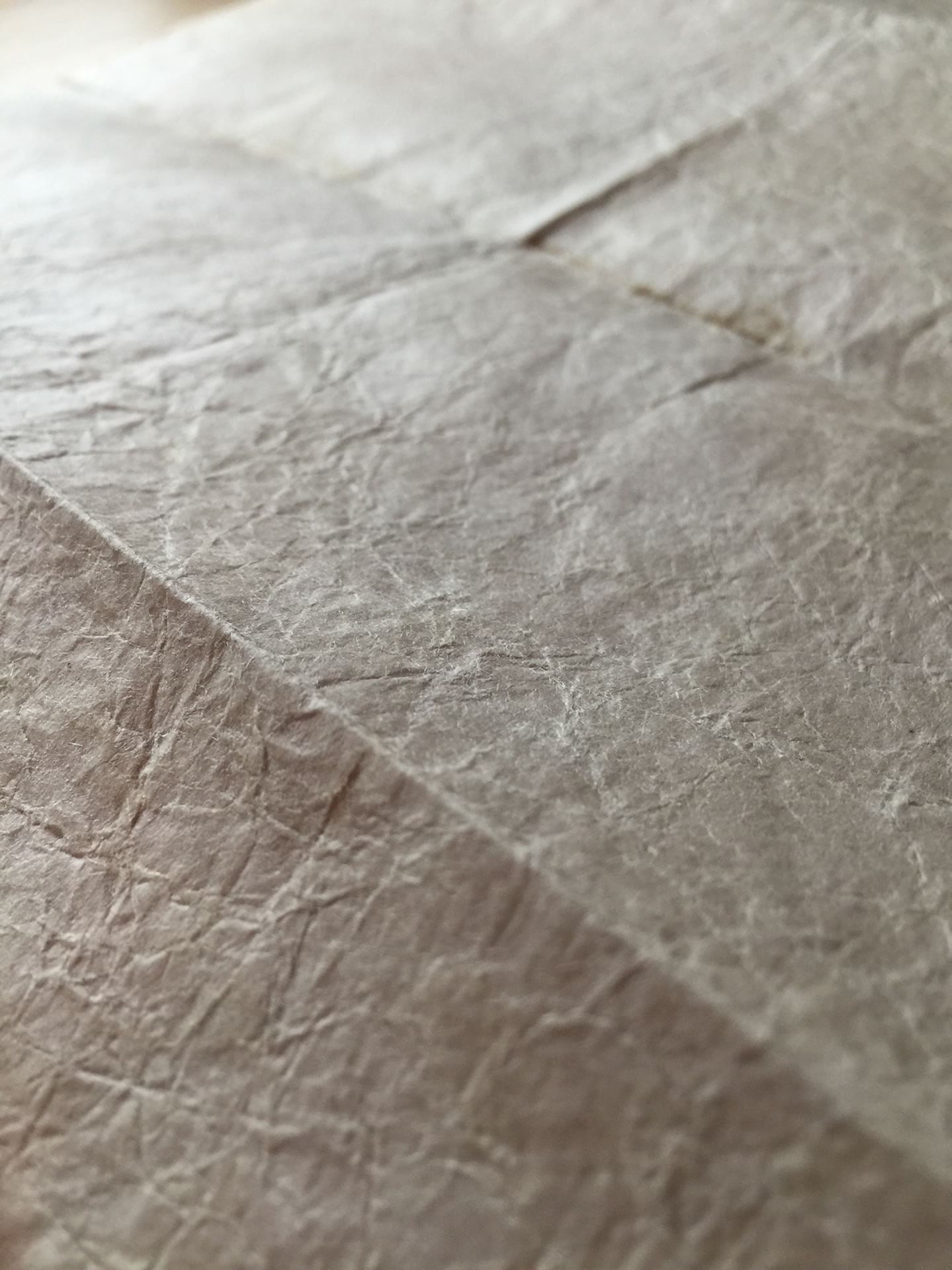
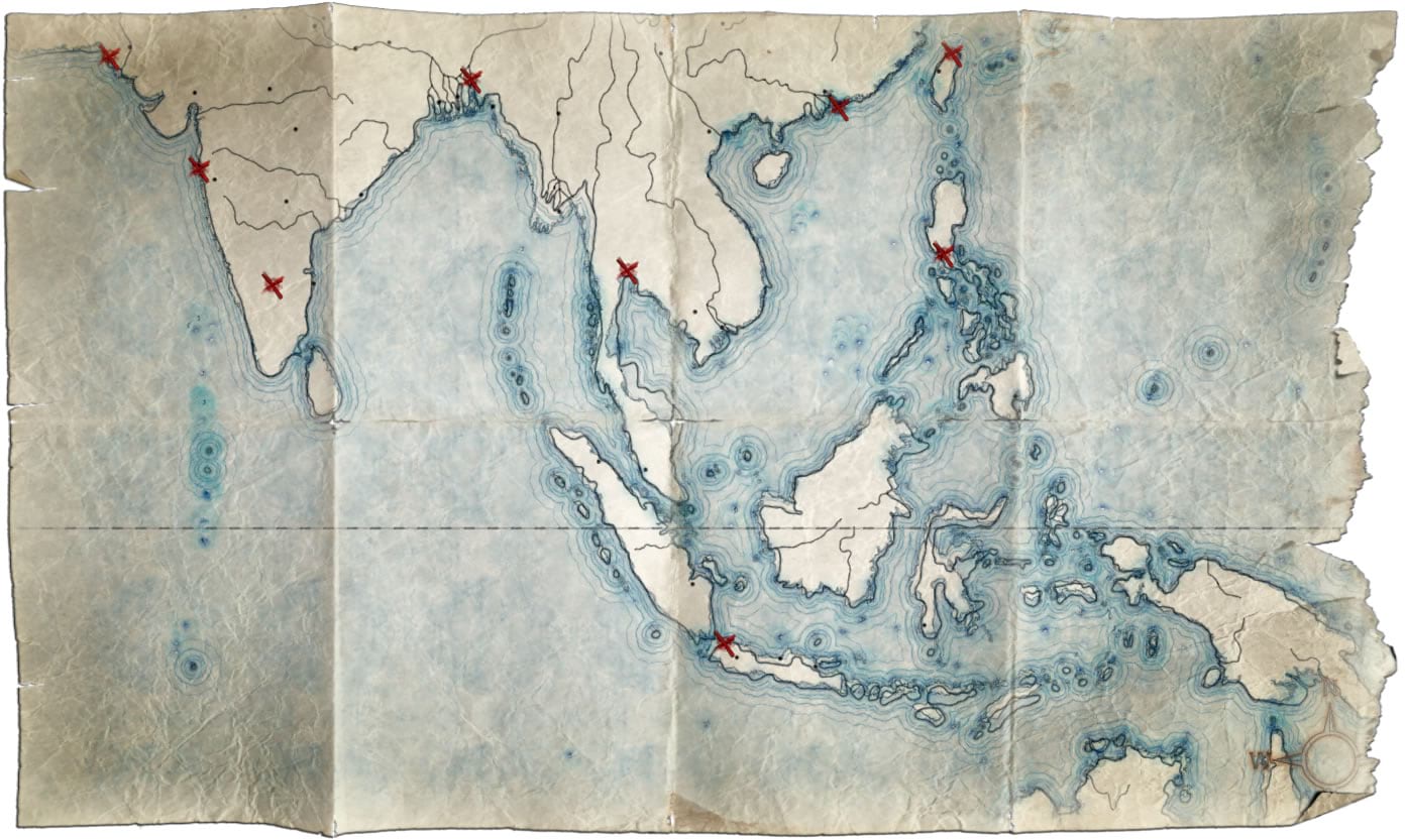
Here are some closer looks…
Feel free to download an ArcGIS Pro source project with these images already set up in some ready-to-go layouts in both portrait and landscape sizes with both light and dark overlays. And here’s the download link again to just the images (34MB zip with four image files), if that’s easier.
Happy Tattered Map Sandwich Making! John

Commenting is not enabled for this article.