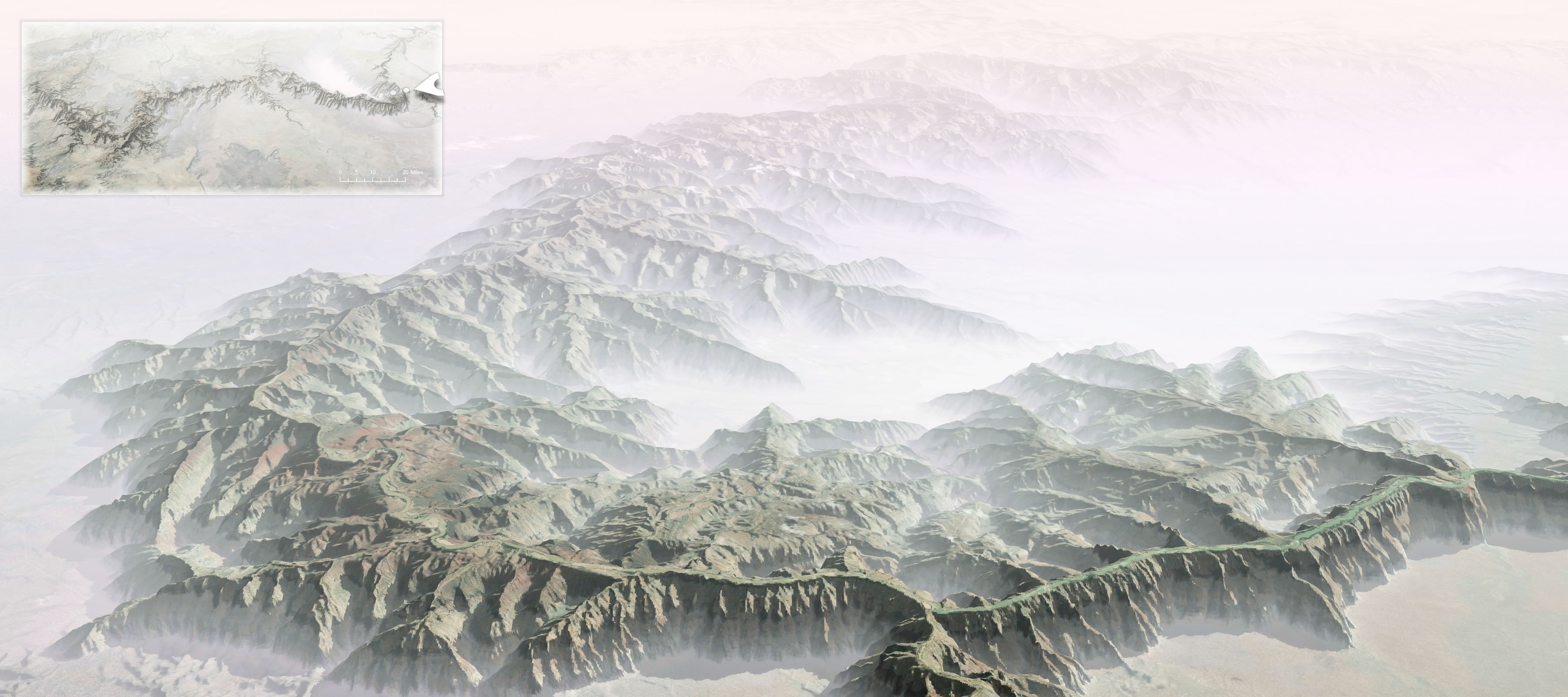
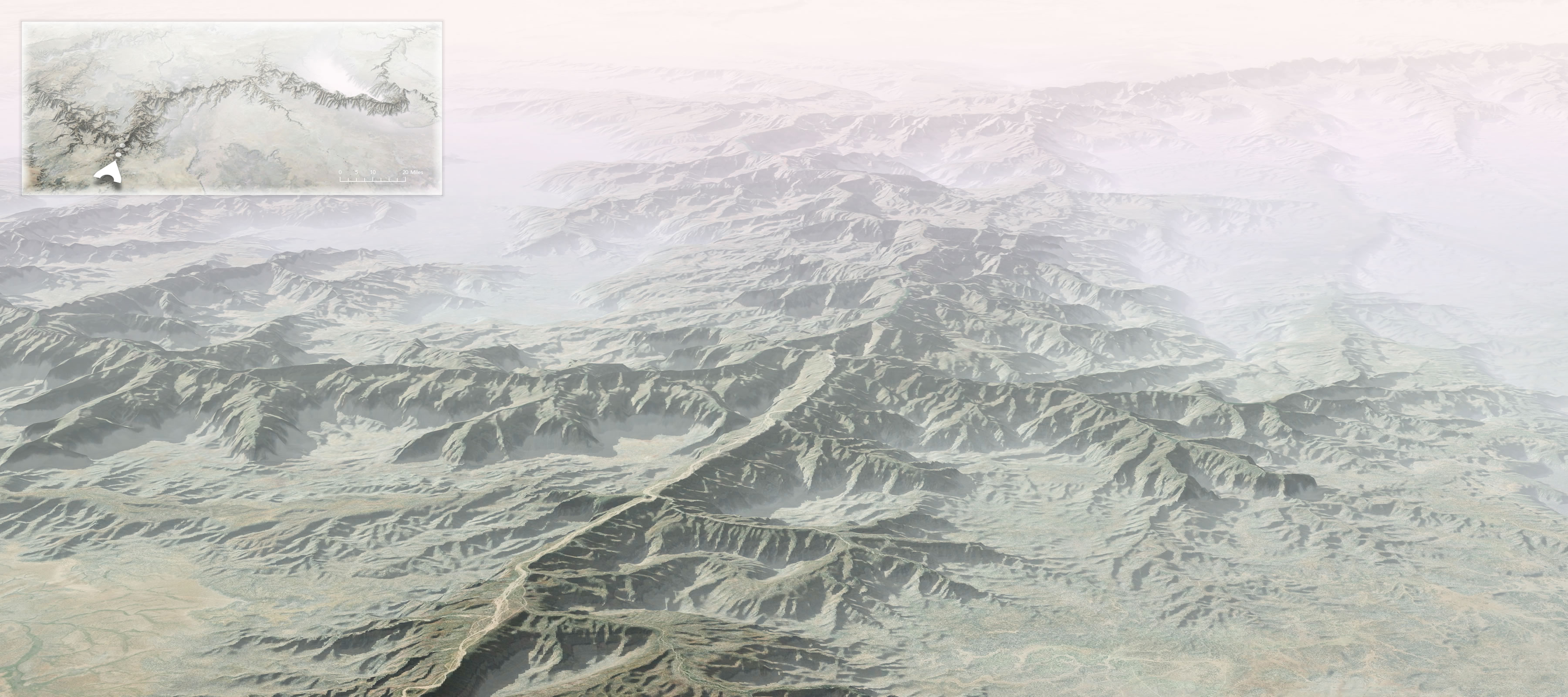
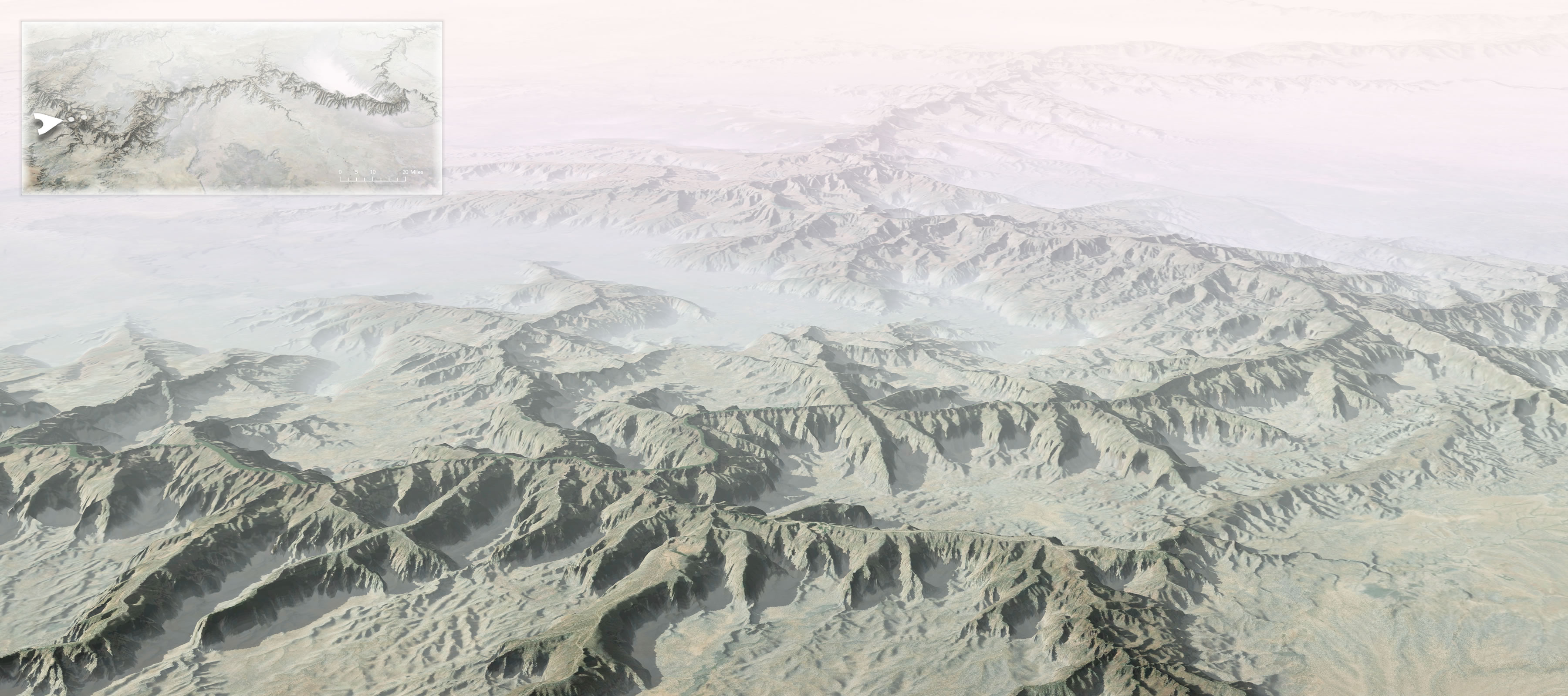
Sometimes the best way to understand something is to think of its exact opposite. This is the Grand Canyon flipped inside out.
Why?
Some of my earliest memories of the place had to do with the trippy feeling of my eyes and mind trying to make sense of the scale. I had seen many mountain ranges and vistas, including some on the way, but the vast negative space played havoc with my perception of magnitude. I’ve felt it a few times since, but never like that first Grand Canyon overlook.
I wondered, then, if flipping the Grand Canyon into a Grand Mountain might in some way help me make sense of its scale. I’m much more accustomed to seeing the mass of something rather than the massive void of something.
There is no exaggeration of height in these maps. This is how tall it would be, if it were up instead of down. The overview map has some vertical exaggeration, though, to help with context at that scale.
How?
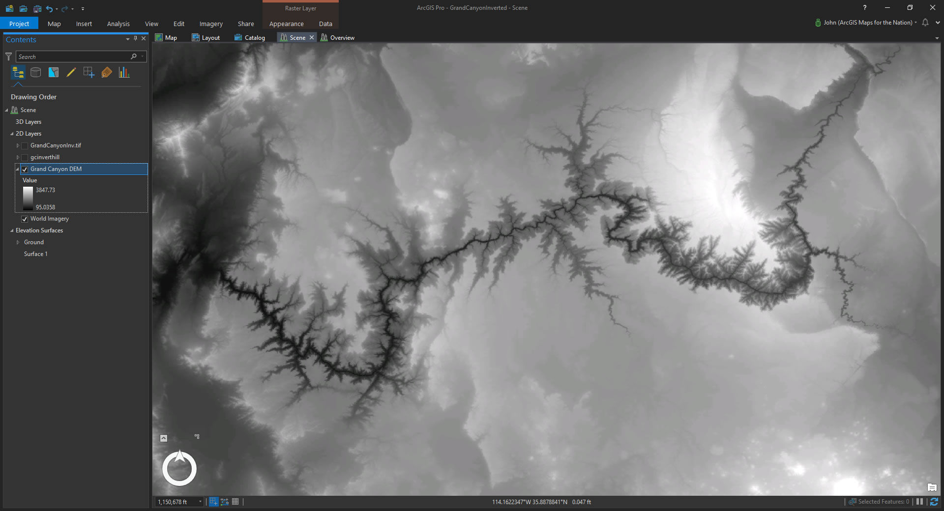
Let’s put on our bizarre-o caps and fire up ArcGIS Pro. Here is a Local Scene with a DEM image of the Grand Canyon area.
Step 1. We need to turn this Grand Canyon into a Grand Mountain. This…literally…could not be easier. Open up the Raster Function tools (in the Analysis tab) and expand the “Math” section. Click the “negate” option.
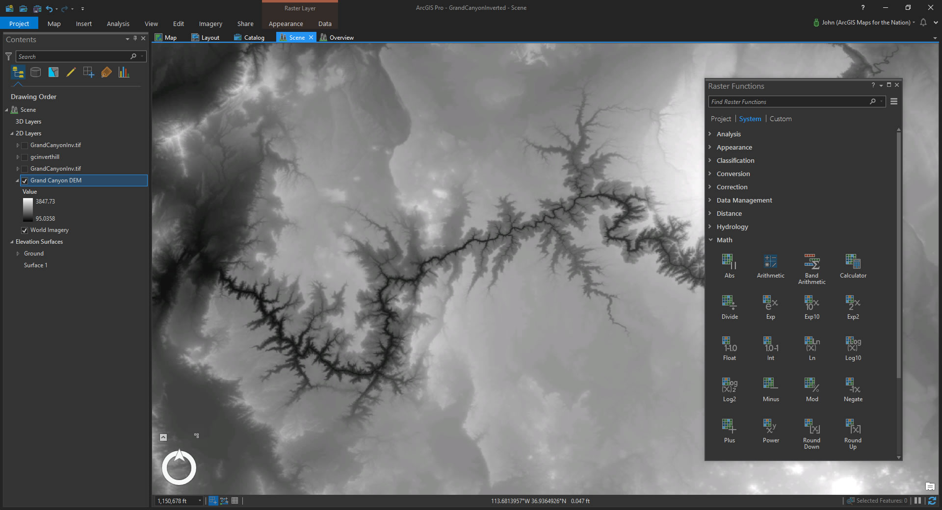
I don’t want to alarm you, but with one click you’ve caused cataclysmic geologic upheaval. The Colorado River is now a scenic ridge line; overlooks are now nestled in the shadows; hikers making their descent are now tumbling back to their base camps.
Step 2. Save. You’ll want to save a copy of this new inverted DEM to use as a ground elevation source later. Right-click the layer and choose “Data > Export raster”. Save it as whatever file format you like.
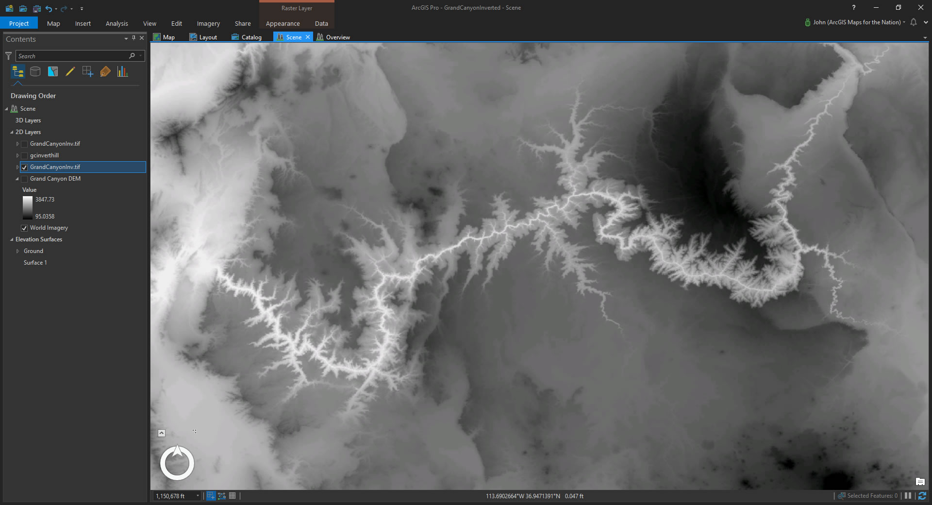
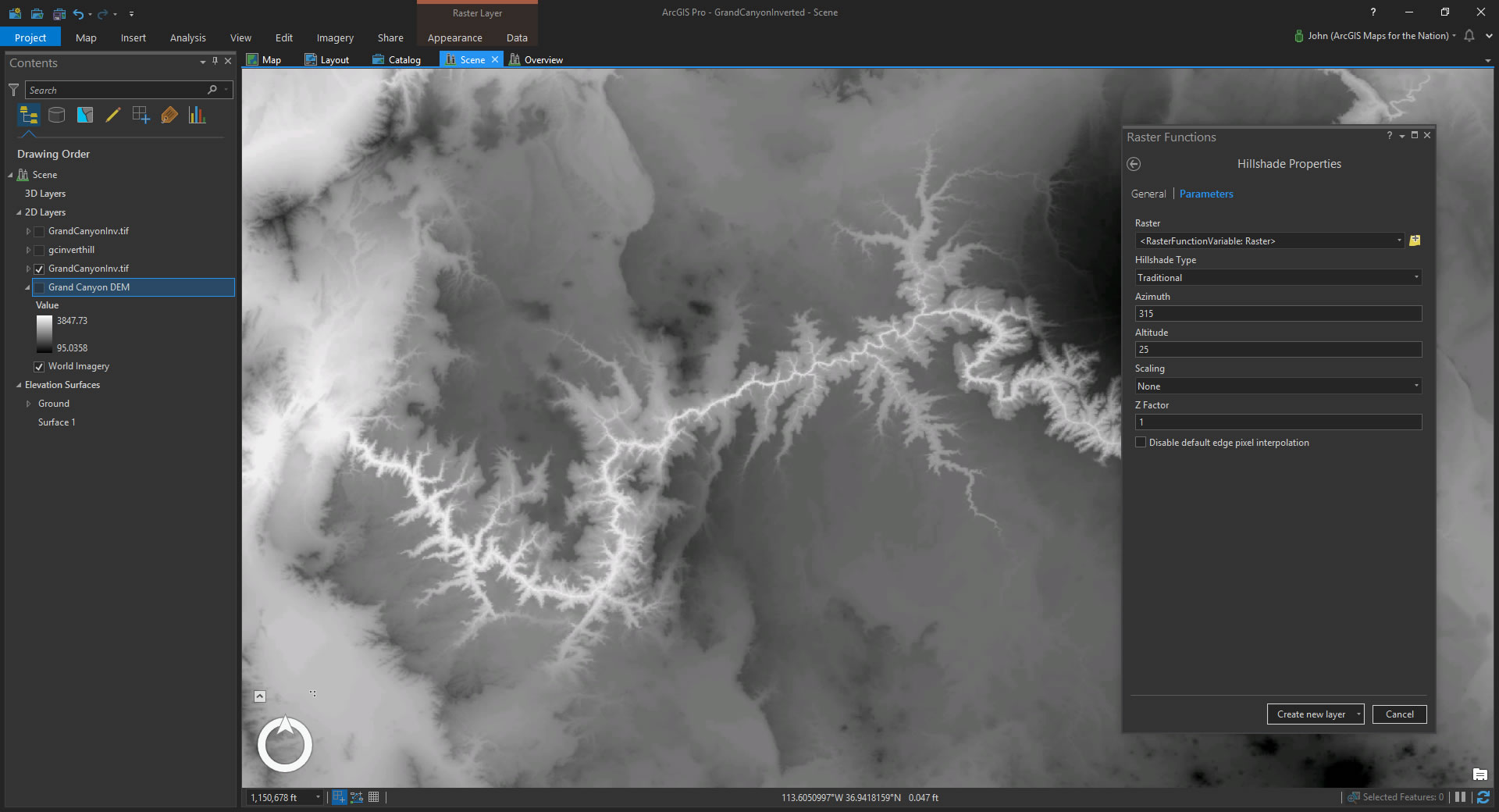
Step 3. Now that you’ve got a sufficiently inverted elevation model, it’s time to continue the abomination by giving this inverted elevation model some hillshade. Once again, open up that menu of unspeakable delights, the Raster Functions. This time choose “Hillshade”. I changed the altitude parameter from 45 (meh) degrees to 25 (epic!) degrees to really make those shadows stretch.
In a couple of seconds you’ll have a stark hillshade surface of the Grand Mountain…
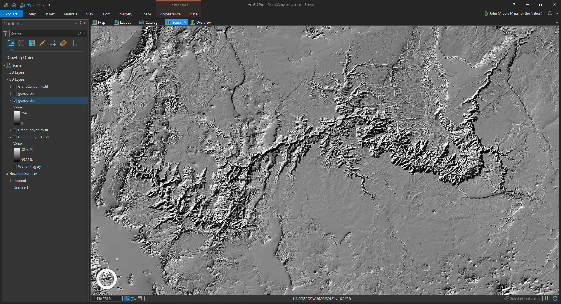
It actually looks the same as a non-inverted hillshade but with the opposite sun angle. Don’t worry, there will be thrills a-plenty in a moment. First, let’s get rid of that default grayscale color scheme and give it a look that only paints in shadows and lets the basemap imagery show through in unshaded areas. Bumpified.
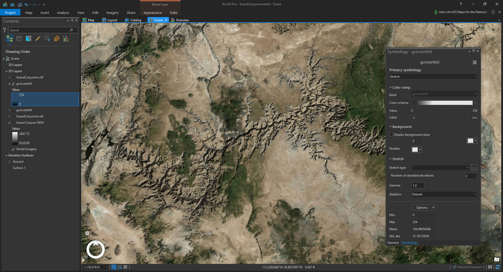
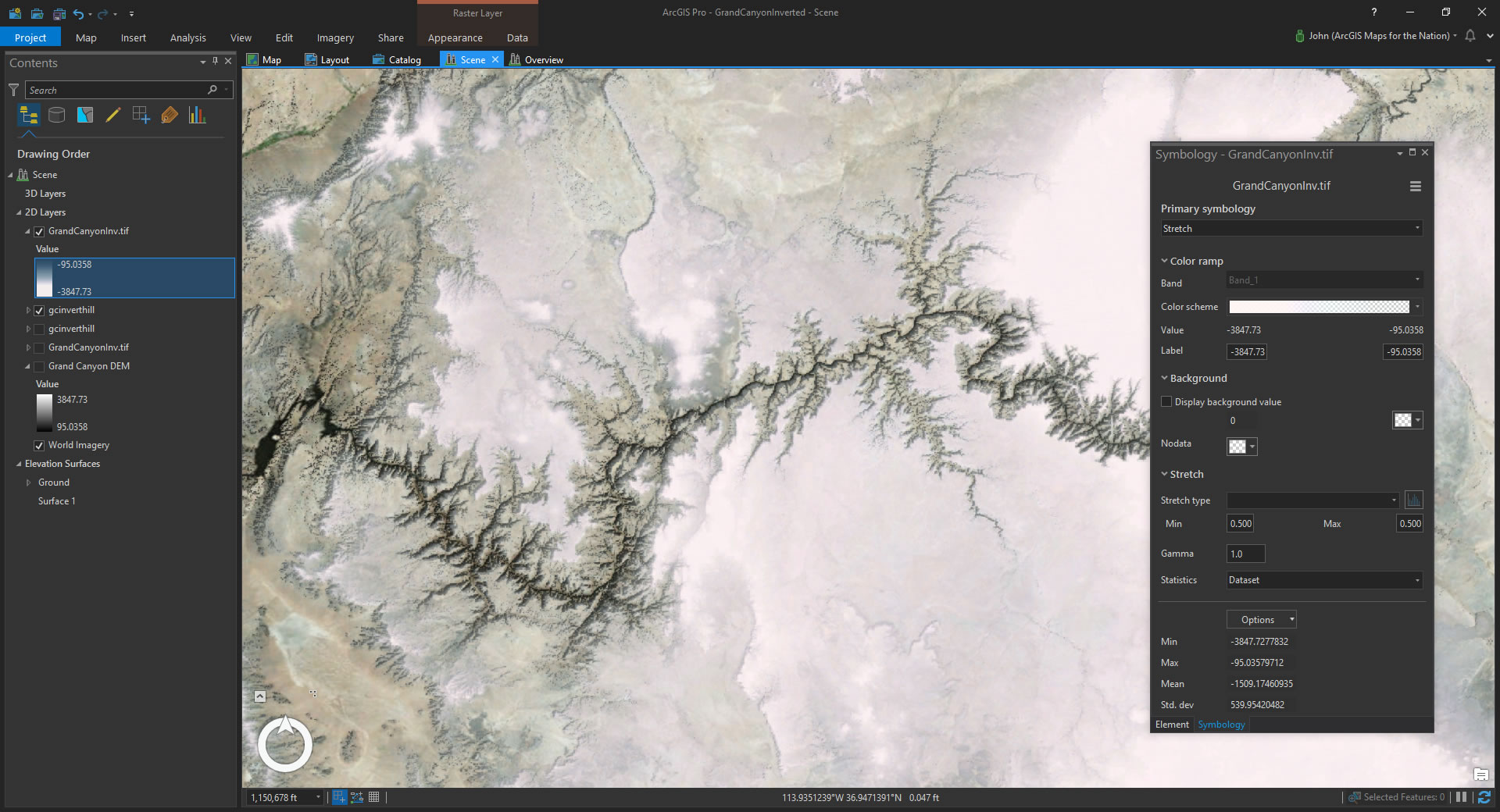
Also, open up the symbology panel of the inverted DEM image and give it a misty color scheme. And drag it right to the top of the layers list. This helps make the fake mountains look like they are rising up our from a low-hanging fog.
Step 4. Swapping out the elevation data for your inverted one. So now you have a 2D mountain where there was once a canyon. But it doesn’t really look too mountainous. We are in a 3D local scene, though, so let’s give this guy a tile and see how the elevation looks…
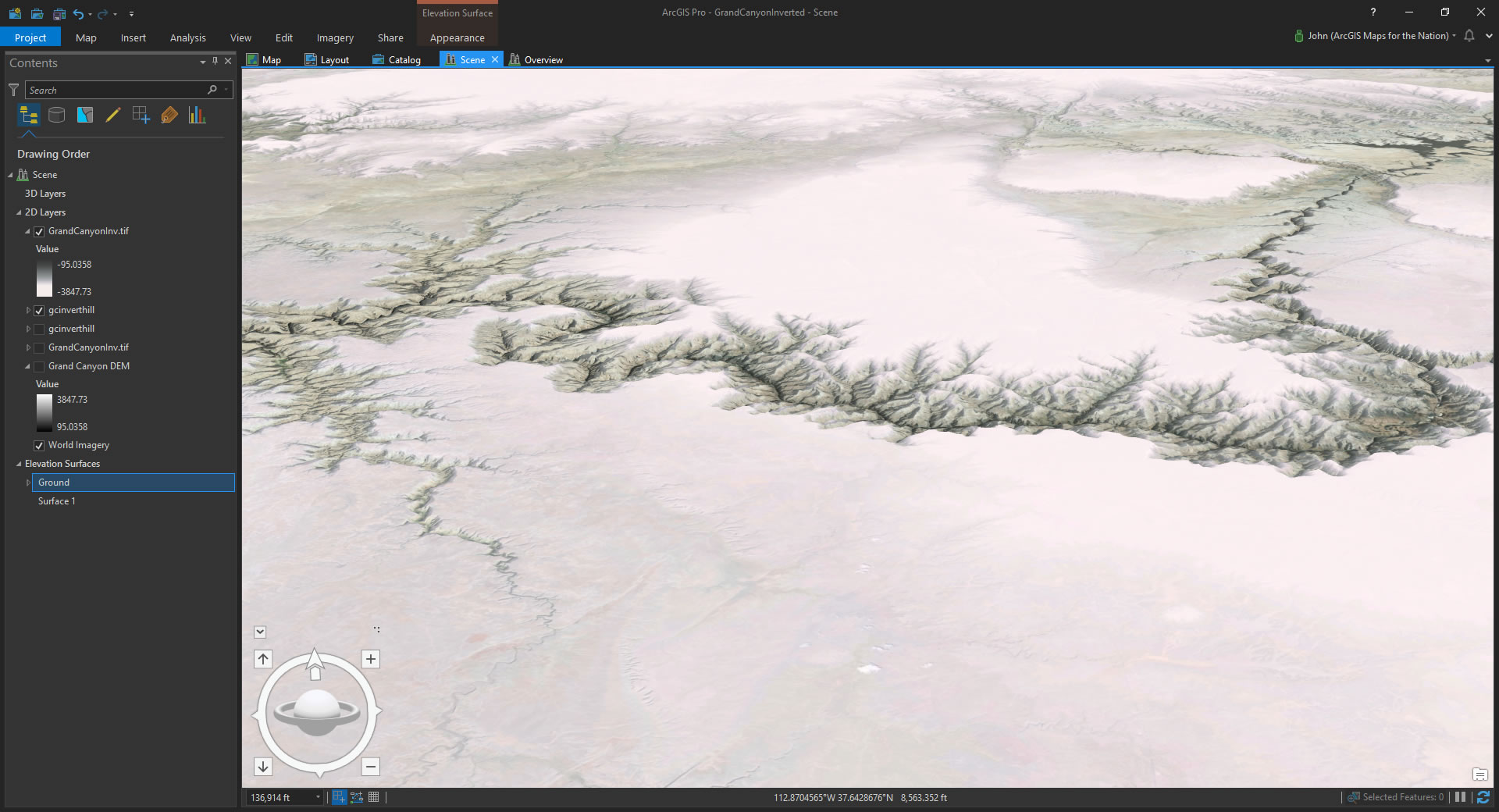
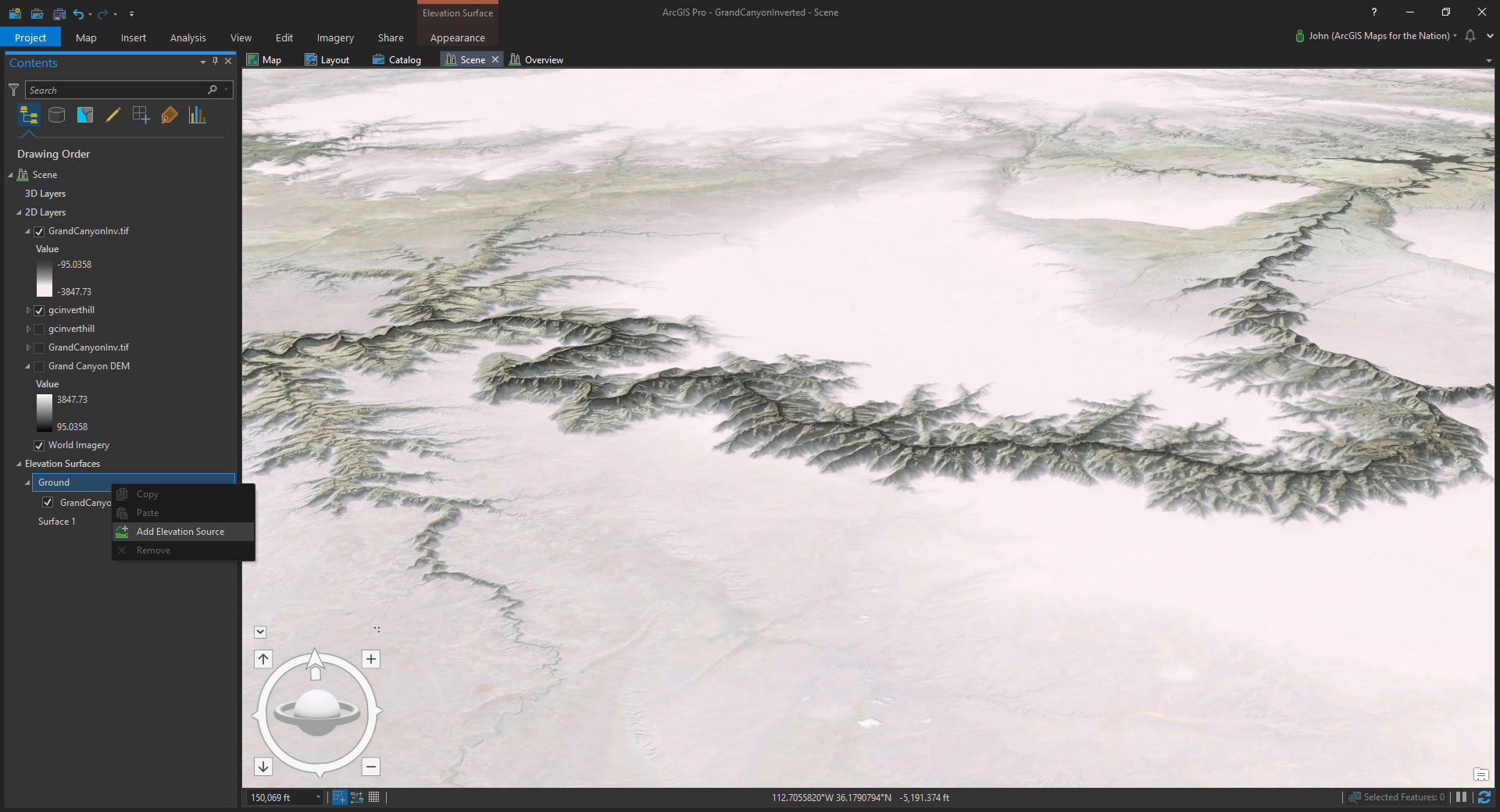
It’s still telling us the inconvenient truth of elevation. But we can totally change the data source Pro uses to draw its ups and downs. In the layer section called Elevation Surfaces, there is the default elevation source. Remove that one and right-click the “Ground” group to point to your freshly-saved inverted DEM image.
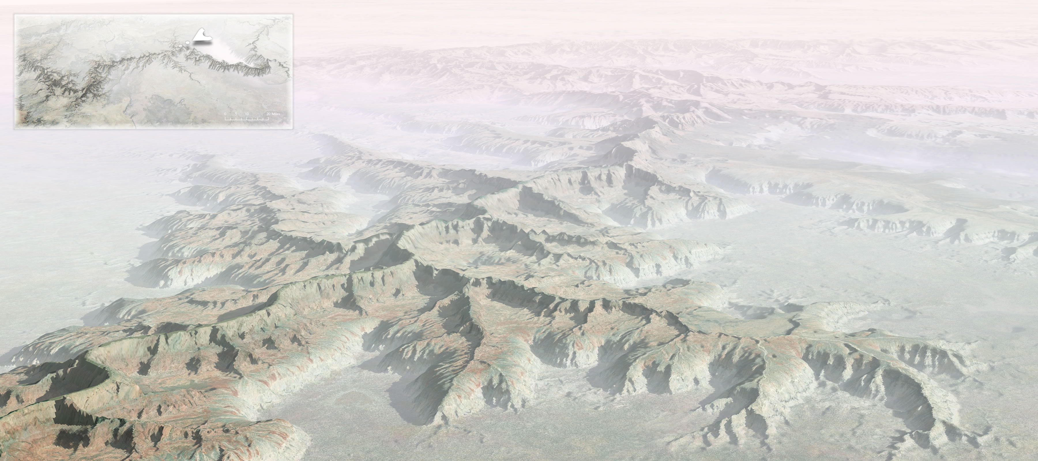
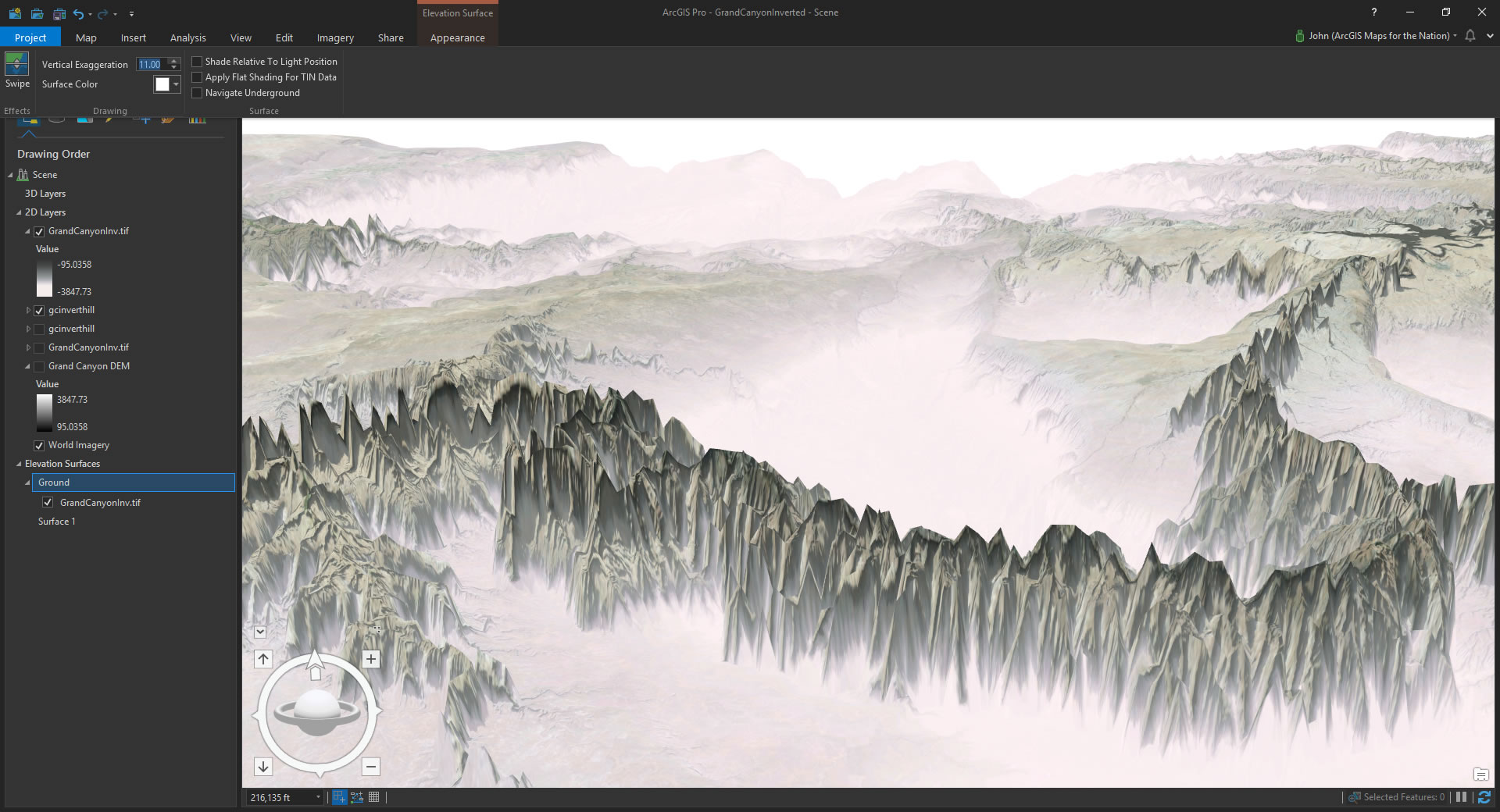
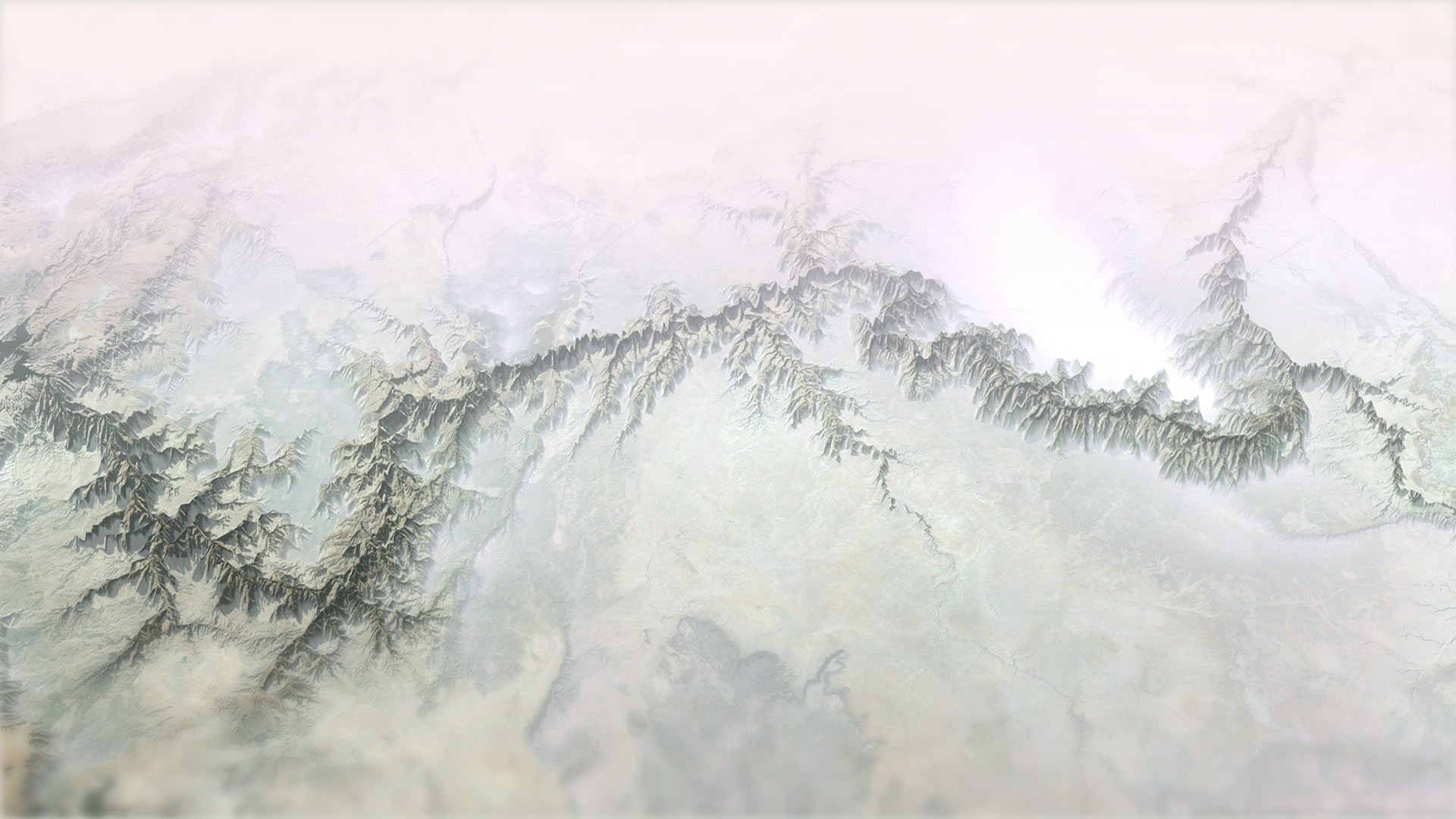
Pow! From canyons to mountains! Now, if you aren’t one for the subtle arts and would really like to stretch this topography out, you can play with the “vertical exaggeration” of the ground layer. Here it is turned up to 11, naturally…
So I thought it was important for my maps that the true (though inverted) vertical elevation of the canyon be shown. But in a small overview map I turned the vertical exaggeration up to 4x to help viewers pick out the map’s perspective from the overall area.
That’s it! A few minutes of hacking. These are impractical maps meant to provide practical context. Do they look like you might have expected?
I hope you try out local scenes in Pro and play with the ground elevation sources. So much fun to be had. Say, if you’d like to see a hastily-produced how-to video, complete with my thick Midwestern narration and bonus stuffy nose, then you can subject yourself to that for some reason here.
Happy Mapping! John

Commenting is not enabled for this article.