
Update: Sidecar has enjoyed a number of enhancements since this post was originally published, including new layout options and the ability to incorporate map actions. Follow this step-by-step tutorial to learn more about authoring a sidecar with these new features in mind.
ArcGIS StoryMaps has been publicly available since July of 2019, and new features are coming out every couple months. We’re thrilled to share the fresh look and function of the new StoryMaps with you.
Let’s take a moment to showcase a couple of its features—the block palette and sidecar—and suggest clever ways to immerse and engage your audience even more.

A brand-new, unified builder
One of the major enhancements introduced in ArcGIS StoryMaps is its unified builder.
One builder, with one intuitive interface, binds together in one place all the different reading experiences familiar to anyone who has used our classic tools, such as Cascade or Map Journal. This unified builder is possible thanks to a single block palette.
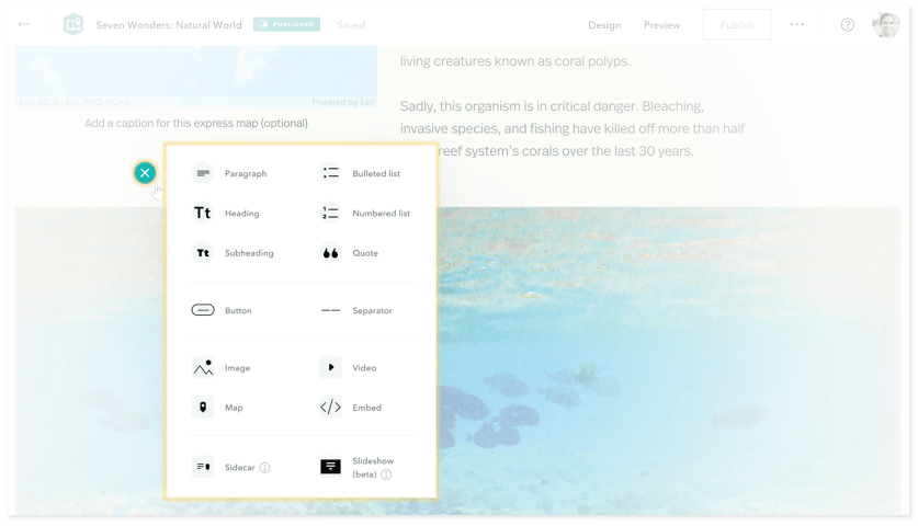
In the new StoryMaps, a component called sidecar is one of our redesigned blocks that provides a rich storytelling experience. For those familiar with our classic tools, you’ll find that sidecar bears a striking resemblance to Story Map Journal.
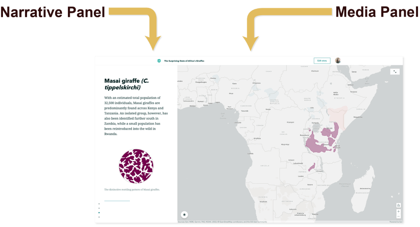
Sidecar is a special immersive block with a side-by-side reading experience. It consists of a wide media panel that locks into place, while a narrow narrative panel containing additional text or multimedia scrolls by along the side.
A single media panel with its narrative panel constitute a slide, and one sidecar can contain multiple slides that fade from one view to the next. The end result is an engaging, vertical-scrolling presentation-like experience. (For a horizontal navigation experience, check out slideshow).
You, our authoring community, have been hard at work pushing and pulling on the new StoryMaps. You’re taking full advantage of sidecar.
Sidecar’s power lies in the ability to stack multiple slides containing a variety of media (maps, images, videos etc.) and animate the transitions between them. These animations can be a simple fade, or they can be a more sophisticated panning, zooming, and toggling of layer visibility in a map, all driven by the user’s scroll.
What follows are six examples of ways to use sidecar that we think everyone should see:
- Illustrate a process
- Compare thematic data
- Show a gallery of images
- Tour a list of places
- Make a presentation
- Explain a single map
Let’s get started…
Sidecar illustrates a process

This project, Searching for Shelters, from the geospatial company Alcis takes a look at using mapping, GIS, and machine learning to identify shelters for displaced persons.
The story does an excellent job of using sidecar. It opens by setting the scene with aerial imagery of shelters. It then takes the presentation to the next level with sequential graphics that fade one into the next. The story richly illustrates how it extracted insight from the imagery, guiding the reader through the analytical process step-by-step.
Sidecar compares thematic data

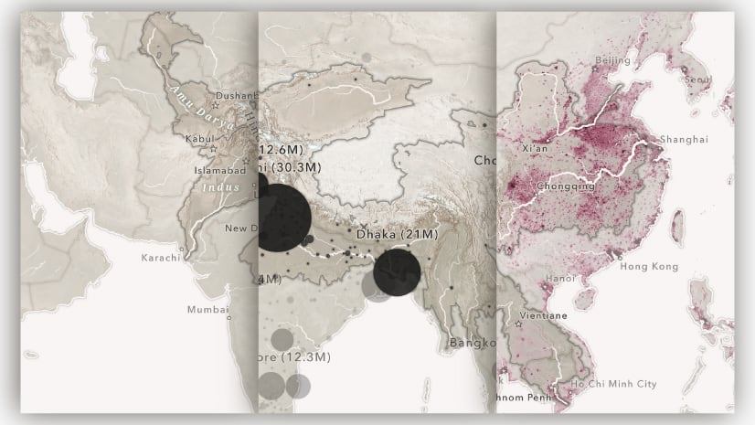
Ireland’s Rivers takes a look at Sustainable Development Goal (SDG) indicator 6.3.2 “Proportion of rivers achieving at least good ambient quality.”
With a simple web map featuring the administrative boundaries of Ireland, the story uses sidecar transitions to break down the subject. It shows those rivers achieving “Good” quality, “High” quality, and those that fall short. Rather than dumping all of this information into a single map, the story deconstructs the thematic categories of river quality. The reader can take her to distinguish successful rivers from needful ones without overwhelming.
You can easily imagine comparing all kinds of thematic data in this way. This could be environmental information, economic data, demographics, or wildlife range land (which our team did in a story of our own: The Surprising State of Africa’s Giraffes). You could even compare temporal data, such as the change in satellite imagery over time.
Sidecar shows a gallery of images

For the dog lovers out there, this fun story, Canine Surprises, reminds us of a core power of story maps: the ability to present rich multimedia in relation to place. There’s nothing quite like creating a dynamic, geographically-aware, and gallery-like experience.
In this story’s sidecars, the media panel provides details about a particular excursion. The narrative panel, meanwhile, showcases a selection of attractive images of the author’s furry friend.

The sidecars in Seven Wonders: The New List offer a related way to create an image gallery. In this case, images appear in the media panel. Complementary location and factoids scroll by in the narrative panel.
So, choose your flavor: do you want to highlight a place accompanied by multiple photos? Or would you rather hold up a single great image for which the location is secondary?
Sidecar tours a series of places

The Ins and Outs of Lake Ontario takes us on a literal tour of “where water in Lake Ontario comes from, and where it goes.” Presenting a series of web maps in a sidecar block, the story identifies various rivers, straights, and channels. The overall experience is that of a smooth and holistic exploration of the waterways essential to the lake system.
Tours like this are a basic and important function of story maps. They help readers to understand how geography affects their world. While the above example explores one type of geographic feature, there are many ways to craft a tour with places—ranging from a series of ancient sites to a portfolio of real estate properties.
Sidecar makes a presentation

One way that story maps have had an unexpected but welcome impact is in making richer, more engaging presentations.
An example of a presentation-style story map is this punchy slide deck on ArcGIS for Family Practice. Short and sweet, the presentation uses sidecars much as one might use a stack of slides in a PowerPoint. It exhibits a series of attractive, topically related images alongside a few key bullet points.
Obviously, this example isn’t meant to be a standalone “story.” It goes great, however, alongside a live presentation delivered orally.
Sidecar explains a map

Sidecar can be used in minimalist fashion to break up the normal reading experience. In so doing, it can create a visual rhythm, highlight, and better explain one map or graphic.
This example, De Spoorzone, explores revitalizing a former industrial zone in the city of ‘s-Hertogenbosch, Netherlands. Here, sidecars are sprinkled throughout the story. Each one contains a single thematic map with accompanying textual and supporting media.
This simple but effective use of the immersive block provides an accessible experience. It allows the reader to easily go between the visual information of the map and the description in the narrative panel.
Sidecar embeds all kinds of stuff
Here’s the six(ish) part: In addition to adding images, uploaded videos, and maps, sidecar also supports adding content by embed.
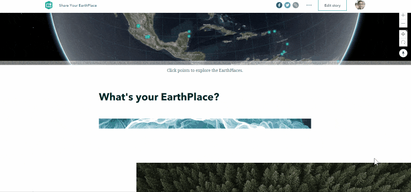
That’s right, in this example of a crowdsourced-style story Share your EarthPlace, we see an embedded video from Vimeo (so as to support an iframe and Vimeo’s URL parameters) followed by an Operations Dashboard indicator of total submissions. But you can pretty much embed anything in sidecar as long as the website or application supports being embedded.
(Why the “-ish”? Well, since embedded content can be any type of media, it’s possible to create the other examples listed here by using the embed option.)
That wraps up our quick exploration of some cool and effective ways authors are taking advantage of sidecar and the new ArcGIS StoryMaps. We can’t wait to see even more great examples of using sidecar and our other immersive blocks.
Got questions or other great examples of sidecar? Let us know here. And don’t forget to sign up for our newsletter, Planet Story Maps. You can keep up to date on new stories, blogs, and other exciting announcements.


Commenting is not enabled for this article.