The ArcGIS Enterprise 12 release brings exciting new features and enhancements to ArcGIS StoryMaps. You can now enhance your multilingual storytelling efforts by linking translated stories, level up the visual power of your content with infographics and 360 images, expand your geospatial communication by easily integrating ArcGIS Apps, and much more.
Read on to learn about ArcGIS StoryMaps updates and how it can elevate your storytelling!
Quick links

Functionality
Item checker
We enhanced the issue checker that scans your story or briefing after clicking the publish button to alert you to subscriber content deleted items, and sharing issues with maps, scenes, or layers. Now, we’re thrilled to introduce Check items, a feature on your My projects page that further enables you to check the functionality of all your published stories, briefings, templates, and themes—at once! This is particularly helpful to catch issues that have occurred after the initial publication of your story.
After selecting Check items from your content page, the check will run through all of your published items to create a list of items containing permissions or sharing issues. This list will include the number of issues and provide you with the option to Review, View, Edit, or View full details for each item.
Selecting Review will bring you to a detailed list of content items that are resulting in an issue, along with the specific issue. One example is a story that is published publicly, but an included web map is published to your organization only, requiring a sharing update for the map to be viewed publicly. Another example is an included web map containing a deleted layer; the issue checker will provide you with the layer ID number, enabling you to pinpoint the issue source quickly.
Ensuring the functionality of your content is one of those finishing touches that sets your hard work up for success. Check out these 12 details that have a significant impact on the overall quality and professionalism of your work.
Link translated stories
The ArcGIS StoryMaps story builder, viewer, and website currently support 40 languages enabling authors to create content that connects with audiences around the world. Oftentimes, authors want to create multilingual options for one story, such as one in English and one in Arabic, like this example titled The Kingdom of Copper. Until now, as seen in this story, a common method to link translated stories was to add a button or linked text at the beginning of the story to create a path between the multilingual options.
A built-in feature to enable this pathway has been highly sought-after by our storytelling community, so we are delighted to introduce just that! You will now find a Translations tab in your Story settings where you can Add translations. By selecting this, you can choose from your published content to add one or more versions of a story to link together. After clicking Publish to save these changes, a language icon will appear in the story header; click there to access a menu containing the translated versions of the story.
Notes: (1) Your stories must be published publicly, and you must be the owner of all the translated stories to use this feature. (2) This feature is in beta; your organization administrator must enable beta features in the organization settings.
Learn more about multilingual storytelling in our October 2025 issue of StoryScape titled Stories in translation.
Button grid
You’re not alone if you’ve ever wished for the capability to add side-by-side buttons to your story. Whether you want to improve navigation, organize complex information, or invite reader interaction, we heard you—and are introducing the button grid!
Now, after adding an initial button, click the + button to build a row of one to four buttons.
Give your audience a clear next step, whether it’s exploring a related resource or supporting a cause, by including a call to action.
Mapping
Map tour enhancements
Categorized map tour
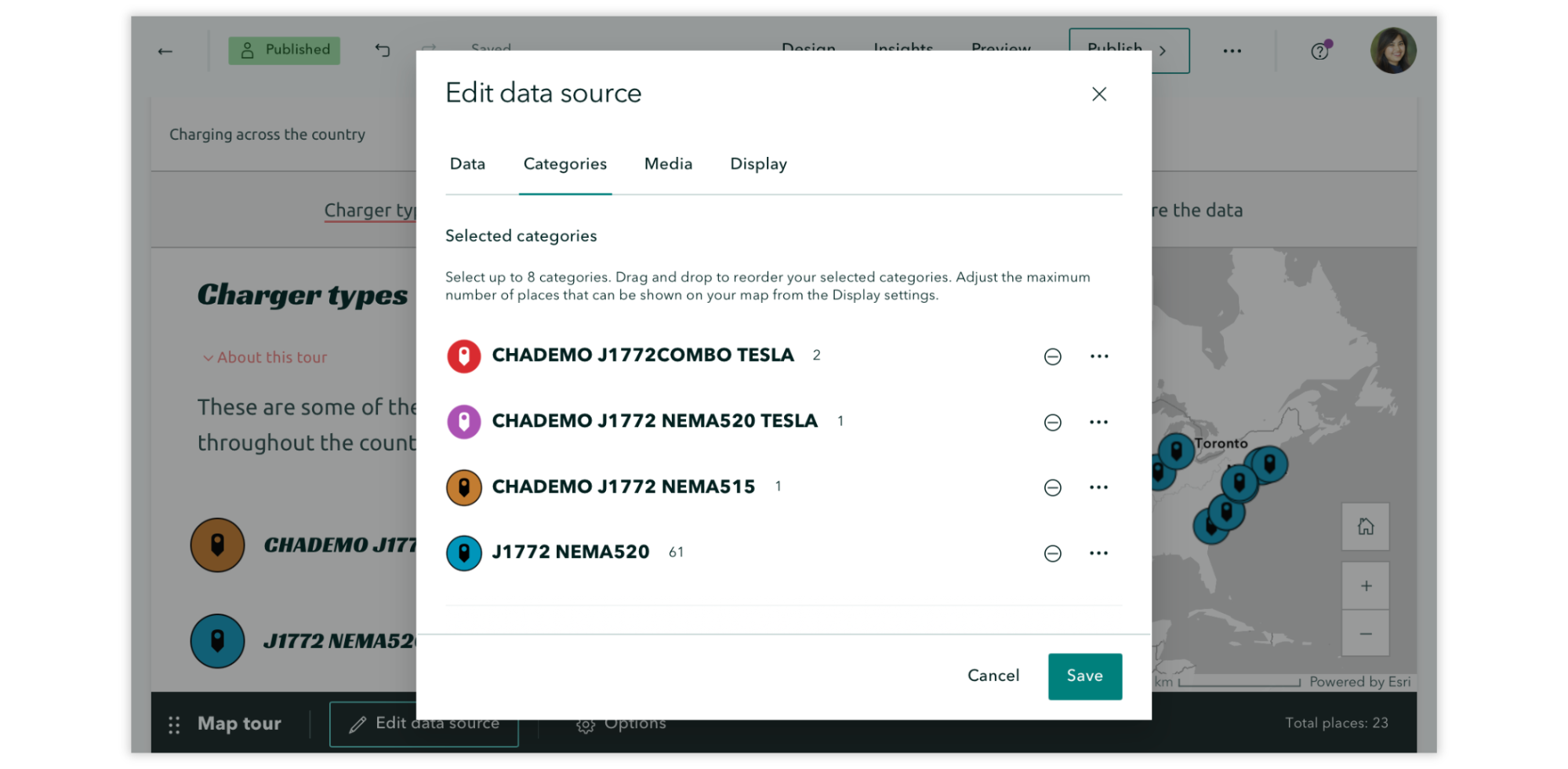
When configuring your Categories in Edit data source, you will now see how many places are in each category, and you’ll get a warning if the number of places in your selected category exceeds the current maximum. Also here, the order of categories sets the order of the layers on the map, meaning you can drag and drop layers in the editor to control how they appear on the map.

Explorer and Categorized map tours: List view
Explorer and Categorized map tours include the option to display tour points in a compact List view with a thumbnail image (the first image added to a tour point) and short description. What if you don’t have images for every tour point, though? Previously, tour points without images were automatically supplemented with a placeholder graphic to fill the void, but we’ve now added Hide thumbnails to the Options of your List view tours; this may be a more aesthetically consistent option when you have tour points without images.
Notes: (1) If you’ve opted to hide thumbnails, but some tour points have images, those images will remain viewable in the detailed place view. (2) Tangentially, tour points without any images will no longer be supplemented with a placeholder graphic in the detailed place view.
Check out this collection of Great examples: Map tour to browse stories that skillfully guide readers through their narratives using a map tour.
Guided and Explorer map tours
Combining maps, media, and descriptive text is no small feat, so we’re excited to add the capability to Duplicate slide to help you save time or do even cooler things with your Guided and Explorer map tours! Test different looks for your media panel configuration. Make just minor adjustments from one panel to the next. Show different zoom levels for one location. Whatever the use case, let your creativity shine!
Data-driven map tour
Creating a data-driven map tour from a feature layer can save you a lot of time by automating workflows such as point placement and media panel configuration. The latest enhancements to this feature include:
- Add a button link below each place’s description by toggling on Show button link in the Data tab of the Edit data source modal. Once you’ve turned on button links, you’ll need to select an attribute field that contains the URLs to be linked to plus specify the verbiage that will appear on all the buttons (for example, “Read more!”).
- Add a thumbnail image via the Thumbnail image field in the Image URL field options in the Media tab when editing the data source.
Data visualization
Infographics
Enhance understanding. Support visual learners. Highlight key points. Infographics simplify complex information by combining visuals and text, which can help your readers better understand your narrative and keep them engaged. And that’s why we’re excited to introduce the Infographic block, making it easy for you to enhance the data visualization of your stories and briefings!
From the block palette, select Infographic and then choose from four options: Basic, Stacked, Compact, and Titled. Your selection will bring you to Edit infographic, where you can customize your Data by specifying the Number, Description, and Icon (with over 100 icon options). Also, in the Settings tab, you can change your Layout and customize the Colors of your infographic.
Want to incorporate data visualization into your story or briefing? Check out this collection of stories that showcase the power of data visualization in communicating a message.
ArcGIS Apps
Integrating other ArcGIS apps into stories and briefings can enrich your geospatial storytelling with tools that offer specialized functionality. Whether you’re crowdsourcing field data using ArcGIS Survey123, presenting location-based analytics with ArcGIS Dashboards, sharing interactive maps using ArcGIS Instant Apps, or immersing your readers in a scene with ArcGIS Experience Builder, adding an app can dynamically enhance your readers’ understanding and bridge the gap between storytelling and decision-making.
You’ve long been able to add ArcGIS apps with options like embedding URLs, but with the endless possibilities (and benefits) of layering your storytelling with these tools, we’re excited to share that it’s now easier than ever with the ArcGIS Apps block.
Now, you can select ArcGIS Apps from the Media section of the block palette. On the next screen, select Apps from the drop-down menu to access available content. Once added, enhance the app by using familiar options like adjusting its size or adding alternative text.
Note: Your ArcGIS apps need to be shared publicly to be added.
Ready to level up your geospatial storytelling game? Read our blog on elevating your story by integrating apps in ArcGIS StoryMaps, and then browse these stories that integrate apps for inspiration. Want to practice before diving into your own story? Follow this tutorial on integrating maps, apps, and scenes to tell a story.
Charts enhancements
In December 2024, we introduced the chart block, leveling up the visual power of your stories and briefings, and we’ve continued to enhance this impactful feature.
Side-by-side charts
One chart can be a dynamic way to communicate a pattern or key finding—and now we’re excited to see what you can do with side-by-side charts!
In stories, after adding an initial chart, you will find the option to create a row of up to three charts by clicking the + button.
Whether you want to directly compare different datasets or display correlations, side-by-side charts create a clean, organized layout that will be easier for your audience to follow. Learn more about Including charts in ArcGIS StoryMaps.
Axis customization in charts
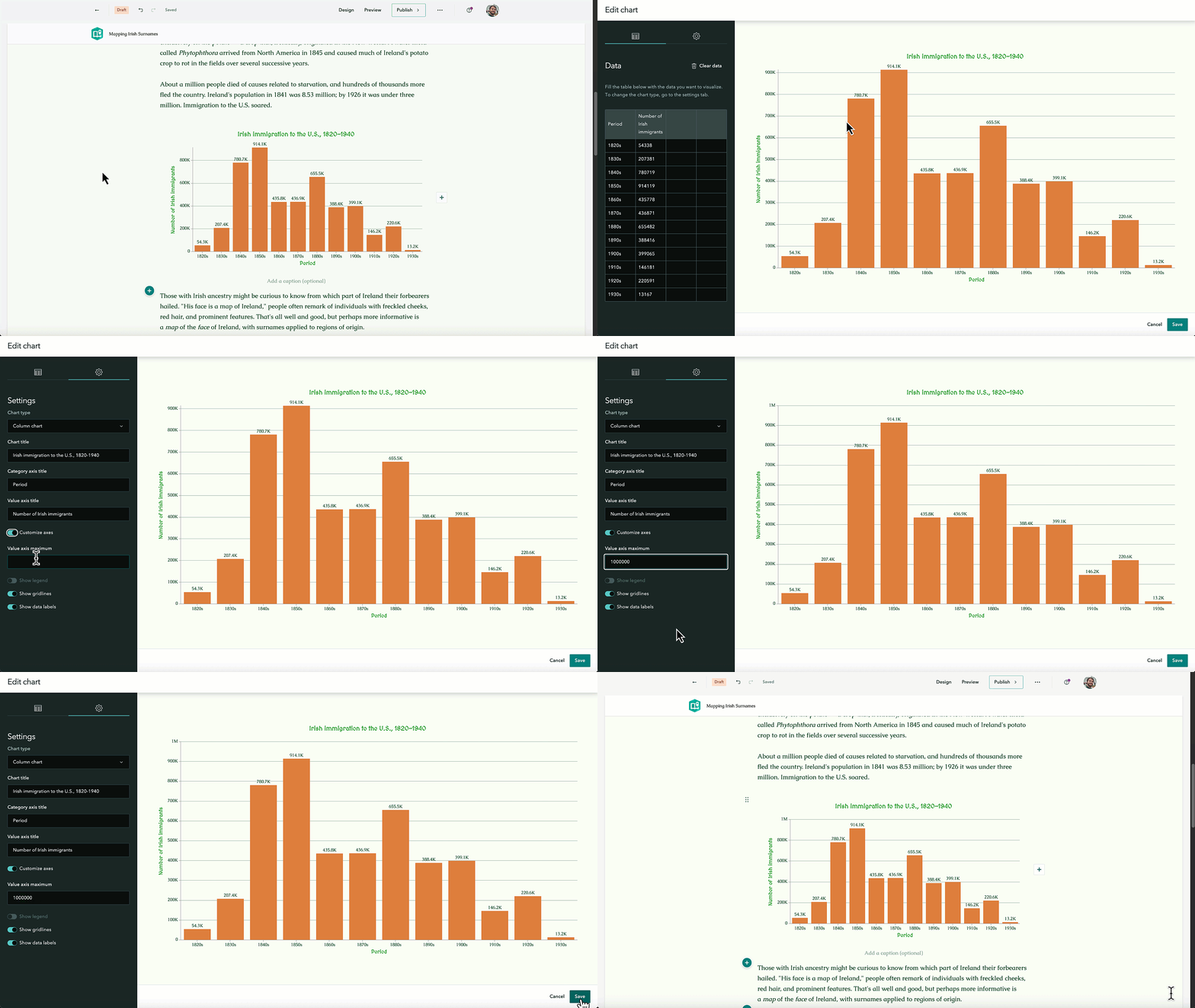
Now, you can customize the axis by modifying the Value axis maximum to suit your data visualization needs best. For instance, if the value is too high, slight differences between data points may appear insignificant. Or you could use the same axis maximum to ensure consistency across multiple charts, making comparisons more intuitive.
In Edit chart, go to the Settings tab and toggle on Customize axes. This will reveal the maximum field on the value axis.

Customize chart colors
We often preach the efficacy of customizing a theme for your items to create a little world for your readers to get lost in, so it only made sense to give you more creative control over your data visualization efforts!
You can now customize the colors for your charts in the chart editor viewer under the Settings tab. For bar, column, and line charts, the color tool is familiar and enables you to ensure you’ve selected accessible colors by indicating whether your selections are legible or not.
For donut charts, you have the choice between Color palette options or Use custom colors. You will find a dropdown menu of algorithmically determined color palettes based on your theme, or you can opt to set a custom color for each datum. Not loving the custom colors you’ve selected? Hit Reset all and try again!
Read about creating a little world for your readers and then learn how to customize a theme for impactful stories.
Text and media
Audio/video transcripts
Personal interviews. Dynamic footage. Narrated tours. Audio and video elements have long been a feature of ArcGIS StoryMaps that help create an immersive experience for your readers, so we are especially excited to announce the capability to add transcripts to your audio and video—boosting the accessibility, clarity, and searchability of your stories.
We enabled closed captions for video to enhance accessibility and support comprehension in situations where audio may not be suitable. Closed captioning is displayed on the video player and synced to the audio so the reader can read as the video plays.
Transcripts enable a full written version of the spoken content to be viewable alongside the audio or video players. Transcripts are not synced to the audio but can be searched, copied, or used for reference.
After adding an audio or video block to your story, go to Options, then Accessibility, to paste a transcript for your media. After saving your transcript, a button to Show transcript appears on the right side of the audio and video players, which you can click to view the transcript and player simultaneously.
Learn more about Getting started with accessible storytelling.
Inline code text format
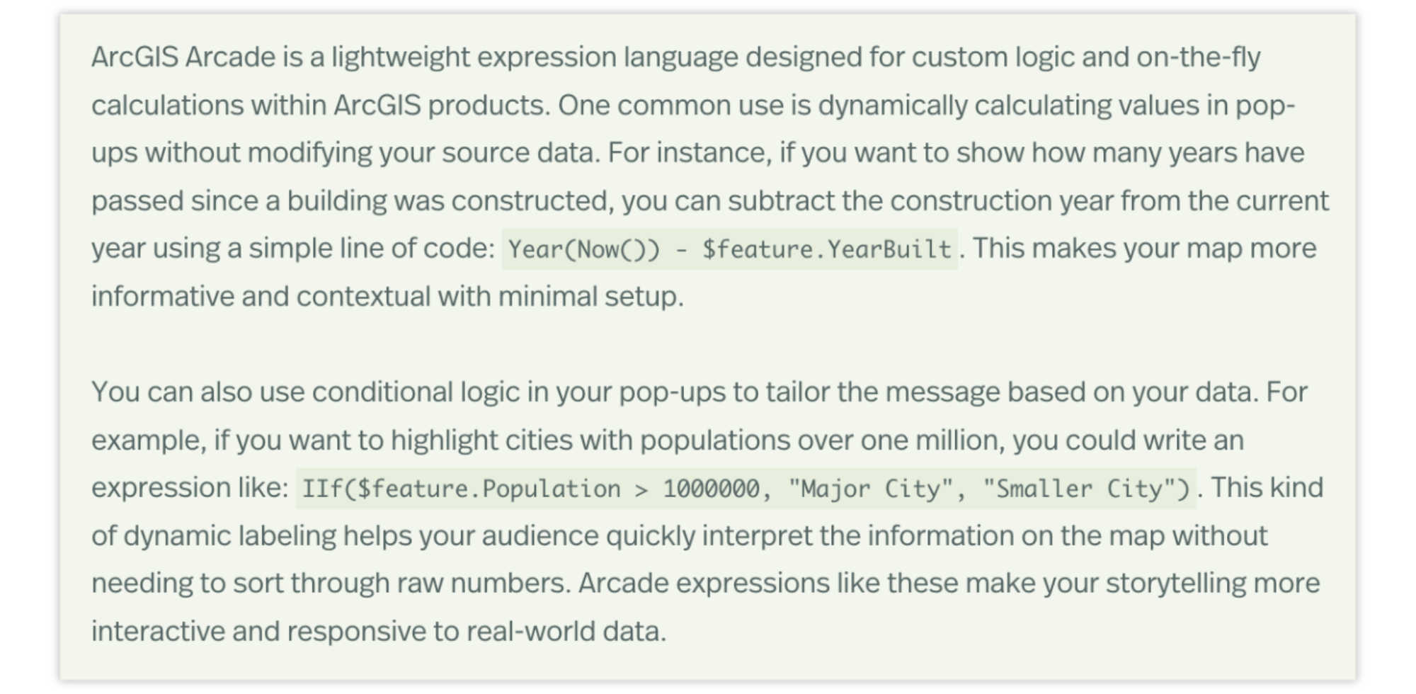
Want to share how you customized that pop-up using ArcGIS Arcade? Teaching students how to perform spatial analysis using the ArcGIS API for Python? You can now format text as inline code to help distinguish between narrative and instruction or signal reproducibility for sharing datasets, tool settings, or parameters, improving your story’s clarity and usability.
After adding text to your story, highlight the text you want to format as inline code and select Code. The text will reformat to appear in monoline font but still retain your theme colors.

Sharing longer snippets of code? In 2023, we introduced the code block, which supports ArcGIS Mapping SDK languages as well as Python, Arcade, and many other popular development languages.
360 images
ArcGIS StoryMaps has long made it easy to combine multimedia to create an interactive narrative that immerses your readers in places around the world. Now, it’s time to take those immersive storytelling capabilities to the next degree — or the next 360 degrees, that is. 360-degree images enable your readers to explore a place as if they were physically there, which can deepen the emotional and sensory engagement and increase the stickiness of your stories and briefings.
Select 360 image from the block palette to add your supported JPG or PNG image file, which must be under 25 MB and have an aspect ratio between 1:5:1 and 3:1. After adding your image, you will find a familiar menu of options by hovering near the top of the 360 image viewer, along with accessible mouse and button controls to navigate the image and Enter full screen mode at the bottom of the viewer.
Read more about immersing your readers into an experience in this story about Nine steps to great storytelling.
Mute/unmute audio
Ambient sounds from a location. Interviews with local voices. Narrated explanations of complex spatial data. Audio is a powerful sensory layer to make your geospatial storytelling feel more immersive and memorable, especially when added to the background of your synchronized media via the Sidecar block.
Adding background audio to your sidecar slides has long been available, but we are pleased to add the other half of background audio’s efficacy: muting it when enough is enough. Now, both in the builder and in published stories, you and your readers can opt to Unmute media or Mute media.
Inspired to add audio to your story? Check out these great examples that demonstrate creative uses of audio in stories.
Briefings
Flexible layouts
It’s been almost a year since we introduced briefings in ArcGIS StoryMaps so now seems like a great time to significantly expand your slide layout options! Until now, there have been seven layouts to choose from with a variety of titles, panels, and media placements that were set by the builder. But we believe your choices should be as dynamic as the presentations you’re creating—enter flexible layouts.
Now, when you add a slide, you can choose from three tried-and-true slide layouts (Section title, Section title with Media, and Media only) or opt for one of two Flexible layouts as a starting point (one with and one without a title). Interested in a head start with your flexible layout? Select the Common tab to find layouts that are, well, a common way to organize your text and media.
Note: Flexible layouts are not yet supported in the ArcGIS StoryMaps Briefings app (v. 1.8.4). Support is planned for the next release. For now, new slides or slides whose layouts have been edited since flexible layouts were released will not be viewable in the mobile app.
These new flexible panels come with multiple ways to add more panels, change their size, and move their content around:
- A flexible layout slide has the capacity for up to two rows and three columns of media. Until you’ve reached those limits, you will find a + button on the vertical and horizontal edges of your slides; select this to add a new row or column of content.
- A Panel actions menu (button with three stacked dots) will appear on the left side of each content panel. This menu enables you to complete actions such as Add panel above or below, Add panel right or left, adjust the relative horizontal size of panels (wider on the left or right, or evenly spaced), Move content between panels, and Delete panel. Note that the options in this menu will appear different depending on the slide’s current layout. (For example, Add panel left or right will not appear in this menu if the slide already has the maximum of three content columns.)
- A Slide actions menu will appear at the top of each slide as three horizontal dots. In this menu, you can quickly complete many familiar actions such as duplicating, hiding, or deleting the slide. In flexible slides, you can also opt to show or hide the title bar, regardless of whether or not your layout started with the title showing.
- Note that slides added through the preset Common layout options can still be modified using these menus and actions.
The flexible panels accommodate all the options you’re used to, from images and videos to charts to the swipe block—the sky’s the limit for organizing your textual and visual communication components! Visit the ArcGIS StoryMaps Gallery and get inspired by these excellent examples of slide-based storytelling.
Image captions
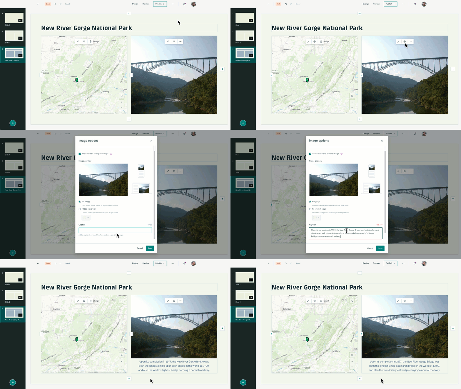
You’ve long been able to add captions to your images in stories, and with our storytelling community increasingly using briefings for their visual communication needs, it only made sense to add this capability here, too!
After adding an image to your briefing slide, select Options to add a Caption. In a non-expanded state, the caption space will display up to four lines, truncating anything beyond that; expand the image to view the whole caption.

Does a gallery of images better suit your needs? Learn more about image galleries and caption capabilities.
Video playback options
Including videos with your narratives can enhance engagement by capturing your audience’s attention. Videos also often improve understanding of your topic by catering to different learning styles. Stories have long had a selection of video playback options that we’re excited to include in briefings now.
Find the Playback tab in Video options to determine how viewers will be able to interact with the video:
- Click to play: This video will start when readers click the play button.
- Autoplay without controls: This video will automatically start on mute and continuously loop. Readers won’t see controls and will not be able to enable audio but can pause the video by clicking it.
- Autoplay with controls: This video will automatically start playing on mute. Readers can pause, skip ahead, and enable audio if they choose.
Additional enhancements to boost accessible videos in briefings and stories include:
- Videos will stop playing when you navigate away from their slide in briefings.
- Video motion supports browsers set to prefer reduced motion in stories and briefings.
- Videos without controls can be clicked to pause in stories (to include sidecar and map tour panels) and briefings (to include cover videos).
Ready to create a briefing for your visual communication needs? Check out these Great examples: Briefings to get inspired!
Collections
Show/hide items
Collections in ArcGIS StoryMaps are a great way to share related content as one cohesive, easy-to-navigate package. However, that package may contain audience-dependent items or content that needs to be modified before being shared broadly—and now we’ve made it easy to show or hide any of those items.
In the collection builder, hover over the item you would like to show or hide and select More options to Hide or Show item—and be sure to hit Publish to save any changes you make!
Maps on maps on maps, as it should be! Read how to Present collections geographically in ArcGIS StoryMaps.
And more…
- The symbol menu for categorized map tours has been expanded to over 100 options.
- Map tours now support the button grid, which enables a row of up to two buttons in text panels.
- The full cover layout now supports a color option, enabling you to choose a solid color for your cover instead of an image or video.
- Spacing between list items is increased for better readability. We suggest reviewing your briefings to ensure that any lists remain fit within your slides.
- Keyboard shortcuts have been added to move the active slide in briefings and immersive blocks.
- Table options now include the capability to toggle a header column on/off.
- Lists now support three levels of text.
- Briefings now support the quote block.
- Swipe block now includes the option to Keep legend open.
- The Keep pop-up open option can be applied to 3D object layers.
- Use focus areas to highlight a portion of a web scene.
- The visibility of the legend, pop-up, and slice widget is honored when configuring web scenes.
- Briefings can be added as ArcGIS content attachments.
- Classification can be assigned to your items from the My Projects page. For more information, see Configure items.
For a complete list of changes and fixes in this ArcGIS StoryMaps on ArcGIS Enterprise release, view the What’s new in ArcGIS StoryMaps on ArcGIS Enterprise documentation.


Article Discussion: