Knowing how your map will be shared before you start mapping helps with important design decisions.
We’ve never had so many ways to share our maps with the world, from full, interactive stories to photocopied brochures, from videos on phones to giant posters. The problem is that a map that works brilliantly for one medium might be a complete mess in another. Interactive maps are great for deep exploration, but not a good choice if people need to print a copy, or if it needs to be embedded on another platform. Print maps are great for fine lines and lots of labels, but those details might be illegible on a phone.
How to choose a medium
We recommend choosing your map’s medium as early in the mapping process as possible. To make this choice, consider these questions:
1. Who is your target audience?
Your boss? Teenagers? People who live in your city? Potential customers of your business?
2. How and where is your audience most likely to read a map?
On a billboard? On your website? In a legal report? On Twitter? Through a projector?
3. What does your audience need to do with the map?
Do they need to print it and write on it? Do they need to add features and attributes? Do they need to be able to search?
4. What medium best supports your map’s message?
If your map’s message is complex and nuanced, a series of interactive maps presented with ArcGIS StoryMaps might serve you best. If you want to show the location of an upcoming event, a single static image shared on social media may be more effective.
Often you will not have a choice of medium. Ask the person who is requesting your map before you begin.

It’s best to think clearly and early in the mapping process about how you want your readers to access your work.
How to design for your chosen medium
Pick your medium early and keep its limitations in mind as you design.
Every mapmaker has experienced the regret of designing without first considering the output medium. The result is more work: either in redesigning or retrofitting the map, or in searching for a suitable medium to match what you made. Every reader has experienced the frustration of trying to use a map that was designed for one medium—for example, a large print topographic map—and displayed in another—perhaps a pixelated JPEG on a phone. Here are some tips on how to avoid those outcomes:
Tip 1: Proof your work often
As you work, frequently check how your map appears in your intended medium. Your map likely looks beautiful on your big display, but how will it appear when it’s in your reader’s hands? Seeing your work for the first time on a tiny phone screen or printed by a low-quality printer can be frustrating if you wait until the end. But it can help you make smart design decisions if you do it early and often.
Tip 2: Consider making multiple optimized versions
If you need to make a map that works well nearly everywhere, your safest option is to make multiple versions of the same map and optimize each for a different medium. Top-tier news outlets tailor the design of their maps for print, phone, tablet, and desktop. Most of us don’t have the resources to do this. But you can work in the same frame of mind by preparing a thumbnail version of your map to share on social media.

If you’ll only be creating one version of your map, design it for the platform you consider primary or most popular with your audience.
Tip 3: Social media isn’t always kind to maps, so keep it simple
Social media is a powerful way to reach an audience, but it comes with some restrictions:
- Interactivity is often not possible.
- Images will be downsampled and compressed, which doesn’t leave much room for small text and fine linework.
- Each platform will crop your image to a different aspect ratio:
Facebook: 1200 x 630 pixels
Twitter: 1024 x 512 pixels
Instagram: 1080 x 1080 (square), 1080 x 566 (landscape), 1080 x 1350 (portrait) - Sometimes social media platforms automatically serve different versions depending on the device, so it’s hard to know in advance how your maps will look.
If you begin your design with these limitations in mind, you won’t have to make compromises later.
If you want to share an interactive map on social media, test it before you get too invested in your design: Will it appear inline, as an embedded item that you click to activate, or with a card placeholder that links to the original? Will it be possible at all? Test your static maps, too. Will people be able to rotate your map or zoom in?
It can be frustrating to see your high-quality images get cropped, compressed, and resized without your control. But social media platforms have to optimize for performance if they are to continue providing you with such an enormous audience. The visibility is great, but not if it leaves your gorgeous, detailed map looking pixelated, shoddy, and with the edges cut off. So test often.
Heather designed this map for Instagram. You can include up to 10 images in a post, which the user swipes through horizontally. To capitalize on this format, she designed a map that was 10 times wider than it was tall, and divided it into squares. They appear as one continuous map when viewed on a phone.

Need help? Here’s a cheat sheet guide to publishing content on major social media platforms.
Tip 4: StoryMaps is the best way to show off interactive and animated maps
Given all of these frustrations, we recommend ArcGIS StoryMaps as the easiest and best way to share your maps, especially if they are interactive or animated. The format is designed by cartographers who are all too familiar with the limitations of sharing work online.
Stories allow you to coordinate and combine maps, narrative content, and other media. They treat maps as their own kind of content, rather than as photos or as videos. Mark is a member of Esri’s StoryMaps team, so of course he’s biased, but Heather agrees that having this platform dedicated to showing off maps is delightful. Stories can handle full-screen maps, 3D scenes, interactivity, and map actions (like zooming in) that are choreographed with the accompanying text. This is much better than a low-resolution placeholder JPEG of your map that opens in a new window when clicked.

Tip 5: Design for the smallest screen it’ll be consumed on
On mobile devices, everything needs to be done by scrolling, pinching, or tapping with sometimes-clumsy fingers. To account for this, use fewer labels with larger text, and fewer layers with simpler symbology. Leave out any complicated UI elements: they won’t work as well on a phone screen as they do on a large monitor.
Tip 6: Be careful with color
The colors you choose will look different on every screen and out of every printer. The printing process is incredibly complex, and it’s unreasonable to expect even a high-end plotter to create something that looks exactly like your screen. A richly or subtly colored map (satellite imagery, for example) will display in all its luminous glory on most digital displays, but will seem darker, muddier, and less vivid once printed. Your best defense is to proof often and keep the colors simple. One of our favorite reliable techniques is to design in grayscale with one or two spot colors for punch.

Conclusion: Keep it simple
The choice of medium should dictate your design choices from the beginning, so don’t wait until the map is done before you give it any thought!
Often, your map will be shared and consumed through different media, where you don’t have a lot of control. The best way to prepare your map for this reality is to keep it simple: few colors, small size, few layers and labels, no fine details or textures, and no interactivity.
But sometimes your map demands highly detailed and highly interactive cartography. ArcGIS StoryMaps offers you a way to share these maps without compromise.
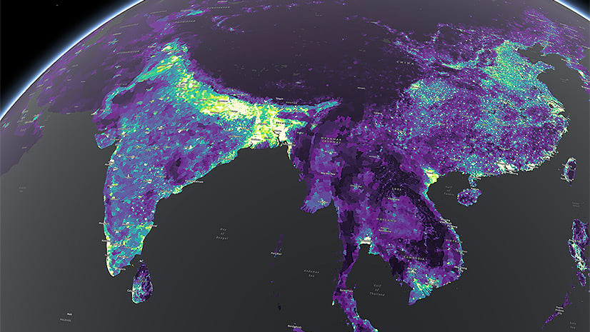
Banner image credit: Map of the Indus watershed by Cooper Thomas, for The river roads of India story.


Article Discussion: