In ArcGIS Business Analyst Web App, tabular infographics are presentation-ready infographic templates displaying modern data tables. Tabular infographics are created in the Build infographics interface. The new modern versions of Esri report templates are tabular infographics. In the future, reports and infographics will be moved to one interface.
To build your own tabular infographic, start with an existing Esri report template (found under the Tabular tab in the Build infographics interface), then update its contents with your own data. You can build a tabular infographic from scratch by adding variables from the data browser or using data from an existing custom classic report. To add variables using data from an existing custom classic report, copy the data from the Build reports interface and paste it into the infographic table panel.
How can I build a tabular infographic from scratch?
First, open the infographic builder by clicking the Reports tab and choosing Build infographics. You will need to use an existing tabular infographic as a starting point. Working with an existing tabular template ensures that you’re using the new tabular infographic styling with uniform theming. We recommend using a tabular template that resembles your existing classic report. For instance, if you’re using a multi-feature table, we recommend using the Crime Summary template as your starting point.
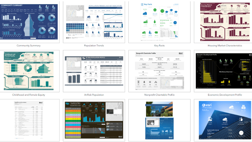
For example, let’s use the Tabular tab. Use the Filter button to show or hide categories from the tabular template collection. For the Demographics category, click Hide others. From the results, select the Retail Demand by Industry template.
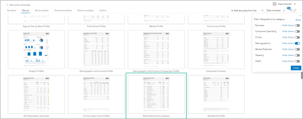
Hover over the template and click Open. This template will be modified with customized data from the data browser or an existing custom classic report. It is useful to clear each panel’s contents so that you can use it as a blank template with preset styling. Hover over a table and click Edit to open the editor window.

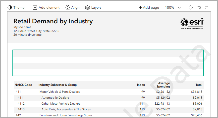
In the editor window, clear the contents of the table. Select all of the cells in the table and press the Delete key on your keyboard. Or select all the cells and click the Settings button, click the Modify table tab, and click Clear cells. Click Apply to save the changes.

Now you have a blank table with the tabular infographic styling. You can continue clearing the contents in the template or start adding new content, such as a new header and footer or variables in the tables. You can add variables starting either from the data browser or from an existing classic report.
How do I add variables from the data browser to a custom tabular infographic?
One method to customize the data is to choose your own variables using the data browser.
Use the tabular template that you created. Hover over the panel and click Edit to open the editor window. Add variables to the table from the data browser and drag them to the table. The table will automatically populate with the variable value and name.
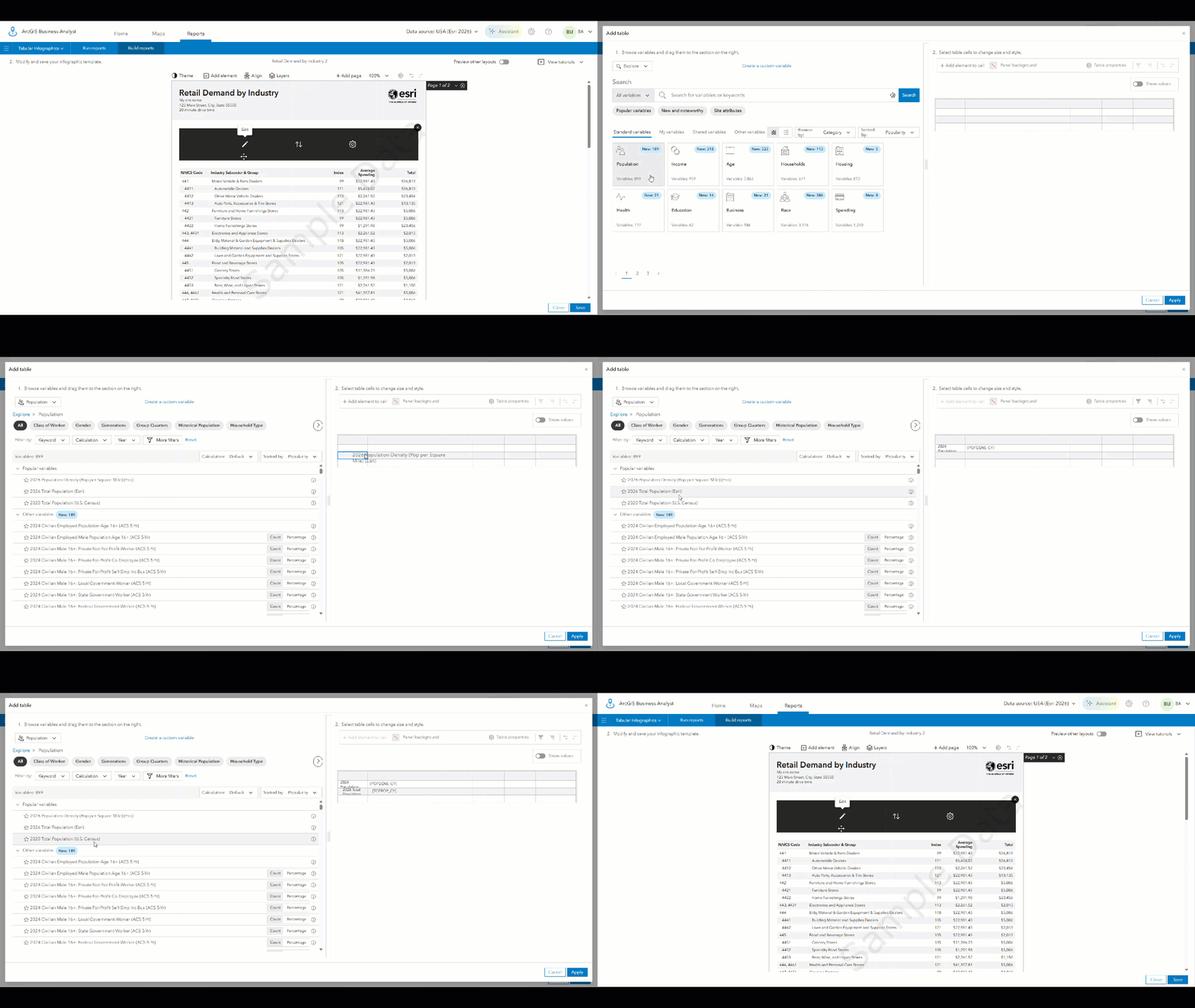
Continue to modify your table with customized headings and any additional variables that you need. Click Apply to implement the changes. You can repeat the process by adding more tables and customizing the variables selected.
How do I migrate an existing custom classic report to a tabular infographic?
You may have existing custom classic reports that you want to convert to tabular infographics. You can select the content from your classic report, copy the variables, and paste them into your blank tabular infographic template.
Start with the tabular template that you created (open for editing in the Build infographics interface). Then, go to your custom classic report template by clicking Build reports on the Reports tab. Select one of your custom reports and drag the report sections that you want to use from the existing report into the report template. Alternatively, you can add the full report by clicking + Add full report.
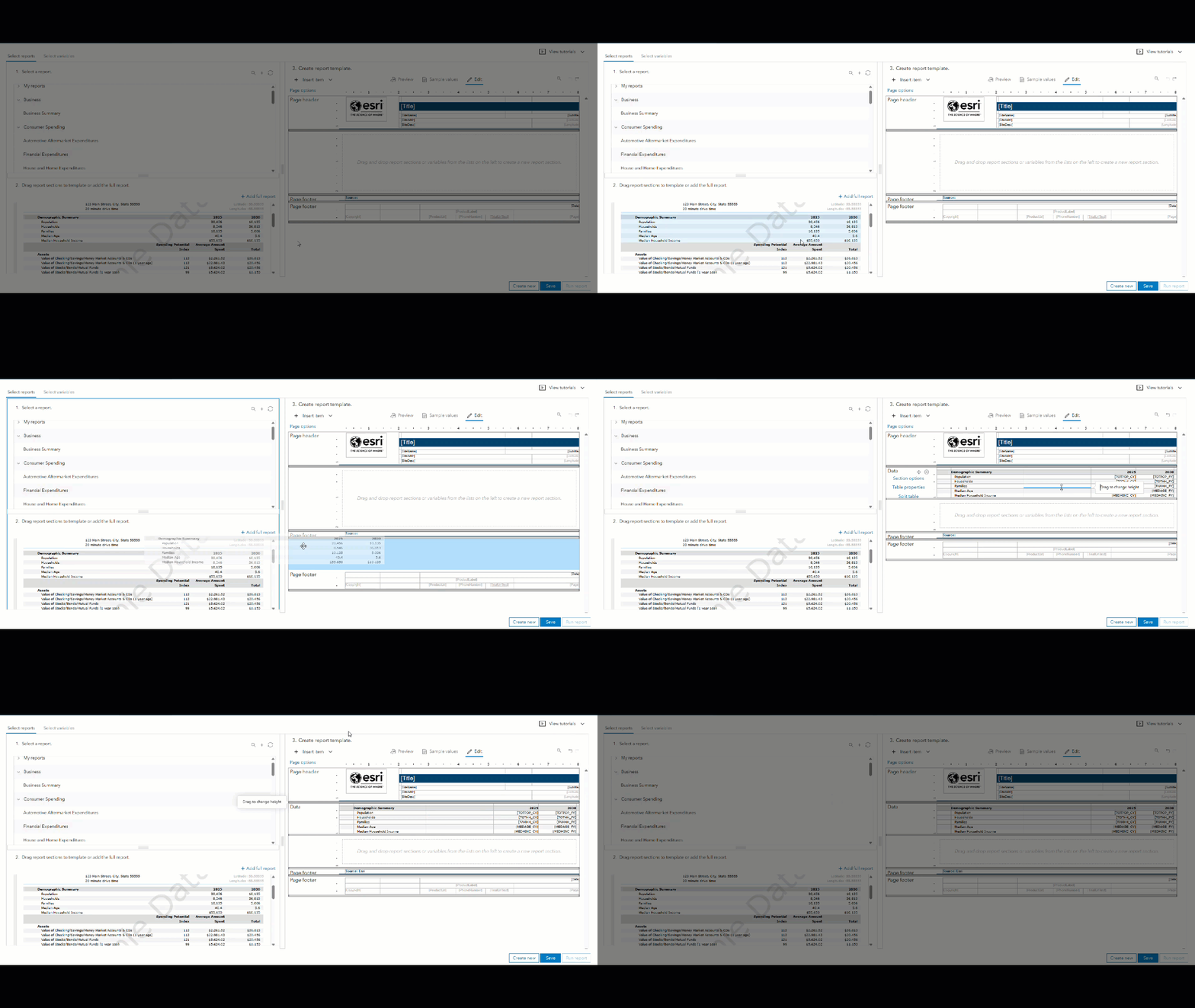
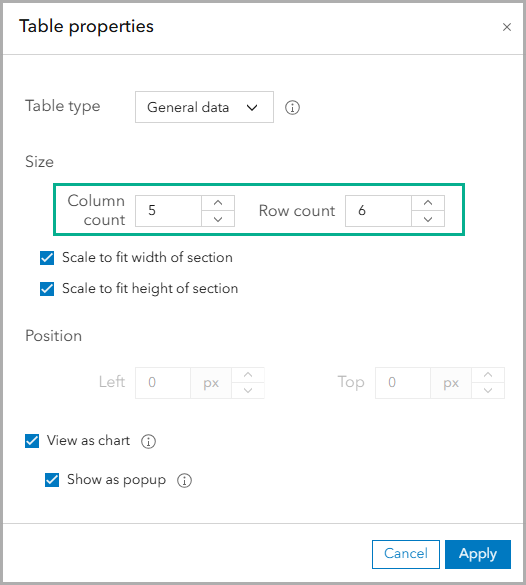
Return to the blank template that you created with a tabular infographic panel as a style reference by clicking Build infographics on the Build reports tab. Hover over the table, and click Edit. In the editor window, click Table properties. Modify the panel with the number of rows and columns to match the table in the classic report. Click Apply to implement these changes.
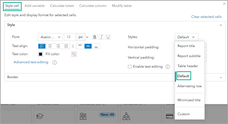
Since you started with the existing tabular template, styles for table theming are automatically applied. To check the styling of the table, highlight a cell (or cells), click the Edit button, and select the Style cell tab. Using the Styles drop-down menu, the tabular styling is:
- Table header style for top row
- Default style for unshaded rows
- Alternating row style for shaded rows
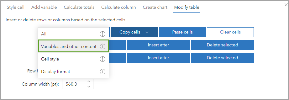
Return to the custom classic report by clicking Build reports on the Build reports tab. Click the Edit in the report section, and highlight the data that you want to copy. Click the Edit button to open the settings, and click the Modify table tab. Click the Copy cells drop-down menu and select Variables and other content. The values and names of the variables are copied to your clipboard.
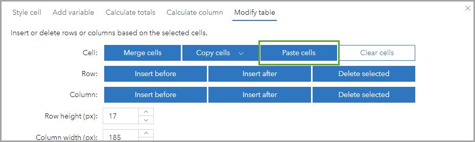
Navigate back to the infographic template by clicking Build infographics on the Build reports tab. Hover over the table and click Edit. In the editor window, highlight the cells in the table. Click the Edit button to open the settings, and click the Modify table tab. Click Paste cells to paste the variable names and values from the custom classic report into the table. Click Apply to implement the changes.
Now you have data from the custom classic report in the tabular infographic formatting. If necessary, you can edit the table, such as removing empty columns.
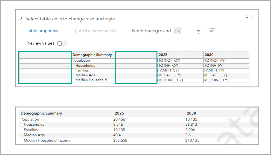
You can repeat the process by adding more tables and copying data from classic reports.
How can I modify the template?
You can modify your template for both design and content. We’ve covered how to add data from the data browser or an existing custom classic report above. In terms of customizing the design, there are endless customizations that you can make. Some customization options include:
- To change the theming for the entire tabular infographic, click Theme and click Advanced options. Use the Table settings to select your preferred color scheme and fonts, and click Apply. The new settings are applied to the entire tabular infographic.
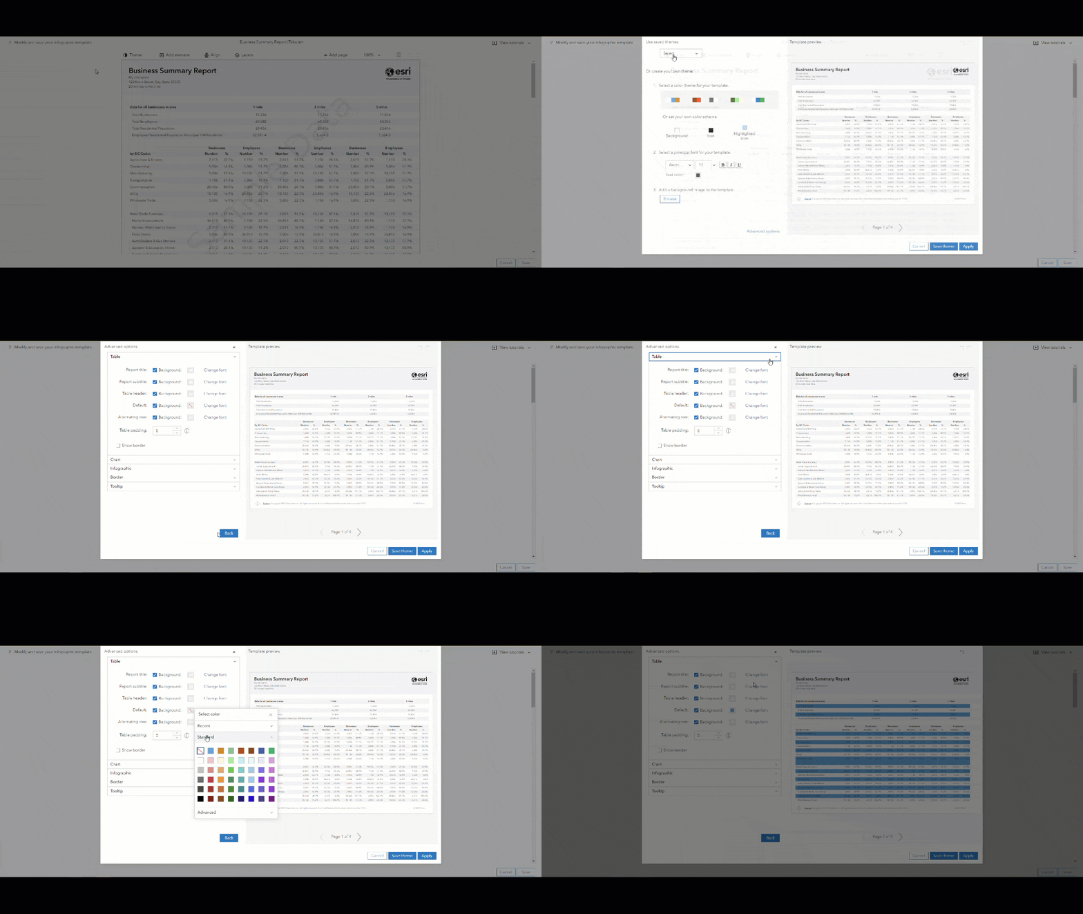
- To add your logo, hover over the existing Esri logo and click Delete. Then work with images as usual, by clicking Add element and clicking Logo. The logo that you set in your app preferences will appear.
- To edit a table, hover over a table and click Edit. Modify the table as usual by changing the variable selection, the font and font size, and background color.
This article has introduced you to creating custom tabular infographics. It described how to create a custom template, how to add variables from the data browser, and how to migrate data using an existing custom classic report. These workflows are flexible and can be customized. It is recommended that you save the custom template you created to have a ready-to-use style reference. You can also create a custom tabular infographic using existing tables from the tabular infographics and configure them to your preference. Please use the feedback option at the bottom of this blog article or post on Esri Community.
Resources
Now that you’ve learned about building tabular infographics and converting custom classic reports, we hope you’ll explore more capabilities in Business Analyst. To continue your Business Analyst journey, visit the following resources:
- Business Analyst product overview page
- Review pricing and purchase Business Analyst
- Business Analyst resources page
- LinkedIn user group
- Business Analyst Web App video channel
- Business Analyst Pro video channel
- Business Analyst on Esri Community
- Business Analyst Web App login page
- Email the team: businessanalyst@esri.com
This article was originally published on October 31, 2023 and has been updated.
This article uses ArcGIS Business Analyst Web App Advanced to create custom infographics.


Article Discussion: