
Business Analyst (BA) Web infographics are a powerful way to understand demographics and other information in context. In this blog I am going to explain how your organization can use the Coronavirus infographic template that was added to the infographics gallery on the 1st of March, 2020.
What are Business Analyst Infographics?
First a little bit of background. BA infographics are authored in BA Web and can be accessed in ArcGIS Pro, Business/Community Analyst on the Web or in the BA Mobile app. In addition to being a great interactive and immersive dashboard, BA infographic templates can be shared across an organization, in an ArcGIS Online group or via a portable document type known as a BRPT file.
You can customize the look and feel of infographics to match your organization brand, export them as an image, interactive HTML or pdf and copy individual elements from different templates to customize an infographic to have exactly the information you want, displayed in the way you feel is most easily understood by your audience.
The Coronavirus Infographic Template
The Coronavirus template is found in the Template Gallery in BA/CA Web.

To access the template, first login to Business or Community Analyst and create a new project if needed. Existing users may need to logout and back in to see the new template in the gallery.
Navigate to the template gallery by selecting Reports > Build Reports > Build Infographics > Standard Templates from the workflow bar at the top of BA/CA Web. Next click on “+ Add Template” and then choose Browse Gallery from the menu list.

You will now see thumbnails of all the shared infographics contained in the template gallery. The Coronavirus infographic can be found in the second column of the last row of the gallery.

You can also sort the gallery by date, or use the search window to find infographics based on name, topic, tags and data collections.

Any infographic you create, edit or copy from the gallery, including those that are shared by your organization, are saved into the My templates section of the infographics designer.

Using the Infographics Designer to Run, Review and Edit the Template
To access the Coronavirus template you need to navigate to the infographic designer. Select Reports > Build Reports > Build Infographics > My Templates from the workflow bar at the top of BA/CA Web.

The templates you create, templates shared by other users that you saved, and templates added from a file or gallery are all stored in My Templates.
Note that there are also other galleries and collections that you can use immediately with BA/CA. I recommend you explore some of the templates at a later date, to discover useful panels and charts that you can use when building and customizing your own infographics.

The Coronavirus template you added from the gallery should now be shown in your My Templates folder.

To make the infographic available to ArcGIS Pro or to customize the infographic you must open and save your local copy.
Note that you can make edits to this infographic without effecting the original in the gallery.
Hover over the thumbnail and click “Open” to begin editing.

Next click the blue “Save” button at the bottom right of the infographic designer.
Each infographic contains a set of metadata that you can expand and edit. The graphic below shows the metadata for the infographic which also contains details of data vintage and source which are automatically built based on the data used in the infographic.
You can save it with the same name (Coronavirus Impact Planning Report) or add your own name to differentiate it from the gallery version. You will be prompted to replace the file, which saves it into your own local folder. You can replace the current name with your version at this point. When the infographic is saved you will return to the infographic thumbnail library view and are ready to start using it in BA/CA Web, BA Mobile or ArcGIS Pro.

Running the Coronavirus Infographic in BA/CA Web
To use the Coronavirus infographic in BA/CA Web you must first select the area for which you want to get information. Most infographics will be run on an administrative area like a state, city, town, ZIP Code or county. You can run the infographic on any area you create or select; including drive times, rings, areas imported from ArcGIS Online and hand drawn shapes. You can use this help documentation to learn more about how to define and find specific locations.
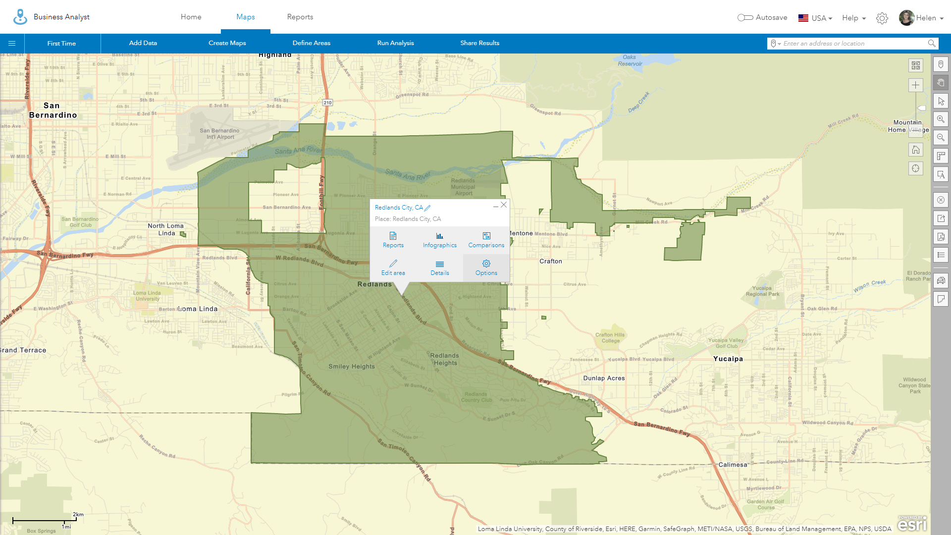
For this blog I and going to use select geography to find and zoom to the City of Redlands.
Use the Maps > Define Areas > Select Geography workflow to bring up the “Select Geography” panel.

You can now select a geography by typing in a name, clicking on a specific geography type on the map or navigate the boundaries by name, geography or type.

Select “Search” to bring up the search box and type in City of Redlands. Click the radio button to add the outline of Redlands to your map.


Click Next and “I’m Done” on the next two panels to finish this workflow and dismiss the project panel. You will now have the City of Redlands boundary shown in the map window with the default colors you or your administrator have set for user selected areas, as shown below.

Use the “Infographics” icon, in the popup that appears within the shade boundary of the City of Redlands, to access the Coronavirus infographic.
BA/BA Web, ArcGIS Pro and BA Mobile allow you to set the default infographic template which is run each time you click on the infographics button. The default infographic for all new users is Esri’s Key Facts template. To run the Coronavirus infographic template or make it the default template you will need to use the templates pulldown highlighted in the top left corner of the infographics menu bar.

Use the down arrow to expand the list of your templates by scrolling through the Esri templates or collapsing the template list. By hovering on the Coronavirus Impact Planning Report name you can bring up a set of additional actions.
Use the blue “Make Default” option to make the Coronavirus template the default or simply run the infographic by clicking on its name in the “My Templates” list. If you make the Coronavirus template the default, its name will be highlighted in blue every time you access the infographic template list menu.

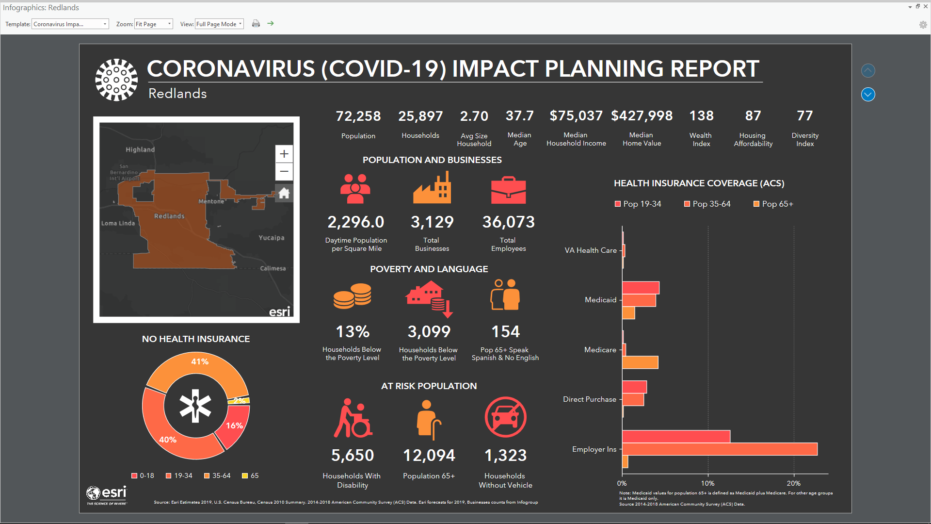
The infographic will now be generated, and all the charts, tables and panels populated with specific insights for the City of Redlands. The infographic has two pages so you can explore the second page of insights using the navigation buttons on the right-hand side of the infographic view.
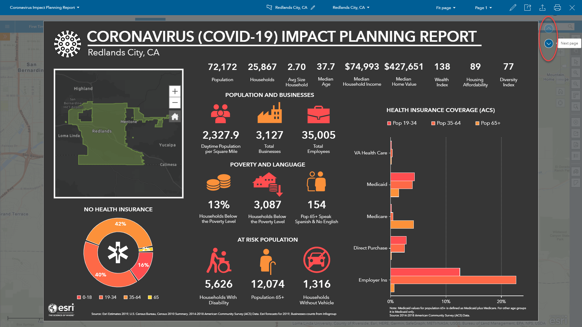

You can click on many of the icons on the first page to explore the immersive experience and get more details on the topic summarized in the infographic group. The screenshots below explore the types of businesses in Redlands.


Setting the Color of the Selected Geographic or Area of Interest
You will notice the map section in the infographic shows the City of Redlands in green, the default color defined in user settings for Select Geography. To change the color onscreen and in your infographic, exit the infographic viewer using the X – Close button at the top right to return to the map view.
Next click on Options in the area popup
And use the fill and border options to set the color, line thickness and transparency to meet your needs.
To set these colors as your personal defaults which are applied every time you use the Select Geography workflow, click the Save button in the popup and Save and Close in the Setting Panel when it appears. When you are happy with the colors click the blue OK button.


The infographic uses the Dark Gray Canvas to select colors which complement this basemap. You can change the basemap using the selection widget at the top right-hand side of the map window.


Changing the basemap in the Coronavirus infographic requires editing the infographic using the infographic designer and is not covered in this blog.
Changing the Site Name of Your Study Area
You may want to change the site name that is used in the infographic, on the popup or that appears when you hover of the area of interest onscreen. To do this, click on the pencil icon next to the blue site name text at the top of the popup and add a new name. Your new name will appear in the Coronavirus infographic each time you run it.

Running the Coronavirus Infographic in ArcGIS Pro
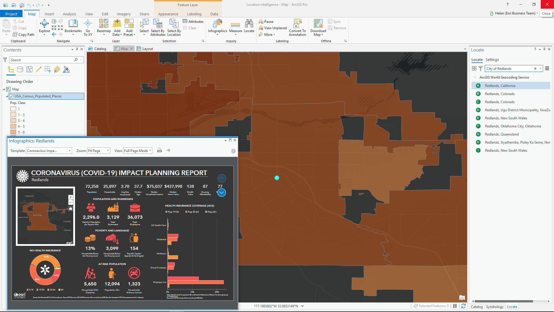
To use the Coronavirus infographic in ArcGIS Pro navigate to your area of interest and add the appropriate layers or features to the map. You can use the USA Census Populated Places layer to find the same City of Redlands boundary used in the BA Web search example shown above.
Once you have the areas you want to explore use the Infographics button on the Map ribbon to run the infographic. You can navigate through the Esri sample infographics to find the infographic you saved in My Templates.
You can view the template in full screen mode, zoom in at different scales and navigate across different pages using the same familiar controls as BA/CA Web. Note that you cannot edit the infographic in ArcGIS Pro as this is only available in the BA/CA Web infographic designer.
Exporting Infographics to Interactive HTML, PDF or PNG Image
Both ArcGIS Pro and BA/CA Web allow you to export an infographic to multipage interactive HTML, PDF or PNG image. PNGs will be exported into a ZIP file with one image per page. PDF and Image formats are static exports, while Interactive HTML allows you to preserve all the exploratory and immersive functionality of the infographic even when exported. You can add and embed the interactive HTML or image(s) into a website.
Once exported the infographic does not require the reader to login to BA/CA Web or ArcGIS Online and they can generate their own local prints using either PDF or image format.
To export an infographic choose either the green arrow button in the ArcGIS Pro infographics viewer or the export infographic icon at the top of the blue actions bar in BA/CA Web.

Next select your export type, layout and other parameters as shown below.

When exporting to interactive HTML you can choose to disable the progressive, immersive experience so that the reader only sees the summary and create an embedded static map for secure and private viewing when you do not want to provide access to other map layers or popup information you have provided in the infographic.

We Appreciate Your Feedback
Now that you’ve learned about how to import and use the Coronavirus infographic, we’d like to hear about how it’s helped you better understand your community. Feedback is also welcome on the Coronavirus infographic itself or features you want to see in BA/CA Web too.
We’ve a lot more information that can help you with creating and enhancing infographics, including a gallery of my infographics that you can access via this link.


Article Discussion: