Exciting news: In July 2026, we are introducing two new Void Analyzer infographics in Business Analyst Web App. These infographics allow our users to quickly identify which business chain brands are present or absent in their area of interest. They can be used for business-focused activities such as conducting competitor analysis, evaluating the local commercial landscape for partnership opportunities, or assessing market entry risks.
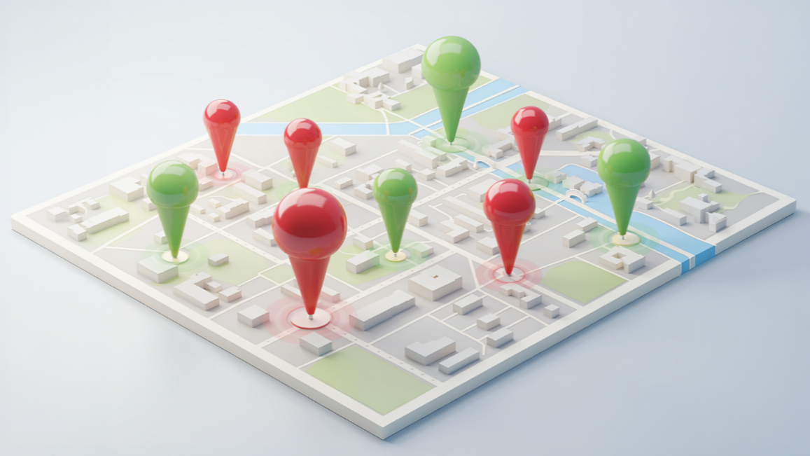
An early version of this concept was previewed at the International Council of Shopping Centers (ICSC) conference in May 2026. As designed, these infographics are likely to be of most interest to our commercial real estate and retail customers.
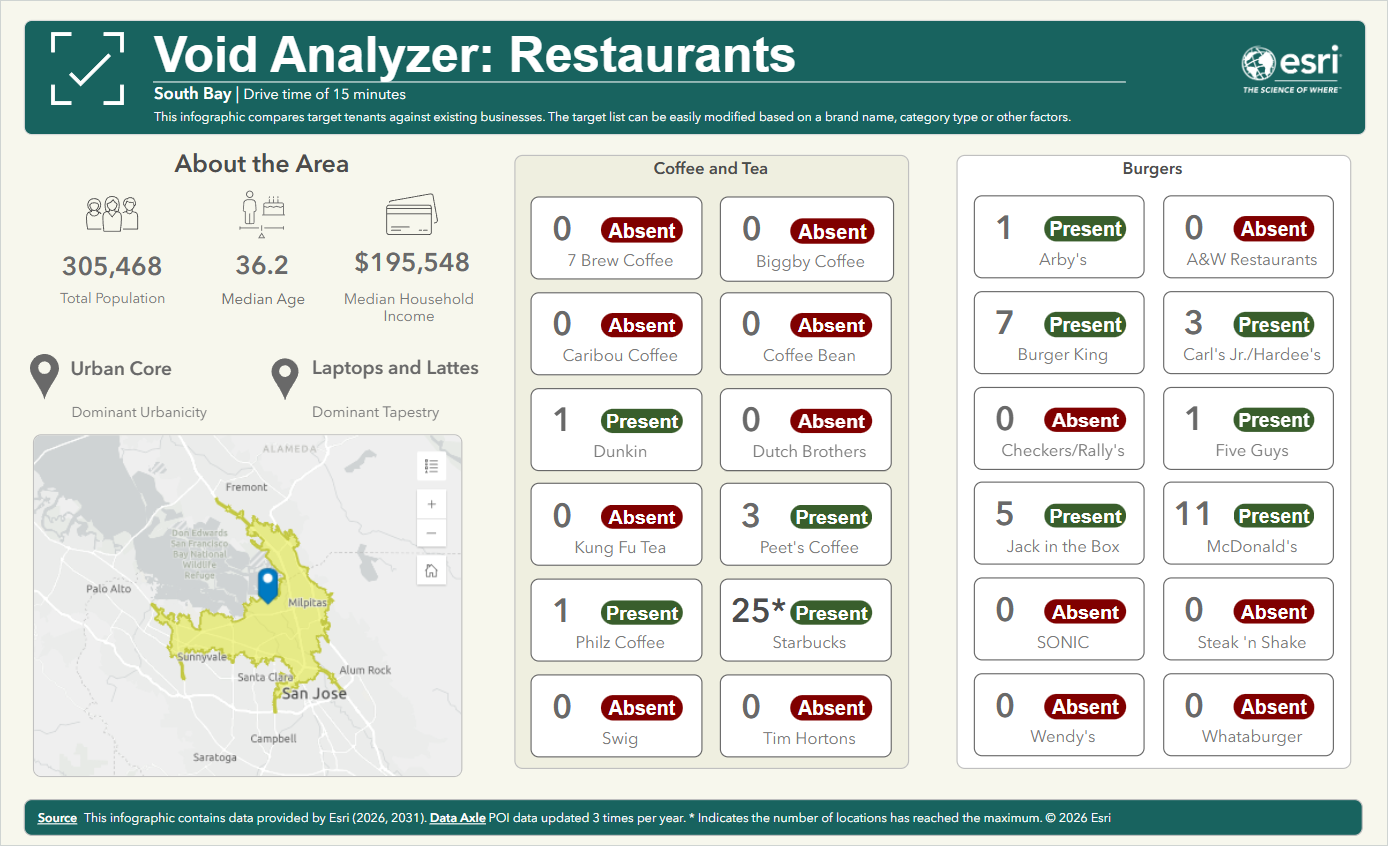
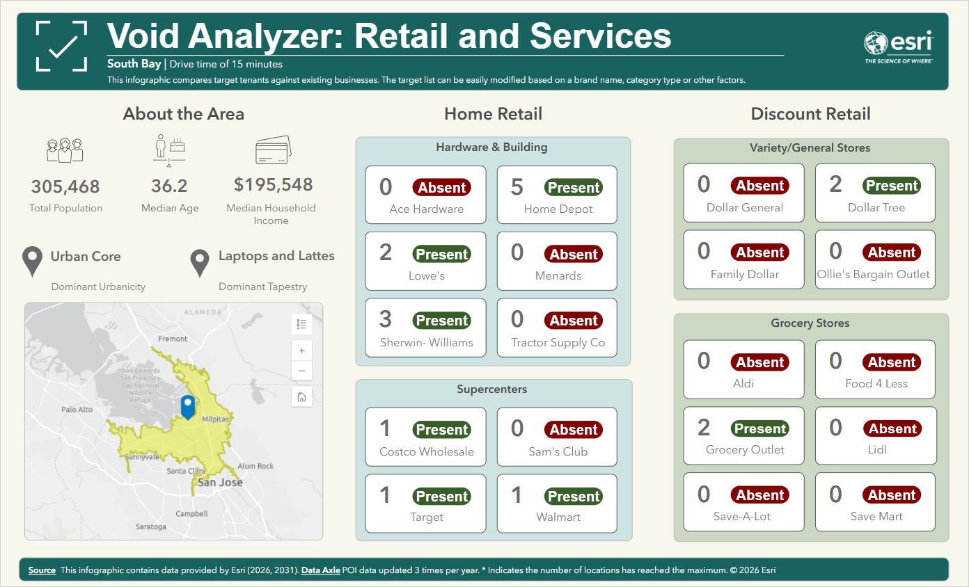
The first infographic, Void Analyzer: Restaurants, features four pages of restaurant brands across sectors such as burgers, coffee and tea, sandwiches, and more. The second infographic, Void Analyzer: Retail and Services, presents four pages of retail and services chains, including sectors like grocery, automotive, health, banks, and discount retail.
Both infographics can be found in the infographics Gallery section. Use these Void Analyzer infographics for areas as small as a shopping center or as large as an entire state. Both infographics are built using Data Axle business location data. The brands shown by default were chosen because they have a large number of locations, either nationally or locally.
Void Analyzer: Restaurants
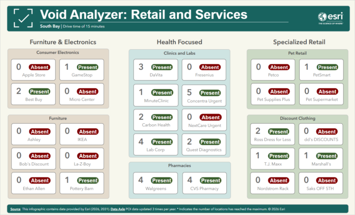
Void Analyzer: Retail and Services
Anyone with a Creator user type or above has access to Business Analyst Web App Standard and can run the Void Analyzer infographics for their sites. Web App Advanced users can customize the infographics to change things like the business sectors and brands shown.
For this initial release, these infographics are available only for the United States. International program partners interested in offering this infographic in their countries are encouraged to contact the Business Analyst team to find out how.
Explore the Void Analyzer
Below are the basic steps for running an infographic, which can be run in both Business Analyst Web App Standard or Business Analyst Web App Advanced.
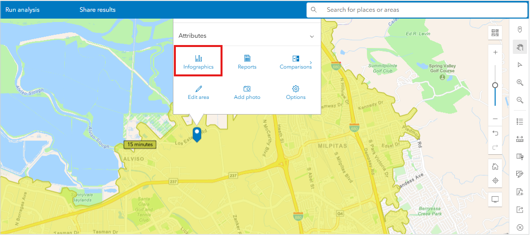
Create a site. For this example, we will do this by putting a pin on the map, then creating a 15-minute drive time around that point to make the site.
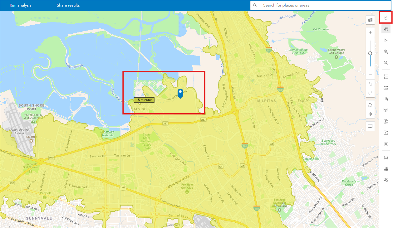
Next, click the pin to bring up an options window. Select the Infographics option.
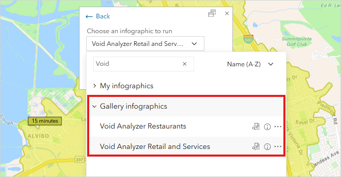
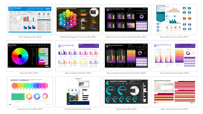
Next, expand the section for Gallery infographics. Or, if you start typing “Void” into the search box, the two Void Analyzer infographics should appear at the top of the list.
The Void Analyzer infographic chosen runs automatically.
Edit the Void Analyzer
Note: Editing capabilities for infographic templates are available to Business Analyst Web App Advanced users only.
Let’s say we want to change one of the default convenience store chains in the Void Analyzer Retail and Services infographic. We also want to change the number of possible stores returned from 25 to 100. To begin, navigate to the Reports tab and click Build reports – Build infographics.
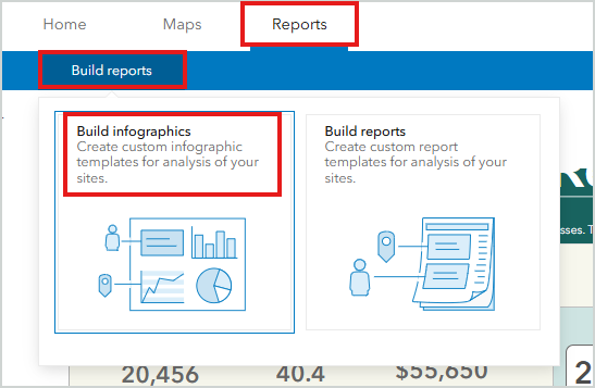
Under Gallery, see the new Void Analyzer infographics. Click the Void Analyzer – Retail and Services infographic to open the editing view. Hover over the brand you want to change and click the Edit button.
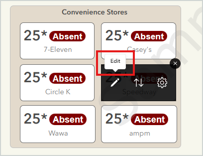
From there, select Update attribute fields and filters. This will open the Add nearby locations window.
We want to change the brand filter, so skip past the first window by clicking the Next button in the bottom right corner.
In the second window, adjust the Filter by attribute option to show the desired chain name. Press Apply to complete the change.
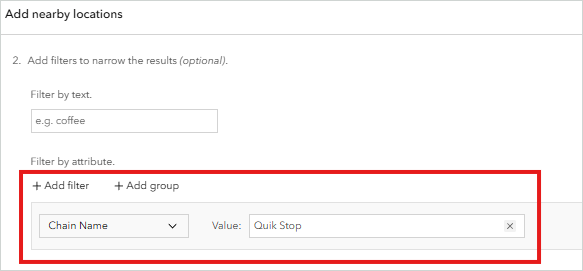
Note: With Data Axle data, businesses like Ace Hardware would be identified using the Affiliated Org field rather than Chain Name. Company Name is another option for filtering. Records can be further filtered by geography values (such as a specific state) or with numeric values such as a minimum number of employees.
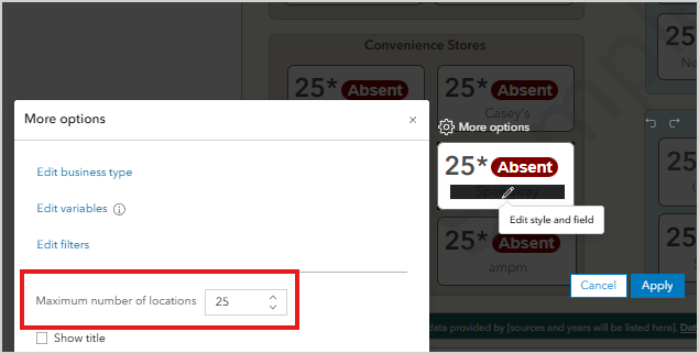
Once the filter has been updated to a new chain name, we will change the number of results returned and the chain name label. To do so, go back to the Edit box, and this time select Edit infographic style.
In the More options window, increase Maximum number of locations to 100. Then hover directly over the chain name label until the pencil is visible and double-click. This opens a new window where the label can be edited. Click into the editing box and change the name. If desired, change other aspects of the label including color and size.
Note: Edited infographics are saved to your My infographics group, not the gallery.
Where do I get more information?
We hope this has been a useful introduction to the new Void Analyzer infographics available in Business Analyst Web App. To continue your Business Analyst journey, visit the following resources:
- Business Analyst product overview page
- Review pricing and purchase Business Analyst
- Business Analyst resources page
- LinkedIn user group
- Business Analyst Web App video channel
- Business Analyst Pro video channel
- Business Analyst on Esri Community
- Business Analyst Web App login page
- Email the team: businessanalyst@esri.com
This article uses ArcGIS Business Analyst Web App Standard for running and viewing the infographics; it uses ArcGIS Business Analyst Web App Advanced for editing the infographics; it uses Data Axle points of interest data.


Article Discussion: