The March 2019 update to the ArcGIS Business Analyst Web App has arrived! Here are the key highlights of this release:
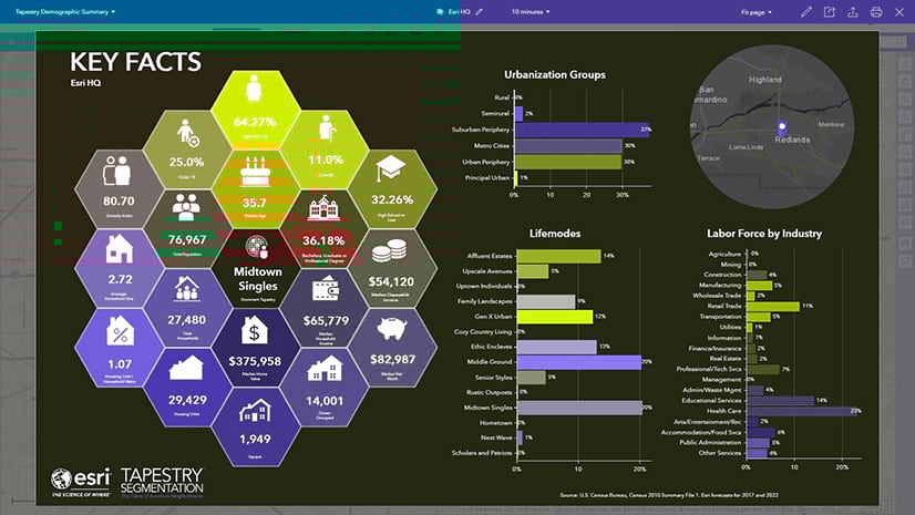
Better, Professional Infographics at Your Fingertips
We’ve added seven brand-new visually stunning starter infographic templates to the Business Analyst Web App to help you summarize your data and analysis. All of the available infographic templates are easily customizable to reflect your company’s logo, branding, and variables of interest. Whether you are trying to gain an understanding of the employment opportunities or health statistics for an area, the infographics in the Business Analyst Web App have you covered.
The following are the infographic templates that have been added with this release.
- Commute Profile: Information about how population 16+ travels to work.
- Demographic Profile: Key facts such as population, education, income, and employment.
- Employment Overview: Employment information, income, total business, education, commuters, and other facts.
- Health Care & Insurance Statistics: A set of major demographic and health care indicators.
- Office Market Profile: Demographic, market potential, and spending indicators to understand market opportunities.
- Property Details: Site details, household spending, and demographics for an area.
- Target Market Summary: Crucial facts, lifestyle spending, tapestry segments, and an age pyramid.
You can read more about Business Analyst infographic templates and how to build your own here.


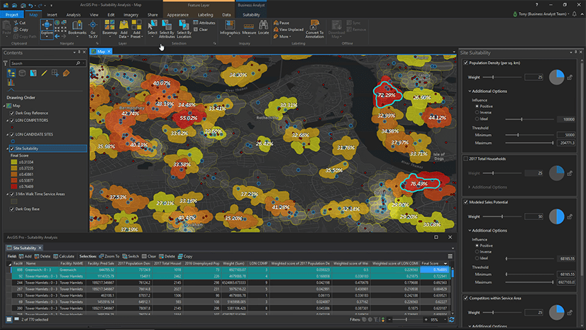
Get More Out of Comparison Reports
Interactively compare sites easier than ever using informative benchmark tables, beautiful charts, and more in the new Comparison Reports workflow.
The old Comparison Reports workflow has been removed with this release, but there’s no need to worry! Its replacement, the new Comparison Reports workflow, is already available in the application. The new workflow gives you all the old Comparison Report features and so much more.
You can read more about how to migrate to new Comparison Reports here.

Access Crime Data for Reporting
Use a new Esri Crime Summary report that helps you understand crime statistics for seven major categories of personal and property crime. You can now use the crime data in custom reports, infographics, and comparison reports to classify crimes by local demographics and type of incident.

Add Nearby Location Counts and Summaries
ArcGIS Business Analyst Web App users can now summarize attribute values in Nearby tables. When running infographics with a Nearby table, click the gear icon, choose the attributes that you want to summarize, and see the results added at the bottom of the table. Optionally, you will be able to choose to display the Nearby table as a summary count in its own panel.

Modern Symbology for Your Mapping Needs
Hundreds of new map markers are now available to symbolize locations the way you want. Start with vector graphics and color them to present locations with the best visualization. In the example below, we represented coffee shops with coffee cups as the symbology.

Combine Dot Density Visualization with Color-Coded Maps
Business Analyst Web App users now have a new option to display dot density maps with a color-coded background. You can view one variable represented in the dot density style in the foreground and a second variable with a color ramp background map. In the example below, we chose to show the total population using dot density mapping shaded by a color-coded background map of median household income.

Use Top Consumer Segments for Canada
Determine the top three consumer segments for any area in Canada using PRIZM5 segmentation data. Simply add the PRIZM5 segments panel in your infographics and run it for any area.

Use Web Layers Directly in Reporting Workflows
Business Analyst Web App users can now bring in location layers from ArcGIS and run reports, infographics, and more without having to convert them into sites. With the new Setup layer option, you can use services already published in ArcGIS in Suitability Analysis, Infographics and reports without the need to duplicate locations. The Setup layer feature also allows pre-filtering by attribute and by map extent.

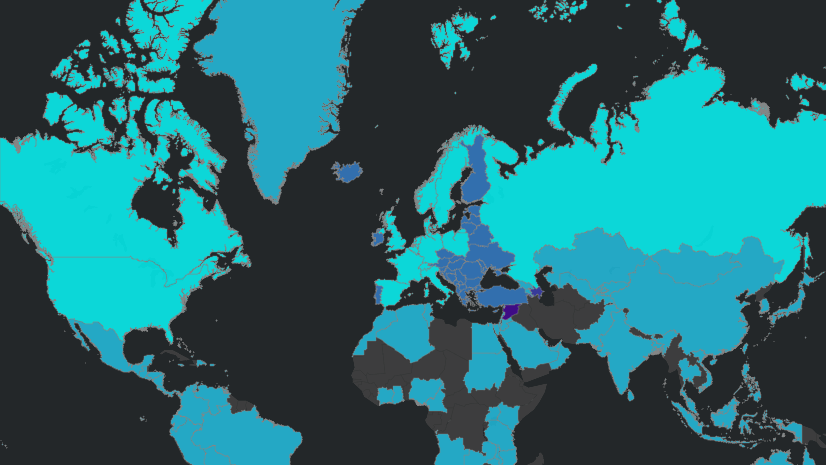
Data Update
With this release of ArcGIS Business Analyst Web App, we have very exciting updates to our data that is now available for users:
ArcGIS Business Analyst Web App now has new advanced data for the Netherlands sourced from 4Orange. Working with Esri Netherlands, we are releasing a new, advanced dataset summarizing socioeconomic, life stage, and personal interest data for Dutch consumers. This data, available at the five-digit postal code level, will provide additional attributes covering:
- Demographic and Socioeconomic topics: Households, Population, Age, Education, Household Size, Stage of Life, Habitation, Heating Fuel, Home Value, Housing Type, Year Built, Income, Industry, Profession, and Marital Status.
- Behavioral topics: Alcohol Consumption, Automotive, Charity, Cultural Engagements, Sports, Internet, Social Media, TV, Pets, Travel, Personal Viewpoints, Buying Behavior, Internet Shopping, Finances, Insurances, Retirement, and Mobile Phones.
- Segmentation: Personicx Lifestyle Segments.
U.S. data updates for businesses locations and DMM major shopping centers to January 2019, Kalibrate traffic data to Q4 2018, and Crime data to November 2018.
Michael-Bauer Research data update to 2018 vintage for 18 countries including New Zealand, Panama, United Arab Emirates, Venezuela, Qatar, Oman, and more.

We’re so happy to share this Q1 2019 release of ArcGIS Business Analyst Web App with you. Below you can find some links for Business Analyst that you may find useful.
- Business Analyst webpage
- Business Analyst Web App login page
- Business Analyst data & reports
- Business Analyst YouTube playlist
- Esri global data overview
- Esri U.S. data overview
- Business Analyst help and documentation pages
- GeoNet Community
- LinkedIn user group


Commenting is not enabled for this article.