A grid graph is a popular infographic that is often used to visually represent percentages. Studies have shown that combining relevant images with numerical text improves readability and increases what the audience remembers after 3 days by 650 percent!
Usually, grid graphs show data up to 100% using a 10 x 10 grid. Like the animated example below.
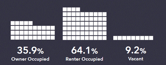
Business Analyst Web does not have a grid graph chart type, so we need a creative way to produce one. The answer is to use a table and take advantage of conditional image styling rules to turn each cell (row) in the table into the appropriate visualization. Because we are dealing with a maximum of 100%, we can use 10 rows, and slice the ranges in groups of 10 (0-10, 11-20, 21-30, etc). We then configure image rules on a row by row basis to display different images based on the unit value of the attribute (0, 1, 2, 3… 10, 11, 12, 13… 20, 21, 22, 23… etc).
In this way, we have 11 rules per row, configured for 10 rows stacked on top of each other.
The following workflow provides a step-by-step guide to creating a grid graph chart.
Step 1: Create the Grid Graph Table
Using a blank canvas layout, add a new floating panel, then select the table option to add a blank table comprising 10 rows by 1 column.

Click apply and then resize the panel so that it is square, in this example 250 x 250 pixels.
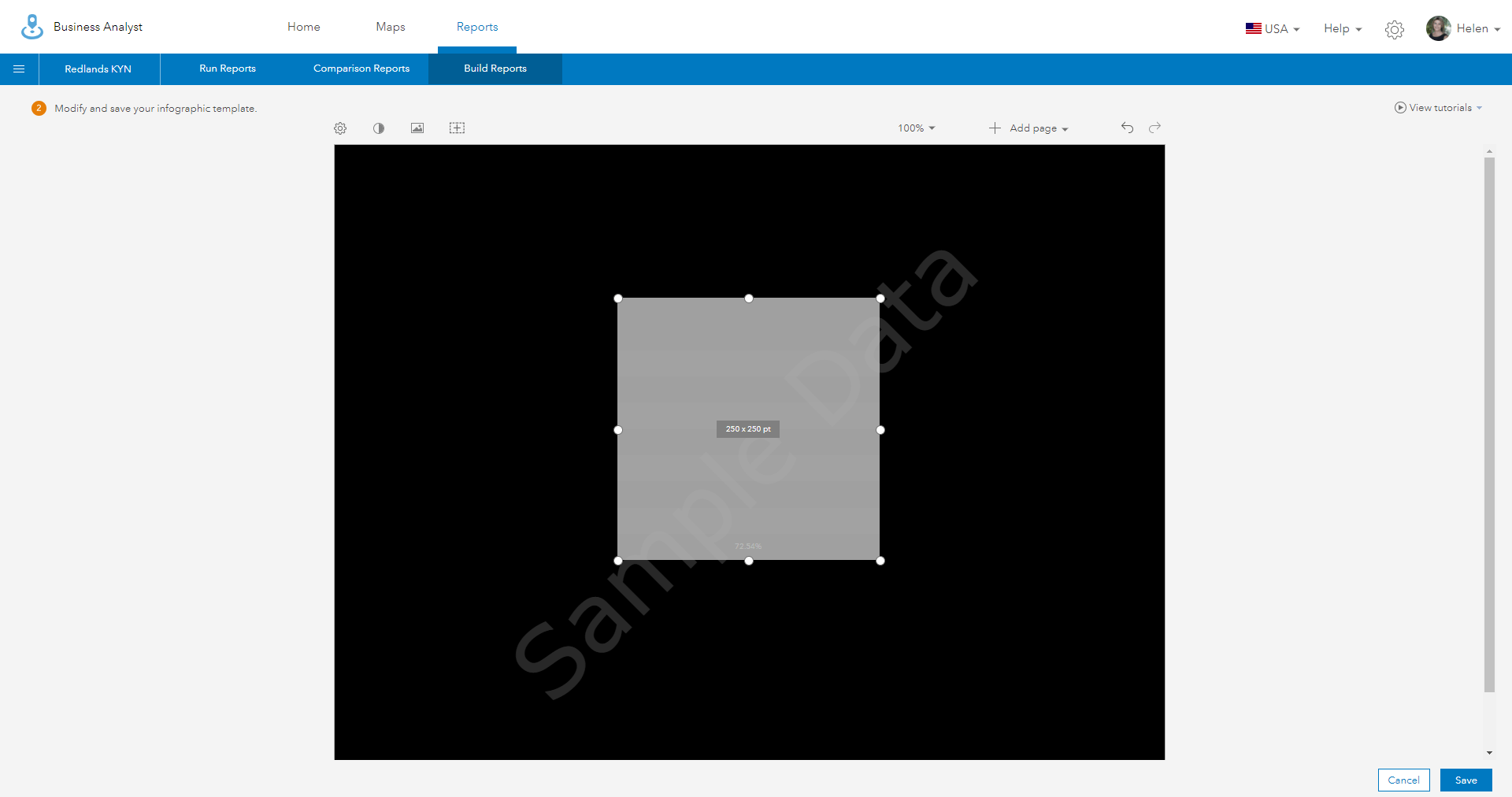
Step 2: Add the Attribute
Edit the resized panel and remove any cell styling or background colors. Now add a percent-based attribute (such as Owner Occupied Housing Units) to the bottom row, ensuring that your attribute is centered both horizontally and vertically.
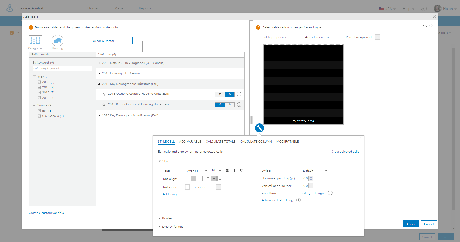
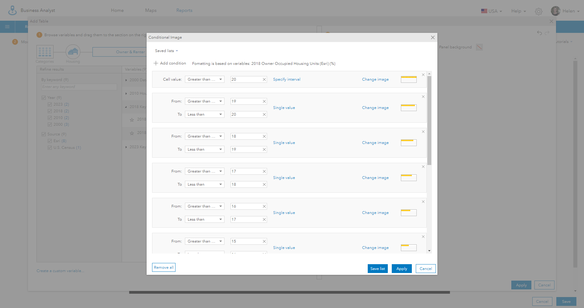
Step 3: Add a Conditional Image Style
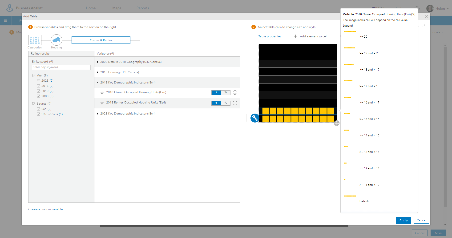
Use the wrench or spanner icon to select the cell style, conditional image style, and add 11 conditions one for each image state representing the values of 0 through 10. The first condition will use a single value and the rule “Cell value is Greater than or equal to” 10.
For each of the other values, use an interval condition using the “Less than” and “Greater than or equal to” conditions to specify ranges for each number, as shown below.

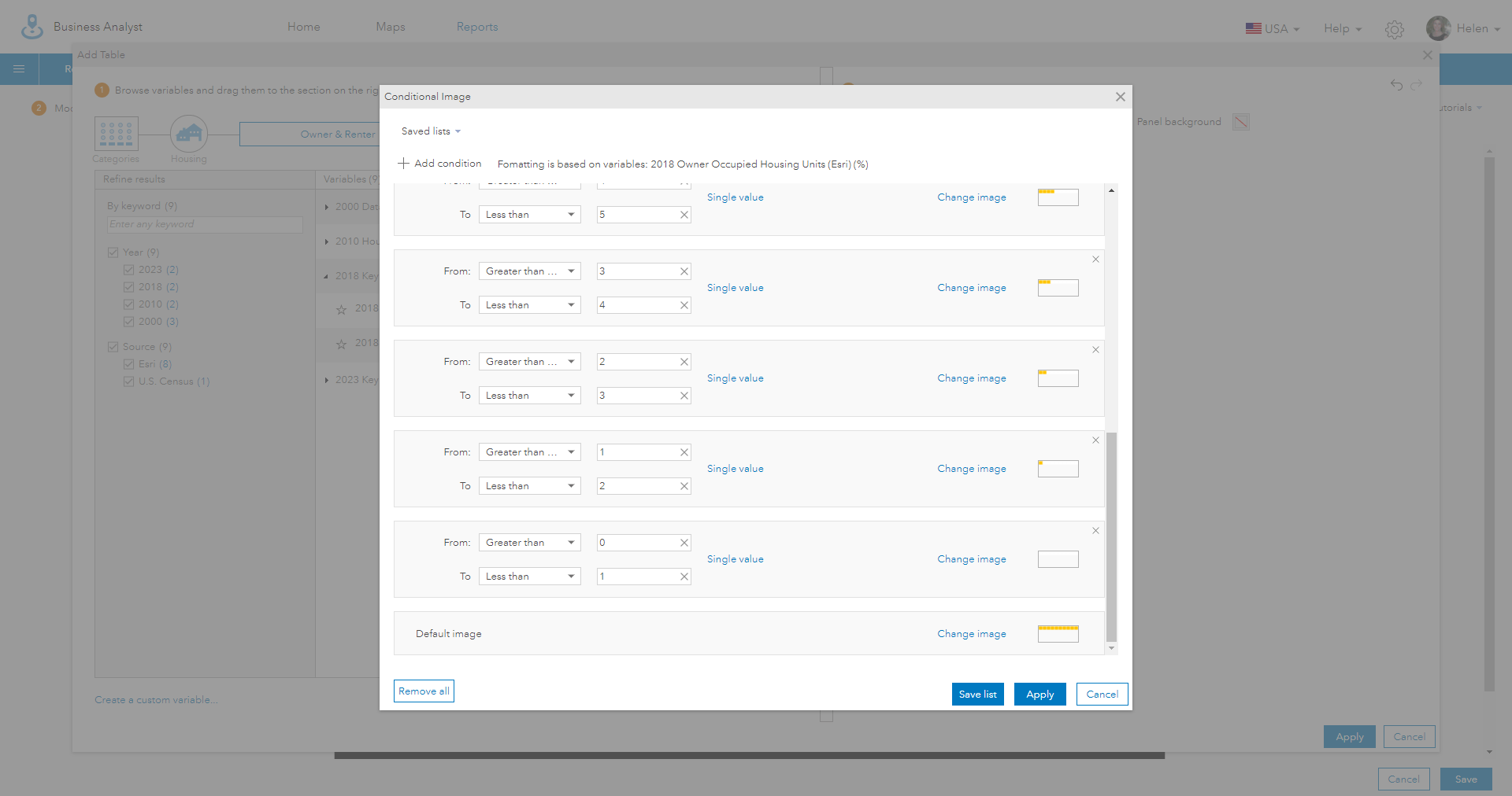
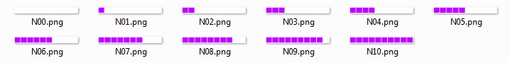
Step 4: Add an Appropriate Image for Each Interval
Click on the image box or use the “Change image” button to set the image for each of the conditional tests. When the cell value is greater than 10 the image should contain a row of 10 grid squares, when the value is 9 use an image with nine grid squares, and so on.
A link to a library of royalty free images, which you can use to create grid graphs in over 30 different colors and 4 styles, is included at the end of this blog
Note: Ensure that you make the default image the same as the maximum value in the interval class, so that you can see the styles that have been applied to each row when you are editing the infographic.
Step 5: Use Copy and Paste to Replicate the Cell Styling
Use the “Modify Table > Copy Cells” option to copy all the different attributes and styling from an individual cell and paste it into another cell or set of cells.
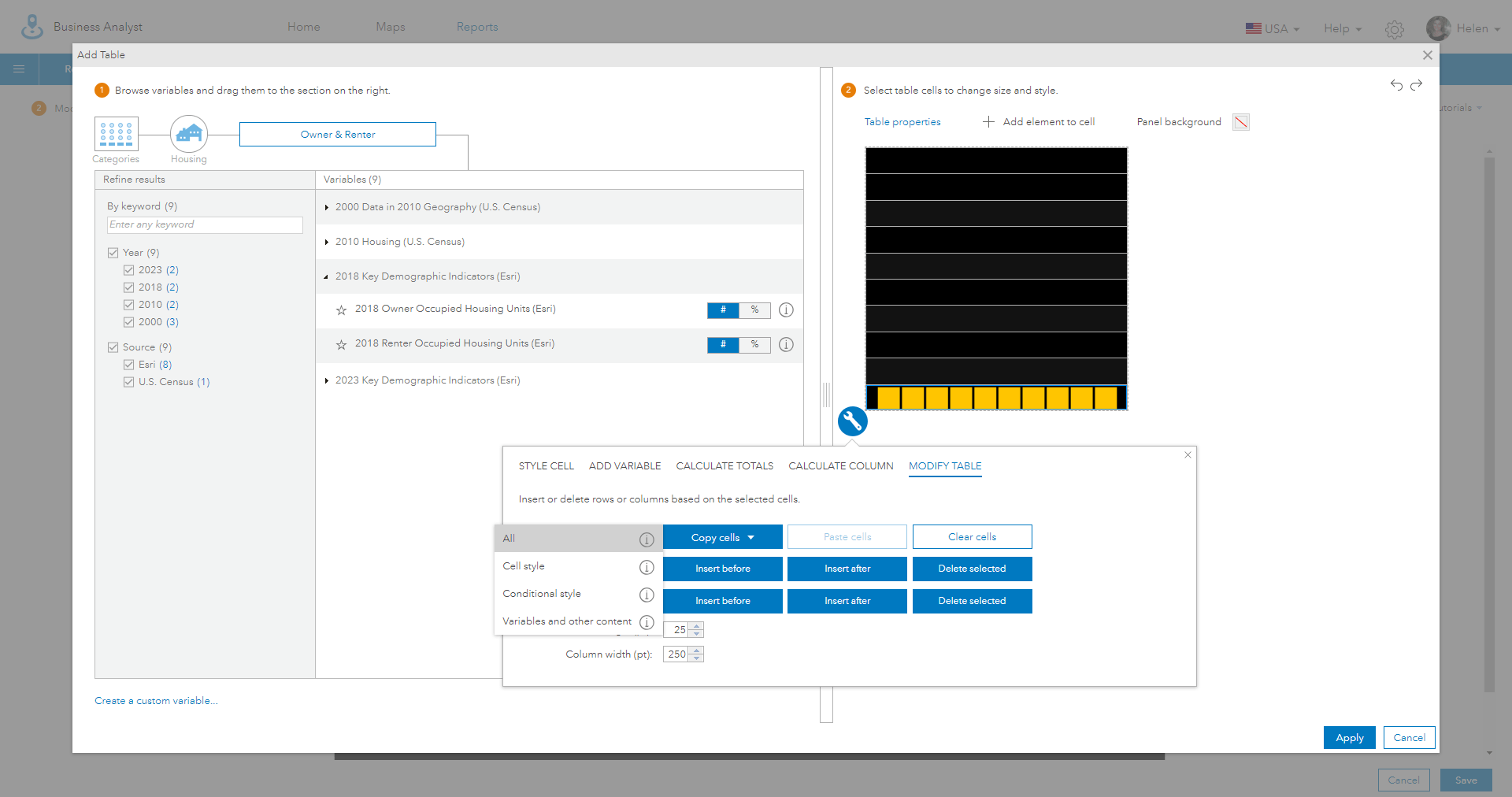
Using the “All” option will allow you to bring the rules you have set up for percentages between 0 and 10, and modify them with different numeric ranges to correspond to this rows values, which are between 11 and 20. Use “Modify Table > Paste Cells” to add the styles into the blank second row.
Step 6: Modify Each Range of Values Within The 10 Rows
Repeat the process for each row using the copy and paste option in “Modify Table” shortcut to add new conditional image styles to each blank row.
One very valuable trick is to save your conditional styles to a “Saved List”, which is a rule base that can be reused again and again. This means you can quickly apply styles without the need to recreate the interval rules and symbology logic again. In the example below, I have created a saved list for each one of interval group (10, 20, 30, etc).

Step 7: Add the Attribute Name and Value
Finally, add a text element to display the attribute value and a description. I further customized the font style, positioning, typeface and number of decimal places to create a complementary summary of the data shown in the grid graph.
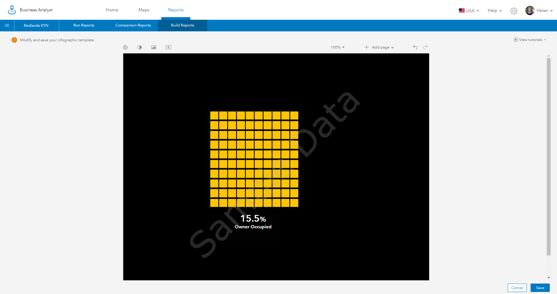
You are done!
Once you have created one grid graph you can easily copy and modify it to display another attribute. Business Analyst Web allows you to just replace the just the attribute while keeping the styling that has been applied to that row. An example infographic using multiple Grid Graph charts can be found here
and a public domain library of images I created to help you build your own Grid Graph can be found here

Commenting is not enabled for this article.