While nonprofit work may be fueled by passion, it also requires money. Which means that fundraising is a necessity. In fact, more than half of nonprofits in the United States rely on contributions for the majority of their revenue (Candid, 2021). Whether it’s feeding families or supporting the arts, organizations can’t do it without financial support. But fundraising isn’t just about dollars, it’s also about where and how those dollars are raised.
Fundraising is inherently spatial. It’s rooted in geography, community, and connection. Nonprofits often rely on local events, community drives, or regional campaigns to engage supporters. And donors are part of physical communities that shape how and why people donate. Even digital fundraising has spatial elements: targeting specific areas, responding to local needs, or telling stories tied to a particular place. I always look at my town first on a map, and I’d imagine you probably do too!
Effective fundraising draws people and makes them care. Understanding the “where” can be just as important as the “how much.” After all, every dollar raised is a reflection of the community it came from and a signal of where impact can grow. And we can leverage the ArcGIS system in a few ways to fundraise more spatially.
Identify Charitable Communities

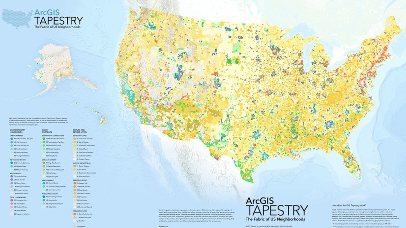
ArcGIS Tapestry – a population segmentation dataset that groups populations into similar areas, making it fast to locate “charitable” communities on a map. Some tapestry segments have a history of making cash gifts – and we’ve put those on a map below to give you an idea of what this type of data looks like.
In this ArcGIS Instant App we have all of the “charitable” counties in the United States. Tapestry data allows you to quickly see the broad-brush strokes that make up communities without advanced analysis. Whether you’re the Red Cross or a local ferret rescue, Tapestry data will provide insights into where people tend to give their money to charitable causes.
Now, this is a general, catch-all “charitable” description. The people that donate to a small land conservation organization may not be the same people who donate to an art museum, or a historical preservation organization, or a food bank. By understanding the interests of our strongest supporters, we can then customize our criteria leveraging ArcGIS data to find communities interested in the type of work our organization does.
Smart map search – ArcGIS Business Analyst

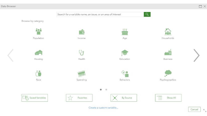
The Data Browser contains over 15,000 variables, including a wealth of psychographic and behavioral variables to understand communities’ interests across the country. We can create donor profiles using this data to highlight charitable communities interested in supporting the type of work we do.
For instance, if we’re a conservation organization, we can search for areas that donate to charities and participate in environmental groups or causes and identify as environmentally conscious. Or if we’re a bike association, we’ll look for areas where people own bikes and regularly bike. Or where people own pets and spend a lot on pet care for an animal shelter. Most nonprofits have a sense for the people that care about their cause, or the characteristics that motivate them. This workflow allows us to turn that sense into data-driven exploration to find the areas to prioritize, helping us raise more money with less work.
The Smart Map Search tool in ArcGIS Business Analyst enables us to quickly narrow down geographies in an area, highlighting those that fit our donor profiles. In the example below we’ve identified communities that are likely to donate to our conservation organization.
Operationalize
Now that we’ve identified communities to target in our fundraising campaigns, how do we best reach those communities? Well, there’s a variable for that! The data browser includes psychographic and advertising data, as well as language data, to ensure that you’re reaching communities where they are – in their language and their preferred mode of communication (ie social media platforms, email, or mail). And we can put this information into an infographic – with the Business Analyst widget for Experience Builder – so our fundraisers can quickly get a picture of who lives in a community and how to reach them.

In the example above, we have one of our previously identified ‘charitable, environmentally friendly’ neighborhoods, and this infographic lets us know they’re likely to be responsive to smartphone ads through Facebook in english.
But.. Where are our existing donors?

So far, we’ve focused on expanding our donor base—but it’s just as important to nurture and retain the valuable network of donors we’ve already built. By spatially enabling our existing donor data, we can uncover powerful insights about where our support is strongest. With mapped summaries by state and county, we can quickly identify geographic patterns in giving behavior. Understanding our fundraising successes allows us to better shape future campaigns.
Taking this a step further, spatial analysis allows us to detect statistically significant hot spots and cold spots—areas where donations are unusually high or low compared to their surroundings. These insights can guide strategic engagement and outreach efforts.

Additionally, we can leverage our current donor base to forecast future giving potential. By analyzing key variables—such as income, age, population, and environmentally focused indicators—from the Data Browser we can build a comprehensive profile of our typical donor. Then we can use this profile to identify similar communities across the country, helping us predict not only where future donations may come from, but also how much those communities are likely to give.
Uncover donor patterns

We can also create a dynamic, filterable experience using ArcGIS Dashboards. This dashboard offers real-time insights into our donor base with interactive maps, summary statistics, and visual charts. At a glance, we can understand the makeup of our donors and explore key trends across different geographies and demographics. Dashboards provide situational awareness to leaders and allow all stakeholders to follow along with the progress of a fundraising campaign. One particularly valuable feature is the ability to isolate inactive or lapsed donors. By visualizing where these donors are concentrated, we can identify high-potential areas for targeted outreach—such as in-person donor engagement events—to reestablish connections and renew support
But how do we put this dashboard to work? Imagine we’re heading to Washington, D.C. for a conference and want to make the most of our time there by connecting with key supporters. With just a few clicks, we can filter the dashboard to identify inactive donors who are based in the D.C. area and have contributed over $50,000. This targeted insight allows us to prioritize meaningful outreach—reconnecting with high-value donors who may be ready to reengage.

If you’re interested in exploring these tools firsthand, we’ve brought them all together in one convenient place with our Portfolio Instant App!
With these tools and the power of geography your organization can make smarter decisions to maximize fundraising efforts – raising more with less.
If you’re interested in learning more about how your organization can use ArcGIS for fundraising, reach out to the nonprofit team at nonprofit_inquiry@esri.com. We’d love to work closely with a few organizations interested in standing this up!

Article Discussion: