Once you’ve found or built a great web map with a well-crafted pop-up, simply drop it into a configurable app to deliver a focused user experience that helps tell your map’s story. Leveraging configurable apps is the fastest and easiest way to turn a web map into a presentable app. No coding necessary!
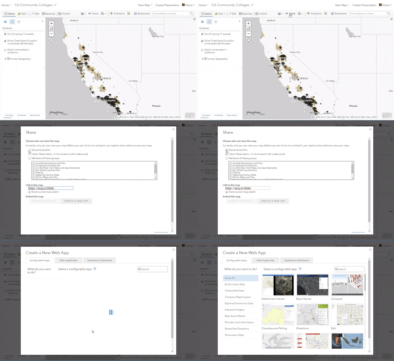
ArcGIS Online comes with dozens of configurable apps, each with a unique purpose and user experience. Two of my favorites are Minimalist and Geo List. These two allow the pop-up to be displayed in the side panel and showcase the web map as a shareable information product. Once you’re finished building your web map, or after you’ve found a web map someone else has made that you wish to use, click the Share button and then Create a Web App.

From there, pick the template you want to use, and then give your app a title and some search tags. If you like, hit the “Preview” button to get an idea of how the app looks.
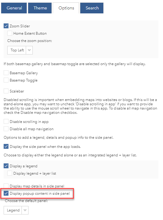
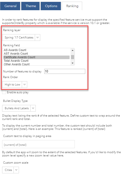
Hit “Configure” to see a configuration panel where you can customize your app. Some common tabs are “Theme” which allows you to control the colors and add things like logos and logo links, “Options” which allows you to turn on and off different elements such as a scalebar, legend, and basemap gallery. Other tabs in the configuration panel may appear depending on the template you’re using. For example, “Search” appears in the Minimalist configuration panel, and “Ranking” appears in the Geo List configuration panel.
Minimalist
The Minimalist app template allows you to showcase a map with the option to show pop-up information in the side panel:

This lets anyone viewing your app to really interrogate the data behind your features. For example, this app that displays Awards and Likely Transfer Destinations from California Community Colleges shows the web map’s pop-up content – the types and numbers of awards, the address, and information on likely transfer destinations – in the side panel when someone clicks on a particular college:
Awards and Likely Transfer Destinations from California Community Colleges
This web app shows the number and type of awards conferred by each CA community college in spring 2017, and likely public universities that transfer students could commute to.
Geo List
The Geo List app template allows you to present a “Top Ten” style list of your features in an ordered list based on the values of a particular attribute. This is a great way to turn your map into a list that reveals a ranking of features in your map.
The Ranking tab in the configuration panel allows you to set which attribute will be used for the ranking, the number of features to display (top 5, top 10, top 25, whatever makes sense for your needs), and the ranking order.

For example, this app of Top 10 California Community Colleges for Certificates walks through the 10 community colleges that conferred the highest number of certificates. The pop-up of the web map (and side panel of the app) show the number of certificates conferred, the address, the school’s link, and the school’s emblem as a picture.
Top 10 California Community Colleges for Certificates
This Geo List app shows top 10 California Community Colleges that conferred certificates in Spring '17. Certificates include various credentials that typically recognize completion of a program of study between high school and the associate’s degree.
The Pop-up is Key
Pop-ups are windows into information – they tell the reader something specific about each thing on the map. As you can see, these two configurable apps really highlight the pop-up, so take the time to configure the pop-up in a way that will look great in the side panel. Ask yourself, “what should someone know about this feature when they click on it?”
Some tips and ideas for pop-ups:
- Add feature-specific links, such as the campus website in the Geo List example above, that are stored as an attribute field.
- Add color to your pop-ups, either right in the configuration window, or by using Arcade expressions for conditional color.
- Use Arcade Expressions for any number of tasks, including handling exceptions, creating conditional text, calculating attributes on the fly, or for making layers talk to each other using feature sets.
The Item Details Page is Important
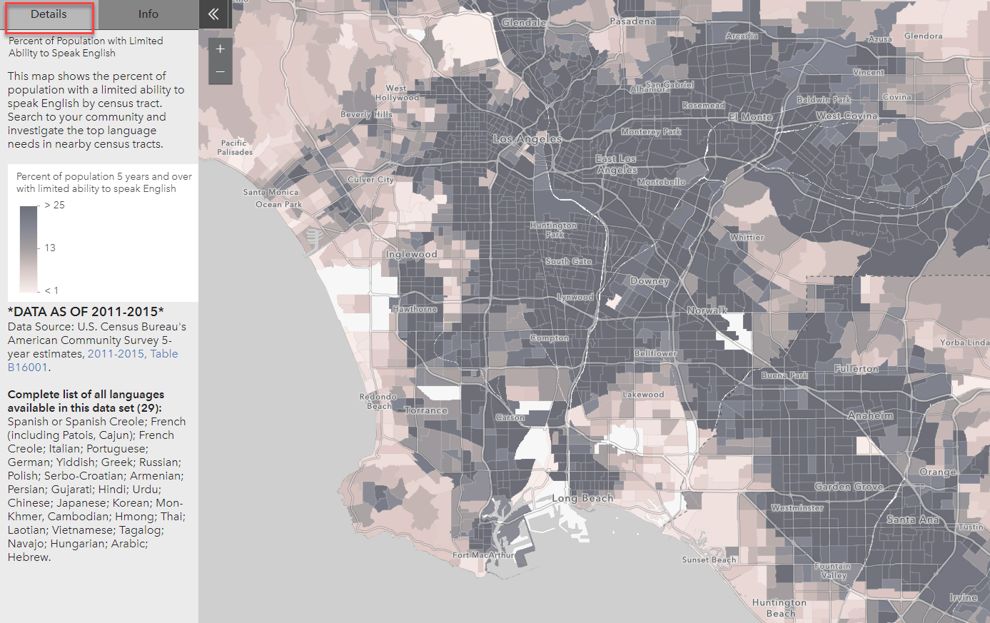
Many configurable apps display information straight from your web map’s Item Details page. For example, this app titled “What are the Language Needs in My Community?” has a “Details” tab that is populated with the description from the web map:

Make sure this communicates what you want it to. Consider adding a picture such as a legend within your item details page, or color your text in a way that will appear nicely in the side panel. Filling out the Item Details page also ensures that your web map will be easy to find, understand, and use by others.
Brand Your Apps for Your Organization
Branding with Specific Colors
In many configurable apps (including Minimalist and Geo List), you can customize the colors used to match the branding colors of your organization within the “Theme” tab in the configuration panel. If you’re creating apps on a regular basis, your ArcGIS Online Administrator can set up a Shared Theme. The shared theme with the desired colors will be an available option to you going forward, saving you time. This will also maintain consistency across all your organization’s apps, even if they are authored by different people.
Branding with a Logo
Depending on the template, you can add your own logo and logo link within the settings (for story maps) or within the “Theme” tab within the configuration panel. If you’re using a configurable app template that does not have this option, you can add your logo as an image in the Item Details page in your web map. That way, it will appear where the Item Details content appears within the apps themselves.
Help Your Web Maps the Get Attention They Deserve
Configurable apps in ArcGIS Online turn your web maps into shareable and presentable information products. Choose the right configurable app that best fits the purpose and user experience that you want based on your audience. You can even embed your app into a web page or in an ArcGIS StoryMap.
This blog post is based on part of a tech workshop called Solving Webmap Challenges presented at the 2019 Esri User Conference. A re-cap and further resources from that session are available in this story map.

Commenting is not enabled for this article.