When it comes to cartography, few things make me cringe more than overly prominent outlines that hide patterns, and icons that are either too small to see, or too large to take seriously.
With web cartography in particular, where maps often span multiple scale levels, finding the right outline widths and icon sizes can feel impossible. You may find sizes that work at one scale, but zooming in or out can quickly turn good cartographic choices into mediocre ones.
The ArcGIS API for JavaScript (ArcGIS JS API) allows developers to define renderers that work well across multiple scales. These APIs give you full control of icon, polyline, and outline sizes at specific scales, also while providing helper methods when you don’t know where to start.
The problem with static icon sizes
One icon size usually doesn’t look good at all scales. This is especially true for dense layers. For example, the points in the map below look good with a size of 10px at a national scale.
Images have been scaled down from their original sizes. Click each image to see the icons at their true sizes.

But when zoomed out to a worldwide extent, 10px appears too big. The large icon size obscures the underlying data, potentially misrepresenting its density.

With a smaller sized point symbol, many of the issues listed above can be reduced or eliminated.

But 3px makes the points almost impossible to see when you zoom to regional scales or beyond.

Dynamic size by scale
By using a size visual variable and a very simple Arcade expression, you can dynamically change the size of these points based on scale.
The visualization profile in Arcade has access to the view’s scale via the $view.scale global variable. In fact, that’s all you need for your expression! Just map the scale values with specific sizes in the stops property of the size variable.
renderer.visualVariables = [
  {
    type: "size",
    valueExpression: "$view.scale",
    stops: [
      {
        size: 7.5,
        value: 1155581
      },
      {
        size: 6,
        value: 9244648
      },
      {
        size: 3,
        value: 73957190
      },
      {
        size: 1.5,
        value: 591657527
      }
    ]
  }
];
Now you get the best of both worlds: smaller icons at small scales (i.e. zoomed out) and larger icons at large scales (i.e. zoomed in).

Check out this app, which allows you to experiment with icons whose sizes vary by scale.
Click the >> icon to view the generated size variable and effective size for the given scale.
This same approach also works for polyline data. The following app makes roads in Florida thicker as you zoom in, and thinner as you zoom out.
Click the >> icon to view the generated size variable and effective size for the given scale.
A little help from Smart Mapping
The SizeVariable API is great because it gives you full control over configuring icon size and line width at any scale level. But you may ask “How do I know which scales matter, and the size range to use?”
That’s where Smart Mapping in the ArcGIS JS API comes in to play. When you use any createRenderer method in the esri/renderers/smartMapping/creators modules, you can use the sizeOptimizationEnabled parameter to generate a suggested size variable that adjusts icon and line sizes by scale. This is available in multiple methods, but for the purposes of this blog, I’ll use the createRenderer method in the locationRendererCreator module.
Expand/collapse the code
locationRendererCreator
  .createRenderer({
    layer: layer,
    view: view,
    // generates a Size Variable that
    // adjusts symbol size by scale
    sizeOptimizationEnabled: true
  })
  .then(function(rendererResponse) {
    // the renderer contains a size variable with stops
    // mapping icon sizes to scale values
    layer.renderer = rendererResponse.renderer;

    // Or you could reuse your existing
    // renderer and set the size variable
    // accordingly ...

    const existingRenderer = layer.renderer.clone();
    const existingVariables = existingRenderer.visualVariables;
    const scaleVariables = rendererResponse.renderer.visualVariables
      .filter(function(vv){
        return vv.valueExpression && vv.valueExpression === "$view.scale";
      });
    existingRenderer.visualVariables = existingVariables.concat(scaleVariables);

    layer.renderer = existingRenderer;
  })
  .catch(function(error) {
    console.error(error);
  });
Once you have the variable, I suggest you copy it and use it directly in the app, so you can avoid making duplicate calls to the Smart Mapping methods every time the app loads.
Graduated symbols by scale
You can even optimize visualizations of data-driven continuous size (aka graduated symbols) by scale. This will cause the entire range of symbols to grow in size as you zoom in, and shrink as you zoom out.
We’ll use this example of traffic count data in a polyline layer of Florida highways, though this principle can also be applied to point layers and polygon centroids.
Note the size range at this scale looks pretty good.

As you zoom in, the width of each highway increases (note the difference in the map and legend between this image and the previous one).

And as you zoom out, the sizes shrink.

Though it becomes more difficult to distinguish the varying size range as you zoom out, it’s better than the alternative – bloated static sizes that are a bit more difficult to interpret in dense areas.

The solution to make this work calls for a more complicated size variable. The size variable must reference an attribute field or Arcade expression, with two additional size variables (like the one described above) referenced by the minSize and maxSize properties.
renderer.visualVariables = [
  {
    type: "size",
    // Feature size depends on
    // the value of the AADT field
    field: "AADT",
    // Features with this value and
    // higher in AADT will be given
    // the max size
    maxDataValue: 299000,
    // The max size will vary
    // based on the view scale
    maxSize: {
      type: "size",
      valueExpression: "$view.scale",
      stops: [
        {
          size: 24,
          value: 9027.977411
        },
        {
          size: 13.5,
          value: 72223.819286
        },
        {
          size: 9,
          value: 577790.554289
        },
        {
          size: 4.5,
          value: 4622324.434309
        }
      ]
    },
    // Features with this value and
    // lower in AADT will be given
    // the min size
    minDataValue: 0,
    // The min size will vary
    // based on the view scale
    minSize: {
      type: "size",
      valueExpression: "$view.scale",
      stops: [
        {
          size: 1.5,
          value: 9027.977411
        },
        {
          size: 0.75,
          value: 72223.819286
        },
        {
          size: 0.5625,
          value: 577790.554289
        },
        {
          size: 0.375,
          value: 4622324.434309
        }
      ]
    }
  }
];
Click the >> icon to view the generated size variable and effective size for the given scale.
While this variable is more complicated to create, the sizeRendererCreator.createContinuousRenderer method has you covered. You can generate a size variable to start with and customize it later in the development process.
sizeRendererCreator
  .createRenderer({
    layer: layer,
    view: view,
    field: "AADT",
    // generates a Size Variable that
    // adjusts symbol size by scale
    sizeOptimizationEnabled: true
  })
  .then(function(rendererResponse) {
    // the renderer contains a size variable with stops
    // mapping icon sizes to scale values
    layer.renderer = rendererResponse.renderer;
  })
  .catch(function(error) {
    console.error(error);
  });
See also sizeRendererCreator.createVisualVariables.
Outlines
Overly thick outlines probably make me cringe more than any other cartographic fail. Yet, outlines can be so hard to get right when multiple scales are involved.
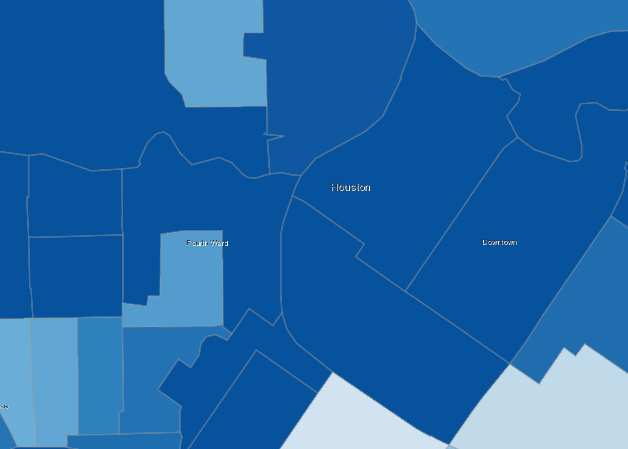
For example, the image below shows outlines that are so thick they completely obscure the fill color of small polygons in the downtown Houston area.

That outline choice is clearly unacceptable. But if you zoom to a very large scale, that outline choice may actually work.

That’s why the relatively common solution of removing outlines altogether may not be the best decision. It can cause confusion for the map reader at large scales because neighboring features with the same color may appear to be a single unified feature.

Using the same pattern established earlier with the size variable, you can adjust outline width by scale simply by returning the view scale in an Arcade expression and mapping scale values to size stops. The only difference is that you must also set the target property to outline. That way the renderer knows the variable should apply to the outline.
renderer.visualVariables = [
  {
    type: "size",
    valueExpression: "$view.scale",
    target: "outline",
    stops: [
      {
        size: 2,
        value: 56187
      },
      {
        size: 1,
        value: 175583
      },
      {
        size: 0.5,
        value: 702332
      },
      {
        size: 0,
        value: 1404664
      }
    ]
  }
];
Now you see outline widths shrink at small scales.

And grow at larger scales.
The same Smart Mapping methods mentioned above also have an outlineOptimizationEnabled parameter that when set to true generates this variable for you so you don’t have to worry about arbitrary scale values.
locationRendererCreator
  .createContinuousRenderer({
    layer: layer,
    view: view,
    outlineOptimizationEnabled: true
  })
  .then(function(rendererResponse) {
    // the renderer contains a size variable with stops
    // mapping polygon outline widths to scale values
    const renderer = rendererResponse.renderer;
    layer.renderer = renderer;
  })
  .catch(function(error) {
    console.error(error);
  });
The power of subtlety
Icon sizes and outlines that scale shouldn’t draw attention to themselves or be obvious to the map reader. They should feel so natural they go unnoticed.
I believe the best visualizations aren’t flashy—they look natural and are easy to understand. However, designing visualizations this way isn’t a trivial matter. They still take effort to get right.
The Smart Mapping methods aren’t intended to be the final decision for what’s best for you. In fact, in most cases you will likely tweak the suggested values until they feel right for your particular dataset. That may take a little extra time to get right, but the end result will be worth it.

Commenting is not enabled for this article.