Are you a dashboard viewer who has struggled to draw useful information from a dashboard you use? Do you have disagreements over how a dashboard should look and work? Or, are you a dashboard author who is paralyzed with information and simply don’t know where to begin creating your dashboard? If any of these questions resonate with you, you’re in the right place.
Effective Dashboards
Why is there so much debate over what constitutes a good dashboard? Well, for one, “dashboard” is such a loose term that is often understood to be simply “a single screen of information” or “a display with charts on it.”
Many understand dashboards simply to be a single screen of information or a display with charts on it.
With this term being so generic, though, it is difficult to draw any conclusions and recommendations. So what can we do? By classifying dashboards into different groups and types, best practices and design guidelines will become clearer.
First though, there are some core principles that truly do apply to all dashboards.
Two groups of dashboards
Dashboards can be divided into two primary groups:
- Snapshot dashboards
- Monitoring dashboards
A snapshot dashboard summarizes a data set where the data behind it does not change (it represents a snapshot of time). As such, it can be used to tell a story or make a claim.
A monitoring dashboard provides updates on data that is dynamic – changing intermittently or regularly. With ever-changing data, the dashboard has quite a different role. Although you often can’t tell a story, you can draw attention to values of interest or concern through highlighting.
The following table summarizes key attributes of each group.
|
Snapshot Dashboards |
Monitoring Dashboards |
|
| Data | A snapshot of time. Data behind dashboard doesn’t update (e.g. census, analysis results) |
Data behind dashboard updates intermittently or regularly (e.g. fire incident, COVID case) |
| Viewing Frequency | Once | Reoccurring (e.g. open continuously, daily, monthly) |
| Purposes/Types |
|
|
| Style | Colors can be used for branding and/or story telling. Dashboards might be embedded to add surrounding context. | A muted color scheme works great to reserve bold colors for highlighting data of concern or interest on maps and visualizations. |
As you can see, these groups differ considerably. Knowing where your dashboard fits can free you up to make creative design decisions and support them if questioned by a user or manager. Let’s dig a bit deeper into each group.
Snapshot dashboards
A snapshot dashboard summarizes a static data set to communicate some information such as census data or analysis results. Charts can often complement a map in visualizing data temporally or categorically in addition to spatially. Once the information is communicated/understood, users may be done viewing it.
These dashboards can serve several purposes:
- Inform
- Explain
- Persuade
- Analyze
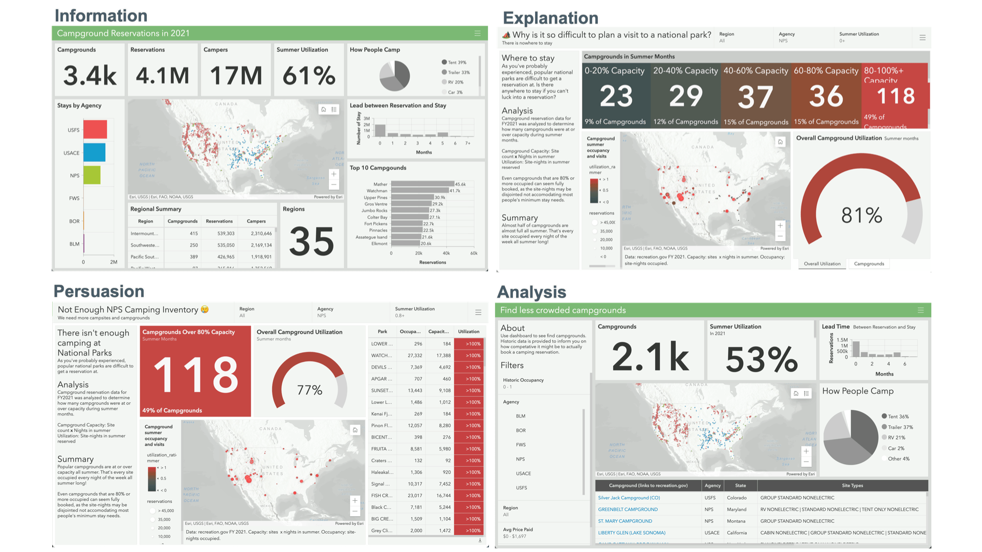
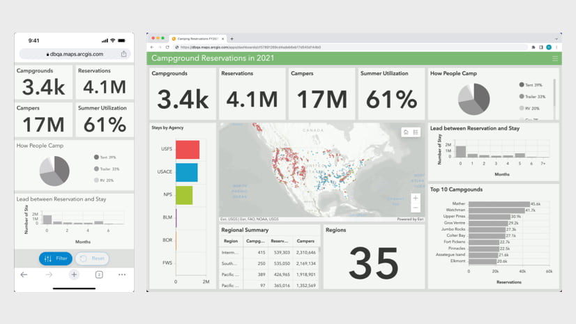
Knowing the purpose (and audience) of the dashboard is key to making it effective. To illustrate this, let’s look at an example. After analyzing camping reservation data, I want to create a dashboard to show some key results that were discovered. If I simply want to provide a general, unopinionated summary of the information, it may turn out like the following.
Note: This analysis was done for demonstration purposes. Accuracy should be self-verified before using it for any individual use.
")
If, however, I want to explain something I found in the data, I may want to design it differently. Showing bits of information on a bunch of metrics isn’t necessary and can be distracting.
Perhaps I want to explain why it is difficult to plan a summer visit to a national park. Stemming from failed attempts to secure camping reservations I wondered how many campgrounds were full all summer. In analyzing the data, it turned out to be a lot! Nearly half of National Park Service (NPS) campgrounds were at or over 80% occupied in the summer, making it difficult to secure camping reservations for a typical stay. To explain this finding, I could make a dashboard that focuses exclusively on the NPS and summer occupancy. Since the data is not changing, I can describe the methodology and provide a written summary too.
")
Maybe we are inspired to make a StoryMap and want to focus on persuading others that we don’t have enough NPS camping inventory. We might embed a dashboard like the following, focusing exclusively on the campgrounds that are fully booked in the summer.
")
Additionally, perhaps we want to help people find less crowded campground options. We could make an interactive analysis dashboard people can use to filter the data down to campgrounds with historically lower summer occupancy and provide attribute information and a link to the booking platform.
")
As you can see, snapshot dashboards can look quite differently depending on what we want to focus viewers’ attention on. Whatever it is, however, that we want to communicate, if users can find the important information at a glance and understand what they are seeing, it is a signal that we are on the right track.
Monitoring dashboards
Monitoring dashboards summarize data that is changing. This could be many times per minute, daily, or even monthly. In each case, the dashboard provides always-current updates to viewers. What information do viewers need to know? Well, that’s for you to decide; but the purpose of a dashboard will likely fall under one of these categories:
- Inform
- Provide status
- Evaluate performance
- Convey progress update
- Analyze
To see these play out, let’s say we want to monitor pothole repair requests. Depending on what information we want our viewers to get out of the dashboard, we might design it very differently. Sometimes a general, unopinionated summary of the data for a recent timeframe is what we need for a public resource or open data site. For this, a dashboard with neutral colors and a variety of summary information can work well.
")
The dashboard provides the number of requests for the last 30 days along with the percentage broken down by status and origin (method it was submitted). On the right we see district-level counts and how daily counts have fluctuated.
Although this works for some scenarios, it won’t provide an operations manager a clear update on whether there is anything concerning to investigate. For this scenario, we could design a dashboard oriented around providing situational status at a glance.
")
The above dashboard distinguishes priority requests that need immediate review based on descriptions containing one or more concerning keywords. Red dots on the map and in the table highlight potentially dangerous road conditions. The right column of the table highlights the keywords for which it was flagged, making review quick and effortless.
Now, say that the department of transportation has implemented two initiatives:
- Process all requests within 40 days
- Move to fully digital submissions (phase out call-ins and emails)
To evaluate performance metrics (KPI’s) associated with these initiatives, we could make the following performance dashboard.
")
In the above dashboard, an overall 90th percentile process time is displayed along with this metric for each community. The communities exceeding 40 days are highlighted. The right side of the dashboard provides an overview of submission types. By reviewing the indicator and line chart, we can quickly get a picture of how both assisted (non-digital) submissions are trending.
Enough about road repair requests, let’s talk about road repair projects (what’s being done to fix things). Each year, the department of transportation plans out projects with to be completed, big and small. Each project has a planned start and end date to ensure all projects stay on schedule.
For projects that have a clearly defined start and end date, a dashboard can be a useful way to communicate progress, or percent of completion. To monitor projects, we could make the following progress dashboard summarizing active projects and whether things are on-schedule to complete this year.
")
In the upper left, we can see how many days are left in the period and how far along things are (percentage of completion). Under that we see the mileage of number of projects currently under construction/active. On the bottom, the line chart displays whether we are on track (looks like we are falling more and more behind our target).
As project managers review these details, they will almost certainly have questions.
- What are the currently active projects?
- What communities are impacted by the extended construction times?
- How does this compare to previous years?
To answer these types of questions, it is often useful to have an analysis style dashboard to filter down the data to certain criteria. With a series of selectors to look up data for a particular timeframe, status, and geographic region, you can provide quick answers. The visualizations can be supplemented with the ability to download the resulting filtered data to a CSV for easy dissemination or further review.
")
In each of these types of monitoring dashboards, different information was displayed and elevated. By having a clear understanding of what you want to communicate, you can design your dashboard to be uniquely effective.
Additional Considerations
In addition to areas discussed, there are a few additional things you may want to consider. For sake of brevity, I’ll just link out to relevant resources.
- Create a mobile view of the dashboard
- Using color-blind friendly colors and culturally sensitive colors
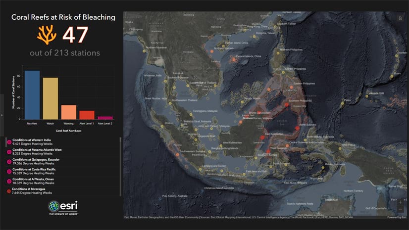
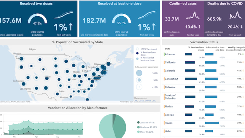
- Evolve the dashboard or charts with time as data accumulates and relevant metrics change (e.g., COVID dashboards)
- Ensure public dashboards scale well
Summary
Dashboards can be used for many different purposes. Knowing what the purpose is can inform your design decisions. Whatever the purpose, effective dashboards…
- Communicate important and critical information
- Draw attention to where it’s needed
- Convey the information clearly and at-a-glance
If you find yourself including a lot of information on a dashboard, consider splitting it into multiple dashboards. If you need a single resource from which your dashboards can be accessed, consider embedding them in an app.
To explore the dashboards covered above, click on the image or find them in this group. You can make copies to edit them and see how they were made.
As always, we love to see your amazing work. Share on social with #arcgisdashboards.

Article Discussion: