My son, Juneau, loves that I make maps. And he has lots of suggestions for maps that ought to be made. Most of them are great ideas—so great, actually, that they have been done a thousand times (a map of where people have more or less money, a map of people’s religions, a map showing where wars have been) but how would an 11 year-old know that? Some ideas are really pretty wonderful and maybe novel, like a map showing how much oxygen is in the air compared to where lots of trees are, or a map showing the first and second most popular sports per country.
This morning Juneau came into my office with three minutes before we were to go wait outside for the school bus. “What about a map showing ages, like how old people are?” I looked at the clock.
Ok, let’s do this.
I opened ArcGIS Pro (could just as easily have been ArcGIS Online) and added in a layer of US counties with census data.
“That looks really…blocky.”
Juneau was noticing the tendency of US counties to be rectangular. And I noticed my presumption, as a map-maker, to rely on handy enumeration units in a pinch. I got to give Junes a ten-second primer on counties and he indirectly gave me a wake-up reminder about the modifiable areal unit problem and the rather inconsistent and sometimes arbitrary nature of political boundaries (minds, am I right?). Anyway, we had 2.8 minutes remaining so you use what you’ve got.
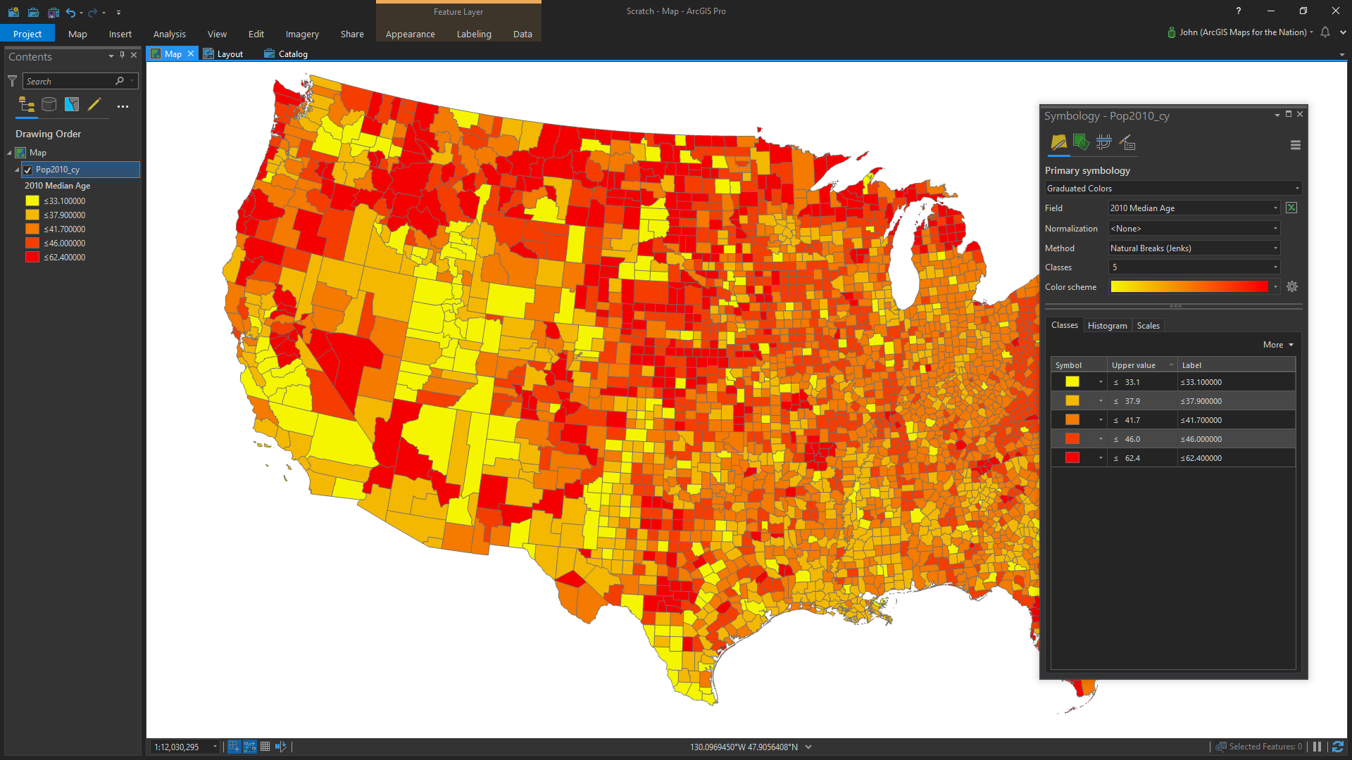
I described what I was doing out loud as I opened the symbology panel and showed the default of every county having the same light green look (my system-one mind was thinking about the power of defaults and almost giddy at the prospect of talking choroplething). I told Juneau something to the effect that we can use colors to show how old people are, on average, in each county. I checked if he knew what average meant. He did (come on, he’s 11). I told him “median,” the name of the field we were about to color by, is a name for one of the ways to figure out an average. “It means the one in the middle.” Juneau shook his head.
One of the things I’ve learned and remembered best, based on my short but terrifying time teaching geography labs, is that you don’t understand something really until you have successfully delivered its essence to another human. I think that’s one of the greatest gifts kids, and teaching in general, give us. Fresh eyes. The thrill of showing.
Anyway, the clock was ticking. That school bus waits for no child.
We chose graduated colors from the primary symbology droplist. Median age was actually the field selected by default (that saved us at least two seconds!). The default of yellow to red was good enough. I was about to change it to another color gradient but then…
“Wait is that it? Did we just do that? Did we just make it?”
Yes, Juneau, that’s it! Fast. We were made of time; that was only like a minute. It’s a strangely rewarding feeling to exceed a child’s expectations. Flush with pride, I described how red places had more older people and yellow places had more younger people.
“Like how old?”
Ok here we go. That innate power of maps to not necessarily answer some preordained question but to present fertile ground for new questions. I think that might be one of the biggest misconceptions we can have about maps. They don’t necessarily answer, they guide.
I described how the chunks of color on the left mean ranges of ages on the map. My system-one mind was contemplating how deeply to go in describing the notion of range breaks and meaningful categorizations. Meanwhile, Juneau was engaging in his map, and pointing out some interesting patterns that caught his eye. His comments pulled me out of my theoretical conundrum and offered up their own more pragmatic way of learning.
“Look how young they are.” He pointed to California’s Imperial Valley and then a band of youth in Utah and Arizona. I pointed out how the top part of Michigan’s mitten, our home state, was pretty old. This classification method, and the small number of classes, was showing Juneau some national patterns.
I changed the classification to equal interval and maxed out the number of classes to give Juneau a smoother finer picture of median age.
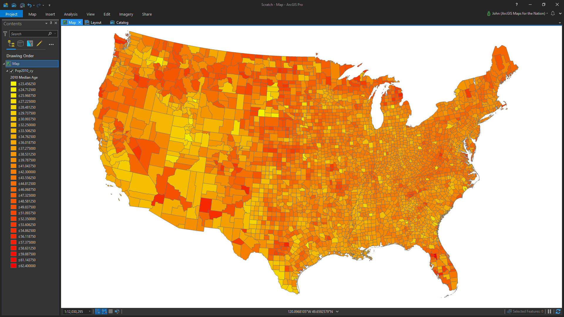
And sure enough, he started pointing out specific counties, the outliers. He noticed the youthful blip of Isabella County, Michigan (actually, my home county). I clicked it to show the attributes. “The average there is 25.” I told him there was a college there; so maybe that’s why.
“Look at those really red ones.” He pointed out bands in Arizona and New Mexico and chuckled a little as he said it, I suppose imagining lots of “old” people. I clicked on a few to tell him the median age. Ok, now it was time to get some specifics. Juneau had seen patterns, he’d found outliers, he wanted some numbers. As I write this I realize he was following a pretty well-documented strategy for information management. Starting broadly, then following clues into greater specificity.
Who, like no one else, has to process loads of new information and make enough sense of it to categorize, conceptualize, and move on quickly? Kids do. It’s what they do. We tend to lose that plasticity in time, our systems growing more rigid with use, familiarity, and cultural constructs.
We opened the attributes table. It was time to name some names (and ages).
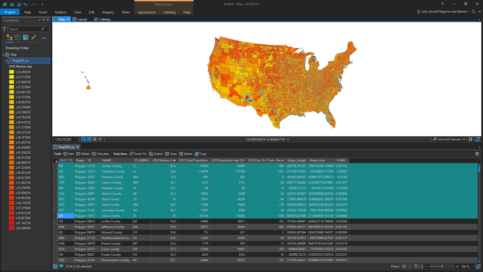
Upon seeing a map of geometric areas in the context of a list of places and their ages, do you think Juneau was marveling at the quantitative breakthrough that the marriage of geometry and attribution enables, the heartbeat of GIS itself, as I selected the ten oldest counties in the list to highlight them on the map? No way, he internalized that immediately. Of course that’s how it is.
“Why are those places so old?”
This time it was my system-two mind that was running hot with questions of human migration both young and old, the economics of savings and retirement, the existential notion of our finite time and certainty of death. What do I tell Junes? I settled on something like there being a couple reasons; some places are older because the younger people leave to find jobs and other places are older because older people move there to be comfortable where it’s warm after they retire. Grandpa Burt retired. He knows retired.

Time’s up. We waked to the front yard and threw the football with the neighbor kid as we talked about Halloween. Coleman was going as a hot dog, his costume stuffed into his backpack. Juneau was Spider-Man, already wearing his costume under his jacket. I watched them get on the bus and drive away.
Back to the office and this map on the screen. Is it any good? It’s one of the best maps I’ve ever made.
Happy Mapping. John


Commenting is not enabled for this article.