At the recent Northwest GIS User Conference, Dorothy Mortenson commented on the location of Alaska on U.S. maps. Dorothy works for the Oregon Water Resources Department and is often tasked with mapping the Pacific Northwest, including Alaska. She made some very good points about why we should try to change the standard practice of placing the state of Alaska in the lower left corner of the page. We agreed with her when she made a case for changing the map layouts and we wanted to share our thoughts with you. But first, here are a few of the points Dorothy made:
- Alaska’s been a state for over 50 years. It’s time to acknowledge it as a U.S. state on maps of the U.S.A.
- With the mapping and publishing capabilities now available to us, there’s plenty of room for all of the U.S. states.
- “No data” is just as important as some data. We wouldn’t feel compelled to eliminate an interior state, like Illinois, from the contiguous U.S. if there weren’t any data for that state.
- If you don’t want to map Alaska, Hawaii and the territories, then call the map what it is – the conterminous or contiguous 48 states.
Dorothy is right to point out one of the injustices of cartographic standard practice, and it is timely to question it. The logic behind the traditional depiction of the USA with Alaska and Hawaii rescaled and tucked into (usually) the bottom left corner, at least in the commercial world, has been economic, market-driven, historical, and in some part the result of inertia.
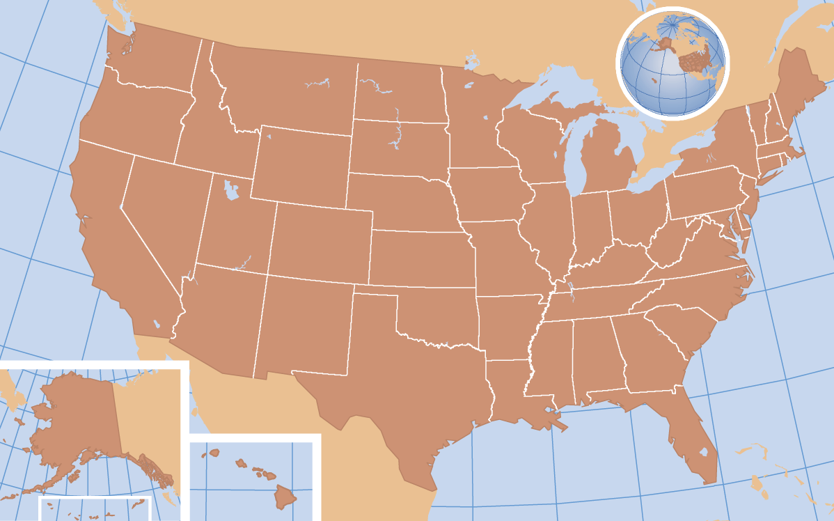
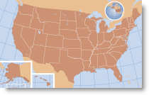
A traditional USA map layout, with Alaska and Hawaii rescaled and tucked into the bottom left corner.
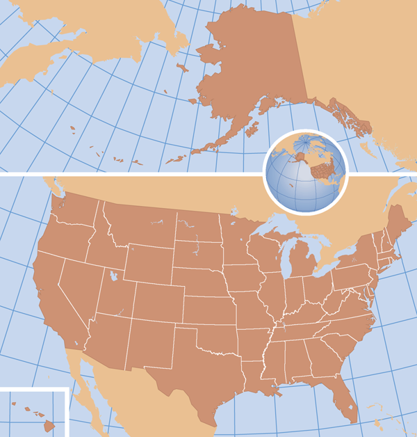
A revised layout, with all maps at the same scale. The major Hawaiian islands are placed at the bottom left to imply the correct geographical relationship with the other states, but this inset map could be moved to the top left if preferred.
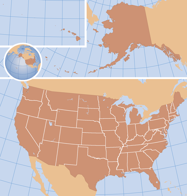
A revised layout with all maps at the same scale, showing the full Hawaiian Island chain. At this scale, the smaller islands are almost invisible, and some degree of exaggeration would need to be considered. On a larger layout they could remain untouched. Alternatively or additionally, a coastal vignette could be used to emphasize the location of the smaller islands.
It was economic because in the print world, a commercial cartographer is always looking to work within the constraints of the manufacturing process. If a space could be filled with map detail, and as a consequence take up a smaller area, there were savings, and therefore extra profit, to be made. The fact (or perceived fact) is that there were never enough customers with an interest in what happened with Alaska and Hawaii to justify the extra cost of manufacturing a more generous layout.
It was market-driven, because our customers had certain expectations. With a wall map, it was always going to be easier to increase the width of the product rather than the height (it will fit better on the average wall). In a book, where maximizing the scale of the “lower 48″ may be considered important by the customer, this was best done in a landscape format, whether it was across two pages (a spread) or turned on the page. On occasion it was and is taken too far. Building a thematic map on two scales, particularly where area is a factor in the data, is a dangerous thing without some very careful explanation.
It was historical, because these constraints informed the development of many such products in the conventional cartography days, when making a layout change could be a long and difficult process. Many later products were derived from these original map elements, so the basic format did not change much. An additional factor on occasion was a lack of map detail (usually Mexico) behind the Alaska and Hawaii insets – bad cartography, but the sort of decision that is made when cost and deadline are important
Inertia I think, at least in this context, is a more recent thing. Despite the fact that layout change is not the issue it once was, traditional layouts have been maintained simply because it is easier not to rebuild a product that works or, more importantly, sells. As maps move more into electronic media the economic constraints are different, as is the user experience. Shape is less of an issue with a web page where on first viewing the available space is generally square, or on a smart phone where scrolling is part of the experience, and the benefits of interactivity are rewriting most rulebooks anyway. Still, in many cases you will see the same old format, with Alaska tucked into the corner and Hawaii alongside.
So the time may be right for the status quo to be challenged. If a map is showing the whole of the United States, should it not include a same-scale depiction of the whole country? I would add one stipulation (which should have been made all along)… that unless the States are shown in their proper geographical relationship, which is unlikely, there should always be some form of location map included that does. If the map does not include Alaska and Hawaii (and there may be justifiable reasons for this), should it not be called “Contiguous United States” rather than a misleading “United States”.
If we subscribe to the view that Alaska should be shown at scale, in its entirety with all of the Aleutian Islands depicted, should we not do the same for the Hawaiian Island chain, out to the Midway Islands? This means that, like Alaska, Hawaii can no longer be tucked into a corner of the traditional map layout.
The Geography of Alaska is so different! The landscape is more extreme, and human impact is less intrusive. It was always easier to treat Alaska as “special” when its depiction was at a significantly different scale (if the final product was a road or a topographic map). With a same-scale depiction, it’s not so easy to justify. Trying to find a balance of data and a level of generalization that works well with the rest of the United States but keeps Alaska detailed enough is a challenge… but that, I hope, is why we have map designers.

Commenting is not enabled for this article.