Natural hazards pose increasing risks to communities, infrastructure, and economies. In this plenary demonstration at Developer and Technology Summit 2026, Sarmistha showcased how spatial analysis transforms large volume of hazard event data into objective, actionable intelligence, moving beyond subjective interpretation toward actionable insights. By applying density modeling and percentile–based contours, spatial analysts can uncover patterns, compare hazards, and prioritize resources with far greater confidence.
Understanding Hazard Patterns Through Density Surfaces
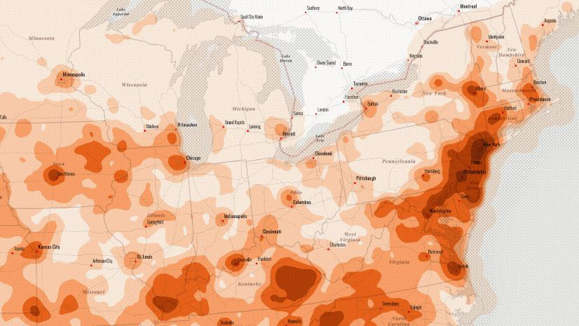
Using more than 100,000 flash flood events collected over 30 years using NOAA Storm Events Database from 1996-2025, the analysis illustrated how density surfaces convert discrete hazard points into continuous representations of both hazard concentration and extent. Viewed only as individual points, the original flash flood data reveals where events have occurred, but not the broader spatial structure behind them. Density analysis addresses this limitation by transforming discrete events into a continuous surface that represents concentration and intensity.

A density surface enables analyst to answer a more meaningful question: where are hazards most concentrated over space? In the flash flood example, clear regional patterns appear once density was calculated. In the figure below, note how flood events are concentrated in the northeastern and midwestern United States. Moving from point-based to surface-based density analysis enables a greater ability to reason about factors such as exposure, risk, and regional vulnerability. However, there is an important limitation to be aware of.

Limitations of Subjective Interpretation
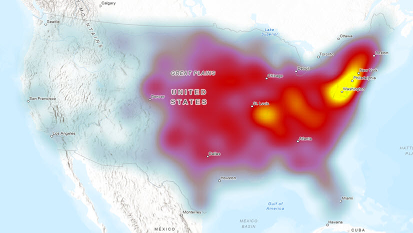
Density surfaces are powerful, yet their interpretation is inherently subjective. How a density surface is classified, symbolized, or visualized can dramatically influence what conclusions you can responsibly make from it. Choosing color ramps, class breaks, and thresholds visually introduces subjectivity into an analysis from which critical decisions will be made.
In the context of hazard planning and other analysis, this subjectivity matters. Different interpretations of the same density surface could lead to different priorities, require different kinds of investment, and result in different outcomes for communities. A way to define concentration zones objectively is needed, one that is based on the data itself, not mere visual preference and its interpretation.
This is where the new Volume Percentile Contours tool, introduced in ArcGIS Pro 3.6, becomes transformative.
Introducing Volume Percentile Contours: Quantify traditional density surface
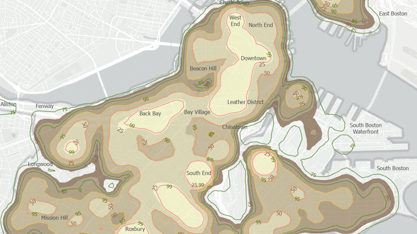
The Volume Percentile Contour tool offers a different way to define concentration. Instead of relying on arbitrary thresholds, it creates boundaries based on the percentage of the total density volume. It can answer questions such as: What geographic extent contains 50 percent of all hazard intensity?
In this analysis, contours were created for the 25th, 50th, and 75th percentiles of flash flood density. Each contour represents a statistically defined zone that contains a known proportion of total hazard volume. These boundaries are no longer subjective, but are now quantitative, repeatable, and actionable.

This change is critical for data-driven decision making. Analysts can now communicate risk using precise statements such as “half of all flash flood intensity occurs within this area,” rather than relying only on a visual interpretation only.
Comparing Multiple Hazards Spatially
A compelling strength of percentile-based contours is the ability to support comparison across hazards. This project extends the analysis to include heavy snow events and tornado occurrences over the same 30-year period.
By generating equivalent density contours for each hazard, analysts can compare spatial patterns consistently. Since each contour represents an equivalent hazard-volume percentile, comparisons remain meaningful across datasets with different frequencies and spatial distributions.

When the 50th percentile contours for flash floods, heavy snow, and tornadoes are overlaid, areas of overlap are immediately visible. These regions are exposed to not just one type of hazard, but to multiple hazards with significant intensity. This insight is difficult to obtain through traditional mapping, yet it is extremely vulnerable to have for emergency management, infrastructure planning, and long-term resilience strategies.
Focusing Planning on the Most Impactful Areas
The following map emphasizes the importance of the 50th percentile contour. Because it overlays half of the total hazard volume, it shows the core area where the impacts are most concentrated. For planning and resource allocation, this contour provides a useful starting point.

Planners can focus on regions with the highest combined exposure level rather than spread limited resources thinly across large areas. Aligning spatial analysis directly with decision-making ensures that analytical outputs translate into actionable priorities.
Adding Time to the Analysis
In the real world, hazards are not static, and neither are landscapes. Climate patterns shift, land use changes, and population distributions evolve. This project incorporated time by analyzing hazard density contours over three-year intervals. This analysis was done using the Space Time Kernel Density tool. The 50th percentile volume contour is then calculated from each slice for each of the three different hazards at a 3-year interval. This temporal perspective reveals counties that experience repeated exposure to multiple hazards over time. Areas that consistently fall within overlapping percentile contours become clear candidates for priority intervention. At this analytical step, additional data management tools like Merge, Count Overlapping Features, Add Field were used.

Why Quantitative Spatial Products Matter
The key takeaway from this analysis is the value of transforming subjective surfaces into quantitative information products. Percentile-based density contours provide a common analytical language for researchers, planners, and decision makers. They support transparency and reproducibility that are essential when analyses inform decisions and resource allocation.
For spatial analysts and data scientists, this approach represents how advanced spatial methods can directly support real-world decisions, especially in the face of growing environmental uncertainty.
Conclusion
Hazard data tells a story, but only if we listen to it correctly. Moving from point event data to density surfaces, and from subjective interpretation to percentile-based contours, spatial analysis becomes a powerful tool for understanding risk and guiding action. The analysis workflow shown here demonstartes how GIS can help communities move from awareness to preparedness. In a world of increasing hazard complexity, objective, data-driven spatial analysis is no longer optional; it is essential.
If you are interested in learning more about density tools, see the following conceptual documentation and keep an eye on future blog articles on Density tools:
- Understand density analysis
- How Volume Percentile Contours works
- How Value Percentile Contours works
- How Kernel Density works
- How Space Time Kernel Density works
References
- NOAA / National Centers for Environmental Information (2024). Storm Events Database. https://www.ncdc.noaa.gov/stormevents/


Article Discussion: