The autumn of 2018 saw the publication of several studies, including the National Climate Assessment, that predicted dire impacts—rising sea levels, widespread droughts, debilitating heat waves, and so on—unless greenhouse gas emissions are quickly brought under control.
I literally lose sleep worrying about our impact on our planet, and the sort of world we’re likely to leave to our children and grandchildren. Denialism and wishful thinking are hampering our response to this crisis at the very time we should be taking urgent action. Thus, my team and I resolved to use our storytelling platform to help convince people that climate change is real, that we’re overspending our natural capital, and that we need to take action.
We’ll publish a number of story maps in the coming months on these topics, but to start we decided we’d compile a list of relatively simple statistics about climate and sustainability. We’d back each number up with summary text, maps, infographics, and links to authoritative sources. The idea was to arm ourselves with facts that we and others can use to underscore just how dire today’s situation really is.
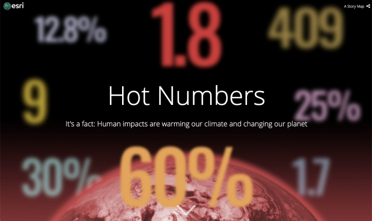
The result: Hot Numbers.
Here are four storytelling techniques that we used in our story, and that you might find useful as you author your own story maps.
1 Conjuring Up a Title
A key task in producing the story was to come up with an effective title. “Deny the Deniers” was my original notion, but as a headline it seemed too negative and would likely be confusing out of context. “Hot Numbers” ultimately popped into mind, and it stuck. It’s gimmicky, perhaps, but our hope is that it’s catchy and memorable.
We’ll use pretty much any trick in the book to make our story titles engaging:
- Alliteration is fair game: “The Living Land,” for instance, or “A River Reborn.”
- For longer titles, using an active verb can be effective, such as “Discovering Liquid Water on Mars” and “Exploring the World’s Top Destination Cities.”
- A catchy phrase can work as part of a title: “On the Brink: The Sixth Great Extinction,” or “Beating the Odds: A Year in the Life of a Piping Plover”
What we avoid like the plague are simple label titles like “Climate Change Facts.” We also never use the term “Story Map” directly in a title.
2 Establishing a Rhythm
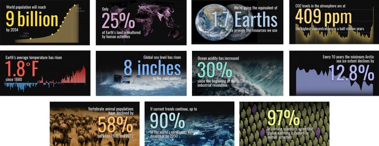
I like to give my story maps a heartbeat—a regular rhythm—by incorporating a repeating structural element to the narratives. Story Map Cascade, with its choice of narrative and immersive sections, provides a built-in opportunity to establish that sort of rhythmic pattern. Each of the eleven numbers in the story is introduced in a one-panel immersive section, with a screen-filling image in the background and a floating caption (with a “hot” number) in the foreground. Then comes a narrative section with a large, attention-grabbing summary sentence, a supporting paragraph, and graphics and/or maps with additional explainer text. There are actually three levels of structure in Hot Numbers: chapters (Causes, Consequences, Consensus, and Action), immersive/narrative pairs, and the repeated text-and-graphic format within the narrative sections.
It’s likely that people are only vaguely conscious of these structural elements as they read the story, but their subtle consistency makes the piece more engaging and digestible.
3 Numbers (or Text) as Art
The visual “trademark” of the story are the big numbers in the immersive sections. The Cascade Builder doesn’t currently support the ability to format such large type. I therefore used a separate graphics program to make the big numbers, and I chose a font that felt bold and newsy. I added soft drop shadows around the numbers and then saved the results as PNG files, which I then added to the story as images. Why PNGs? Because they support transparent backgrounds. Those floating numbers are much more impactful than they would have been as items against a solid background.
PNGs are good to use within the narrative sections as well. The background tint in Cascade’s dark theme might look black, but it’s actually a dark gray. Saving images with no background makes them blend seamlessly into the background—and into the story.
4 Twitter Buttons
My fellow team members Hannah and Greyson came to me with the bright idea of adding Twitter buttons to each section of the story as a way to increase its social media impact. I readily agreed, and together we came up with tweet text and images for each section. Adding the buttons required a little manipulation of the story’s JSON. That sounds scarier than it is, but it does necessitate some coding. However, if we hear from you that this should be a standard feature of our storytelling platform, please let us know, and we’ll add it to our admittedly long list of future enhancements.
The Bottom Line
“Hot Numbers” may or may not find a large audience, although we’re doing our best to publicize it with help from partner organizations, including the Global Footprint Network and Project Drawdown. But if we change one mind, if we inspire one person toward action, then it’s worth the effort. I feel that it’s our responsibility—as mappers, as geospatial professionals, as storytellers, as world citizens—to help raise awareness about important issues. I hope you feel the same, and that you do the same.

Commenting is not enabled for this article.