When you are looking to create a sustainable future, it can be difficult to know whether your organization is doing the right thing. Here we are focused on leveraging equity solutions with the utility network. We have developed the Social Equity Analysis solution to provide a straightforward way for businesses and organizations of all sizes to tackle issues head-on. The solution guides you through thinking about your organization’s equity goals, as well as whom it serves (and how), by using tasks. At the end of this blog, you’ll have an idea on how to use a social equity analysis for utilities in this abbreviated guide.
Step 1: Build a community focused index
Understanding community characteristics starts with asking how your customers are distributed across the places you serve.
Data on the community’s conditions, characteristics, and outcomes might include outage duration that is longer than usual, poor asset condition, race, folks who are elderly, and people with chronic health conditions or low income.
You will need data to discover patterns. That includes looking at things system wide and getting an idea of where are service hiccups, where are assets in poor conditions, or where are elderly folks whose primary language is not English. This allows you to identify communities that may be experiencing inequity. The good thing is that you can bring your own data to leverage business data that focus on leading or lagging indicators that matter. A common pattern for this work is to use American Community Survey (ACS) data, you might already be familiar with, or even take advantage of Esri demographic data. The goal in this step is to create a community characteristics index.
To study the demographics of communities, you need to identify boundaries that show the appropriate level of detail. These can be census tracts or block groups, utility specific service boundary, maintenance areas, or any geopolitical boundary.

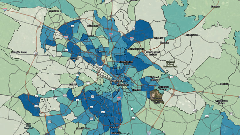
The result is a community characteristics index that answers, where are priority communities? The dark blue means higher focus area. For this index, I chose to include persons with disabilities, low income, low educational attainment, people of color, and seniors. The main goal is to know where folks are located and which part of the network is serving them.
Next up! Evaluating how assets, resources, harmful elements, or undesirable outcomes are distributed across service areas.
Step 2: Evaluate conditions to fix inequity
Secondly, we are evaluating the distribution of assets, resources, or community outcomes. Community assets are amenities like parks and other green spaces, grocery stores, banks, pharmacies, day care centers, and hospitals. From a utility perspective, think of these assets as being what would go into your asset management system. Resources are the commodity flowing through your network. Access to resources is an important equity question. If you haven’t already, start thinking about what a social equity analysis for your utility would look like.
Let’s define outcomes—planned or unexpected events that have already happened as a result of a decision or practice. Typically, business data that we use for reporting is going to to be outcome data. Bringing in business data like information on power outages, water main breaks, sewer system overflows, or lack of broadband access—is outcome data. Also, we can pull ACS outcome data such as poverty status or educational attainment. Critically thinking about the areas that have more events than others and what the difference is in the service you are providing.

For this workflow, we are using power outage duration to visualize the distribution of outages across the community with the associated circuit. We need to focus on improving the system that is experiencing more of the burden of outage duration in dark green areas. Areas that are doing well are highlighted in light green and experiencing shorter outage time. At this point, we are thinking about interventions, resources, or assets that are needed to improve the conditions of the least performant areas in the system. Next, we will combine the community index and the condition to get an equity analysis index.
Step 3: Prioritize areas of greatest need
In step 3, we identify where needs are greatest based on the communities and conditions identified in the previous steps. Equity analysis index layers offer powerful ways to visualize the distribution of community indicators such as population groups, community conditions, and resources. This sets the stage for equitable decision-making, investments, and actions. An important path forward is the ability to operationalize positive practices and ask what, where and who. Who is experiencing the inequity? Where are areas of greatest need? And what investments are we making?

Generally, this part of the workflow is about creating an equity analysis index. An index works well to highlight where your populations of concern overlap with the areas of greatest need. In this case, the lower the index score the greater the need, which are blue areas. The need is for resources, assets, or investment. Areas are ranked accordingly to allow you to prioritize resources. The result is a visualization that allows you to clearly see where interventions will make the biggest impact. For this index, we’re looking at outage time in minutes from step 2 and communities from step 1.
Step 4: Look at gaps
Finally, we are optimizing the relocation of resources and/or assets to increase equity. We ask the following questions directly: What can be done to improve the part of the system that is failing? What interventions will decrease the outage time with an average greater than 20 minutes? How can we prevent main breaks in a particular area? Is it possible to decrease the number of overflows for community X? Where can we put broadband infrastructure to expand access to community Y?
Many of these decisions and techniques can leverage data from your asset management programs. An obvious use of the equity index layer is to develop new strategies. Taking it a step further to intersect performance metrics with your index. It can also be used to assess the impact of failure of existing maintenance plans.
One way to address placement of resources is with a travel-time analysis to assess candidate intervention sites. A travel-time analysis allows you to know where to place a resource that would offer the greatest benefit to the community. Ultimately, we want to incorporate the index into asset management strategies, preventative maintenance plans, and project justifications to support decision making.
Try it out in your organization
Jump into building an equity analysis index layer by deploying the solution from the ArcGIS Solutions site by searching “equity”. Think about your network and you can leverage the a social equity analysis for your utility. What questions can a powerful equity analysis index layer answer for you? Explore the array of available outcome data in ArcGIS Living Atlas of the World.
Also, Esri is providing several resources to help organizations in their sustainability and resiliency efforts. The Racial Equity and Social Justice GIS Hub is the place to access resources and request GIS assistance from Esri folks focused on this topic. Connect with us or provide feedback via GeoNet.

Article Discussion: