At version 4.11 of the ArcGIS API for JavaScript (ArcGIS JS API), we added support for DotDensityRenderer, which visualizes the density of a population or count in polygon layers. Last week I wrote an introduction to these visualizations. In this post, I’ll demonstrate how to add custom behavior to the Legend, to transform it into a data exploration tool allowing users to explore dot density maps in more depth.
In Dot density maps for the web, I demonstrated how to create this app, which visualizes population density by race/ethnicity in the United States.

While the visual is fun to explore on its own, you may want to focus on one data category at a time. This can be difficult in highly dense areas for a couple of reasons:
1. One category could clearly dominate and occlude all others, or
2. Several categories could be evenly represented, making it difficult to discern which ones are present.
Let’s take a look at various ways you can make dot density visualizations more interactive, allowing users to explore individual data categories.
Copy the same layer for each attribute
You could allow the user to explore individual categories by creating up to eight separate layers that visualize each field with a different color. You can even add a LayerList widget with an embedded Legend to toggle layer visibility:
view.ui.add( new LayerList({
  view: view,
  listItemCreatedFunction: function(event) {
    const item = event.item;
    item.panel = {
      content: ["legend"],
      open: true
    };
  }
}), "top-left");
This allows the user to not only view one category at a time, but any combination of categories at a single time. This can be appropriate for some purposes, but it also makes the LayerList/Legend long, redundant, and frankly kind of awkward to use when as many as eight layers are included.
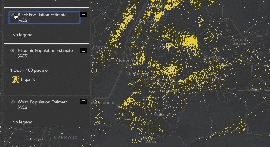
Another drawback of this approach is performance; the geometries of each layer (the same data) are downloaded to the browser a total of eight times! This isn’t ideal considering the geometries are all the same.
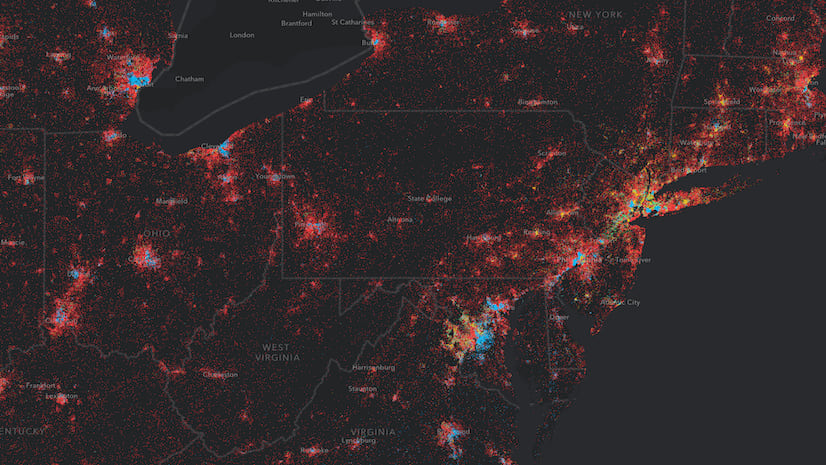
Display each attribute in different views
You could do a similar visualization, but modify it by adding each layer to a different view with the same extent…

This app has similar performance issues because it draws eight separate views to render data from the same layer. However, it does allow us to see population density for each category at a single glance. I even synced the views so you can navigate to any area in the United States and see the full breakdown of the data.
This is particularly useful if you want to clearly see categories with smaller populations in high density areas. For example, the “Other race” and “Two or more races” categories in the image above would be difficult (if not impossible) to see in the original visualization. By displaying it in a different view, we can more easily see the whole picture of the data at once for this area.
Create an interactive legend
There may some use cases for the other two visualization styles, but I found it more fun (and performant) to explore all this data in the same view with a single layer. That’s why I settled on adding custom interaction to the Legend for exploring each category.
The app below doesn’t look much different from the original app. However, as you hover over each Legend element, the visual will update to emphasize the category touched by the pointer.
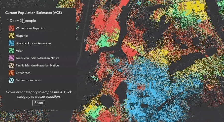
If you click one of the elements, you can freeze the emphasis on that category to resume normal interaction with the view.
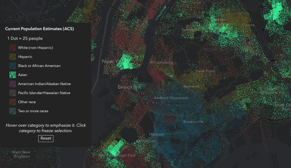
Notice the dots pertaining to non-selected categories are still present, but deemphasized – they’re just given an opacity value of 0.2. This allows you to get a better view of the selected category (even the small population ones) in the context of all others all while rendering a single layer of data to maximize performance.
Click here to view my demo of this app at the 2019 Dev Summit plenary session.
How it works
To add interaction to the Legend, you need to hook up the desired event listeners on the Legend container. The Legend uses dot density attribute labels in the alt text of the DOM element representing the dot color and the innerText of the element containing the label text.
If the pointer hits an element containing alt text or innerText in the Legend, I store that string in a variable called selectedText.
The Legend has a activeLayerInfos property that contains information about how the Legend is rendered for each layer. For every interaction with the Legend, I check the selectedText against the activeLayerInfos labels. If the selected text matches any of the activeLayerInfos, then I call the showSelectedField function.
legendContainer.addEventListener("mousemove", legendEventListener);
legendContainer.addEventListener("click", legendEventListener);

let mousemoveEnabled = true;
function legendEventListener (event:any) {
  const selectedText = event.target.alt || event.target.innerText;
  const legendInfos: Array<any> = legend.activeLayerInfos.getItemAt(0).legendElements[0].infos;
  // if selectedText matches any text in the legend infos, then update the renderer
  const matchFound = legendInfos.filter( (info:any) => info.label === selectedText ).length > 0;

  if (matchFound){
    showSelectedField(selectedText);

    // additional logic for freezing view if mousemove
    // was disabled would be included here
  } else {
    layer.renderer = dotDensityRenderer;
  }
}
This function modifies the renderer so all categories whose labels don’t match the selected label are assigned the same color, but with an opacity value of 0.2.
function showSelectedField (label: string) {
  const oldRenderer = layer.renderer as DotDensityRenderer;
  const newRenderer = oldRenderer.clone();
  const attributes = newRenderer.attributes.map( attribute => {
    attribute.color.a = attribute.label === label ? 1 : 0.2;
    return attribute;
  });
  newRenderer.attributes = attributes;
  layer.renderer = newRenderer;
}
If the selection doesn’t include any text or text that doesn’t match any label from the renderer’s attributes, then I set the original renderer back on the layer.
As you can see, with just a little bit of customization, you can create highly interactive dot density visualizations for data exploration purposes. This is just one way you can do that. Stay tuned for more posts exploring dot density in the ArcGIS JS API.

Commenting is not enabled for this article.