I’m a huge fan of transit maps. Harry Beck’s London Underground map, first published in 1933, remains my all-time favourite map. It’s simple, intuitive, and perfectly designed to support its sole purpose, which is facilitating people’s navigation of, often unfamiliar, cities. Most major cities with mass transit systems use some version of a schematic map that shows lineage to Beck’s version.
They effectively reduce geographical detail to the bare bones and, often, have nothing of the above ground geography at all. Instead, the map usually has colour-coded lines so we can trace where it goes from and to; and stations shown along the route with symbols to explain where there’s an interchange or transfer station. So how do you make one in ArcGIS Pro?
Well let’s take a quick tour of some of the tricks to making a transit map. I’m going to make a new map of London’s transit network as an example. But what does it look like geographically and why don’t we just use that map?
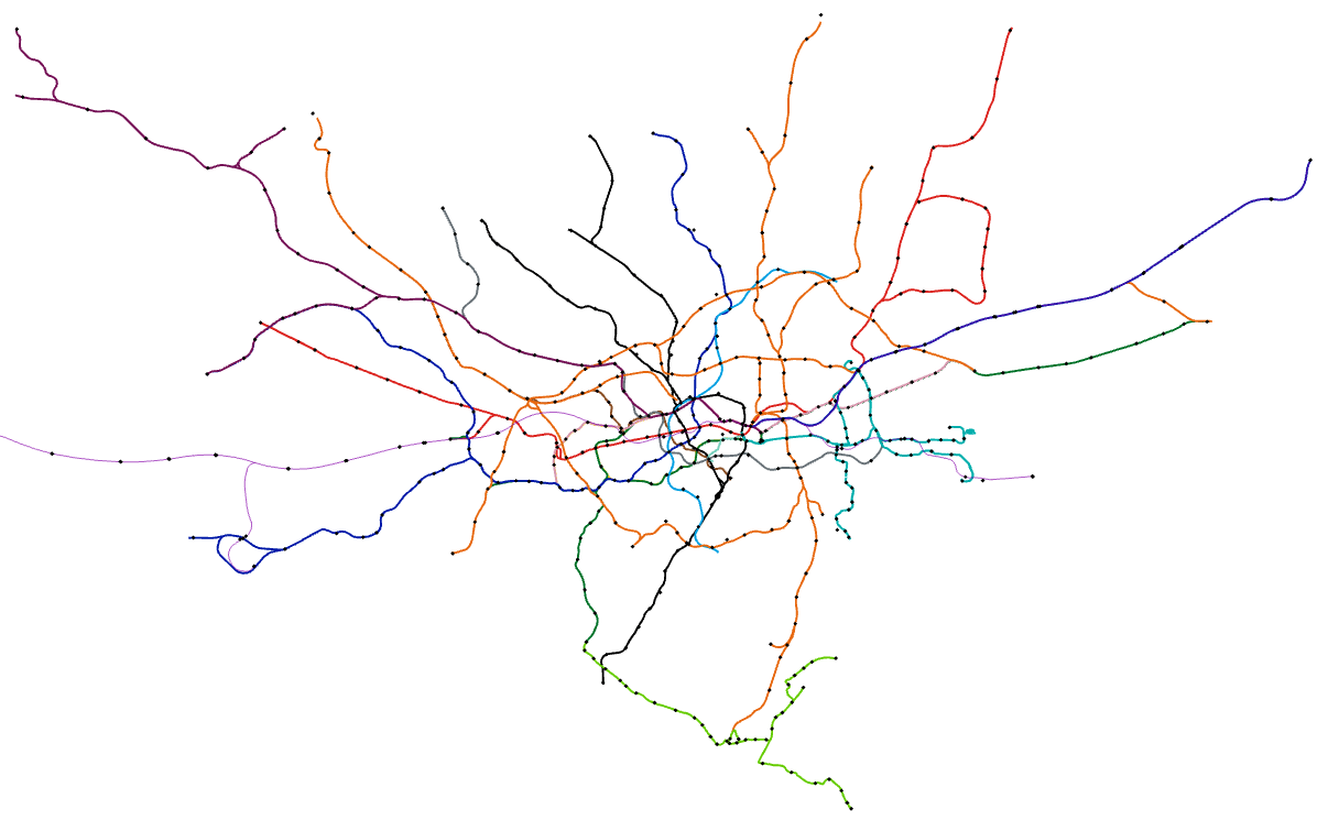
OK, that’s one big mess of spaghetti. Of course, London’s a major city with a transit network that goes back to 1863 with the construction of the world’s first underground railway – the Metropolitan Railway. And lines and stations have been constantly added ever since. There’s currently over 250 miles of track serving 270 stations which will expand further with the brand new Elizabeth Line currently nearing completion. Beck’s answer to creating a map that would support the need for route-finding was to simplify the geography to straight lines organised horizontally, vertically and at 45° angles. He exaggerated the congested central area and contracted the periphery, arguing that people didn’t need to know what lay above ground to get from one station in the network to another. Beck’s initial pattern remains in London’s official map products.
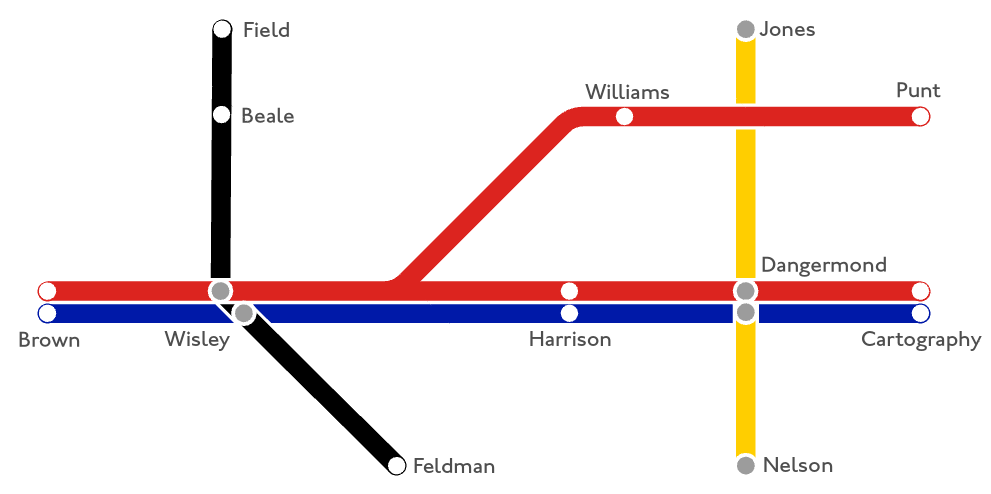
Most transit maps use a grid as a framework. This grid supports the systematic creation of the lines in an orderly fashion. A grid can use pretty much any geometric shapes that tesselate such as squares, hexagons and triangles. This provides you with the scaffolding for the map.
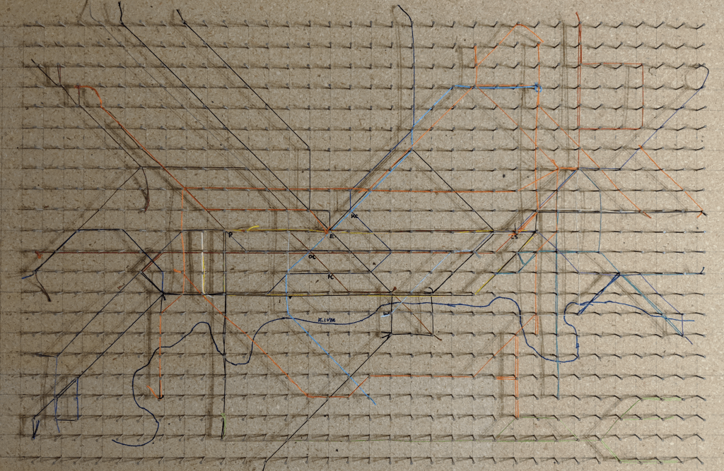
For my example I went a stage further but this is by no means necessary. I made a physical peg board which had 800 nails in a square grid each 3cm apart. Beck’s original map was laid out on a square grid and while I’ve experimented with other forms I keep coming back to squares which seem to suit the layout of London. Here’s the board with a load of thread that I used to lay out the map. The beauty of sketching (whether using pencil, thread, or some other physical means) is that you’re engaging in a manual creative process using your hands to craft something before committing it to a different medium, and you can easily change things around quickly. You can, of course, skip straight to digital if you prefer.
I tried to be unencumbered by the official map, or the dozens of other versions that you can find with a quick internet search. Obviously any new map of a city that has many official and unofficial maps will take on some similarities to their counterparts but what I was trying to achieve was a simplified map, compared to the official version. And once I’d got as far as I thought I could it was time to go digital.
I began with a blank ArcGIS Pro project and added a basemap reprojected into British National Grid. I was going to include a geographical (rather than schematic) representation of the River Thames on the map so situating the schematic detail would be done around this single natural feature.
I took a high resolution photograph of my peg-board and then simply added it as data to the Map in ArcGIS Pro and used the Georeferencing tools to position it in roughly the right place. The nails were at a 3cm spacing on the peg board, and using the river as a reference feature I reckoned this would translate to a grid of squares about 500m x 500m on the digital map. Now, remember, scale is completely shot to bits on a schematic but all I’m trying to do here is set up some sort of framework to allow me to build the network. Or, in my case, trace it from a digital photograph of the peg board.
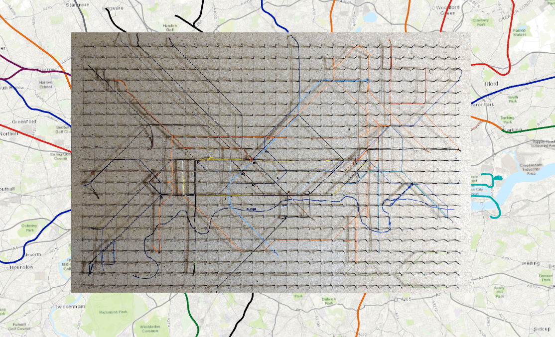
You can already see that my peg board, now roughly located atop of London has massively contracted the extremities of the geographical lines as they extend beyond the board and off into the suburbs.
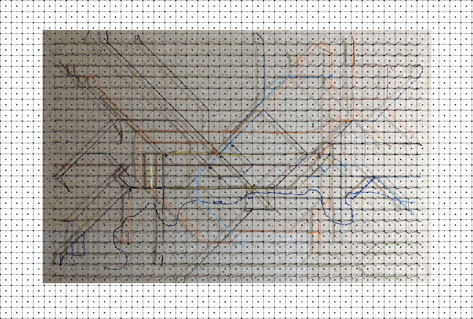
OK, now to get rid of the basemap because it’s not needed any more, and the geographical lines need to go too. In their place we’ll build the scaffolding. I used the Generate Tesselation tool to build a layer of grid squares 500m x 500m. I then used the Feature to Point tool to convert the polygons to a point feature class of point features that were positioned at the centroid of each square. Then, I used the Feature Vertices to Points tool to create another feature class of points at the corners of each of the squares. Finally, I made two copies of the corner vertices layer and, using Edit -> Select to select each duplicate layer in turn, I then used the Move To tool to move one copy 250m horizontally and the other copy 250m vertically. And there you have it – a digital version of my peg board (with a few extra nails for good measure) all ready for digital thread to be entwined.
So here’s the thing, sometimes actually drawing the map is the easiest way. Let’s call it on-screen digitising because that’s what we’re about to embark on. Using the geographical data I have and trying to move, warp and cajole it into neat lines is more trouble than it’s worth for this particular map, though of course you can just edit the vertices of the original data if you prefer.
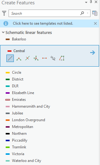
I made a polyline feature class and added a text field in the attribute table that would be used to note what line a particular route segment belonged to. And then I used Create Features tools to begin digitising of the features. I also defined the symbols I was going to use, and being careful to design the symbols at a specific reference scale (in my case 1:50,000). If you ensure consistent symbol widths at your reference scale are set up then you can use various editing tools later on to do some fine tuning, knowing that things will fit together and line up sweetly.
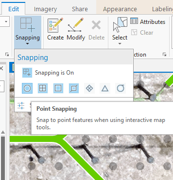
While I was using my peg board in the background to guide me, I was effectively creating new linear features on the map. The secret to making the features respect the horizontal, vertical and 45° angles lies in setting the snapping environment to help you.
You’ll find the snapping environment settings on the Edit toolbar. Just make sure Point snapping is turned on for initial digitising. You’ll make heavy use of End, Vertex and Edge snapping later on when editing features to fine tune their position.
OK, let’s get digitising. Click on the start of a line segment, move your mouse to a vertex (change of direction), make sure you’re snapped to a point on the digital peg board, rinse and repeat for your line and double-click to end it. Boom – your first line is complete. Just keep going to build your network.
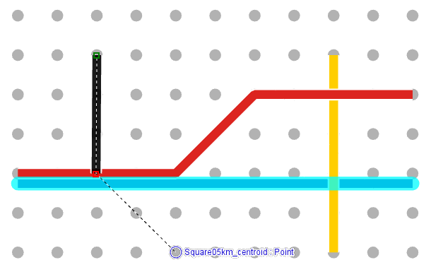
You see the highlighted line in the image above? That was actually digitised using the same left end point of the red line above it, only extended further right to a new end point. Yet it’s been moved downwards. You could drag the line with your mouse to a new location but if you want precision, that’s where the Move To tool comes in. Select the line and then use Move To. In this case a move in the y-direction of -90m means my line shifts south and has a perfect offset with no overlaps to the red line immediately above it. So even though real geography is meaningless on the map I’m still using measurements to build the map. It’s freehand…with precision.
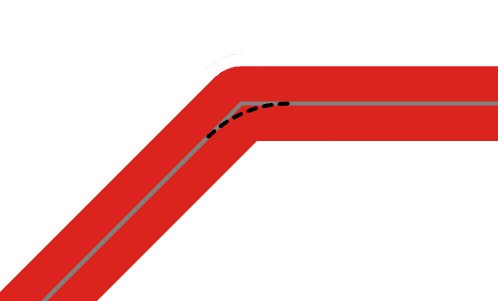
But when did you last see a train make a sharp turn? Track curves gently right? So let’s make our lines curve gently around the bends and where there are connections in the network. For that we use the Fillet tool and select a part of the line on one side of a bend, and a line segment on the other side of the bend we want to curve. We can manually drag a curve or set a specific distance. Because I want uniformity for the bends on my map I set this to 120m for most bends. You have to experiment a little for bends that are nested on adjacent lines because the curve becomes tighter for interior lines, but essentially it’s the same process. So let’s see this close up. The grey lines show the two selected line segments, and the angular join. The dashed line shows the curve that’s about to be created by the Fillet tool.
There’s plenty of other editing tools that you’ll likely find useful when editing your network. For instance, if you find you digitised something a little too short or too long, don’t try and edit the vertices, use the Extend or Trim tool instead. And a tip for those situations when you find unsightly gaps in the lines – open the attribute table for the lines and use Select by Attributes to select all line segments belonging to the same line. Then, use the Merge tool on the Edit toolbar to merge all line segments into a single feature. Be a little careful, because you’ll lose the ability to edit individual segments (unless you reverse the process using the Explode tool) but it’s a good final edit to really make those lines look classy.
There’s a few other things to think about while we’re digitising. For the polyline feature class, ensure that you are using Symbol Layer Drawing to specify that each segment joins to the next with no unsightly gaps. Make sure you use the end vertex of a previous line as the starting point for the next, again to avoid gaps. Finally, the draw order is also specified in Symbol Layer Drawing. On this example the red line takes priority over all lines. The black and yellow lines take priority over the blue line. You can change these depending how to want your lines to appear.
Notice also how there’s a little casing on the lines so when they cut over one another there’s a thin white line that creates that illusion of separation. This is simply achieved by adding a second solid stroke symbol layer to each line symbol. So, I have a 6pt solid white line with 4.5pt coloured lines stacked on top of one another for each line.
Finish your network off by designing station symbols for a point feature class and then digitising them into position using Point, End or Edge snapping to ensure they sit perfectly along the linework or at the end of a segment. You can add a text field into the attribute table for the station name and then use Labelling to position the labels but you’ll likely also want fine control over the precise location of each station name so you can simply Convert Labels to Annotation and then be able to move and modify each station name as you wish.
Depending on your network you might add other symbols, for instance to indicate short walks between stations, or where the transit network links to national rail networks. Once you’re done, it’s time to place the map into a layout and add titles and legends and whatever other map marginalia you wish (but please…no scale bars or north points!). I also used a small tapered polygon fill effect to the river because, well, it gets wider in the east as it approaches the Thames estuary.
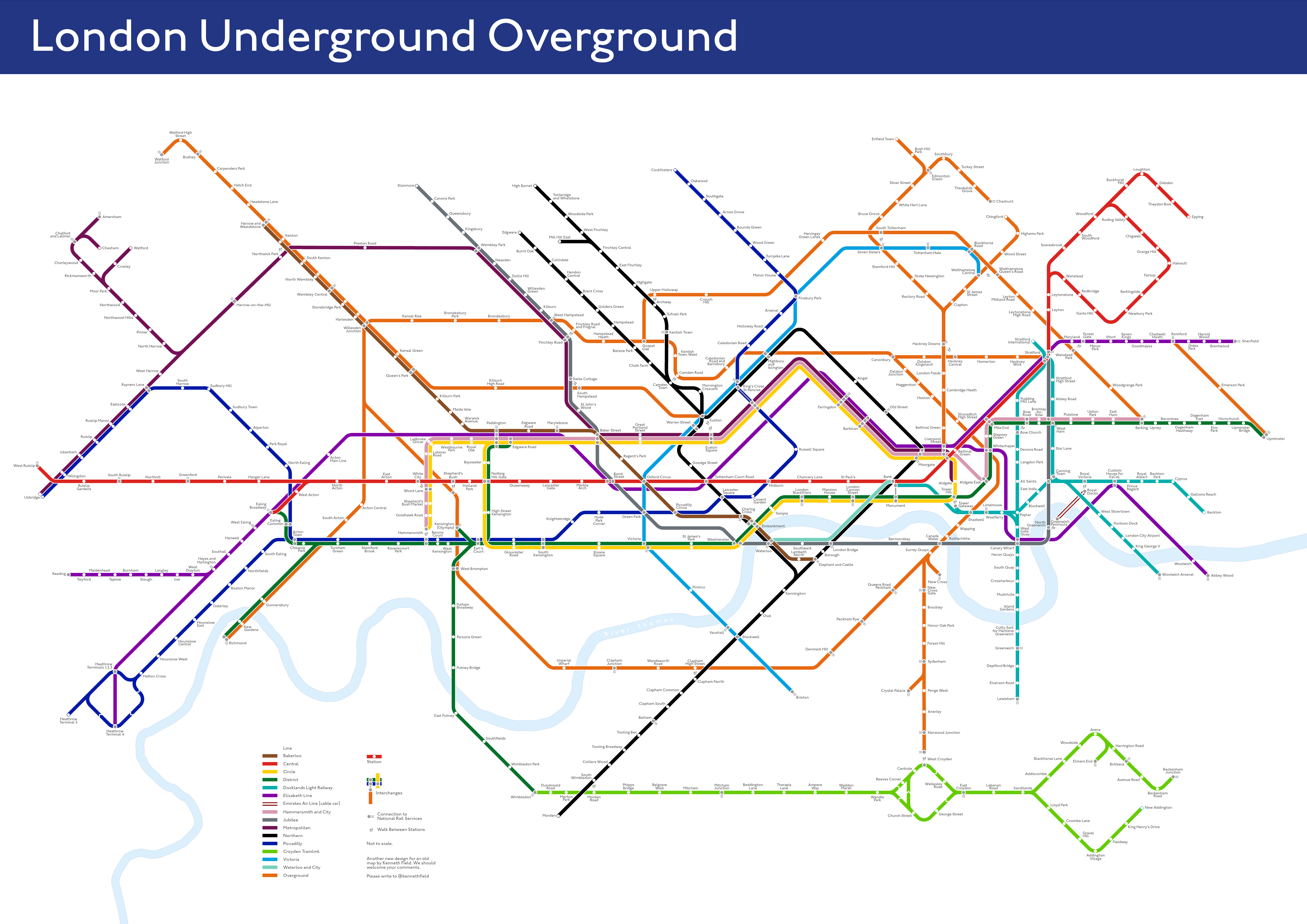
And here’s the finished map which you can download here as an A2 poster. It’s designed for paper because…paper.
Wait, what do you mean you’re strictly a web map person? But, but, oh OK. Here’s a slippy version for your digital delight but don’t go expecting fancy popups or other interactivity. It’s just a map. You can expand to an entire screen here.
There’s lots of conceptual reasons why I made the map in this way which I’ll explore in another blog. For now, I hope you enjoyed this how-to for making a simple transit map using ArcGIS Pro. Just be sure to put ‘not to scale’ on your final map.
And if you’ve read this far, thanks! Don’t forget there’s still my Tube map of tube maps parody map still out in the wild….and keep your eyes out for a 3D version of this transit map. Because…THREE DEE.


Commenting is not enabled for this article.