You have data, but that’s not enough to make a map. You also need a purpose.
There’s no point in making a map unless you have something to say. Making a map means making many decisions. Making decisions without guidance is hard. Making decisions toward a goal is easier.
Consider these questions, ones that commonly come up when making a map:
What should I title this map?
- Which color scheme should I use?
- Should I include this layer on the map?
- Do I need a legend?
- Should I include a chart in the pop-ups?
- What should be the extent of this map?
- What medium should I use to share this map?
Until you’ve decided on your map’s purpose, answering these questions will remain difficult.
A Map without Intent
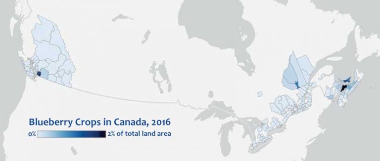
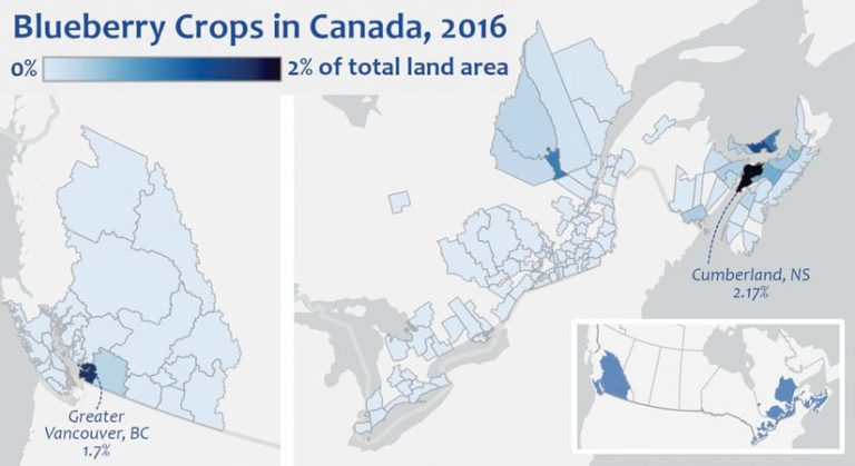
I made the map in Figure 1 without knowing what I wanted to say. My lack of intent resulted in an uninteresting map. That’s okay!
If I stopped my experimenting here and called the map in Figure 1 complete, what messages would be communicated to the reader?
- Blueberries are not grown in the middle of Canada.
- Cumberland County, Nova Scotia, grows a lot of blueberries, considering its size.
- Your map will always convey some message. It’s important to assess if it’s the message you intended.
A Map That Communicates Intent
You can communicate your intended message more clearly if you design the map with that message in mind. If the messages listed above were intentional, rather than accidental, I might arrive at the map in Figure 2. Because I made that map knowing what I wanted to say, I made decisions that led to the following actions.
- I added text to emphasize Cumberland County and compare it to its closest rival, Greater Vancouver.
- To make it easier to compare the relative colors, I zoomed in on the blueberry-growing regions and cut out the middle portion of the map that was empty.
- Removing the middle of the map also helped emphasize the lack of blueberry crops in central Canada.
- With its middle missing, the map was a bit disorienting. To compensate, I added a locator map, which also emphasizes the empty center of the map.
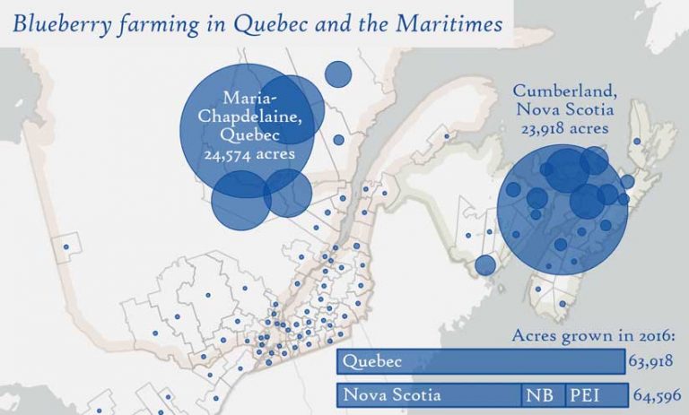
Changing the Map’s Intent
Consider a different map intention—one that determines which region grows more blueberries, Quebec or the Maritime provinces. This intention is narrower and more focused and it results in a more effective and interesting map. Except for the basemap and projection, every other decision I made for this map differs from the previous two maps because I was guided by a different goal.
Quebec is large, so showing blueberry crops as a percentage of total land area won’t do it justice. By switching to proportional symbols, I can show Quebec as a major player in the blueberry industry. In 2016, Quebec and the Maritimes were almost perfectly tied for dominance in blueberry farming, so I added a chart to illustrate this. British Columbia and Ontario also grow blueberries, but they are not relevant to this map’s goal, so I didn’t show them.
- The title is about the intent of the map, not the contents of the data.
- I outlined the regions that are being compared. The colors are faint, so they don’t compete with the primary data.
- I chose a font that softens the tone of the map to avoid the appearance of competition between the two regions.
Showing a Different Intent
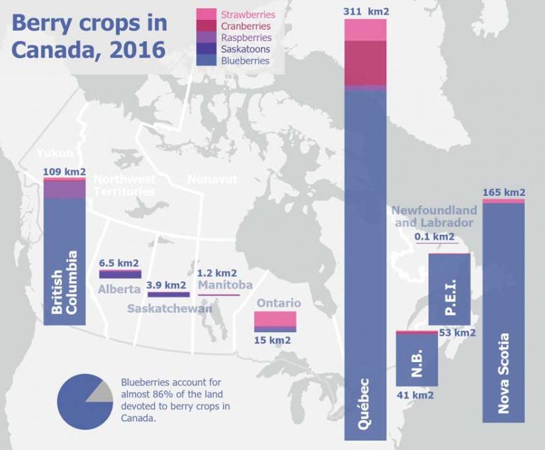
Consider making a map to show that blueberries are the dominant berry crop grown in Canada. For the map shown in Figure 4, comparing blueberries to other berry crops was important. Symbolizing by charts allowed me to do that. Should I even make a map?
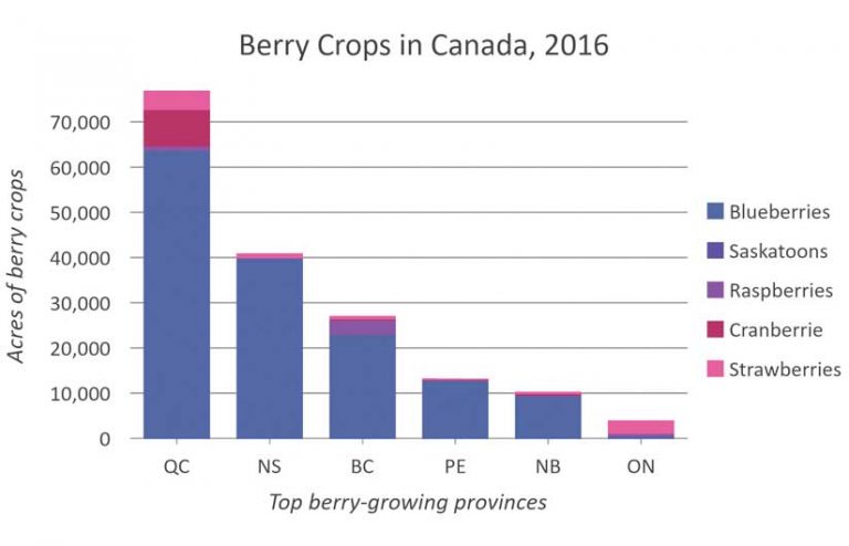
If you find that you’re fighting with your map to make it say what you want it to say, consider other methods of presenting your data. In the example in Figure 4, do I need to show the geography? Could a single stacked bar chart (shown in Figure 5) convey my message more clearly? Sometimes the best map isn’t a map.
Having an Intention Makes the Difference
In all these examples, shifting the intention resulted in different choices and different maps. What is the intention of your map? Why are you making it? What do you want it to say?
You can phrase a map’s intention as a goal. These are examples of goals that clarify a map’s intention.
- Help campers find their campsite and the nearest bathroom.
- Convince councillors that a new commercial development in your town will be beneficial.
- Educate children about the history of colonialism.
You can phrase the map’s intention as a statement. These are examples of statements that clarify a map’s intention:
- Our company offers better shipping services than our competitors.
- This is a remote region with great natural beauty and few services.
- This lake has been shrinking since 1965.
You can phrase the map’s intention as a question. These are examples of questions that clarify a map’s intention:
- Where are sensitive ecosystems most at risk in this country?
- Where should you locate a new health clinic?
- Which intersections have the most traffic accidents?
A Good Map Has Something to Say
Make sure that your map doesn’t just ask the question—it should also answer it. Don’t be afraid to state your intention outright. Consider making it the title.
Gone are the days when maps merely stored information. We have computers for that now. A good map has something to say.
Download MappingWithPurpose to view all the maps shown in this article and see how they were constructed in ArcGIS Pro. The primary dataset used in these maps is the Census of Agriculture 2016—Crops layer from ArcGIS Living Atlas of the World, sourced from the Government of Canada 2016 Census of Agriculture.
Experimenting with symbology, making charts, and exploring the attribute table are all important methods you should use to become familiar with your data. Never assume that you already know what your data says, or what you want to say with it. Making different maps is one method for arriving at your intention. [An accompanying article in this issue, “Explore Your Data First,” shares techniques and tips for using ArcGIS Online for exploring your data and gaining a better understanding of it so that you can make maps that have purpose.]
But it’s important to distinguish between the maps you make for yourself—the maps you make to help you explore your data—and the maps you make to share with others. The maps you make to share should be purposeful.
If I stopped my experimenting here and called the map in Figure 1 complete, what messages would be communicated to the reader?
- Blueberries are not grown in the middle of Canada.
- Cumberland County, Nova Scotia, grows a lot of blueberries, considering its size.
- Your map will always convey some message. It’s important to assess if it’s the message you intended.
A Map That Communicates Intent
You can communicate your intended message more clearly if you design the map with that message in mind. If the messages listed above were intentional, rather than accidental, I might arrive at the map in Figure 2. Because I made that map knowing what I wanted to say, I made decisions that led to the following actions.
- I added text to emphasize Cumberland County and compare it to its closest rival, Greater Vancouver.
- To make it easier to compare the relative colors, I zoomed in on the blueberry-growing regions and cut out the middle portion of the map that was empty.
- Removing the middle of the map also helped emphasize the lack of blueberry crops in central Canada.
- With its middle missing, the map was a bit disorienting. To compensate, I added a locator map, which also emphasizes the empty center of the map.
Changing the Map’s Intent
Consider a different map intention—one that determines which region grows more blueberries, Quebec or the Maritime provinces. This intention is narrower and more focused and it results in a more effective and interesting map.
Except for the basemap and projection, every other decision I made for this map differs from the previous two maps because I was guided by a different goal.
Quebec is large, so showing blueberry crops as a percentage of total land area won’t do it justice. By switching to proportional symbols, I can show Quebec as a major player in the blueberry industry.
In 2016, Quebec and the Maritimes were almost perfectly tied for dominance in blueberry farming, so I added a chart to illustrate this.
British Columbia and Ontario also grow blueberries, but they are not relevant to this map’s goal, so I didn’t show them.
- The title is about the intent of the map, not the contents of the data.
- I outlined the regions that are being compared. The colors are faint, so they don’t compete with the primary data.
- I chose a font that softens the tone of the map to avoid the appearance of competition between the two regions.
Showing a Different Intent
Consider making a map to show that blueberries are the dominant berry crop grown in Canada. For the map shown in Figure 4, comparing blueberries to other berry crops was important. Symbolizing by charts allowed me to do that. Should I even make a map?
If you find that you’re fighting with your map to make it say what you want it to say, consider other methods of presenting your data. In the example in Figure 4, do I need to show the geography? Could a single stacked bar chart (shown in Figure 5) convey my message more clearly? Sometimes the best map isn’t a map.
Having an Intention Makes the Difference
In all these examples, shifting the intention resulted in different choices and different maps. What is the intention of your map? Why are you making it? What do you want it to say?
You can phrase a map’s intention as a goal. These are examples of goals that clarify a map’s intention.
- Help campers find their campsite and the nearest bathroom.
- Convince councillors that a new commercial development in your town will be beneficial.
- Educate children about the history of colonialism.
- You can phrase the map’s intention as a statement. These are examples of statements that clarify a map’s intention:
- Our company offers better shipping services than our competitors.
- This is a remote region with great natural beauty and few services.
- This lake has been shrinking since 1965.
You can phrase the map’s intention as a question. These are examples of questions that clarify a map’s intention:
- Where are sensitive ecosystems most at risk in this country?
- Where should you locate a new health clinic?
- Which intersections have the most traffic accidents?
A Good Map Has Something to Say
Make sure that your map doesn’t just ask the question—it should also answer it. Don’t be afraid to state your intention outright. Consider making it the title. Gone are the days when maps merely stored information. We have computers for that now. A good map has something to say.
Download MappingWithPurpose from to view all the maps shown in this article and see how they were constructed in ArcGIS Pro. The primary dataset used in these maps is the Census of Agriculture 2016—Crops layer from ArcGIS Living Atlas of the World, sourced from the Government of Canada 2016 Census of Agriculture.