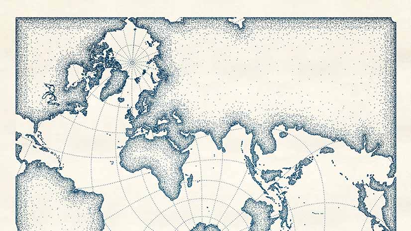
Try this Pen and Ink Style
Create a digital map that looks like it was drawn with pen and ink using the new pen and ink style created for ArcGIS Pro.
Create a digital map that looks like it was drawn with pen and ink using the new pen and ink style created for ArcGIS Pro.
A Canadian city used ArcGIS and GNSS receivers from Eos Positioning Systems, Inc., to map social distancing signs in parks and on trails.
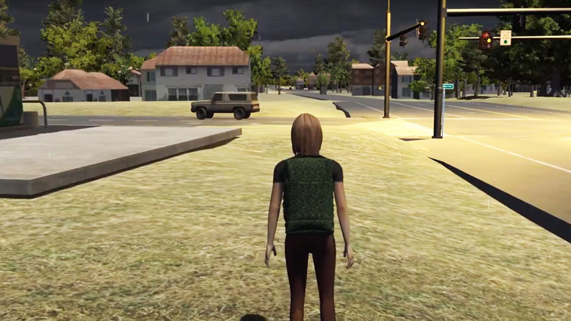
See how researchers at Rochester Institute of Technology (RIT) in New York used ArcGIS to create serious games for disaster response.
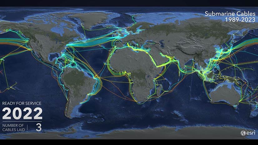
View an animated map of the worldwide system of underwater cables that carry telephone and Internet traffic.
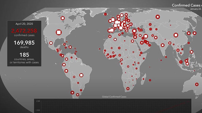
ArcGIS Pro and Adobe After Effects were used to create this animated map of the spread of COVID-19 from January 22-April 20, 2020.
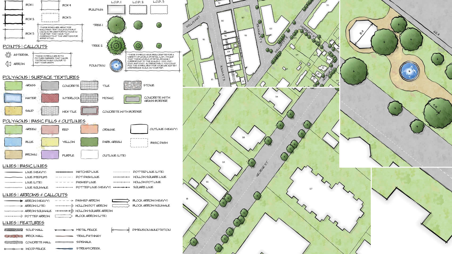
GIS analyst Warren Davison of Ontario, Canada, created Draft Sketch, a very artistic n ArcGIS Pro style for landscape design and site planning.
Learn to use the erase geoprocessing tool in ArcGIS Pro and data from ArcGIS Living Atlas of the World to make a map of your area of interest.
Do you need to extract information from imagery collected by a satellite or a UAV? Check out a course called Imagery Analysis in ArcGIS Pro.
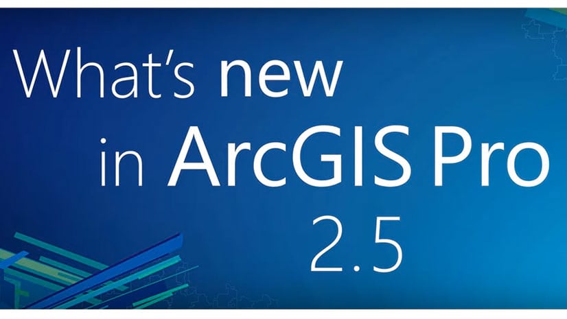
ArcGIS Pro now includes new data analysis capabilities, three new map projections, tools for making chart symbology, and more.
In this one-minute map hack, John Nelson from Esri teaches you how to add elevation hillshade to your map without washing the colors out.
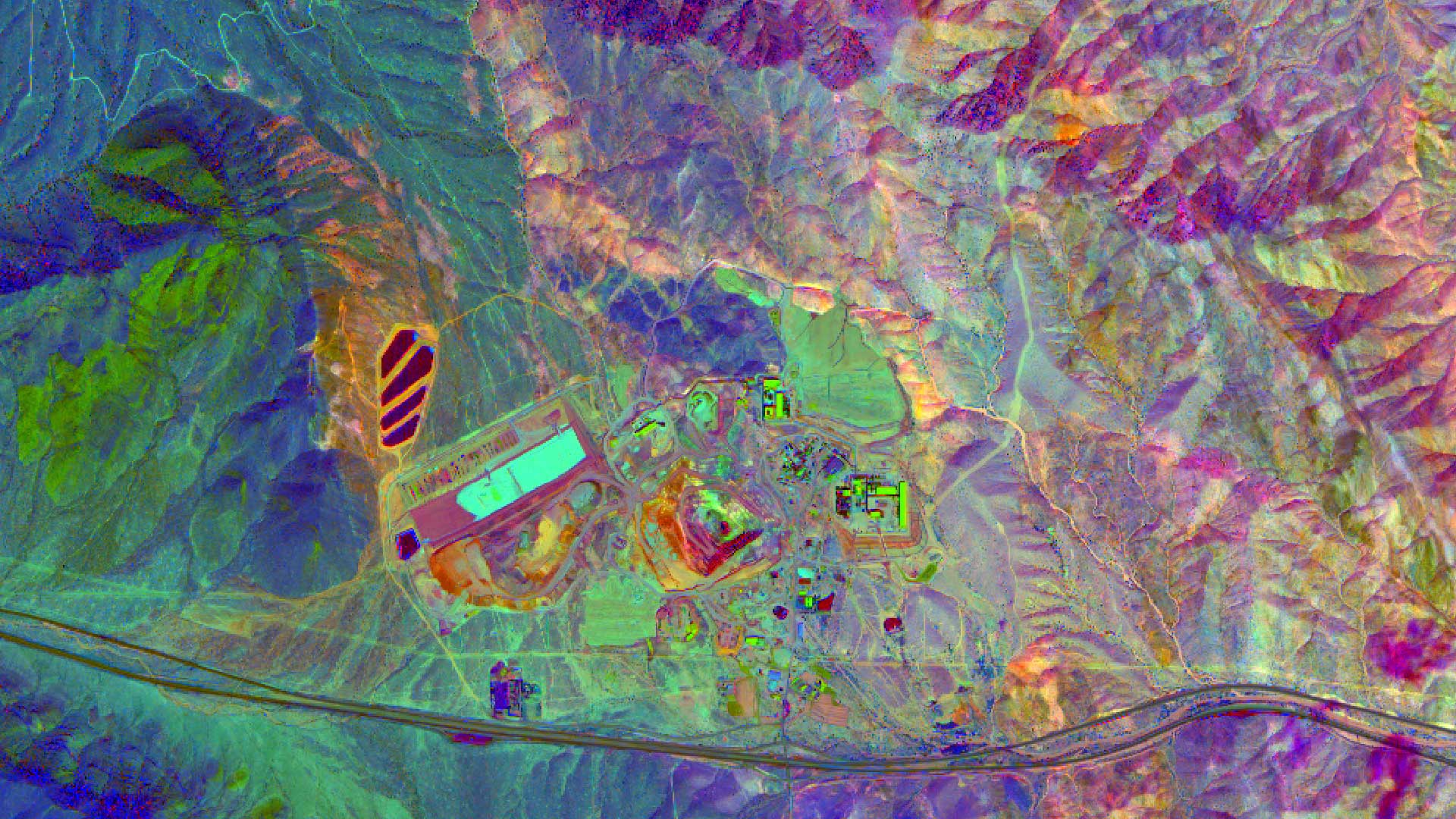
High quality imagery helps in finding mineral and petroleum deposits and Esri ArcGIS can be used to process, enhance, and analyze those images.
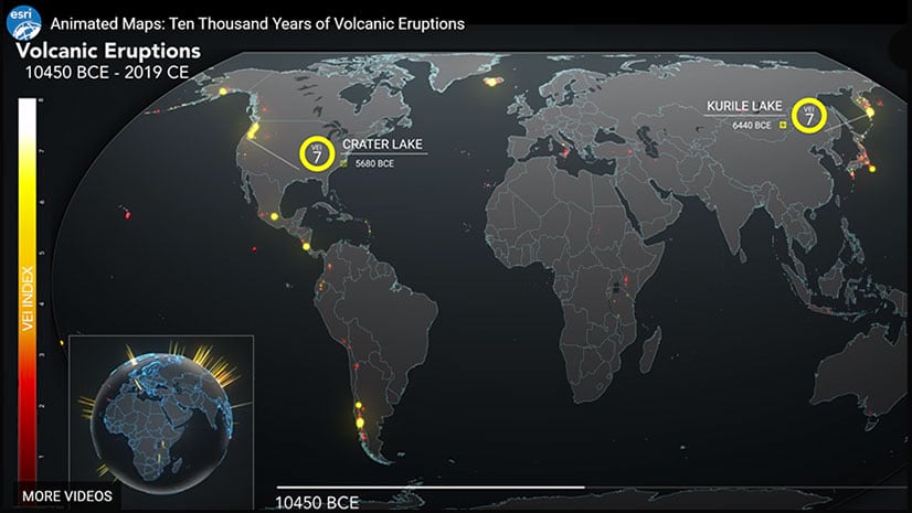
Esri created an animated map that groups volcanic eruptions over the last 10,000 years using the volcanic explosivity index (VEI).