Examine the 2011 Tōhoku, Japan, Earthquake and Tsunami with GIS
It is still one of the clearest memories I have of any of the hundreds of work trips I took over my career: My colleagues and I, along with over 10,000 others, had just arrived in San Francisco, California, for the annual meeting of the National Science Teaching Association (NSTA). It was the evening of March 11, 2011.
As the night wore on and we were setting up our Esri space in the exhibit hall in a very large convention center, reports began to flow in about the terrible events that were currently unfolding in Japan: A magnitude 9 earthquake had struck northeastern Japan, triggering a devastating tsunami that caused thousands of deaths. It came to be known as the Tōhoku earthquake and tsunami. It seemed almost too horrible to believe.
Even though all of us staffing the Esri exhibit had been studying natural hazards and teaching others about them for years, the photos we saw of cities besieged by waves—this was before streaming video on phones was common—were of heights and extents far larger than we had ever seen before. Suddenly, all the challenges I was experiencing in life seemed to pale in comparison to what people were dealing with on the other side of the Pacific Ocean.
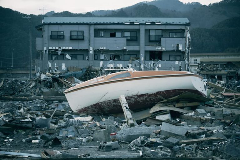
When all was said and done, Tōhoku was the most powerful earthquake ever recorded in Japan and the fourth most powerful in the world since modern record keeping began in 1900. According to some estimates, more than 20,000 people were killed, injured, or missing, and close to 500,000 people were forced to evacuate. In addition, a nuclear power plant meltdown triggered a nuclear emergency. The economic loss from this event was estimated at $360 billion, easily making it the costliest natural hazard the world had ever experienced.
On that night, none of us knew these figures yet, but our hearts went out to the victims. And we immediately shifted the main focus of our Esri exhibit to show educators how they and their students could use GIS to examine the earthquake and tsunami and other devastating natural hazards in science education.
We believed that spatial thinking and analysis through GIS was a method that could be used to study any aspect of our dynamic Earth, at any scale, and across any temporal span. The same is true a decade later. We used what we had available to us in 2011—real-time feeds from the QuakeFeed app (which still exists and is still excellent), which you can download from the Apple App Store. Back then, you could also map the United States Geological Survey’s (USGS) real-time spreadsheets of earthquake epicenters, magnitudes, and depths.
Since ArcGIS Online was just coming into existence, we were able to show a few of these layers using this new tool and also in ArcGIS Desktop 9. Even then, educators were amazed at the capabilities at their fingertips. This ArcWatch article, “Understanding Japan’s Earthquakes from a Geospatial Perspective,” describes these tools.
Fast-forward 10 years: You now have an even more amazing variety of 2D and 3D mapping tools to work with including ArcGIS Online, ArcGIS Earth, ArcGIS Pro, and Scene Viewer. You also can access authoritative geographic content from ArcGIS Living Atlas of the World and tutorials and lessons in the Esri Community space, GeoInquiries, and the Learn ArcGIS lesson library. The tools, content, and lessons help you to examine what has transpired over the past decade in the areas affected by the earthquake and tsunami and in locations impacted by other natural hazards around the world.
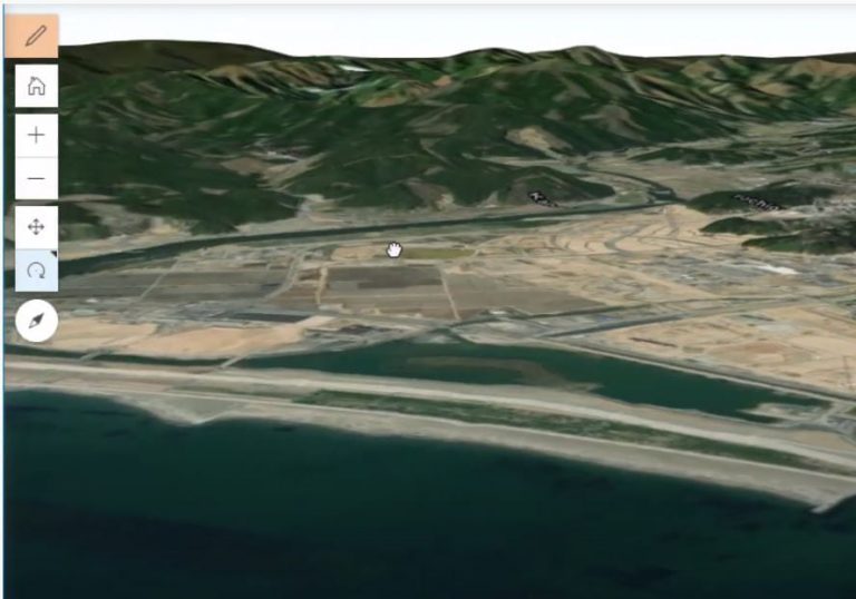
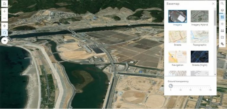
In this video, you will see how you can use tools in ArcGIS Online to study the Tōhoku earthquake and tsunami, including the devastation suffered by the residents of the city of Rikuzentakata, which sits on Hirota Bay. The city, which was home to more than 23,000 people before the earthquake and tsunami, was almost completely destroyed, with every building under three stories high completely flooded.
You can use a wide variety of basemaps in ArcGIS Online, including oceans, satellite imagery, street maps, and shaded relief, to examine changes at a small scale, including to local neighborhoods and coastlines. Measure tools in ArcGIS Online can be effectively used to learn about scale and distances.
For example, you can measure the distance between the northeast coast of Japan and the boundary of the Pacific Plate, along which the earthquake that resulted in the tsunami occurred. The Earth’s plate boundaries are often located where earthquakes occur. When these boundaries are added using the add button in ArcGIS Online, they show Japan’s position straddling at least two major and three smaller plates.
You can use the same tools to measure the following:
- The distance from Rikuzentakata to the Fukushima Daiichi Nuclear Power Plant in Ōkuma, where the tsunami caused the nuclear disaster
- The total area occupied by this massive power plant
- Changes that have occurred on the plant grounds and surrounding community between when the earthquake occurred a decade ago and today (The plant has expanded over the past decade with additional roads and storage constructed.)
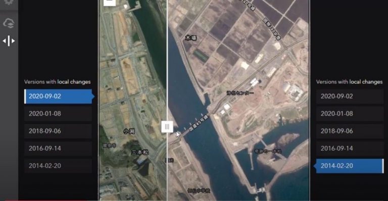
You can use the World Imagery Wayback app in ArcGIS Living Atlas to assess the reconstruction in coastal villages from 2014 to the present. As you can see by studying this imagery side by side using the swipe tool, massive amounts of earth are being moved in to raise the coastal area of the city before reconstruction can even begin.
You can add map layers to these maps and scenes, such as ecoregions; land use; earthquake epicenters before and after 2011; nearby volcanoes; and human-built infrastructure such as buildings, roads, and dams. Doing this will help you detect patterns, relationships, and trends.
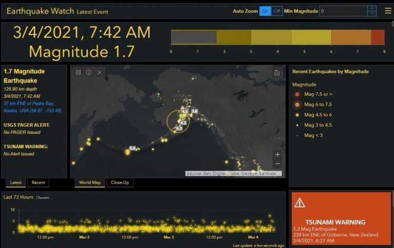
Resources available through the Esri Disaster Response Program website can be used to understand the dynamic planet that we call our home and the variety of hazards that exist. One good starting point is the Earthquake Watch dashboard, which is updated in real time.
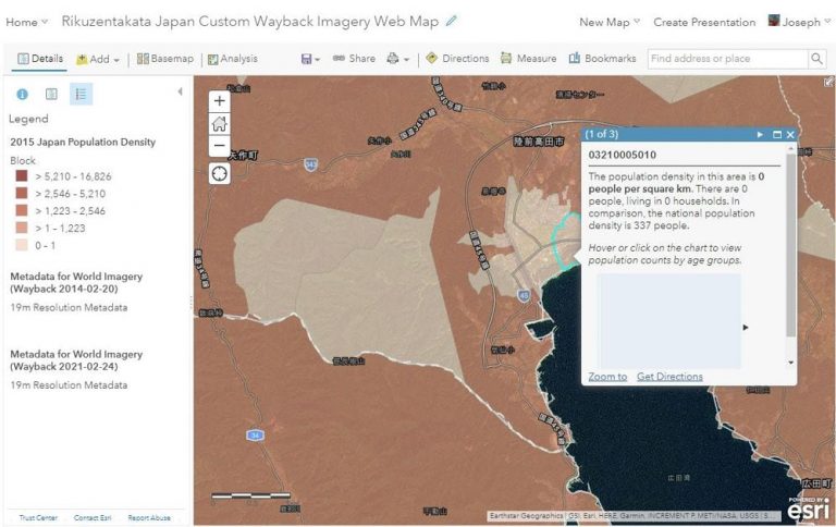
This ArcGIS Online map (displayed below) has layers selected that show population density, purchasing power, average age, and historical and current satellite imagery.
ArcGIS Online, which has more than 40 spatial analysis tools, can be used to determine all the land in Japan within 100 kilometers of the plate boundary; the population living within five kilometers of the coastline; the land-use change in communities over the past decades, pre- and post-earthquake; and much more. You could create a mean center and standard deviational ellipse of recent earthquakes there.
Using GIS has always been about far more than the tools and data layers alone. It’s being used in natural hazards work by a wide variety of organizations, helping with warnings, evacuation, rebuilding, and resilience efforts. But it’s especially important in hazards as devastating as an earthquake and tsunami. GIS can help us understand where people may be most vulnerable to natural hazards and help communities to become more resilient.
The initial shaking from the 2011 earthquake only lasted a few minutes, but its effects will be felt for many generations. What are the short- and long-term impacts on people’s lives, communities, and the country? What are the efforts that other communities have made to be more hazard resilient? What hazards are most common to your own community and region? You can use GIS to answer these and other questions.