

April 8, 2020 |
Richard Leadbeater | GIS for Good
When the COVID-19 pandemic intensified in Kentucky this summer—as it did across many parts of the US—the state was recording an average of 1,000 new cases each day. The spike was particularly pronounced in the state’s northernmost counties, which form the southern edge of the Cincinnati metro area. By early August, the region was experiencing its highest weekly caseload since the pandemic had begun, and the daily case count had doubled.
Of course health statistics alone don’t provide a complete picture of COVID-19’s effect on communities; the pandemic also causes economic fallout, a negative feedback loop of shuttered businesses and increased unemployment.
“It’s not just about a major plant shutting down,” said Kevin Hogue, a geographic information system (GIS) specialist with Kentucky’s Commonwealth Office of Technology (COT). “It’s also the places people go to eat lunch, and the gas stations, and everything else that gets affected by the closing.”
Recently, the Northern Kentucky Health Department reported three of the four counties under its jurisdiction experiencing community spread. Kenton County was the hardest hit, with a total caseload that topped 1,000, but Boone and Campbell Counties had the fastest rates of infection. Grant County, also under the department’s purview, had comparably fewer cases, but had just recorded its own milestone, with total cases reaching triple digits.
In March of this year, as the pandemic was gaining force, a group of IT and GIS experts with the state convened to discuss ways they could contribute. “During those early discussions, one of the things we talked about was creating a kind of map series or hub site with different focus areas,” said Kent Anness, GIS manager of Kentucky’s Division of Geographic Information. “We decided we needed an economy tab.”
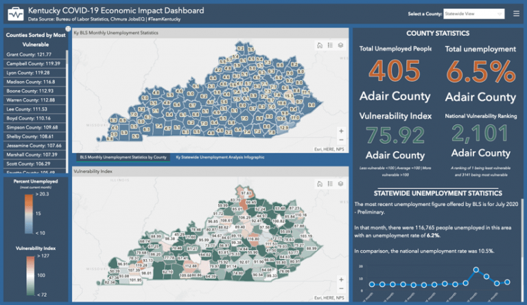
Kentucky’s economic development experts were thinking along similar lines. They knew federal aid would be necessary. As they gathered datasets, they realized a visual component could bolster their case. And since much of the data was public information, they decided a COVID-19 Economic Impact Dashboard, developed by Hogue could give Kentuckians context for what they were experiencing.
“People are hungry for information right now, and they’re out there looking for all sorts of things,” said Jennifer Schenkenfelder, sites and buildings coordinator for the state’s Cabinet for Economic Development and also the group’s resident GIS specialist.
Once the public-facing dashboard was established as a place for people to find the health-care information they need, Schenkenfelder said it was a clear pivot to add economic information to the site.
“They’re so used to hearing about the health-related end that when they discover the ability to look at it from an economic perspective—the infographics, the vulnerability index, all that stuff—they discover a different angle on the pandemic,” she said.
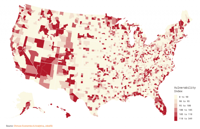
The vulnerability index, developed by labor market data company Chmura, is key to the site’s utility. Its formula assigns a value of 100 to represent average US job loss. Based on an area’s major employment sectors, and how likely they are to be disrupted by the pandemic, any score over 100 represents an increased likelihood of job disruption in the near future.
Kentucky’s Economic Impact Dashboard contains two state maps that display unemployment rates and vulnerability index figures by county. A glance at the ranked list of vulnerability figures reveals that Kentucky has so far weathered the pandemic’s economic effects relatively well. Of the state’s 120 counties, only 20 have a score above 100. Even among those 20, the unemployment rate is only slightly higher than the statewide average.
But, a look at the dashboard’s data presented in both list and map formats communicates a more troubling reality for northern Kentucky. The map reveals a cluster of vulnerability at the top of the state. The two counties with the fastest rates of infection—Boone and Campbell—are in the top 5 for vulnerability numbers. Grant County, despite its lower number of cases, also places in the top 5. Conversely, although Kenton County is the regional leader for cases, it scores below 100, signaling predicted lower-than-average job loss.
The upshot, presented in a format that is easy for even a casual user to grasp, is that northern Kentucky’s health crisis and future economic fortunes are intertwined. And since these counties are linked—economically and demographically—with the counties in Ohio and Indiana that also comprise greater Cincinnati, the dashboard provides a strong argument for an economic recovery strategy that addresses the entire region.
Besides offering an informed glimpse into the future, the dashboard’s architects believe it will also provide a way to assess the pandemic’s overall impact on Kentucky.
“The dashboard will be very important to show a month-to-month temporal analysis,” Hogue said. “We’re already talking about how it could be used as an ‘after-action report,’ whenever that might be.”
Learn more about how states apply GIS to explore and enhance economic development.