


September 22, 2020 |
Clinton Johnson | GIS for Good
June 19, 2022
Johnny Finn has long been interested in where things are and why things are where they are. It’s what geographers do. So, when he moved to coastal Virginia in 2012 to be an assistant professor of geography for Christopher Newport University in Newport News, he started to dig into the area’s history to understand the patterns he was seeing. It’s a postbellum, ship-building city in a region called Hampton Roads or Tidewater that felt more North than South but existed just down the road from what had been the headquarters of the US Confederacy during the Civil War.
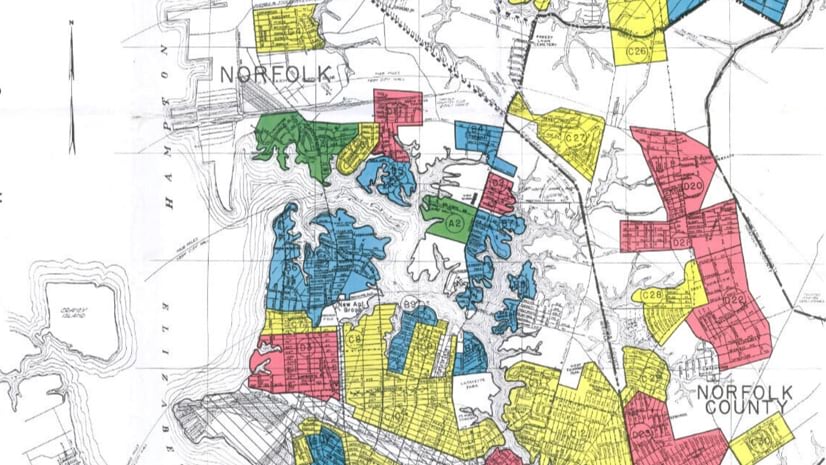
After reading about the University of Richmond’s “Mapping Inequality” project, he dove deeper into the redlining maps of the 1940s that banks used to deny loans to Black and immigrant homebuyers, including one for the city of Norfolk that referenced his own neighborhood. He was seeing that the region’s past wasn’t as far removed from its present as people might have believed. It became even clearer when he overlayed present-day demographic data over the overtly racist maps of the 1940s using geographic information system (GIS) technology.
“This was a really important moment—seeing how the geography we inhabit in the present is very much shaped by century-old processes that continue to reproduce the inequalities that we live with today,” Finn said.
For the last several years, Finn has been showing others what he’s seen in presentations to state leaders and community members, and in partnership with The Virginian-Pilot newspaper in Norfolk which published his maps and a series of stories dubbed “Dividing Lines” that explained how so much of the manufactured discriminatory divisions made decades earlier in the region of Hampton Roads, had lingered.
[Navigate the tabs in the StoryMap below to explore how past patterns persist in Hampton Roads, Virginia. Clicking on the brackets box in the lower right will open the map full screen.]
This fall, he’s hoping even more see the connections he’s made in a unique exhibit at the Virginia Museum of Contemporary Art, the culmination of several years of data collection incorporated in about a dozen maps produced with GIS for a project he calls Living Apart: Geography of Segregation in the 21st Century. Set to debut Nov. 17, his focus is on the people who have felt the sting of those lingering social inequalities firsthand.
“I’m starting with the stories,” he said. “This impacts individual people and we need to not lose sight of that.” The geographic data, “is embodied through the experience of people.”
Finn didn’t begin researching his new home with redlining maps. Instead, in 2016, he started gathering data from people that lived there. This work included an oral history project, in-depth interviews with members of the community, and a photographic experiment that involved giving people disposable cameras to take photos of the places that held the most meaning for them. He placed each photo on a map with captions that reflected people’s memories and interactions with each place. It turned out those meaningful places sometimes involved harmful incidents, including locations of shootings that had changed families.
Data, itself, can so often feel disconnected to the people it’s attached to, “real people, with real traumas,” Finn said.
When the pandemic arrived and he could no longer do face-to-face interviews, he started doing more spatial analysis using ArcGIS Online at home to show, in an empirically driven way, how a history of segregation had manifested into modern social inequality.
“Why has the inequality that the 1940 redlining map mapped out been so durable and so persistent across nearly 100 years?” Finn said.
It would have been one thing to overlay the older map with one that simply showed racial demographics of today and call it a coincidence. But Finn added more data within GIS including the locations of industrial sites that release toxic materials, asthma cases, home values, food deserts, and life expectancy, revealing inequities that demand environmental justice.
“Every single one of those maps show the same patterns of inequality,” he said of the near identical patterns he would see. Segregation had created longstanding, persistent inequalities. It wasn’t just an anecdotal theory. The maps showed that marginalized people faced continuous harm from policies in place long before many were born.
And not just in Hampton Roads in Virginia. He replicated the data and maps in GIS for other Virginia cities – Richmond, Lynchburg, and Roanoke – and saw similar results. He did the same for Baltimore, Cleveland, New Orleans, and even in San Diego County in California. There he showed community leaders how longstanding racist structures in the Southern California region have exacerbated issues related to substance use disorder and homelessness.
“There is no way this can be coincidence,” Finn said he discovered in his map-making using ArcGIS Online. “The maps visually show how systemic and how multi-faceted it is, to make it almost impossible to argue against.”
He’s been particularly encouraged when a stormwater engineer, public health official, or transportation manager calls him for help in understanding the impacts of racist past policies. With new investments in infrastructure, there may be an opportunity to right past wrongs or ensure inequalities don’t continue. Not all roads, stormwater pumping stations, and neighborhoods have been invested in equally. In many cases, the needed assets have been built in the wealthiest neighborhoods first, and these lopsided investments may not have happened had it not been for redlining decades earlier.
In his academic-turned-artistic endeavor, he expects to delve into five themes: a history of how the divisions happened, economic impacts, environmental impacts, health impacts, and a look at where we might go from here. He doesn’t want to fall into the trap of easy solutions, but he wants to offer some semblance of hope.
“I think we need to be made uncomfortable about the world we live in, in order to do something about it,” Finn said.
He hopes those visiting his exhibit see data in a different light, “that it’s not just abstract, it’s lived,” and that they walk away with more empathy for individuals’ lived experiences, which are all different.
He’s spoken to diverse groups, but with Black church members or activists, he often gets a similar reaction: “We know.”
“We know this to be true because we live it, but it’s really nice to see this data that shows it’s been true all along,” he said he’s been told.
“It’s so stark,” Finn said. “You can’t unsee it.”
Learn more about how GIS is being used to advance racial equity.