In ArcGIS Pro, there are a couple of tools in the Spatial Statistics toolbox (Modeling Spatial Relationships toolset) that help you to compare maps. The Local Bivariate Relationship tool analyzes the relationship between two numeric variables. The output visualizes areas where the variables are related and also identifies the types of relationships across the study area. Another tool, Colocation Analysis, measures local patterns of spatial association between two categories of point features and helps you to analyze where the category A points are more likely to collocate the category B points. In ArcGIS Pro 2.7, we have released a new tool called Spatial Association Between Zones, which evaluates the degree of spatial association between two regionalizations in the same study area. This tool also identifies where correspondences are between the zones on two maps and where are not. With this tool, questions like “How different are 2000 census blocks and 2010 census blocks?”, “How consistent are Building America climate zone and IECC climate zones?”, or “How do the crop types change from 1999 to 2019?”, which has been a very visual and manual process in the past, can now be quantitatively assessed.
In this blog, I will illustrate the basic concept of Spatial Association Between Zones and show you how to analyze the change in climate zones using this tool.
The Concept of Spatial Association Between Zones
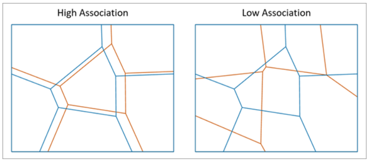
The tool measures the degree of spatial association between two regionalizations of the same study area in which each regionalization is composed of a set of categories, called zones. The association between the regionalizations is determined by the area overlap between zones of each regionalization. The association is highest when each zone of one regionalization closely corresponds to a zone of the other regionalization. Similarly, the spatial association is lowest when the zones of one regionalization have a large overlap with many different zones of the other regionalization. To illustrate this concept, let’s use Figure 1 as an example.
Local Correspondence Measures
Step 1. Let’s say there are two maps, Map A and Map B (Fig 1). The tool overlays these two maps and compares Map A zones to Map B zones. In Figure 2, for the red zone in map A, it looks in Map B and says there is only one zone type which is the purple zone that falls within the area of the red zone. So, the red zone gets the highest local correspondence measures, which is 0. Similarly, for the green zone (Fig 3), and the blue zone (Fig 4) of Map A, the correspondence values are 0.

Step 2. Next, it compares Map B zones to Map A zones. Let’s look at Figure 5. For the purple zone, there are actually two zone types that fall in that area, so there is a lower correspondence between them, and the purple zone gets a score of 0.5. The higher the value, the lower local correspondence. If there had been 4 different zone types within the purple area, the local correspondence will be much lower. Then the yellow zone gets another zero (Fig.6), which means the highest local correspondence again. So overall these two maps have both high correspondence, but there is a lower correspondence between A and B in the purple zone area (Fig.7).

Global Correspondence & Global Measure of Saptial Association
In addition to the local measures of the correspondence between two regionalizations, the most important metric – Global Measure of Spatial Association – tells you the overall spatial association between zones on two maps.
Step 1. To get Global Measure of Spatial Association, the tool first calculates Global Correspondence of Map B zones within Map A zones, which is a measure of the consistency of the zone categories of the Map B within each of the Map A zone. The tool weights each local correspondence measure on Map A by the percentage of its area. Then, summing them up and subtracting this value from 1 (check the original paper for the details of the algorithm). After that, we get the Global Correspondence of Map B zones within Map A zones. Different from the local measures of the correspondence, 1 is the highest global correspondence. A value of 1 indicates that every Map A zone contains only a single Map B zone within it. In our example (Fig.1), every zone on Map A (including red zone, green zone, and blue zone) contains only one type of zone from Map B; therefore, the Global Correspondence of Map B zones within Map A zones is 1.
Step 2. Similar to step 1, this tool also calculates the Global Correspondence of Map A zones within Map B zones. A value of 1 means every Map B zone contains only a single Map A zone within it, while values closer to 0 indicate that the Map B zones do not have a dominant category from Map A. Using the same example, the purple zone on Map B contains two different zone types from Map A, so Global Correspondence of Map A zones within Map B is closer to 0 (about 0.66).
Step 3. Global Measure of Spatial Association, ranging from 0 (no association) to 1 (perfectly match), is a harmonic mean of Global Correspondence of Map B zones within Map A zones and Global Correspondence of Map A zones within Map B. If Global Correspondence of Map B zones within Map A zones and Global Correspondence of Map A zones within Map B both are 1, Global Measure of Spatial Association will become 1 as well. It means every Map A zone contains only a single Map B zone within it, and every Map B zone contains only a single Map A zone within it. In other words, it tells you that the zones in these two maps perfectly match each other.
Figure 8 is another example, orange zones and blue zones in the left graph have higher Global Measure of Spatial Association and much have a lower association in the right graph.
How does the climate zones shift?
1. The data used in this blog article
Köppen-Geiger Climate Classification 1976-2000, and Köppen-Geiger Climate Classification 2076-2100. The data can be downloaded from The World Bank Data Catalog.
2. The Analysis
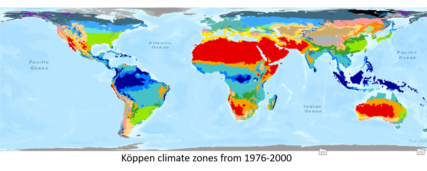
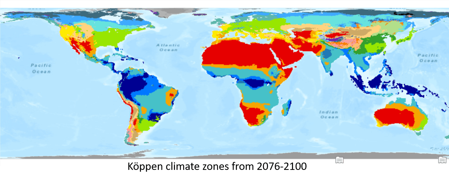
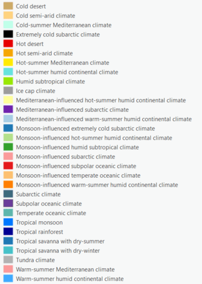
Here are two maps of the Köppen-Geiger climate classification downloaded from the World Bank Data Catalog. Figure 9 is the Köppen climate zones from 1976-2000 calculated from observed temperature and precipitation, and Figure 10 is the Köppen climate zones from 2076-2100 projected with Tyndall temperature and precipitation data for that period. Colors in both maps indicate the climate zones (Figure 11). To understand how similar the climate zones are across 100 years, what climate zones changed the most, and what are the changes, let’s get started using this tool.
To use this tool, I select the Previous Koppen Climate Zones as the Input Polygon Feature or Raster Zones and I select the Categorical Zone Field. The polygons with the same categorical zone will be treated as the same zone in this tool, even though they are not contiguous. Then, I select the Future Koppen Climate Zones as the Overlay Polygon Feature or Raster Zones and also select the Categorical Overlay Zone Field (Fig.12).
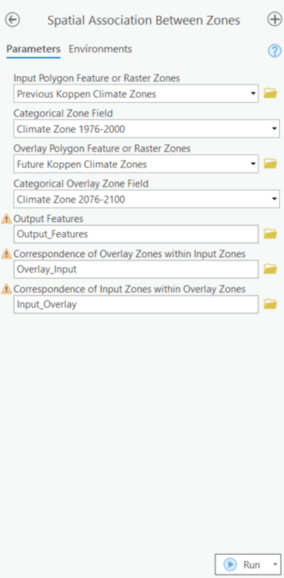
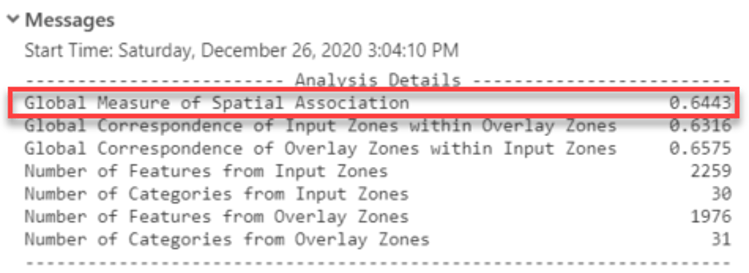
The Global Measure of Spatial Association is a derived output and also shown in the Geoprocessing Message (Fig.13). The number indicates the degree of spatial association between zones on two maps, with closer to 1 representing a higher association. Overall, the value of 0.64 tells that these two maps are somewhat similar.
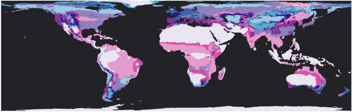
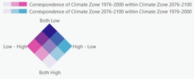
The output features (Fig.14) visualized by bivariate colors scheme (Fig.15) tells you the local differences. The lightest grey indicates a high correspondence between two maps in both directions (Both High). As you can see in Figure 14, Northern and Sothern Africa, the Southwestern region of North America, and Western Australia are in the lightest grey, and it means the Hot Dessert Climate Zone stays relatively constant across 100 years. Tropical Rainforest Zone including Southeastern Asia, the northern part of South America, and the middle region of Africa won’t change a lot because they are also in the lightest grey. The U-shaped region of North America, a part of Russia, and some areas of the Southwestern region in China are Cold Semi-Arid Climate Zone. They are in the darkest purple in Figure 14, which indicates the lowest level of correspondence between two maps (Both Low). Darker shades of blue indicate the lower correspondence of the overlay zone (Climate Zone 2076-2100) within the input zone (Climate Zone 1976-2000). Take West Europe for example, it is in the darker blue, and the color means the Previous Koppen Climate Zones here, Temperate Oceanic Climate Zone, will be decomposed into various climate zones after 100 years.
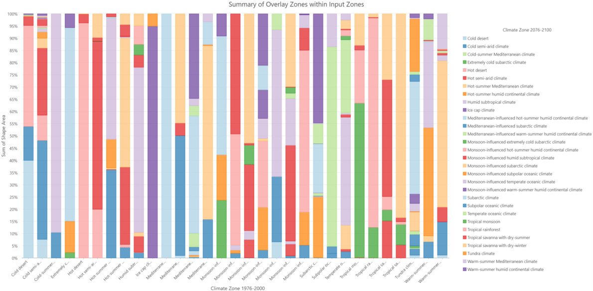
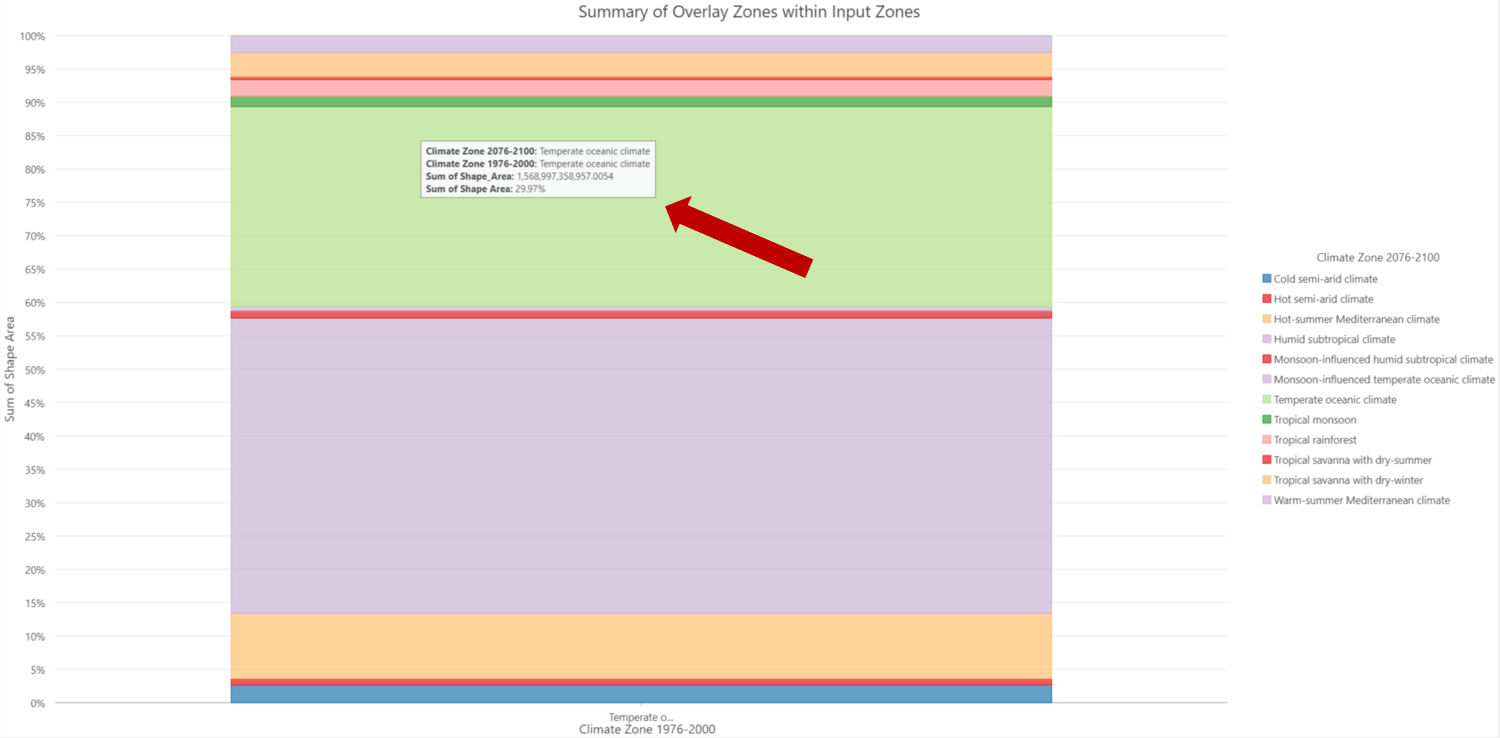
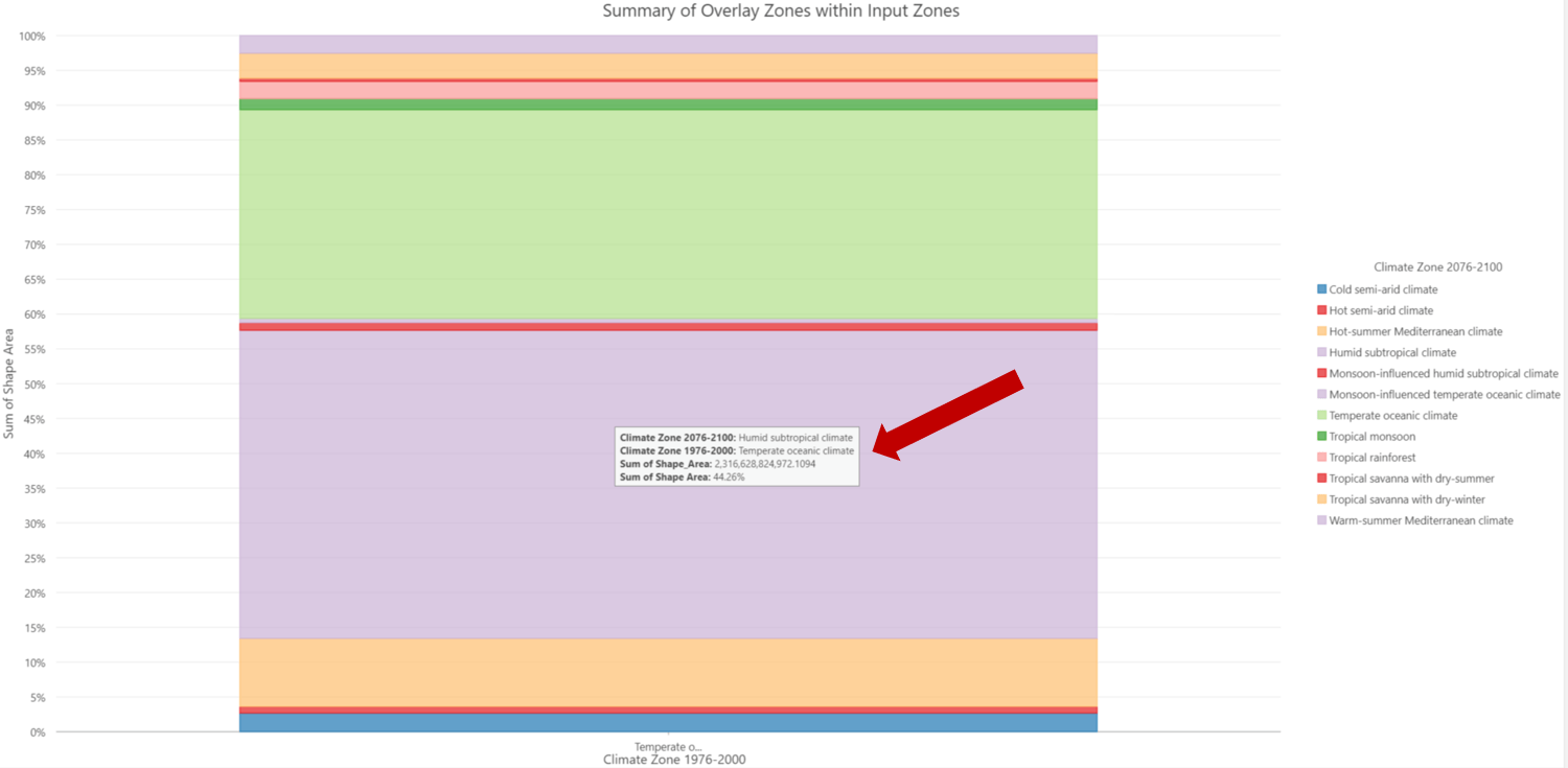
You might want to dig in more about the change. One of the charts, Summary of Overlay Zones within Input Zones Map (Fig. 16), coming with the Output Features can help you. Figure 17 is the selection of the Temperate Oceanic Climate Zone, which shows that only 29.9 % of Temperate Oceanic Climate Zone (green color) will stay the same. However, 44 % of the Temperate Oceanic Climate Zone (purple color) is going to become Humid Subtropical Climate in 2076-2100 (Fig. 18).
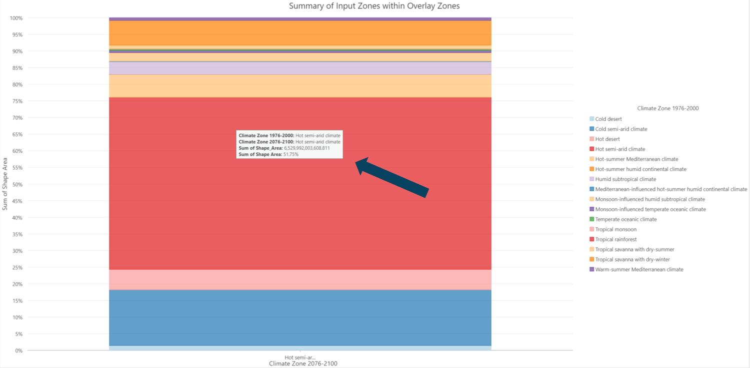
Darker shades of pink indicate the lower correspondence of the input zone (Climate Zone 1976-2000) within the overlay zone (Climate Zone 2076-2100). The dark pink belts around Africa and Australia, and the dark pink region of the east corner in South America are the example. They are Hot Semi-Arid Climate zone. In this case, the pink color means the Hot Semi-Arid Climate zone is expanding, and more different climate zone types will become Hot Semi-Arid Climate zone in the future. The selection of the second chart, Summary of the Input Zones within Overlay Zones Map (Fig. 19), coming with the Output Features tells you the details of the change. Around half of the Hot Semi-Arid Climate zone (red color) during 2076-2100 were also Hot Semi-Arid Climate zone before. However, many other climate zones in the 1976-2000 period later become Hot Semi-Arid Climate zone, including the Cold Semi-Arid Climate zone (blue color) and Tropical savanna with dry-winter (orange color).
In general, the higher latitude regions in both the North and South hemispheres are leaning toward blue. This indicates that the cold and temperate climate zones such as Tundra climate, Monsoon-influenced subarctic climate, and Temperate oceanic climate are breaking into various climate zones in the future. In contrast, regions closer to the Equator are leaning toward pink meaning that the dry climates such as Hot semi-arid climate and Tropical savanna with dry-winter are going to incorporate more different climate zones. It could be related to global warming – the earth is getting hotter and dryer.
In Conclusion
In this blog, I demonstrate how Spatial Association Between Zones tool help to quantitatively evaluates the change across time. Another application is that a demographer can compare the 2000 census blocks with the 2010 census blocks to detect the overall change and the small-scale boundary shift rather than relying on crosswalk tables. This tool can also help you to explore the relationship between two variables. For example, an agricultural extension agent can compare crop type with climate zones to inform planting decisions in a changing climate. In addition, this tool can be used to evaluate the classification or clustering results. For example, a climatologist can compare two climate zone maps (BA and EPA Climate Zones) to determine the consistency between the two climate classification methods and where they differ.


Commenting is not enabled for this article.