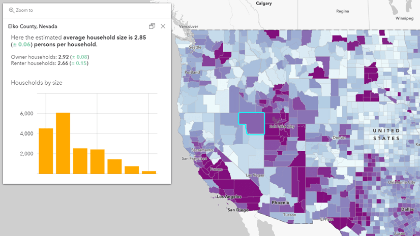
Many GIS analysts work with American Community Survey (ACS) data from the U.S. Census Bureau. This data is based on a sample of the population, therefore, like all survey data, it contains error due to sampling. Census publishes margins of error along with each and every estimate they publish, which is incredible. Viewing margins of error for a specific measure on a specific tract can erroneously lead users to dismiss the entire ACS. Worse, users may not know that the typical geographic analysis of ACS data actually increases the data reliability by a noticeable amount.
The way that Census is able to publish estimates down to the census tract and even block group level is by coarsening/aggregating across years. They pool together 5 years of data in order to produce estimates at such fine geographic levels. In addition to coarsening across time, we can also coarsen across space.
While this may seem like heresy to many geographers, there are benefits to coarsening, or aggregating up geographically. Many people need data disaggregated by race/ethnicity, gender, income, and more. Well, coarsening can make this data more reliable. Some cities have gone through robust validation processes to create their own geographies that are coarser than census tracts. For example, New York City has their own Neighborhood Tabulation Areas, and Houston has their own Super-Neighborhoods. We can tap into geography to test your own groups of tracts. You can call them anything you like. I’ve been calling them super-tracts.
Introducing: the ACS Summarization App
This lightweight app is designed to help you get a quick sense of how many tracts you’ll need to aggregate together to get an estimate that meets your desired reliability. The left panel lets you search and select layers and attributes. If you select a count, the tract centroids will be symbolized by size. If you select a percent, the tract centroids will be symbolized by color.
The right panel lets you see your summary statistics. The gauge shows the Coefficient of Variation (CV), which is calculated on-the-fly. The lower the coefficient, the higher the reliability. Conversely, the higher the coefficient, the lower the reliability.
| Coefficient of Variation (CV) | Reliability |
|---|---|
| CV <= 12 | high |
| 12 < CV <= 40 | medium |
| 40 > CV | low |
Use the sketch tools on the top of the map to create your super-tract. Watch the gauge change as you modify your sketch!

Still not convinced? Watch this 5-minute video:
Tract summarization best practices
First, draw a shape around the neighborhood or district you know you want to analyze. Get the basic shape on the map to start.
Preserve patterns in the map
Try to follow the patterns in the map when combining. For example, combine high values with other high values and lower values with other low values. The symbology in this app can help, but your own local on-the-ground knowledge is invaluable here. I realize this is hard when aggregating just a few tracts, and also balancing other considerations. However, combining areas with wildly differing characteristics will smooth out the numbers and become less informative.
Be mindful of tracts with an estimate of zero
Tracts with an estimate of zero are symbolized by the transparent teal symbols (for counts). These are generally in places such as airports, cemeteries, open land, and so on, but they can be anywhere.

Even zero estimates have margins of error, which means there may be a few individuals in your population of interest in these tracts. They will not add anything to your estimate, but because they have a nonzero margin of error, they could add slightly to your error.
Use official estimates when available
Additionally, this aggregation method will only give you an approximation for both the estimate and the margin of error using the approximation formulas in the ACS Handbook. Census produces official estimates for school districts, incorporated places, county subdivisions, congressional districts, and much more. If you’re aggregating up to get values of a defined census geography, such as a city boundary, check data.census.gov for an official estimate you can use. Not only does the official estimate use the true boundary, but it will also have a lower MOE than you’d get from aggregating tracts, since it’s not being approximated.
Adjust your reliability comfort-level depending on the nature of the estimate
Ideally, we’d like all estimates to have high reliability, with a low coefficient of variation. However, this will be hard to achieve for very small populations, for example:
- children in the care of grandparents
- female veterans
- rental housing units that are mainly heated by solar
In cases like these, could you live with a medium level of reliability if that means finer geographic detail?
Also, neighboring tracts can have different reliability for the same attribute. Sometimes tracts do have reliable estimates, so there’s no need to aggregate unnecessarily. Why lose the geographic detail?
Use this app to iterate quickly and dynamically
Some last few details:
- The final super-tract does not persist outside of the app. Use this app as a starting place to iterate, and then create your final super-tracts using geoprocessing tools such as merge and dissolve. This app uses centroids for faster performance, but you might be interested in using the polygon versions of these layers that contain tract boundaries.
- Estimates of medians are not included. Aggregating medians requires the full distribution of values, not just the medians of the various tracts. Therefore, estimates of medians are not in this app. Sometimes, entire layers are not included, such as Median Age, since all the attributes in this layer are medians.
- The estimates update every year with new values, since they use Living Atlas layers that are updated annually. An aggregation that meets your reliability requirement now may not hold in future data releases.
This app is designed to give you a jumping-off point for creating aggregations of tracts. It’s designed to help you iterate quickly and dynamically, to get a quick sense of how much you’ll have to aggregate up geographically in order to meet your reliability comfort-level. Geography can actually help us work with error, rather than being scared by it.
Updated on 2/27/23.

I’ve not used CV much, but wonder if your table is correct. Shouldn’t the “Low” category be “> 40” instead of “<40?
Oh goodness, thank you! Blog post has now been corrected.