I have great respect for the past. If you don’t know where you’ve come from, you don’t know where you’re going. I have respect for the past, but I’m a person of the moment. I’m here, and I do my best to be completely centered at the place I’m at, then I go forward to the next place. -Maya Angelou
When Dr. Lauren Gardner’s team at Johns Hopkins University began tracking, and sharing, up-to-date case counts of the nascent spread of SARS-CoV-2, the virus that causes COVID-19, few in the United States may have suspected the magnitude of the impact, and duration, of the pandemic these many months later.
Familiar as red graduated circles in a web-based dashboard—a resource that quickly became the de facto reference for a rapt public to the growing reach of the pandemic—these local counts of infections and deaths provide a visceral documentation of the situation right now. But the nature of right now is that of a moving window, with previous versions extending into the past like breadcrumbs tracing our path through this difficult time.
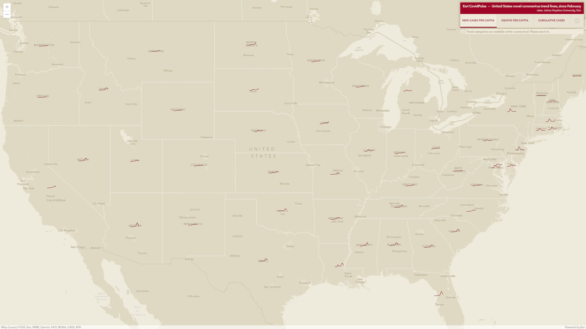
CovidPulse, available here in Living Atlas, presents this daily data as a simple visual trend of local rates of infection, over time. Like a stock ticker, or the regular pulse of an EKG, the proportion of those infected in a community rises and falls with each spread event and subsequent suppression. CovidPulse shows not only where we are, as best we can know, but also where we’ve been.
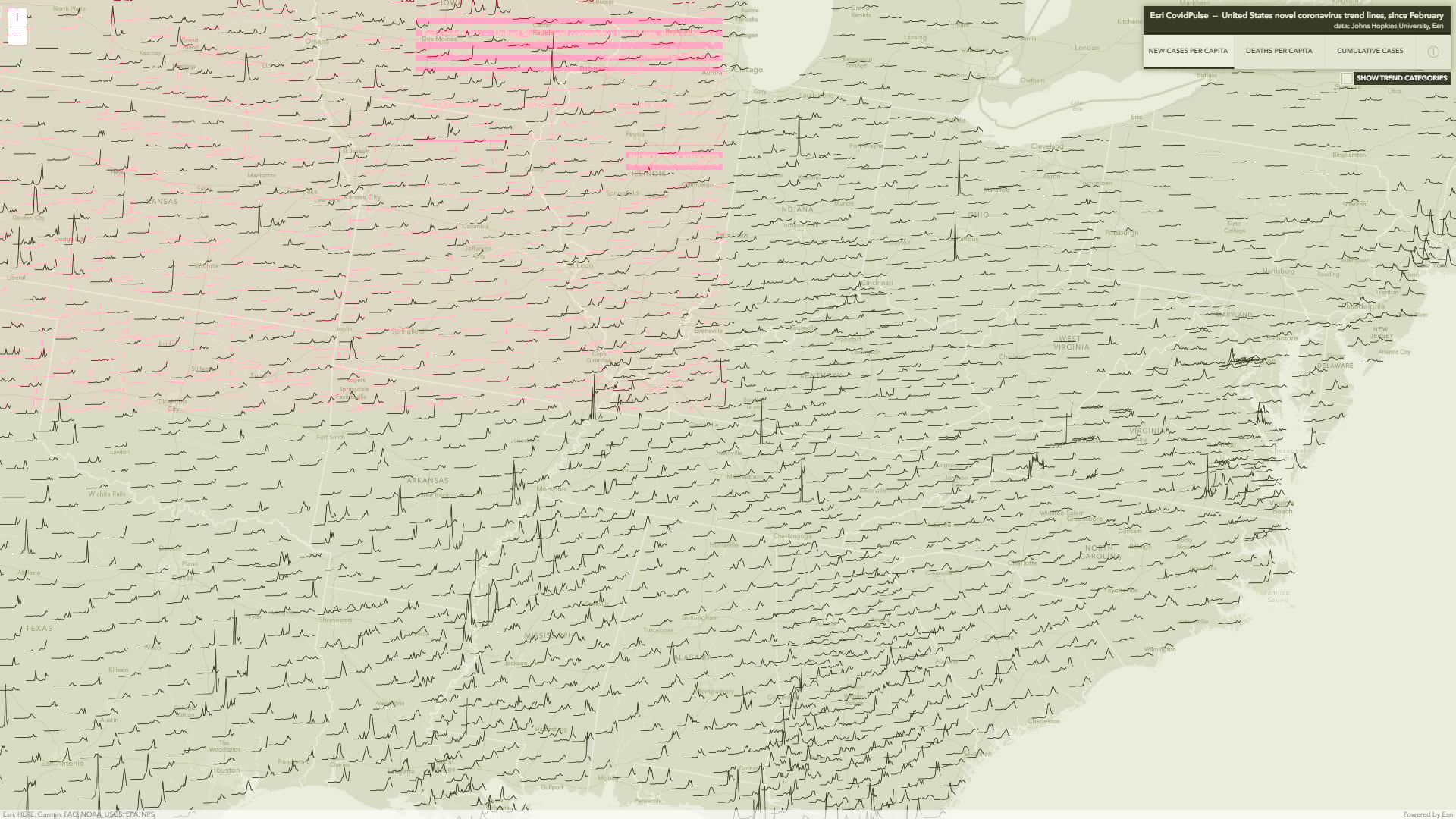
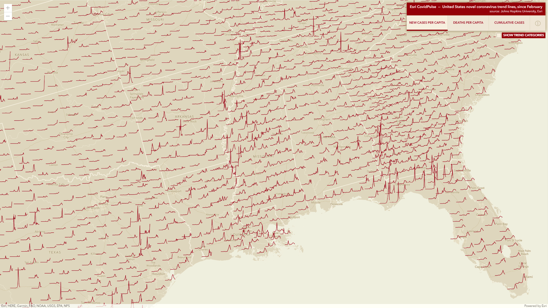
CovidPulse shows this meandering trend of an epidemic for all 50 states (and DC) and all 3,000+ counties. This is an immense (as of writing, the source tops 6 million data points) amount of data to communicate, but the form factor of trend lines presents it in an intuitive and compact way.
How is this different?
Showing the current state of the pandemic is valuable and many are doing that with map-based dashboards offering situational awareness. But COVID-19 is a moving target with some jurisdictions performing differently than others and some performing differently over time. It can be a challenge to answer key questions like How are we doing today relative to yesterday? and What can we expect tomorrow? Trend lines help with that.
CovidPulse provides three day-over-day trend visualization options: new cases per capita, deaths per capita, and cumulative cases (which is also per capita, but gives a third option for understanding trends). Normalizing the data per capita gives us a rate, making comparisons of place to place possible. The trend lines reach back to February, just before confirmed cases of SARS-CoV-2 began appearing in the United States (though the spread had already begun).
Let’s take a closer look at each of these three visualization options, starting with new cases per capita.
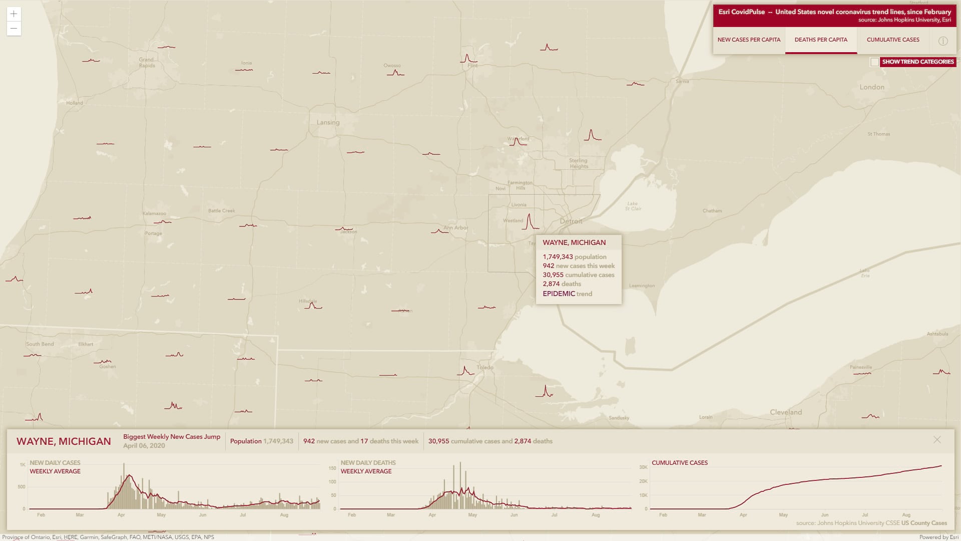
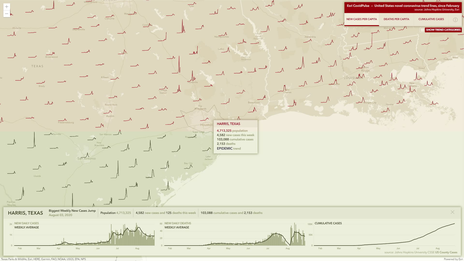
New Cases Per Capita
New cases per capita shows the rise and fall of local cases reported at the county level (and aggregated to states when zoomed out). These cases are normalized by population, to show the proportion of newly confirmed cases within a community.
Because of this per capita rate, the trend lines have a consistent scale and we can visually track the trend of infections over time not just within a community, but we can visually compare communities to each other.
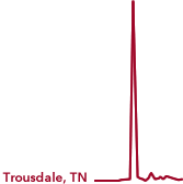
Let’s consider the cases per capita of New York, New Orleans, Los Angeles, and Trousdale County, TN…
New York was one of the early hot spots for transmission. The line rises abruptly in the spring; after control measures were taken the rate gradually declines in steps. New cases per capita then flattened to a steady (though still epidemic) level.

Perhaps due to the Mardi Gras celebrations in late February, the rate of cases to population in New Orleans was comparably quite high; just as quickly as new cases spiked, however, they fell. This was followed by a couple months of nominal new case rates before a second, smaller, wave in July steadily rose and then declined.

Los Angeles, and California in general, had a comparably gentler, though sustained, increase in infection rates though mid-July. Rates have since trended downward.

Trousdale County, Tennessee, is home to a population of just over 11,000. How is it, then, that over 1,200 cases were reported in the span of two days? And only a handful of cases before and since? Trousdale is home to a prison. The nature of COVID-19, and the reporting structures of local and state governments, result in this punctuated signature in locations with a large prison population.
Deaths Per Capita
Deaths per capita can be assumed to follow a somewhat similar pattern to cases per capita, though with a lag-time associated with deleterious progression of the disease. Because there are far fewer (fortunately) deaths than cases, the per capita death rate can be quite small and have relatively unstable denominators in very low-population areas. Low population areas can be expected to exhibit a more abrupt stepped pattern, while larger population areas will likely have smoother trends. Something to consider with this visualization option is its difference from the cases per capita option. Some areas, particularly in the east, show a comparably less favorable death rate curve. Such outcomes may represent sequelae from strained hospital capacity or a learning curve for effective COVID-19 treatment strategies. As these conditions improve over time, death rates may become comparatively flatter, even in times of increasing case rates.
It is important to note that the scales for the trend lines of new cases per capita and deaths per capita are not the same, so toggling between the two should only provide a relative sense of trend patterns for hypothesis generation and additional inquiry.
A more specific (day-by-day) comparison of rates can be seen in the popup charts that appear when a state or county is selected. Note the different y-axes between the two. Note also the lag time between case rates and death rates and how sometimes we can detect a diminished proportion of deaths in the second wave of infections.
Cumulative Cases
The cumulative cases visualization option provides an additive look at infection rates, rather than the at-a-glance view of the other two choices. The gentler shape of the cumulative cases trend lines may perhaps provide an opportunity for insight regarding the full sweep of the epidemic at any location, and the regional trends that emerge when looking at a broader scale.
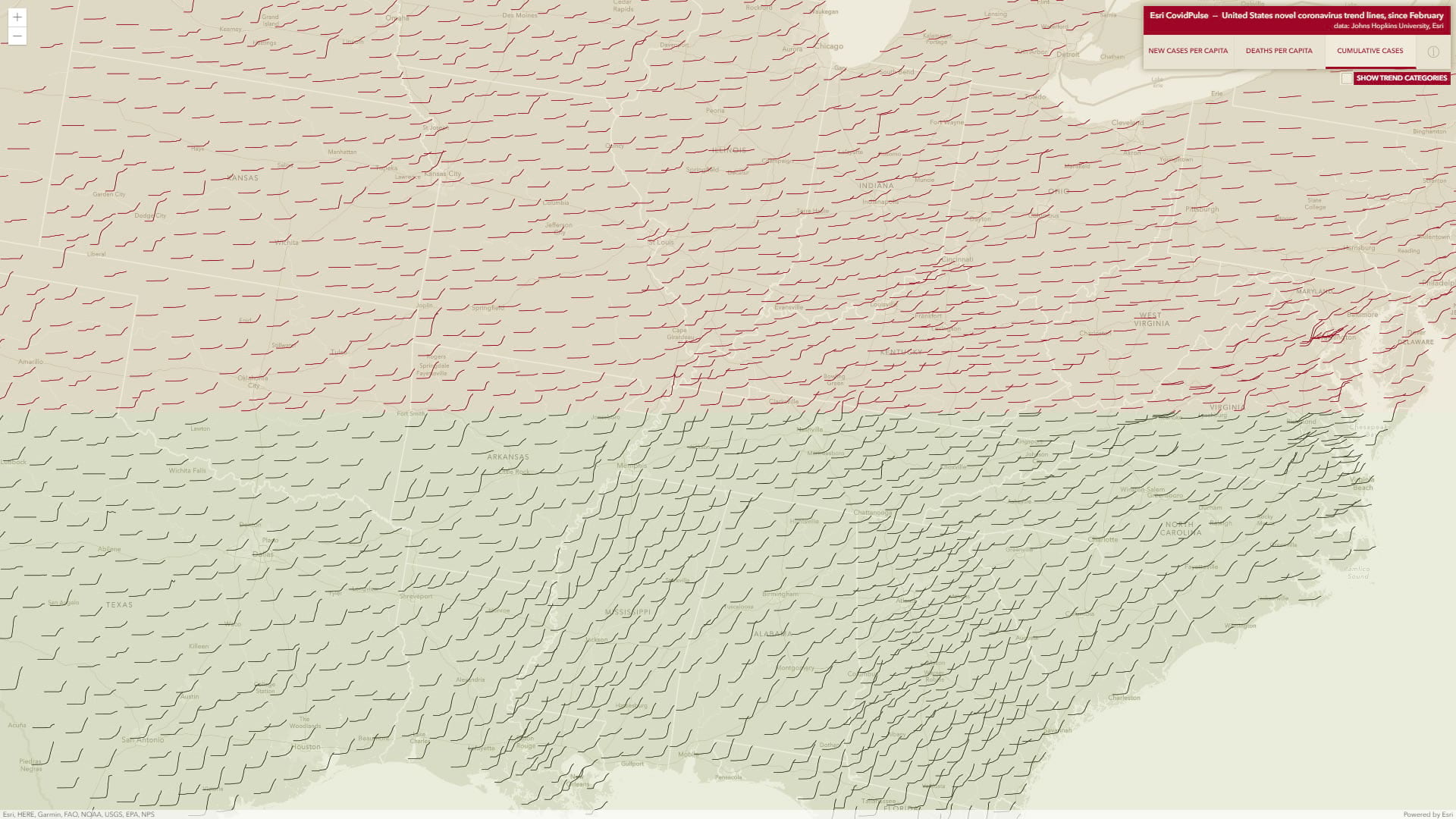
A gentle s-shape indicates a consistent transmission rate followed by a gradual tapering off.

An abrupt s-shape indicates a punctuated spread event with little activity before or after.

An upward-bending tend line represents a currently-growing local case rate.

A stepped trend line indicates multiple waves.

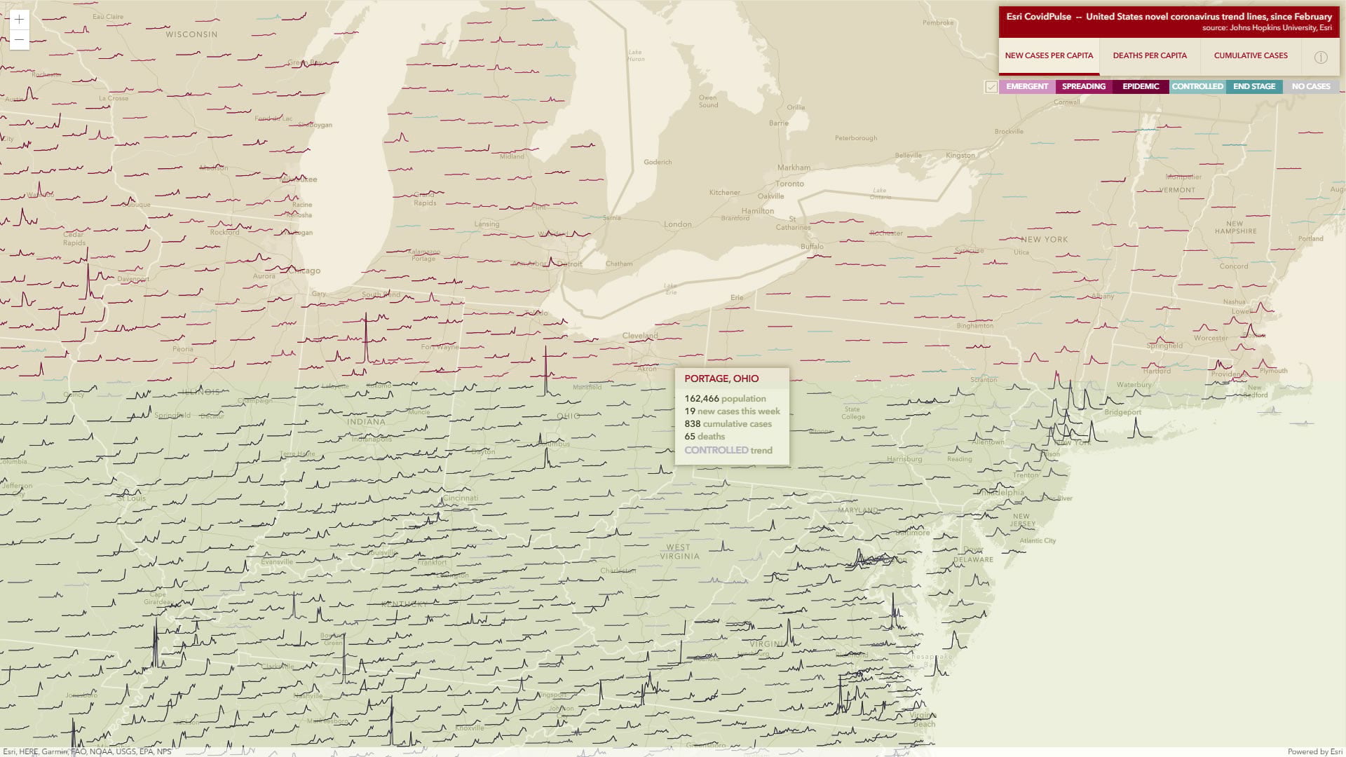
Pandemic Phase Color
Charlie Frye, a colleague at Esri, has created statistically-determined trend summaries that categorize the rates by their pandemic phase (emergent, spreading, epidemic, controlled, and end stage). Continuing with that theme, county trend lines can be optionally color-coded to provide a visual sense for their local situation. If you are having trouble distinguishing colors with confidence, the trend categories are also named in the mouse-over tooltip that appears over each county. You can find a complementary application of this color categorization here that provides current pandemic status by county. To learn more about the methodology, see this story map that provides the technical (or statistical) details as well as an international viewpoint.
Consider the Sparkline
The sort of trend lines used in this map are sometimes called “sparklines,” a term coined by Edward Tufte. Sparklines are small word-sized graphics, showing only the charted data and no labels, grids, frames, etc. They have a rich and practical history and exist to provide a quick visual sense of a phenomenon. They can be placed into context, like a word in a paragraph-or a chart symbol on a map, and are valuable not just because of what they show (only data) but because of what they don’t show. In this application, they allow for the distilled communication of a living and moving phenomenon.
Sparklines are a wonderful visual mechanism, but when a person navigates data they generally pursue a path from general to specific, following clues that pique interest. After the initial visual exploration of the high-level sparklines, mousing-over places on the map provides a second level of information quickly and specifically. If a county looks interesting, clicking it shows the more detailed, labeled, charts.
Inspiration
CovidPulse was created by Jinnan Zhang and John Nelson, with help from Yann Cabon, Fang Li, and Sean Breyer. Medical insights were provided by Dr. Este Geraghty. It was primarily inspired by the trend line maps of Mathieu Rajerison and the localized 1918 flu charts drawn by Riley D. Champine.
livingatlas.arcgis.com/CovidPulse
Collaboration
Jinnan Zhang is an eclectic and adventurous developer. John Nelson works with maps and information architecture. Dr. Estella Geraghty is a chief medical officer. This application is possible because of the collaborative environment at Esri, and the generous and energetic work shared by data visualization professionals the world over. The broad swath of skills and interests of our colleagues, combined with the energy of a culture of curiosity that wants to do well by doing good, churns up an active cycle of ideas and products. We hope that CovidPulse serves as a pragmatic utility for those wanting to better understand the terrain of this illness and a resource for those considering a response to it.
For more geographic resources, please visit the Esri COVID-19 hub.


Article Discussion: