Following my work at the end of last year to develop an accessible basemap and its dark equivalent, I got some requests for a gray version … and here it is!
In fact here they are – I’ve created two versions for you to look at and try out. We may focus on only one of them going forward (depending on how popular they are), but both will be available here for the foreseeable future.
The Aim
… is to improve the legibility of the basemap so that someone with a visual impairment can access the content. In particular, to have the map meet WCAG (Web Content Accessibility Guidelines) standards, and the US Federal ‘Section 508’ equivalent. The maps are single-color, so color-blindness is not an issue.
The Approach
Our existing single-color maps are deliberately subdued, to leave plenty of room for the user to show their own data. This can be a challenge for this audience, who may require a much stronger visual contrast between map features. We still need to find a balance between this accessibility and functionality however. There has to be some room for your content!
So, on both versions I have increased contrast dramatically. It’s more of a challenge to build on top of these! One of the benefits of a single-color basemap however is that the rest of the palette is available for your content (as long as it is color-blind safe).
And as previously, I have avoided ‘fussy’ fonts that might be difficult to pick out of the background. I have used larger labels (but carefully – not wanting to swamp the basemap with words). Haloes have been added to help with the legibility of these labels.
The Results
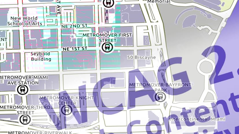
Version 1 started out as a grayscale conversion of the ‘Accessible Basemap’ created last year. Then I made custom adjustments to increase clarity. It makes use of patterns/textures for some of the symbols (Parks notably). It’s a strong map, but the white background leaves some room to play with.

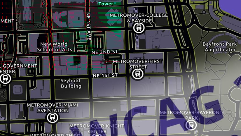
Version 2 is adjusted from the current Light Gray Canvas basemap, and the map has a much darker feel to it as I’ve increased the contrast between symbols. The consequence of course is a more challenging map to work with. The softer feel of the canvas map is still there however, and that opens-up some possibilities. Again, I’ve used patterns/textures for some of the symbols.

Using the basemaps
These basemap layers will be available for you to use at the URLs linked above for the foreseeable future. The map content is updated with our regular basemap data updates. I may make periodic changes to these map styles as needed based on your feedback and our experience using the maps.
If they prove popular, we’ll consider incorporating one or both into the core basemap set. We’ll try to give you plenty of warning if we decide to shut these URLs down and replace them.
Again, I would appreciate any feedback you care to provide, either via the comments section below, or directly at askinner@esri.com.

Article Discussion: