Here are five minutes of just straight up chill-zone time:
…
It is based on the simple Breathing Earth animation, the GIF that just keeps giving. But this version includes aggregate Arctic sea ice extents. Here’s how to make it in ArcGIS Pro…
The basemap comes from the NASA Visible Earth set of monthly cloud-free image mosaics. You can find them here, though they’ll have to be georeferenced. Alternatively, you can download handy spatial-aware geoTIF files from this resource.
Here they are added to a Pro layout, and given a North Pole Orthographic projection…to look all globe-y.
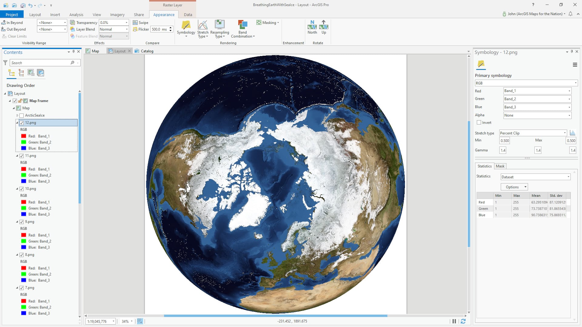
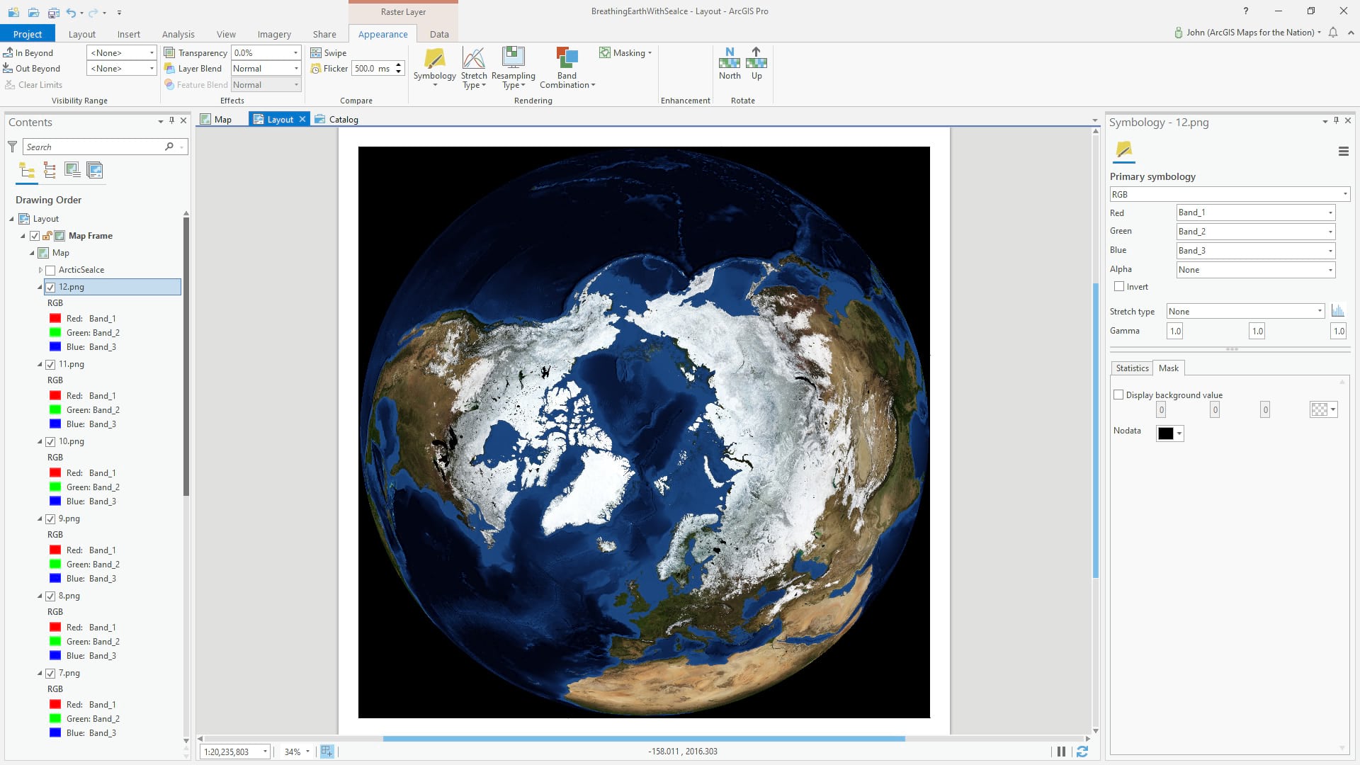
Because Pro tries to optimize the appearance of imagery, we’ll have to re-set some visual parameters so the images appear consistently from month to month. In this case I’ve changed the “resampling type” (how to render large images when zoomed out) to “cubic” so it appears smooth and jaggy-free, we set the stretch to “none” so that the original brightness levels of the image are retained (again, very important when showing a series of images, so they don’t appear to dance in brightness), the “gamma” we reset to 1, and set the “no data” background color of the image to black rather than transparent.
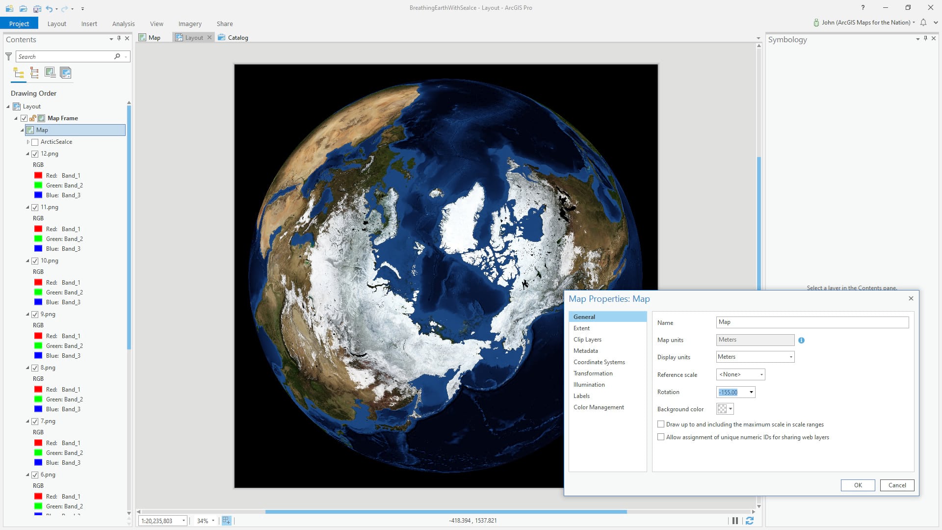
You aren’t stuck with the earth rotated like that, too. We can open the map properties and rotate it. This rotation of -155 degrees puts Europe and Siberia on the left and North America on the right; it’s just an aesthetic choice that looked good to me.
Now we are ready for some Sea Ice data. Living Atlas has a very helpful collection of sea ice resources, including the Sea Ice Aware app, that lets you explore this dat in a more controlled fashion. We’ll be using the Arctic Sea Ice extents layer, made available by the folks at the National Snow and Ice Data Center.
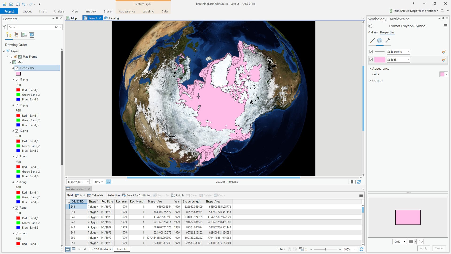
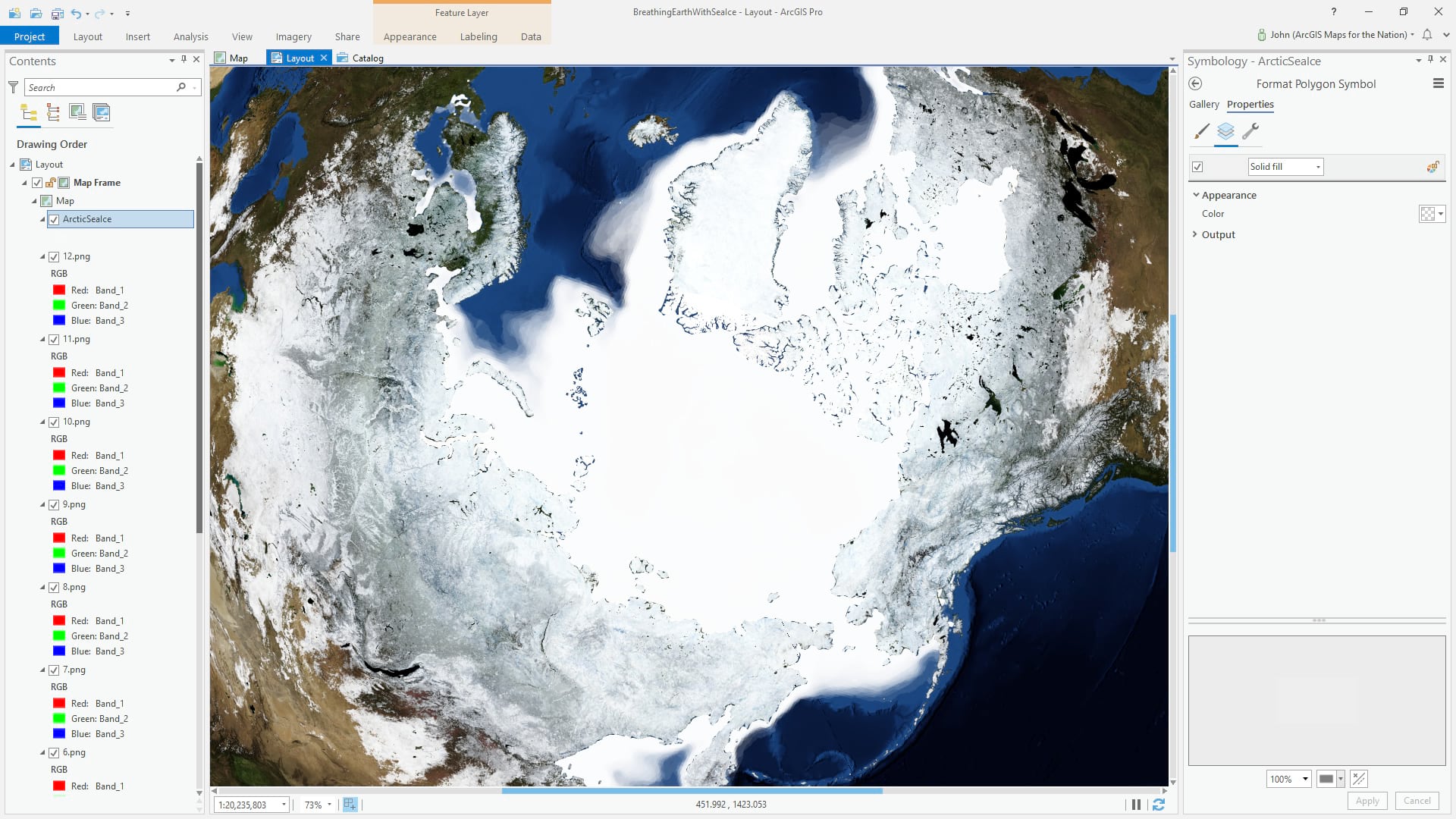
Hundreds of polygons, spanning decades, each with year and month attributes, stack up on each other. If we set each polygon to be white and 95% transparent, the stacking contributes to an opaque mass with feathered edges where sea ice is less frequent.
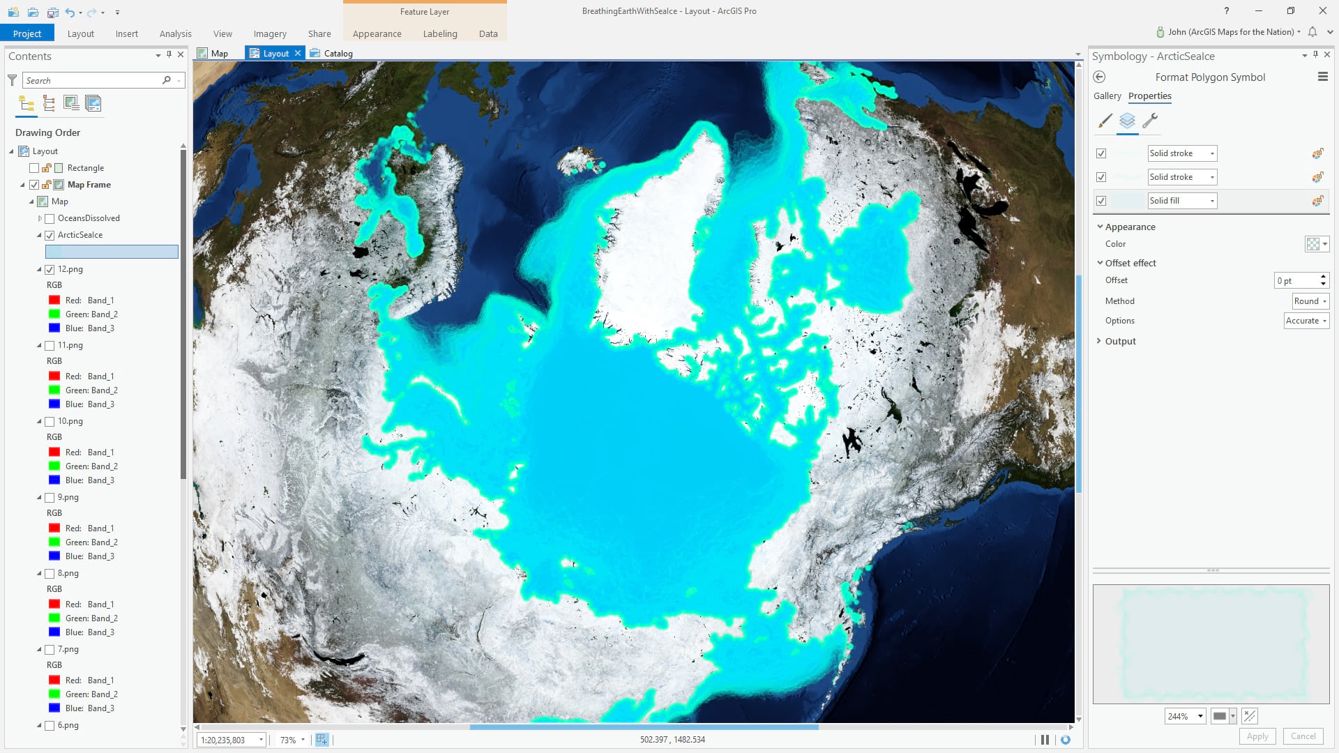
To visually disambiguate sea ice with terrestrial ice, we can change its color to something cool and bright. We’ve also given the polygons two semi-transparent boundaries, each with a randomized wave effect to break up the ice edges.
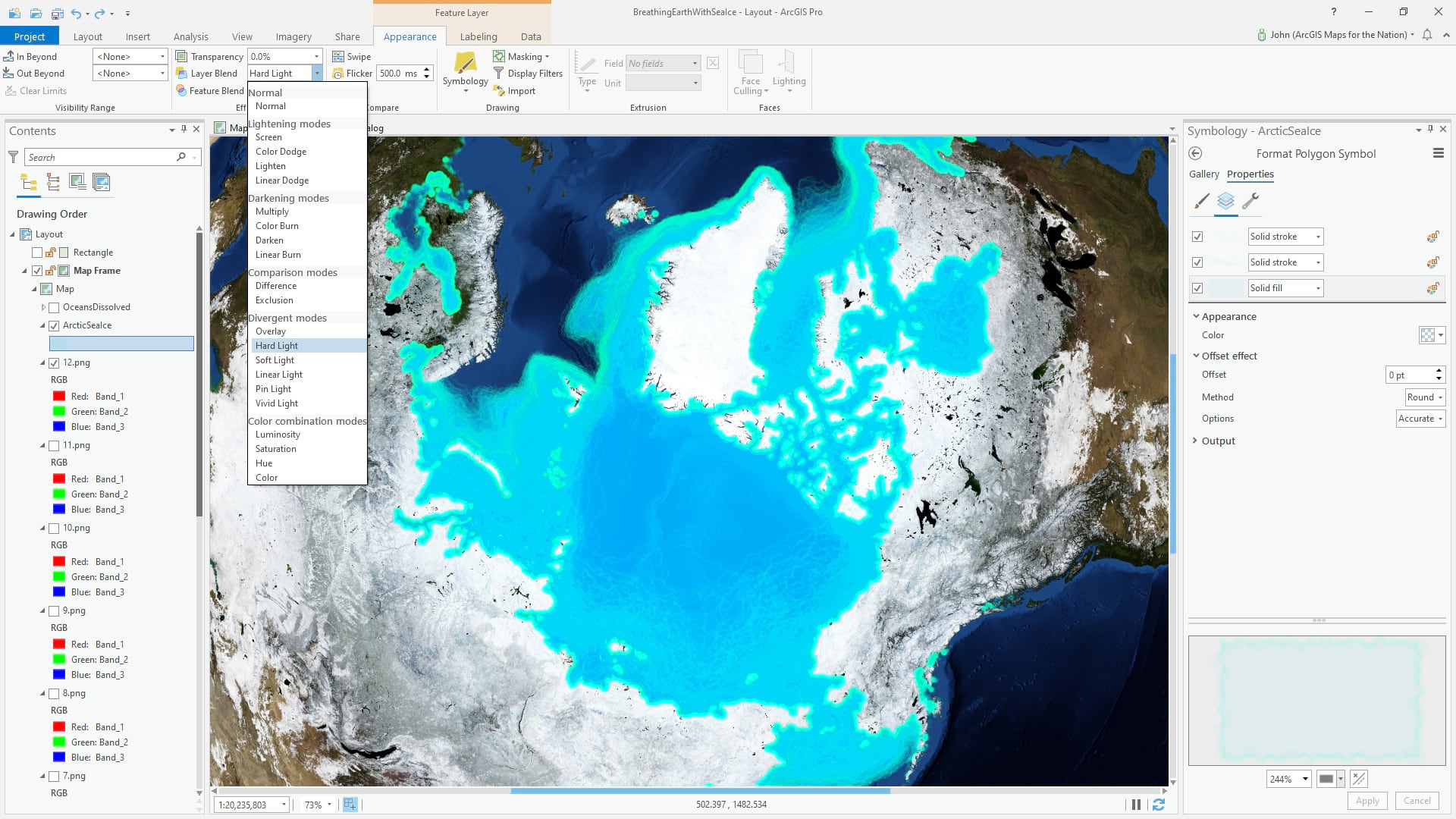
In order to bring in a bit of the underlying arctic bathymetry from the base image, we can use the “Hard Light” blend mode. The result is a more vibrant ice field.
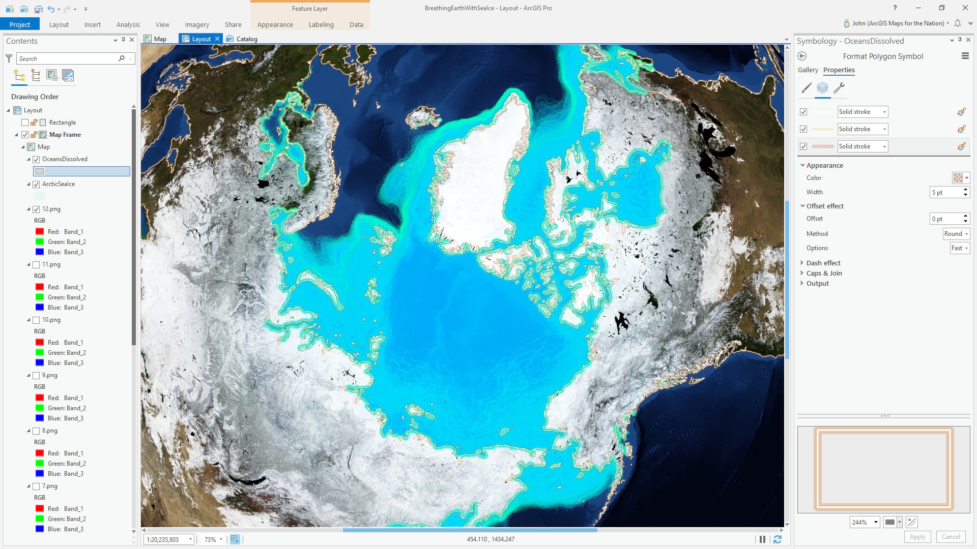
To provide a visual reference of coastlines, and just to make the land/sea edge pop a bit more in the basemap, we’ve added a global oceans polygon layer, and symbolozed it with a thin white border, and a couple thicker semi-transparent borders in an earthy color.
In order to help the sea ice appear as the prominent visual element of this map, it’s time to de-saturate the imagery a bit. Here is a trick to desaturate any map: add a global background polygon to the top of the image layers…
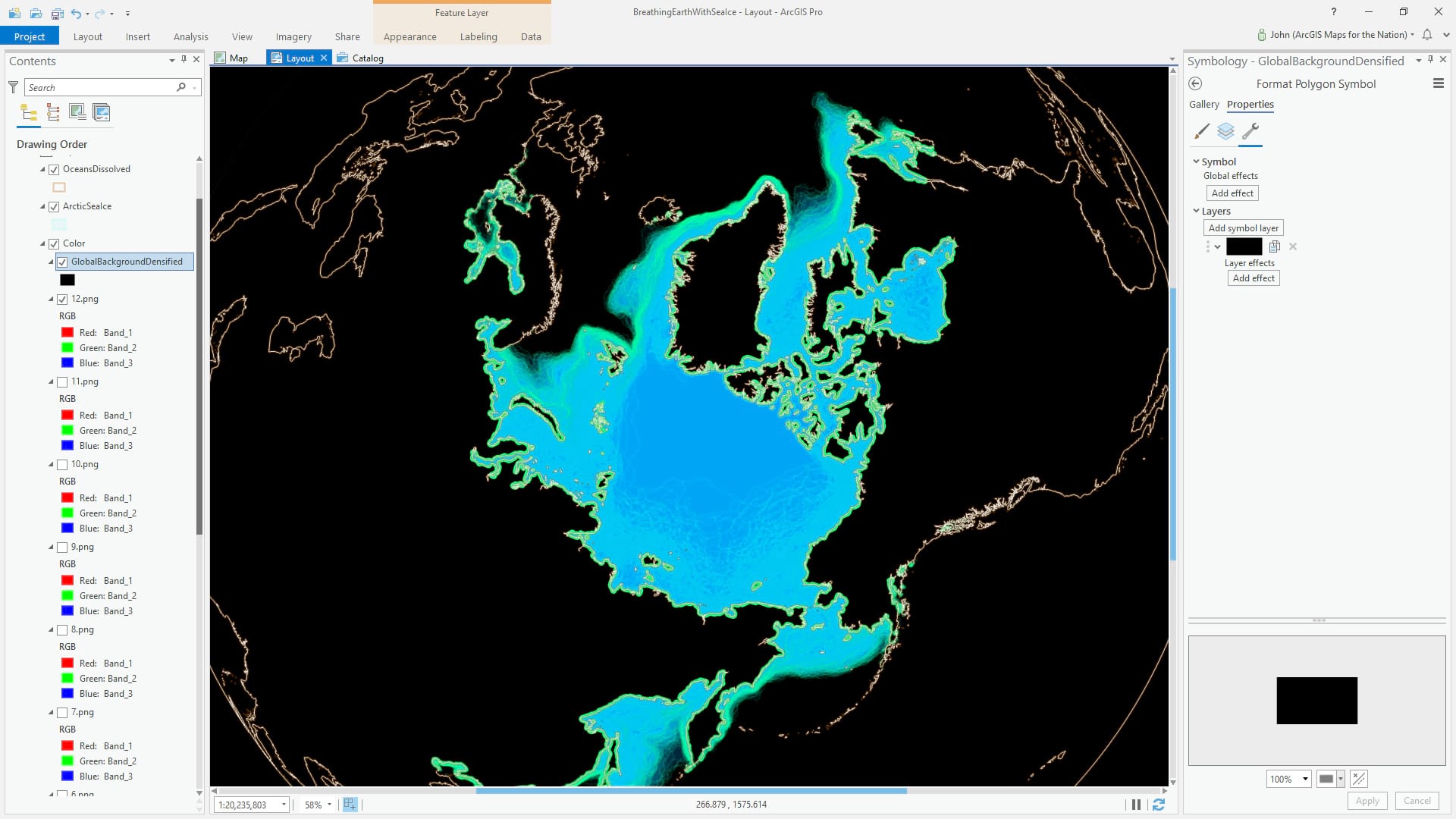
…and give it a “Color” blend mode. This has the effect of making the underlying map appear grayscale…
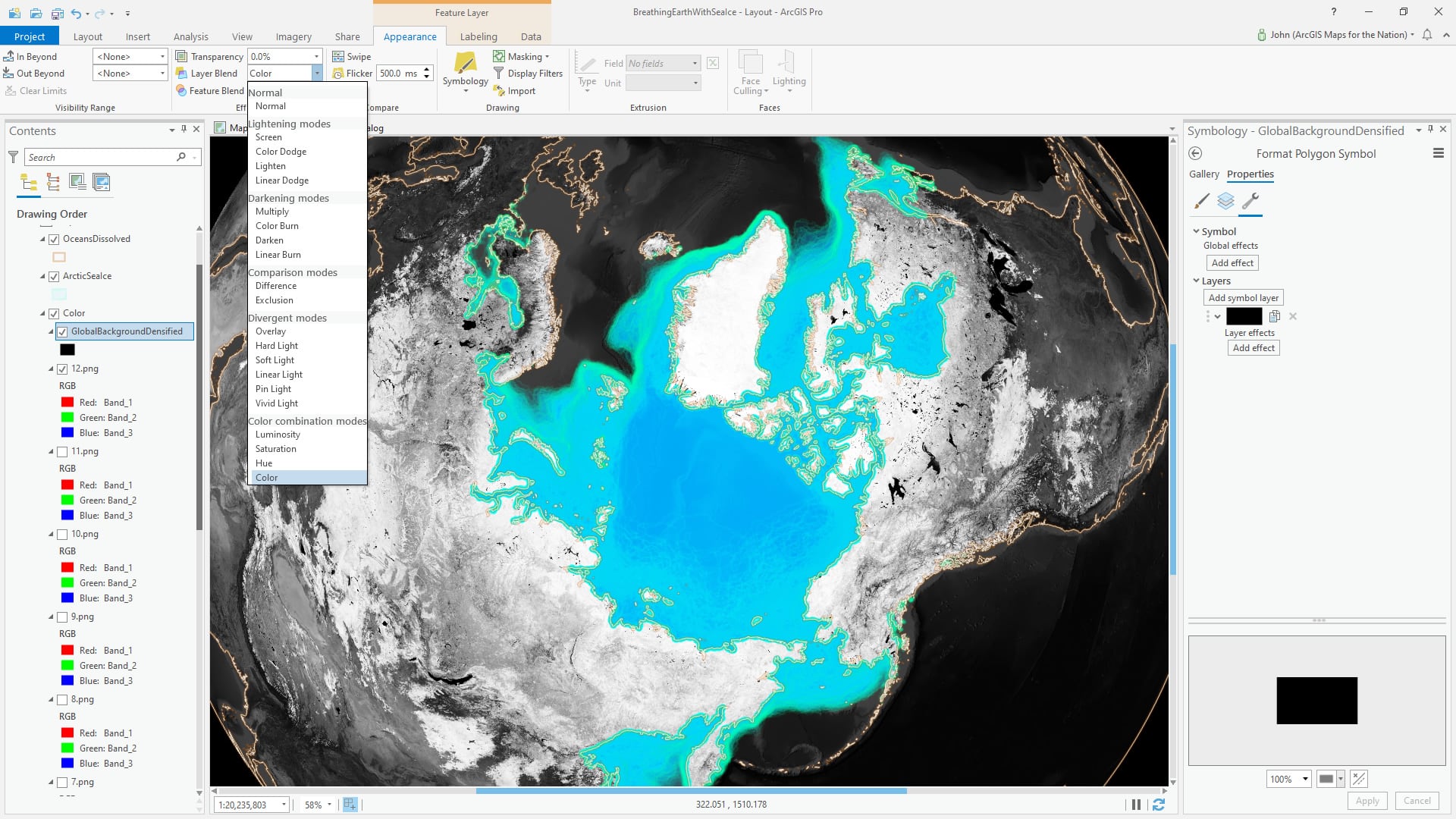
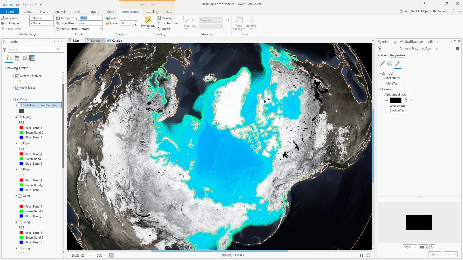
…but we want just a bit of color to come through, so it’s just a matter of giving the global rectangle some transparency. 30% transparency makes the imagery look 70% desaturated. Neat trick, huh? Blend modes are just absolute magic.
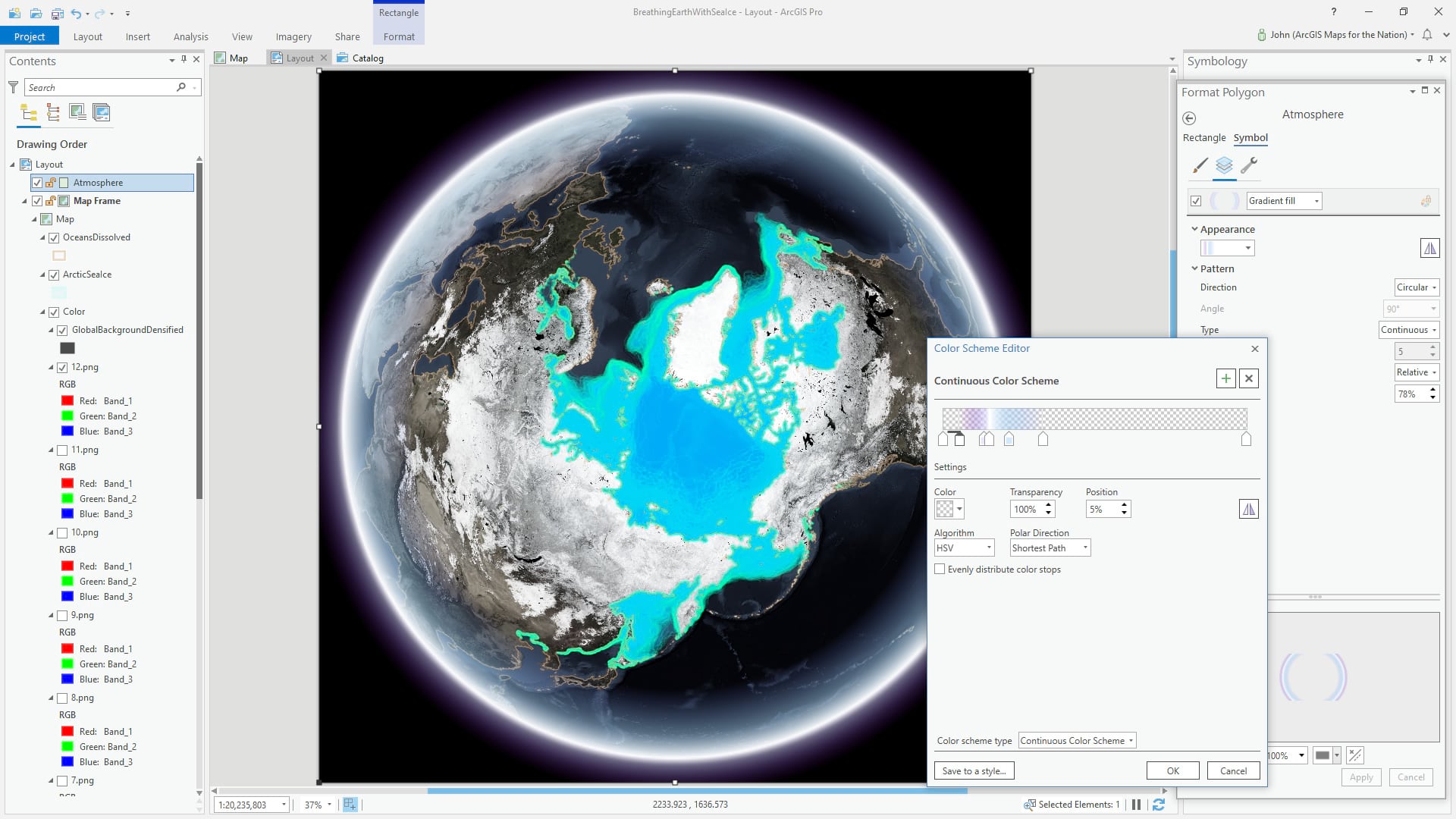
We now have a pretty stark edge to our map. It would be nice if it looked more en-thing-ified. We can hack in an atmospheric effect super easily, and it can make a…world…of difference. Here’s how. Insert a rectangle, and draw it to fit the edge of the layout…
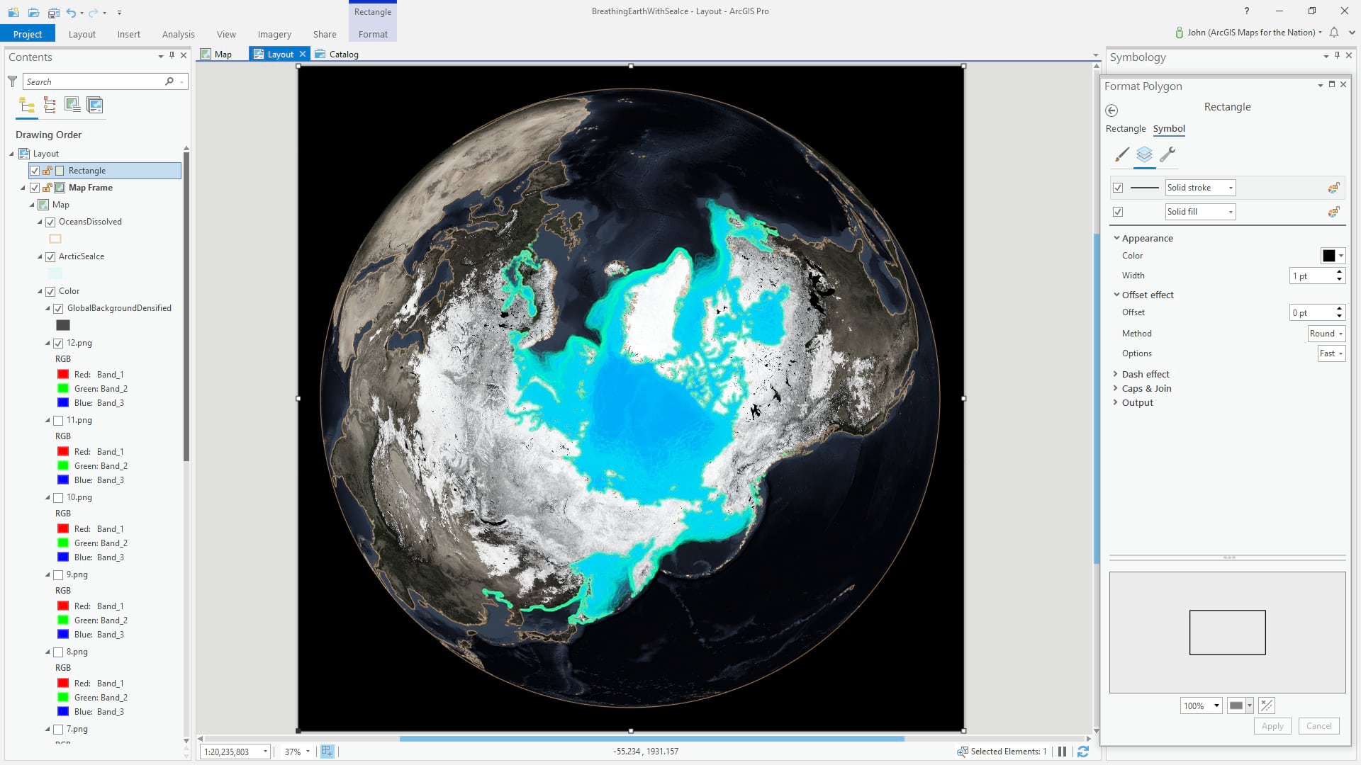
…and instead of a black border and no fill, give it no border and a circle gradient fill. You can play with the transparency and colors of the gradient, but the goal is a nice fuzzy atmospheric ring.
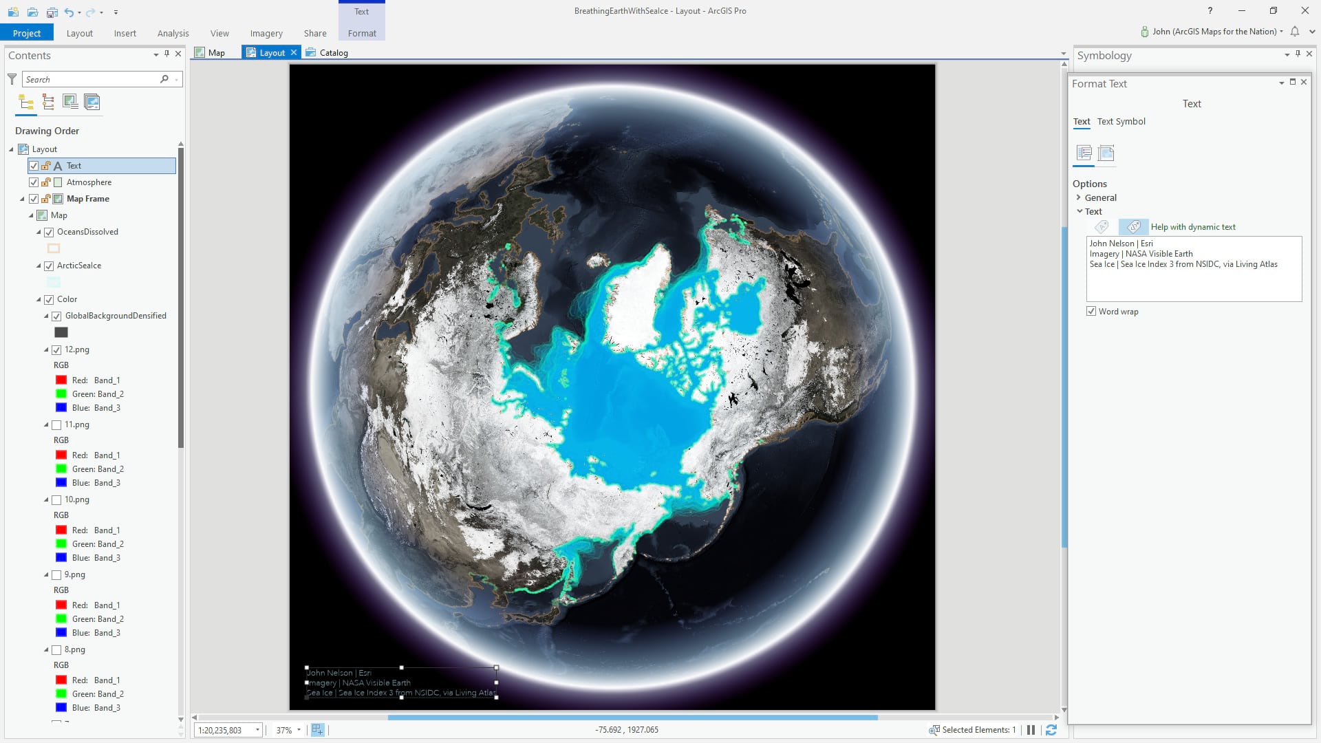
Of course you should always sign your work and cite your sources.
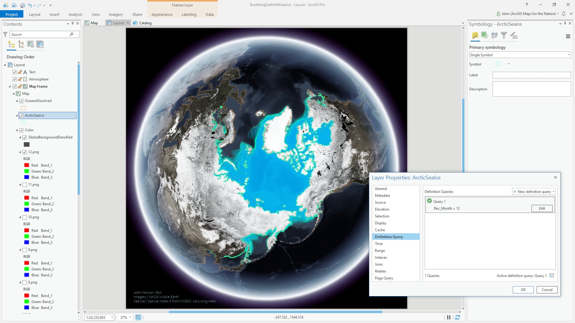
At this point we’re ready to start making month-specific views of the map. With only one of the month basemaps active, we opened up the Definition Query form for the sea ice layer and filtered it to show only the ice polygons corresponding to the visible basemap (without deleting the data or selecting-by-attribute and making duplicate layers).
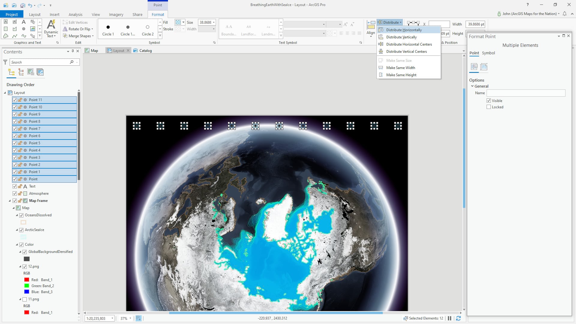
Lastly, it helps with a 12-month looping animation to provide a small visual indication of progress. Here we’ve inserted 12 point graphics and styled them as minimal little circles.
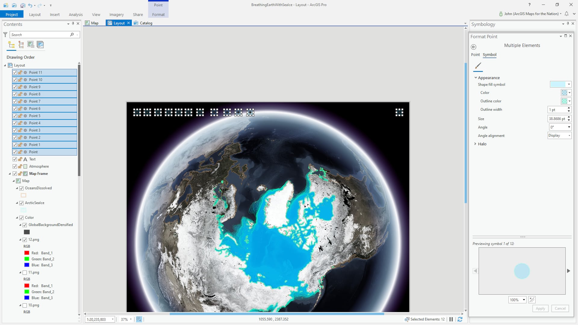
And we can evenly distribute the graphics in the layout.
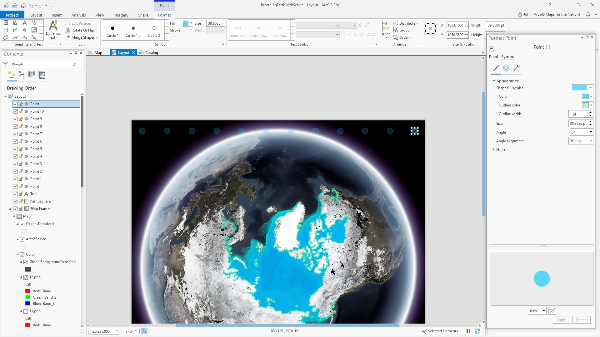
And make the fill a bit bolder for the month that corresponds to the basemap and ice month. In this case, December. This we’ll do manually for each exported month image.
You can use the powerful animation features to export an animation of these 12 months, but in this case, since we have manual graphics to update, it’s easiest to simply export 12 distinct images and stitch them together in whatever animation tool (or website) works best.
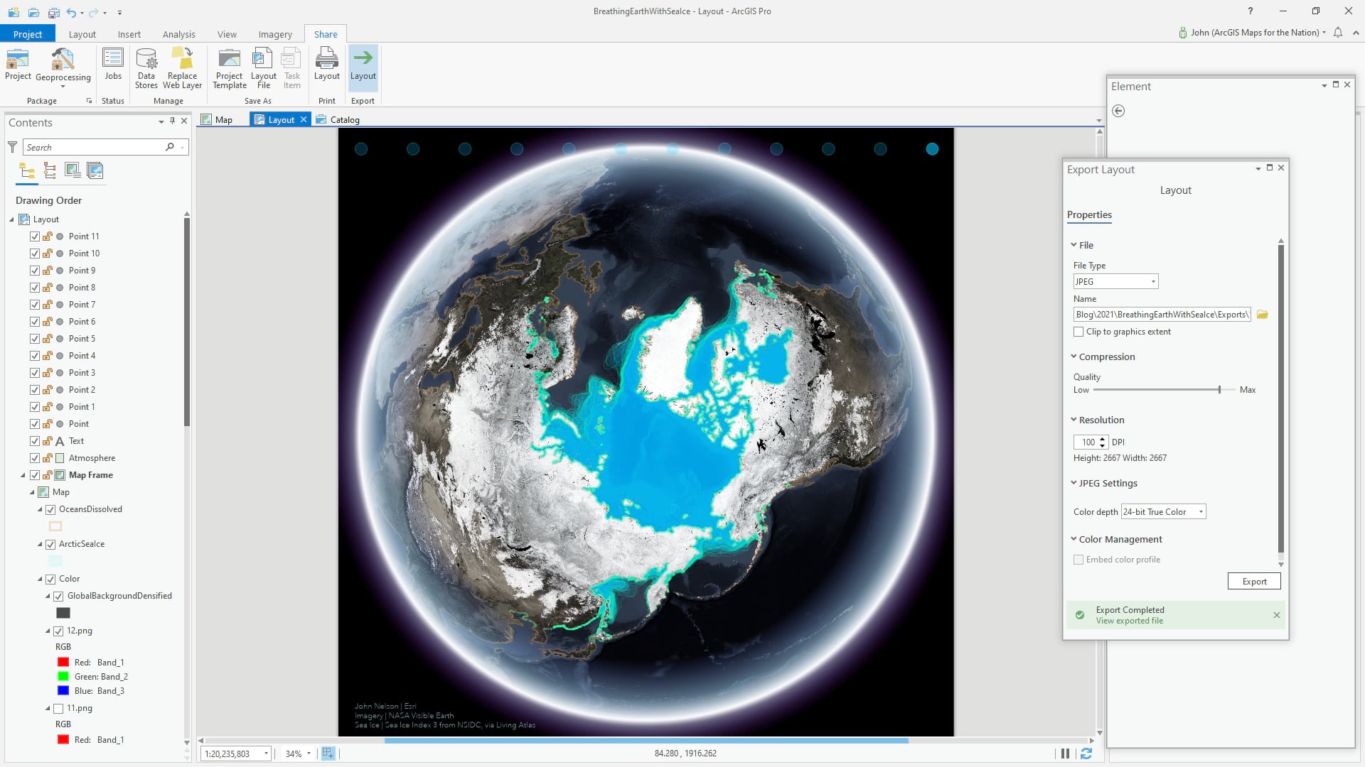
The result, is a happily looping seasonal animation of sea ice.
Happy Earth Day Mapping! John Nelson

Article Discussion: