Well, the numbers are in. 2022 was the fifth warmest year on record. Europe sweltered all summer – its hottest ever. The year closed out with the fourth lowest Arctic sea ice totals. Tools like the Living Atlas Global Monthly Temperature Anomaly can show us exactly when, where, and how temperatures were abnormally high this year. With a tough year for climate behind us, let’s take a look at where we are heading into 2023 and beyond…

When people talk about climate change and increasing temperatures, a lot of numbers get thrown around. Most often, you will hear about thresholds laid out in the Paris Agreement: 1.5°C of warming or 2.7°F.
Your immediate response to these numbers, at least if you’re an optimist, might be to think that it doesn’t sound that bad. What does it matter if a day is 83°F vs. 80°F? Will such a temperature increase make that much of a difference? The truth is the heat you and I will experience is probably WAY higher than a mere 3°F. Let’s get into why…
How to think about extreme heat
2022 didn’t just bring us lots of hot days; we also got new CMIP6 climate models – the first released in nearly a decade. Eleven temperature variables are available in Living Atlas, and comparing them against historic baselines lets you explore predicted future temperature anomalies. Before you start manipulating these multidimensional datasets yourself, here are some caveats about extreme heat. When figuring out how much heat you are likely to experience, there are two things to consider:
-
Warming is not uniform across the globe
Most extreme levels of warming have been concentrated in the Northern mid and high latitudes – and these patterns are expected to continue.
 under business-as-usual high emissions scenario (SSP5-8.5).")
That means for us in the United States, we will likely see warming far beyond the 1.5°C Paris goal. With unchecked emissions, that number is more like 3°C. That’s about 5.5°F! What we’re getting at here is that, unless you’re a diplomat or climate scientist, ignore the global averages. The numbers you need to watch are those for your immediate environment. If you live anywhere in the Northern Hemisphere, the warming you’ll experience is probably worse than the global average.
-
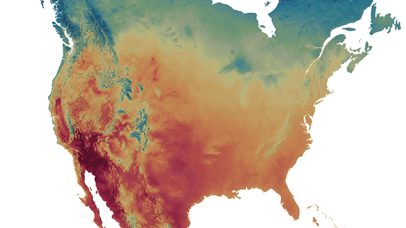
Averages do not tell the whole story
See the map above? You can ignore it too. Maps of mean annual temperature change are really talking about averages of averages. We’re taking daily mean temperatures and dulling them even more by averaging across a year, and then averaging those years over decades. These averages are helpful for understanding basic temperature increases, but they really blunt the impact of dangerous, extreme heat. Breaking temperature anomalies into seasons can show some of these extremes. Even better, variables like Maximum Temperature of the Warmest Month shows how much hotter the hottest days may get.
 values rather than average (mean) temperature values. Maximum temperature of the warmest month shows the greatest anomaly by 2050 under the high emissions scenario (SSP5-8.5).")
More importantly, look at the difference in temperature anomalies between mean summer temperatures and maximum temperatures of the warmest month. Summer days could be on average 12.5°F above baseline temperatures. That’s a pretty big jump. When you look beyond averages though, you get an even bigger shock. For the hottest month of the year, maximum temperatures could leap on average of 19.7°F. WOW! That is quite different from the value we saw when looking just at mean annual temperature anomaly (about 4.5°F). The lesson here is that when it comes to climate data, the most dangerous temperature increases are not always obvious. You have to look to extremes and maximum thresholds (not averages) to see the biggest threats.
Now let’s look at some more detailed extremes, coming from the U.S. Climate Thresholds data in Living Atlas.
Biggest temperature increase
Greatest jump in temperature is the most obvious way to think about warming. Through Living Atlas, we have county-level climate models available from NOAA to look at U.S.-specific temperature increases. As previously discussed, it is often better to look at maximum, not mean temperature. With that in mind, below we have changes in maximum temperature.
 temperature by 2050 compared to the 1976-2005 baseline under the high emissions scenario (SSP5-8.5). Highest anomalies are concentrated in the Midwest region.")
Clearly the middle of the country may face the biggest temperature jumps over the next several decades The flip side of this is, of course, that the Midwest and northern Great Plains are not the hottest places to begin with. So even if these regions warm the most they may not have the highest heat risk. Minneapolis may warm on average of 5.6°F, but that is from a relatively cool baseline. This brings us the second way to think about heat.
More extreme heat
This second way of thinking about heat risk focuses on areas that are already extremely hot and could have even more severe heat events in the future. One common metric for extreme heat is days over 90°F, which shows areas of the U.S. with the worst lethal heat. Using the LOCA data, we can see areas of the U.S. that could experience the most days over 90°F in 2050.
. Days over 90°F shows where heat could be most dangerous, and this type of extreme heat is concentrated in the southern portion of the U.S.")
Unlike data on biggest temperature increase, this risk indicator shows that the southern portion of the U.S. may experience the worst extreme heat. Some places may even see over 4 months of days over 90°F!
Combining datasets: a new way of thinking about heat
On their own, these data sets show most warming and most dangerous heat, but together they can give us a better sense of compounded heat risk. The most vulnerable areas could be those where heat is both unprecedented (biggest temperature increase) and extreme (most days over 90°F). We can use a bivariate map of these two indicators to better understand the intersection of risks.
 and much higher than historical maximums (greatest temperature increases). The intersection of these two risks, in dark brown and concentrated around New Mexico Texas, and Oklahoma, shows areas where heat is both extreme and unprecedented.")
When these indicators are combined, there is a very clear area of increased risk centered around the Southern Plains and Southwest – where heat may be both extreme and unprecedented. When it comes to targeting resources to combat extreme heat, these communities are areas that should get particular attention.
Where do we go from here? Heat resilience layer in Living Atlas
Thus far, we’ve looked at ways Living Atlas climate data and be used to evaluate heat risk – just one of endless analyses that can be done using these multidimensional climate layers. To take analysis to the next level and bring context to local communities, Living Atlas has several other resources as well:
Urban heat islands
The urban heat island effect, when dark dense often treeless urban areas trap heat, can elevate temperatures beyond regular background warming in more leafy, suburban areas. To measure the relative severity of urban heat islands, Living Atlas has annual products on urban heat. These can be used to help target mitigation efforts to urban communities most at risk from extreme heat.
Heat and inequity
Heat is a major equity issue. Like so many public health and urban policy issues, it predominantly affects marginalized communities. To better understand the complex and important relationship between heat and racial discrimination, users can also explore Living Atlas resources on heat and redlining. Living Atlas also provides data on heat and health disparities to understand intersecting environmental and public health risk factors. The equity component is a critical element to understanding and ameliorating heat disparities.
Heat resilience and mitigation
Living Atlas also provides resources on how extreme heat may be mitigated at the local level. Several policy interventions can combat extreme heat, and Living Atlas gives an outline of the success of some of these programs. Tree planting is a long-term strategy to reduce urban heat. Initiatives like cooling centers and a buddy program can also improve urban heat health when heat waves strike.


Article Discussion: