I have been having a good time trying out the new layer effects in the Map Viewer. Recently, I was testing a layer from the U.S. Environmental Protection Agency and started combining it with other ArcGIS Living Atlas layers. One idea led to another and I ended up with a decent map that takes advantage of the Drop Shadow effect and the Multiply blend modes.
With Living Living Atlas layers and a few simple techniques you can quickly create maps of your own like this:
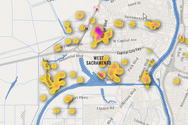
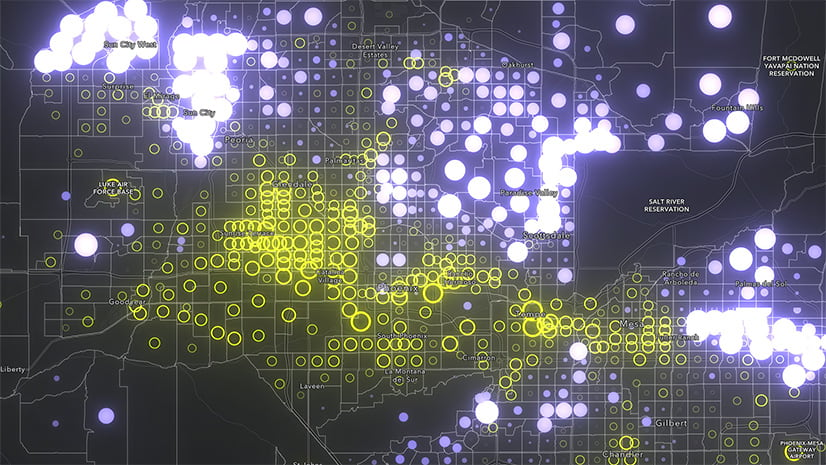
This map displays the locations of pollutant discharge permits issued under the United States Clean Water Act.
Here is the link to the application and the link to the map that goes with it.
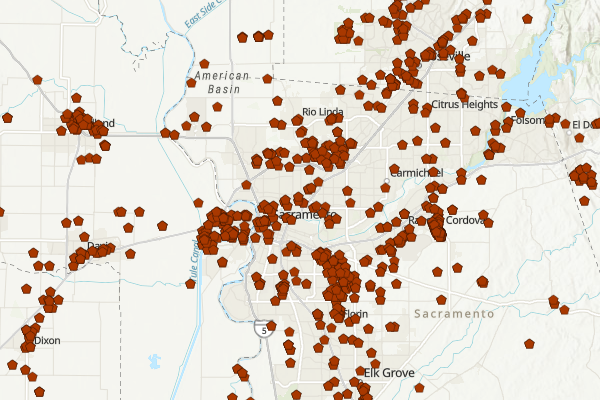
I started with the U.S. Environmental Protection Agency’s National Pollutant Discharge Elimination System layer. In the United States, the Clean Water Act requires a permit for anyone discharging pollutants from a point source into surface waters. The National Pollutant Discharge Elimination System (NPDES) permit limits what can be discharged and contains monitoring and reporting requirements. It’s a useful layer for understanding patterns of discharge permits but the density of points often obscures the base map and visually, it isn’t super exciting.
The default view of a layer often could use a little work to bring out its full potential.
With Living Atlas, making a beautiful map doesn’t have to be hard. Most of my work is done by making incremental changes, saving what I like, and tossing things I don’t.
As you put together your map here are a few things you should try:
Change the Base Map
When I first look at a layer I will often click through a few base maps in search of an idea. Lately, I have been using the Newspaper base map a lot. I like the clean look of the base map that I can build on.
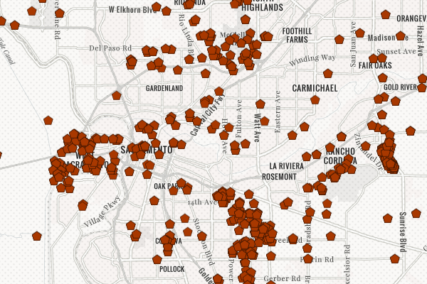
The Newspaper base map provides a visually interesting reference and a neutral pallet to help focus the map on the layer.
Explore Different Symbology Styles
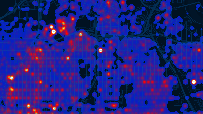
Take a minute to explore different symbology options. For this map I tried several iterations of heat map symbology.
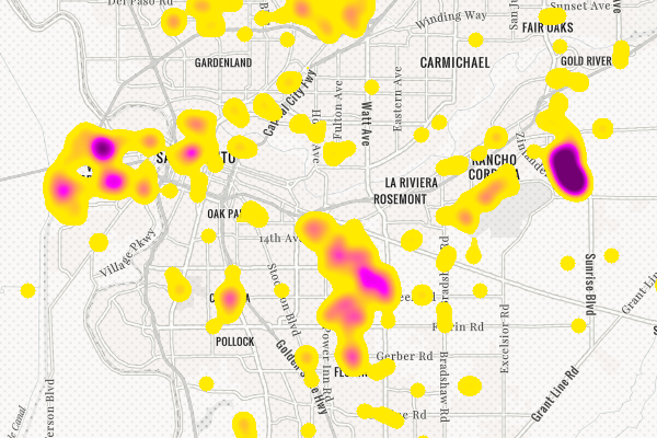
Heat Map symbology helps visualize dense points and reveals patterns of distribution.
Try Blend Modes and Effects
Click through the Blend Modes and Effects options. You will be happy you did.
Drop shadows are one of the new effects you can add to your layer. To add drop shadows first select the layer in the Table of Contents – there will be a blue bar on the left side of the layer when it is selected. Then select Effects on the right side of the window. The effects window will open with Drop Shadow at the top.
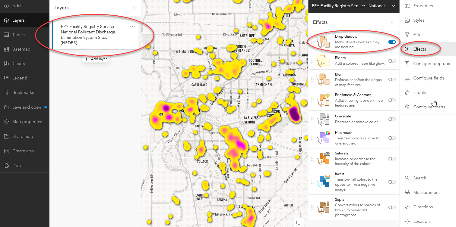
Try the different Effects settings to add drop shadows and much more!
Blend modes control how overlapping layers are combined to make a map. My favorite Blend Mode is Multiply and I use it in almost every map I make. Turn on Multiply blend and see for yourself. Select the layer in the table of contents then Properties at the top right of the Map Viewer. The Blending drop down menu is under the Appearance tab. Change the value from Normal to Multiply.
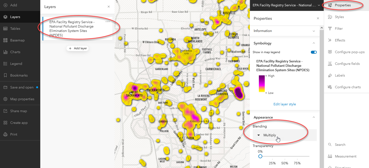
Blend modes allow us to control how overlapping layers are combined. In this map the Multiply Blend Mode is used to combine the heat map and the base map.
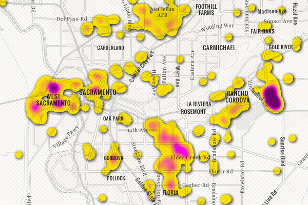
Notice how the labels, roads, and other features are now visible through the heat map without using transparency.
Find more information on how use Blend Modes here and learn more about working with Effects here.
Think Multi-Scale
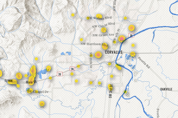
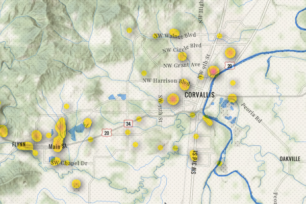
Explore opportunities to use visible scale ranges to control the map experience. If you look closely I swap in points for the heat map as you zoom in on the map.
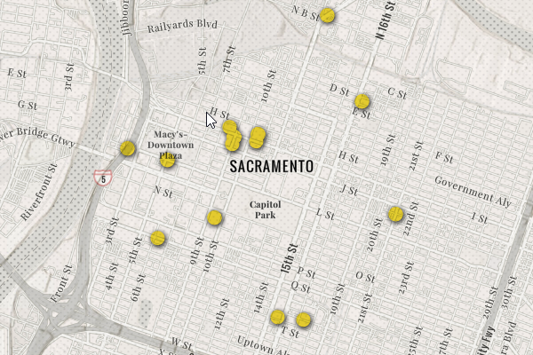
Switching from the heat map to points at large scales allows the user to identify the precise location of waste discharge points.
Because this layer is all about pollutants being discharged into surface waters I used a couple of surface water layers from Living Atlas. At smaller scales, I use the Major Rivers of the United States as Lines and the National Hydrography Dataset Plus Version 2.1 – Waterbodies layers with the Multiply Blend mode.
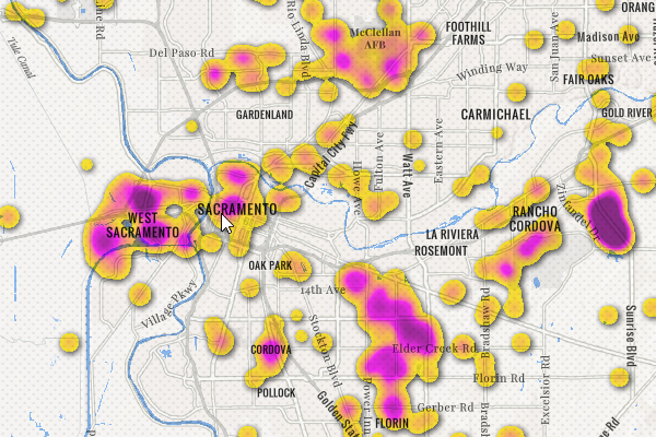
Adding surface waters adds a visual connection between impacted water bodies and discharge permits.
As the user zooms in, I switch the National Hydrography Dataset Plus Version 2.1 – Flowlines with Multiply blend for the major rivers layer. While this layer has far to many features for an effective display at small scales, at large scales it provides a visual connection between the NPDES points and local waters. As you zoom out the map switches to the NPDES heat map and major rivers to provide context. Designing across scales can be challenging but is worth the effort.
The map uses a more feature dense stream layer at large scales to provide detail but switches to a less dense stream layer as the map’s scale decreases to avoid overwhelming the map.
Finishing Touches
I added the World Hillshade layer with Multiply blend:
The World Hillshade layer adds terrain to the map and gives context to the surface water layers to provide subtle clues about how water and pollutants move across the landscape.
Lastly, I gave the background a little suggestion of vegetation by adding the USA NLCD Tree Canopy layer with Multiply blend. To reduce the square look of a 30m imagery layer, I added the Blur Effect and created a green wash for forested areas.
The Blur Effect, Multiply Blend Mode, and 75% transparency on the USA NLCD Tree Canopy layer are used to provide a wash of green in areas with forest cover.
I was able to put this map together is less than an hour using only Living Atlas layers and you can to. I encourage everyone to take a little time to explore and experiment. Living Atlas layers are ready for you to use in your own maps.
ArcGIS Living Atlas Layers Used in this Map:
EPA Facility Registry Service – National Pollutant Discharge Elimination System Sites (NPDES)
Major Rivers of the United States as Lines
National Hydrography Dataset Plus Version 2.1
Map:
National Pollutant Discharge Elimination System
The map requires a log because it contains subscription layers, but it does not consume credits . Take a few minutes and explore the layer settings. Add other layers to the map or add your own data. Save a copy of the map and use it as a starting point for your own maps.
Application:
National Pollutant Discharge Elimination System Permits
The application is the best way to view the map and explore the rich detail. It does not require a log in.

Really enjoyed the article. I have tried some of the techniques as I learn how to create a map in ArcGIS online. And was very impressed on easy it was. Thanks for posting it. The effects techniques you describe would be a great addition to ArcGIS Pro. Is that possible to add that capability to Pro.