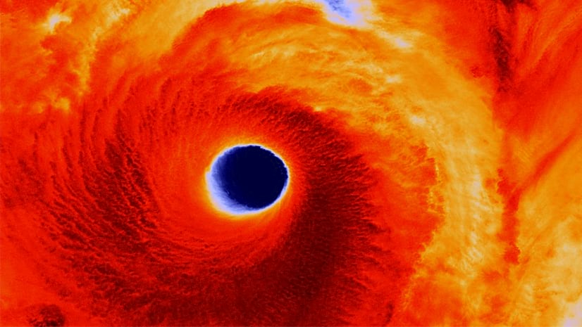
If you haven’t heard of the drought in the western U.S., you must be living blissfully under a nice cool, moss covered rock. But to quickly catch you up: it’s bad and getting worse.
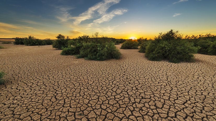
Drought is a part of life in California (and don’t get me started on people watering their lawns in the desert). Unfortunately, it’s also becoming a more frequent part of life in many areas west of the Mississippi. Or so they say.
Let’s test that hypothesis.
Drought and climate information
ArcGIS Living Atlas has a variety of resource to help dig into this topic. Let’s start with something simple.
Here are the climate stripes for where I live in Southern California. Each line represents one year of temperature or precipitation measurements that are above (red or green) or below (blue or brown) the 20th Century average. These stripes are such a cool tool since they provide an instantaneous spatial and temporal component. We can see a very pronounced warm and dry period over the last 25 years in Riverside County.

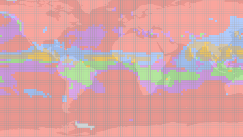
We can also see in the latest Standardized Precipitation Index that over the last 12 months, much of the western U.S. has experienced dry conditions – this drought has not just popped up as they sometimes do out east. More complex spatial and temporal patterns can be explored in the full SPI archive.
A spatial analysis of drought trends
OK…those are both qualitative assessments. Let’s get specific. Another incredible resource in Living Atlas comes from the U.S. Forest Service in their Drought and Moisture Surplus layers. These layers describe the moisture condition of the area and whether the area was above (surplus) or below (drought) normal, based on a z-score statistic. That dataset runs from 1900-2019 with 1, 3, and 5-year moisture averages, so there are a lot of ways to slice and dice drought patterns over time.
My approach: analyze the 1-year average moisture condition from 1900-2019 to look for space-time patterns in drought.
To do this, I first downloaded the entire TIF archive provided by USFS in their ArcGIS Open Data Hub. While their image services are great for mapping and localized analysis, when you need to analyze large areas over long timeseries, it’s often faster to go directly to the source data.
After converting one of the TIF files from Raster to Point, I used those points to sample the entire TIF timeseries that was built into a mosaic. The result was a table with 1 column for each year, which isn’t very useful for analysis – I needed to get those columns into rows in the feature class. The Transpose Fields tool was able to do that. The result: almost 58,000,000 feature points.
After some table cleanup and Arcade trickery to insert new Year fields (and many hours of twiddling my thumbs), I finally had a usable timeseries for analysis.
Identifying trends
I’ve blogged before about using the Space-Time Pattern Mining Toolbox in ArcGIS Pro with complex climate datasets – they’re easy to use and provide some amazing insight. For this project, I ran Create Space Time Cube by Aggregating Points (all 58 million) into 5,000 sq km hexbins with 1-year increments. By applying a definition query to the Year field on the points, this process could be re-run for different time periods. The resulting netCDF can be visualized several ways – I chose to look at trends.
This map shows statistically significant trends in moisture condition over the entire timeseries (1900-2019). While the Southwest is drying, many parts in the eastern half of the US have received surplus moisture.
This drought trend pattern becomes even more pronounced when the analysis is restricted to the last 40 years (1980-2019).
So maybe what they say is correct: there is a statistically significant trend towards more frequent droughts in many areas of the Western states. If you want to try this method for yourself, just remember a decreasing trend actually means increasing drought (since drought is the lower moisture score). The resulting hexbins can also be used as an overlay to help contextualize other maps, such as ecoregion or habitat type, hydrologic units, agricultural areas, etc.

Article Discussion: