The ability to slide on the data visualization goggles to filter, pivot, animate, and otherwise magically parse a phenomenon is a real wonder. I’ve been doing this a while but am still frequently amazed when the structure of a phenomenon washes over my screen. This StoryMap walks through the visual analysis of 30 years of nautical piracy through various cross-sections of the calendar.

While I am not a marine security expert or global economist/sociologist/explorer, I do make maps for these sorts of people. The story map presents nautical piracy in place and time, which offers up all sorts of questions. Questions I don’t know the answer to; but maps don’t necessarily have to answer questions. Maps prompt new and more specific questions.
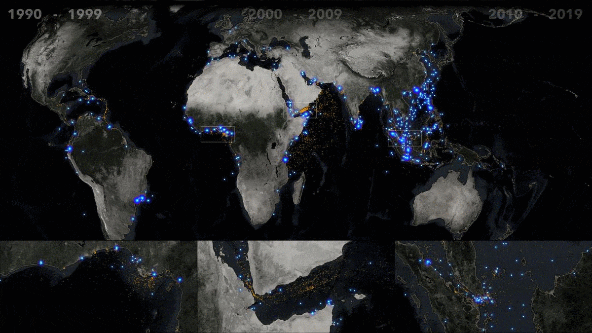
Here are a couple extracts from the StoryMap. First, a linear look at the past three decades…
And here is a seasonal cross-section of this era…
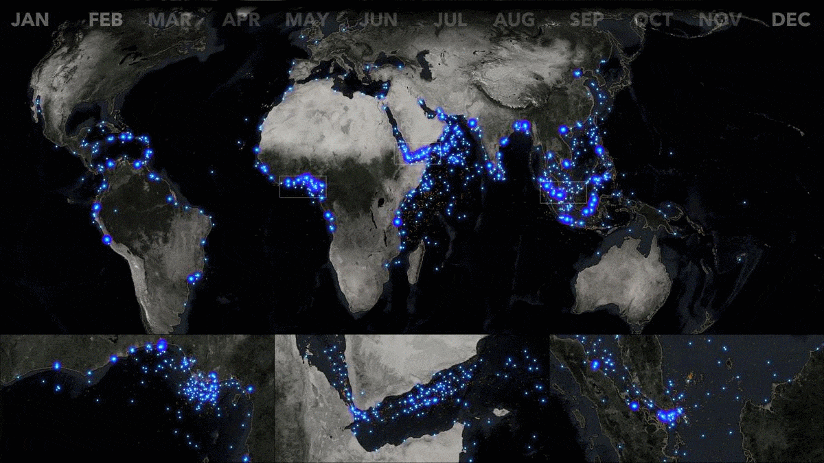
I hope you check it out and ask questions of your own. The data is sourced from the National Geospatial Intelligence agency, and is available as a feed, updated weekly, in the ArcGIS Living Atlas of the World. The maps were created in ArcGIS Pro with Arcade date functions, a multiple map frame Layout, and the Firefly style.

Article Discussion: