I recently got involved with a project that mapped grocery store accessibility by scoring every census block in the United States by the number of grocery stores within a 10-minute walk and a 10-minute drive. As the cartographer the challenge was to get all the layers to work, make sense, look good, and tell the results of the analysis as clearly and beautifully as possible. There were four distinct areas of the map to think through.
The Cast
Capturing what grocery access means didn’t take just one layer, it took four.
There were two raster datasets:
- USA nationwide grocery store access within a 10-minute drive
- USA nationwide grocery store access within a 10-minute walk
Also two point feature classes:
- 53,000 grocery store locations
- 11-million U.S. Census Tracts analyzed for population and proximity to grocery stores by walking or driving
Four layers both vector and raster, with millions of records, all with unique needs that overlap and connect, yet also need to be separate too. Yes, we can!

#1 Multi Scale Mapping
This is an interactive online web map so its very different than designing for print. Everything needs be understandable at multiple map scales from nationwide to city blocks. There will also be labels, other reference layers, and new features with additional information appearing as you zoom in and out.
Plus the map’s subject changes depending on where you are looking so the styling needs to accommodate that. Some areas might have a lot of overlapping or adjacent data, while in others it appears more isolated. The cartography has to work for every situation. Multiscale is multi-planning, multi-decision, and multi-testing!
The colors also needed to be viewable together at 1:3,000,000!

#2 Using Color Thoughtfully on Overlapping Layers
Transparency was not an option for this map and since the raster layers share the same geographic space (overlap), they had to look good together while also standing up on their own. The color choice would be the most important factor in delivering the information so we decided to go with what the layers represent and selected blues and greens to honor the nature based side food (and those colors are just really pleasing to the eye). We also thought since walking is considered GREEN energy it was also the intuitive choice for representing it.
By staying within the same area of the color wheel both layers look cohesive and like they belong together.
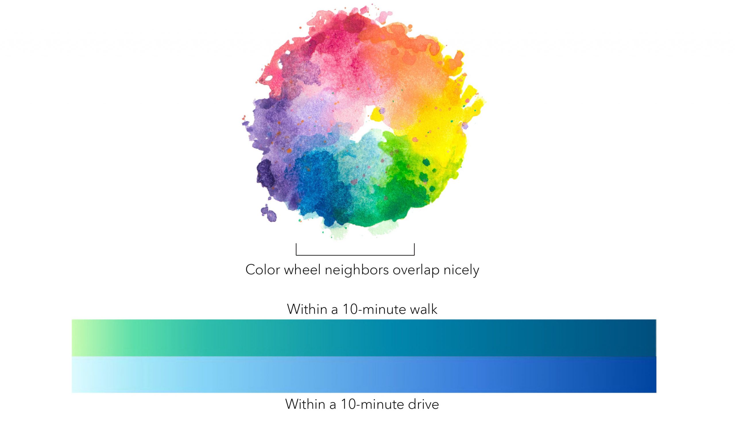
They also need to continuously go from light (less) to dark (more). It was tricky (and several tries down the wrong path) but after careful thought it was possible. Here are other things encountered:

#3 Telling the Story
While making a map there’s a point when you really get to know the layer, the colors start unlocking their story, and you see the data values turning into meaning. As cartographers we love this.
It was actually the lowest value “One store within a 10-minute drive” that carried the most weight or presence as it’s found all over the map at every scale. Since it’s the predominant value the color must be liked a lot and I mean A LOT because it sets the map tone and will overpower the story if not treated with care.
The raster layers are also classified numerically by how many stores are found. This is where the art of balance come in. The high values are not better or more important then the low values (and vice versa) so the palette was designed with that in mind. No one color should seem more important.

As map makers we tend to look towards the places and experiences we know to tell the map’s story.
I live rural and have few grocery store choices. In fact in my town there is one main grocery store that is very important for my community. When coming up with the palette we felt that the lowest possible value “One store within a 10-minute drive” should mimic the fragility aspect of only having only one grocery store around. We built that into the map story by selecting a light-almost-fading-away-blue. This way it’s present, but not distracting. It intensifies in color around the cities but nowhere on the map does it take over. All values are represented equally yet rank is implied.
Oppositely once the ramp goes up, anything after five stores means you have serious options. Both palettes address that and you can see we were very conscious about the significance of the breaks and where the colors got applied knowing that their emphasis would help drive the subject matter of this map.

#4 Styling Millions of Points
When I picture shopping in a store, I see big bold primary colors with bright lights. I started by doing research on grocery store logos and the color red seemed to stand out. For the actual symbol I wondered if it should it be a classic cart, basket, or another symbol for food?

The last layer to style was the Census Blocks. These are actually served as polygons, but you can set their symbology to be “Graduated Symbols” so their centroid is represented as a point.
Now, what kind of point symbol to use? This was an opportunity to get a clever and take the literal expression of “Can you walk there?”.
A typical symbol for population is a circle/dot, except, when you look at the map you don’t immediately recognize that dots = people. So why not make the symbol exactly what it is, a person symbol!

There were are few things to think about to get this symbol to work:

Now the fun part. Let’s have a look around the map! It is incredible to see where you need to drive to buy your food, and where you don’t. How many options there are, and where there aren’t any.
Redlands, California
Several of the areas in Redlands that would be considered a 10-minute walk but have none or low populations within and around them. You must drive to these places.

Taos, New Mexico
You really need a car if you are living in Taos to be able to buy your groceries, but you have a lot of choices.

Washington County, Maine
In far northern Maine, each of these grocery stores provides vital food resources for their communities.

Los Angeles, California
In the land of traffic and cars this is where you can walk to a store within 10-minutes.

The State of Wyoming
Wow! Look how few grocery stores there are in the entire state of Wyoming!

Dallas/Fort Worth
In the sprawling Dallas-Fort Worth area a vast majority of the population are unable to walk 10-minutes to a grocery store.
NOTE: Yes the overlapping person symbol is too much/too many, but it is doing its job just for this image by showing the lack of convenient walking access for so many people to get food.

Resources
What a journey right? The best adventures offer exploration and cartography is like that for me. Thank you to Jim Herries for bringing this project for collaboration.
- The Grocery Access app is live and hosted in the APL infrastructure.
- Grocery Access web map – an example web map that brings walkable and drivable layers together with the SafeGraph store locations and Census block population data.
- Origin Destination Access Analysis Starter Kit – a Pro Package configured with the Tools used in this project. This allows anyone with Pro to produce analysis and results like this for their town, on the topic of grocery stores or any other locations (e.g. health facilities).
- Grocery Access Map Resources – a gallery of layers, web map, Pro Package used in the project.
Behind the scenes…
Here are a few other ideas we had for palettes.
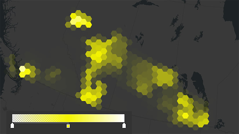
This example with a dark base map version really pops out anything past five stores (where it moves to yellow) and it looks really cool. But it’s just too dark and it doesn’t tell the story as well as it should.

This was a promising version, but the feedback from early testing was the switch into yellow (once you got past five stores) was not intuitive. So, the quest went on to create something different, but we still felt that this tells the story very clearly and it is offered online as well.

This is our final version. This one honors the analysis results, the colors are pleasing to the eyes, there is depth, subtlety, and an organic look and feel connecting us to this map. It also does not look like water, which needs to be considered when using blue (there is a bit of teal in this blue so that helps too). Everything is present and nothing is overpowering. You see the intensity, but nothing is pulling. There is something about it that makes you want to explore, and that is the true goal of a cartographer…to lure you into the map.

Please feel free to reach out to me with questions or comments. Thank you!

Article Discussion: