Every great map starts with purpose. But how can you choose a purpose for your thematic map if you don’t understand the data yet?
So many times, we are shown in tutorials that the map making process follows a guided and regimented step-by-step process, but this isn’t what the map-making process is like at all. Realistically, we spend an incredible amount of time finding/processing/analyzing data and then run out of energy by the time we need to use it to tell our final story. In most cases, we have no idea what to expect from the data when we start to set the cartography on our thematic maps. Some may find this unsettling, but it can be an opportunity to create a map with fresh eyes and perspective.
Anyone can drop some data onto a map and call it a day. The internet is full of maps like that. Don’t be that person. Ask more of the data. Ask more of yourself. The next time you reach the point of setting your cartography, I challenge you to take an extra 5 minutes to just explore your data in ArcGIS Online. This exploration can lead to better maps, more informed cartographic decisions, and more meaningful narratives about the data we spend so much time preparing.
For example, my manager has tasked my team to better understand which parts of the country are at higher risk when evacuation orders are necessary for natural disasters such as hurricanes, fires, flooding, and more. I’m interested in visualizing patterns related to poverty, the non-English speaking population, and households without a vehicle. These are indicators of at-risk populations during evacuations when every minute counts.
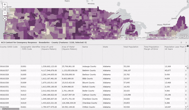
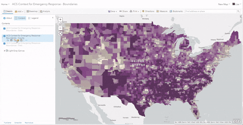
Let’s try out some easy ways to explore a spatial dataset by testing it out on a layer you may have never seen before. If you want to follow along, open this ACS Context for Emergency Response layer from ArcGIS Living Atlas containing demographic data from the most recent American Community Survey offered by the U.S. Census Bureau. Upon opening the layer, we can see three layers in the table of contents (state, county, and tract) but let’s start by viewing the counties to see what nationwide patterns emerge during our exploration.
Below are some tips for exploring your data. Your exploration of the ACS layer may be different than what you see here (and that’s ok). I like to start my exploration with a neutral light grey basemap so that the colors don’t compete with the basemap as I try new things. Change the basemap to Light Grey Canvas for this map to get started.
1) Browse the attributes
This may sound obvious, but this is the foundation of your understanding of what a dataset has to offer. In this case, we are exploring a dataset created by a government agency, so the level of familiarity is not as high as a dataset we created ourselves.
One way to start exploring is to open the table and see what types of fields are there: numbers, dates, categorical, etc. You can also get a sense for how many records are in the database. For this layer, open the table to see that there are 3220 counties in the US (including Puerto Rico and DC). Scroll through the table horizontally to see that most of the attributes are numeric and cover a wide range of demographic topics related to at-risk populations.
Another way to explore the data before we map is to explore the item page for the layer. Choose Show Item Details within the layer options to get here from the map. A well-documented item page will provide context about the data source and use constraints (if they exist).
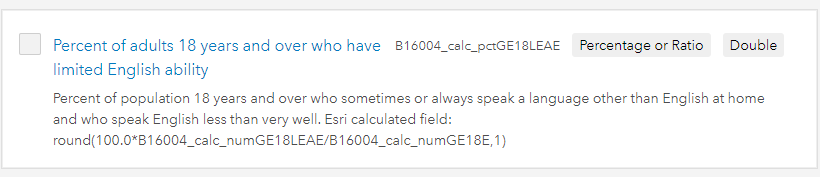
If you choose the Data tab, you can see the table by default. If you toggle from Table to Fields, you can see each field, the alias name, the long description, and field type for each attribute. Scroll until you find the attribute “Percent of adults 18 years and over who have limited English ability“. We can see that this attribute represents the population who sometimes or always speaks a language other than English at home. Areas with higher percentages would be at a higher risk during evacuation orders since they may not understand they are being asked to leave.
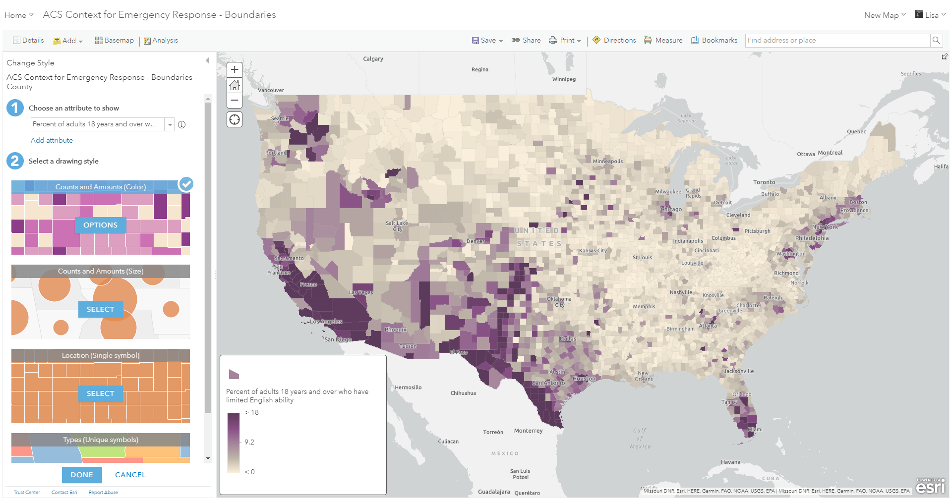
Another way to explore data is to utilize smart mapping to immediately see patterns in the thematic map. The reason it is called “smart” is because no matter what attribute you choose, it will recognize the type (numeric, unique, date, etc) and only offer you mapping options specific to the type. This makes it easy to quickly choose different attributes and swap between the appropriate mapping styles.
Looking at the table helps you get a sense for what fields you have and what kinds of values are in each of them, but often you can get a better sense of these fields by mapping them. Click Change Style for the County layer. The first step is to Choose an attribute to show. Start by finding the “Percent of adults 18 years and over who have limited English ability” attribute we just looked at. Since this is a numeric attribute, we are offered Counts and Amounts (Color) as the default mapping style and the map shows us where there are some distinct areas of at risk populations.
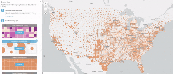
Now, switch to the Counts and Amounts (Size) option to see how that style looks with this attribute. We can still somewhat see the pattern, but it is a bit harder to differentiate. Go into Options to see the spread of the data. It looks as though an outlier is reducing the variation of sizes in this map. To overcome this, try dragging down the upper handle to see how the map changes.
In general, percentages work well when mapping with color, but size is usually more appropriate to use when mapping a count such as the count of adults 18 years and over with limited English ability. Just trying the different styles helped me decide how I would map this attribute.
Since it is easy to try different attributes and styles, spend a few minutes just scrolling through the list of attributes and trying different attributes that you find interesting. You may be surprised at what you find. At this point you don’t need to have a plan, but this initial discovery should help inspire you to get started! You may even find another attribute which helps support your map’s purpose.
Tip: if you don’t know what the attribute means, click the i next to the attribute to see the long descriptions that are included for each attribute in this layer.
2) Let the statistics tell you something
As mentioned in #1, smart mapping in ArcGIS Online recognizes the types of attributes and only offers you appropriate suggestions. But did you know that smart mapping also shows you statistically significant patterns by default?
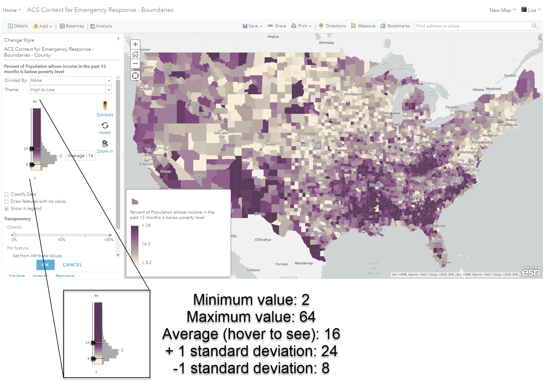
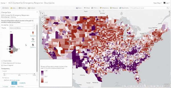
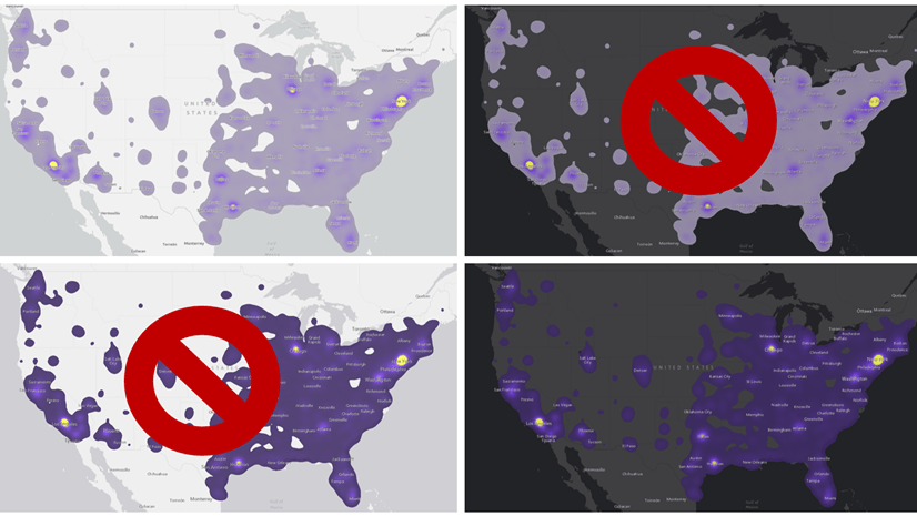
If you choose a numeric attribute from your data and choose to map by color, the map will automatically highlight areas in your data that are plus or minus one standard deviation (aka significant). This makes it easy to quickly see patterns. I want to explore another at risk group, so using the ACS layer, find the attribute “Percent of Population whose income in the past 12 months is below the poverty level”. By clicking Options, I can see the histogram of my data. The image above explains what we see in this histogram.
By simply choosing an attribute I was interested in, I learned which parts of the country have significantly high rates of poverty (over 24%) shown in the darkest colors of purple.
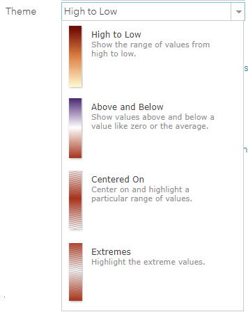
Another way to utilize these statistics for exploration is to try out different themes. The themes can help emphasize these significant patterns by drawing focus to the outliers or the bulk of the data.
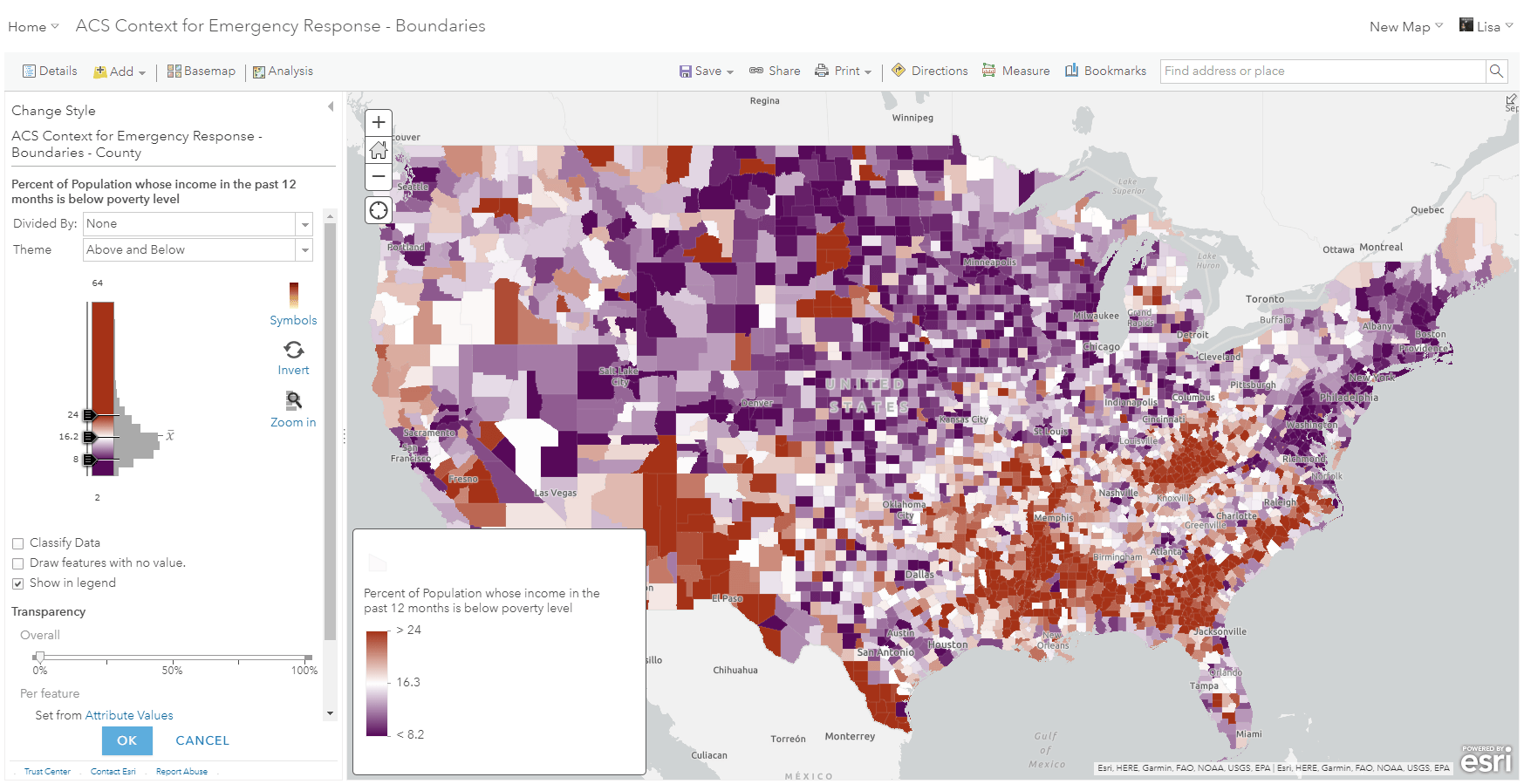
If we try out the Above and Below theme on our map, it will adjust the colors to show which parts of the country are either above or below the average value from this county dataset, which is 16%. This could help emphasize areas of need, which we see in red:
3) Don’t be afraid to try things (and fail)
This may be the most important step of exploration. If you limit yourself to the defaults that are given, you may never reveal the most interesting patterns hidden in your data. The Options button is your best friend and will open a world of possibilities and tools for exploring. I can guarantee you won’t make the perfect map in your first few clicks, so don’t be afraid to make some ugly maps along the way.
Try different basemaps, color ramps, symbols, and themes. You might even have some fun while you do it! You could also end up with multiple maps you like through this process, which is great! Save each one as you try things you like, and you might notice that the same attribute can be shown in very different ways.
4) Try mapping multiple attributes
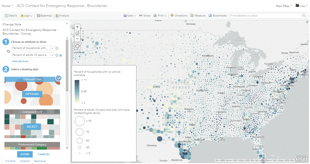
Now that you’re feeling more comfortable with your data and the tools, use the creative part of your mind to start making connections between the different attributes in your data. In our example, there are the following two attributes that could have some possible relationships. In the case of emergency response, these two attributes could be important to map together since they both are at-risk during scenarios requiring evacuation:
- Percent of households with no vehicle available
- Percent of adults 18 years and over who have limited English ability
As before, smart mapping knows what to offer you when you choose two (or more) attributes. In this case, I chose two numeric attributes, so smart mapping offered me color and size, predominance, and relationship styles. I can try each one to compare the patterns and see what relationships start to emerge. Not every option will give me a useful map, but I might see some interesting things along the way. This is all part of the data exploration process.
Tips:
- Color & Size is good for showing a count and a normalized version of that count. For example, the color can show the percent of poverty, but the size shows the count of people in poverty.
- Predominance works best when comparing multiple numeric attributes that are counts. For example, an election map comparing the count of voters for each party.
- Relationship is powerful for comparing the patterns of two different numeric attributes. For example, two counts being compared, or two percentages.
- Compare A to B, like relationship, is best used when the two numbers are comparable.
5) Use your knowledge
While we have a world of technology at our fingertips to help us make better maps, nothing beats the power of the human mind. Smart mapping can get you most of the way there and help you learn new things, but your own knowledge of the world is your most powerful tool.
As you get closer towards your map’s purpose, bring meaning to your map by asking questions like “at what point do I care?”.
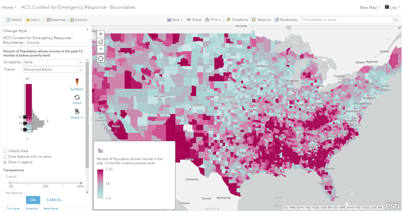
For example, earlier I tried mapping the percent of households in poverty, and the average value for counties was 16%. While that was a good start, my map will be released with a report that references the national average, which according to the American Community Survey is 14%. A few minutes of research helps bring meaning to this map by adding additional context, as well as creating consistency for the report this map will be released with. If I use the Above and Below theme mentioned earlier and anchor the center of my map around the national average instead of the county average, I have given my map a more solid anchor point. All areas in blue are below the national average, and all areas in dark pink now highlights areas of deep poverty.
The national average is just one way to anchor my map. Using the same technique, you can set your center color around a threshold, goal, or other meaningful number in order to create deeper meaning to colors in your map. For example, if my manager was interested in targeting areas with over 10% of people in poverty, I could use the number 10 instead.
Always search for great maps
Now, zoom into a city where you see the Census Tracts, and use the techniques listed above to explore some new patterns of your own. Try using different attributes or use the same ones and see what the local pattern reveals about an area.
Every map maker should understand that turning data into a purposeful map is a journey, not an event. Making one good map ought to lead to better questions, which lead to other good maps. It’s a virtuous cycle once you tune in to how to participate in it.
Putting data onto a map is only the beginning. At that moment, your map has no purpose, only data. A map gains purpose as the map maker begins to understand the data, explores it, asks questions of it, and modifies the map based on answers to those questions.


Article Discussion: