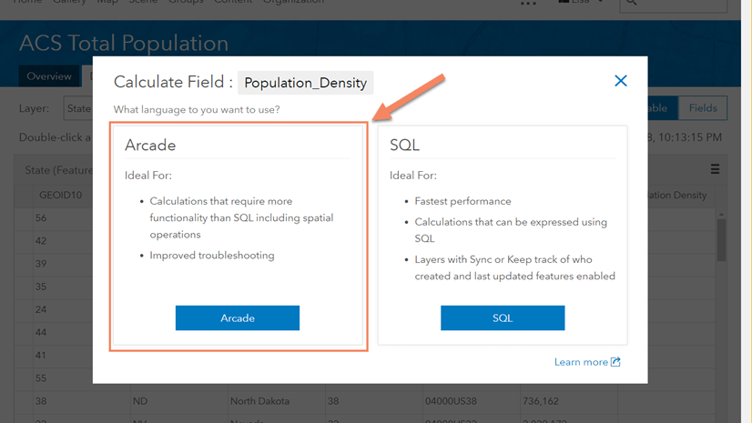
ArcGIS Arcade is a powerful expression-based scripting language that can help you accomplish a lot in your web maps, including changing the symbology, configuring pop-ups, or updating labels. One of my favorite things about Arcade is the ability to create new attributes on the fly from expressions with data without having to leave the map or take the data offline. This is beneficial if you are constrained by the layers you have but know how to manipulate the data to tell the story you want.
Imagine you’re on a team working to reduce traffic congestion in Boston. You want to identify areas that could use new infrastructure, as well as areas that could use improvements. You’ve been tasked with creating a map to demonstrate what method of transportation residents are using to commute, as well as how long they are spending commuting.
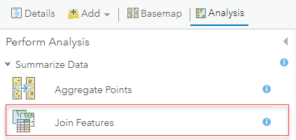
You have these two layers (we’ll call them Method and Time) but want to keep the map as simple as possible. Arcade can’t be used for styling across layers, so you’ll join these two layers to have access to all the data you’ll need to symbolize your map.
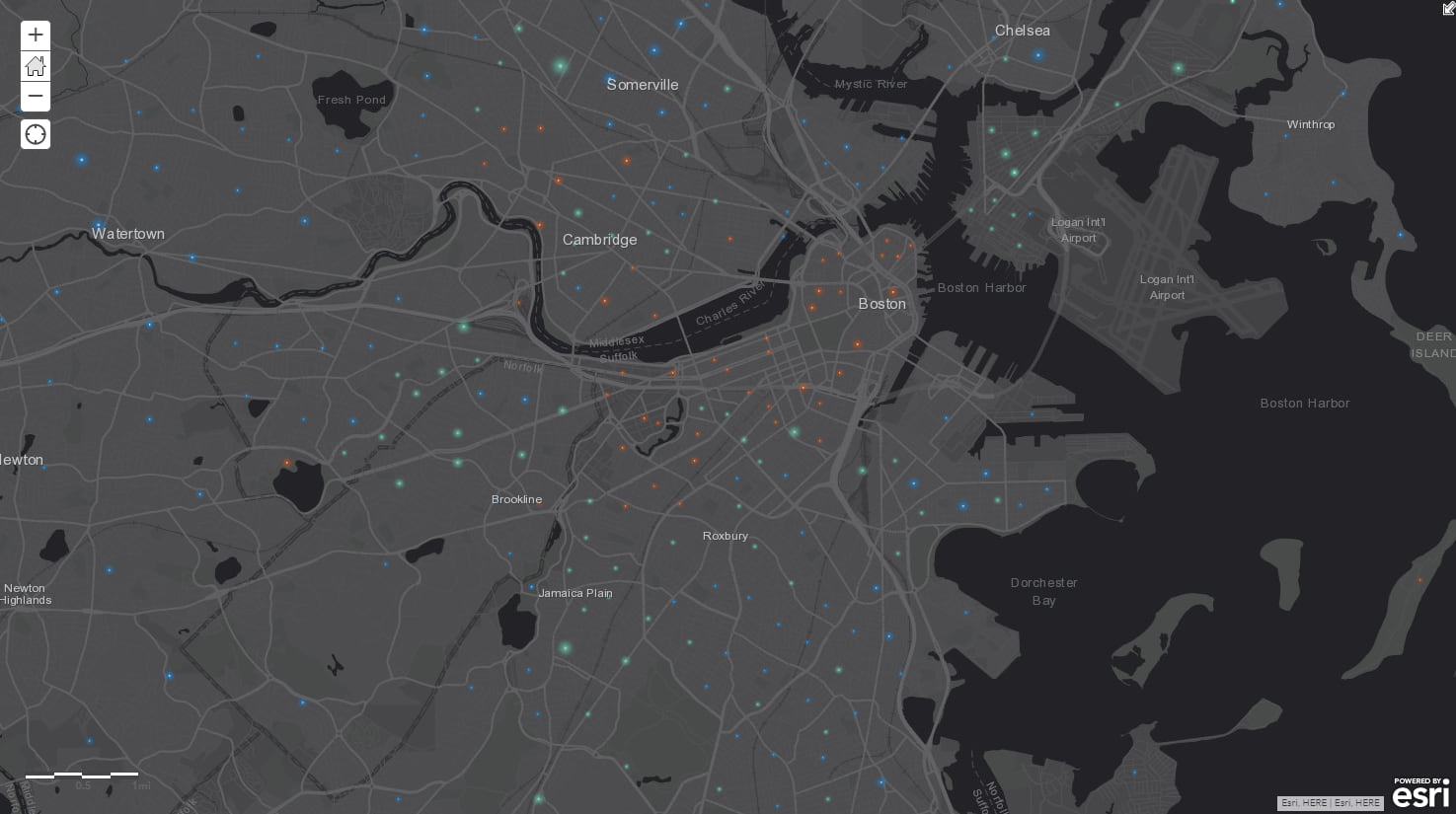
The Method layer already includes an Arcade expression to determine the predominant method of transportation per census tract, which is shown by the color of the points. You decide to leave this alone, as it makes it easy to identify how different parts of the city are getting to work.
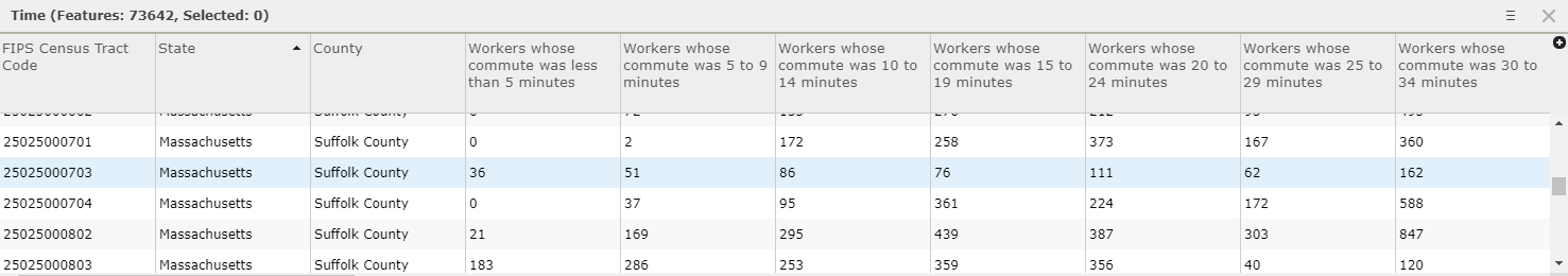
However, you want to add an expression to your layer to symbolize your points by size, where the larger the symbol, the longer the commute time. Your data is currently set up in time intervals. You could set up an Arcade expression like the one that exists in the Method layer, but symbolizing the predominant time interval for each tract could be a little confusing.
To keep the map simple, you decide to calculate a weighted average for each tract. You’ll have to make some assumptions about the data (for example, that there’s an even distribution of commuters throughout the time interval), but since this map is just taking a preliminary look at trends in the city, it’ll do the job.
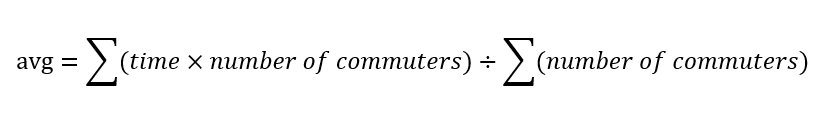
You grab a pen and paper and write out a generalized equation to help you calculate this average.
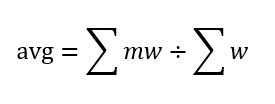
This equation uses the number of commuters (w) as the weights and time as the value (m) being averaged. Since you can’t average a time interval, you take the midpoint of each interval. (This is where you are assuming even distribution of commuters throughout the interval.)
Now you’re ready to translate your equation to Arcade. You start by selecting the fields for number or commuters and multiplying these by the midpoint of the time interval:

The denominator of your equation is the sum of all commuters per census tract:

You apply your Arcade expression (and play with the symbology a bit) and view your final product.
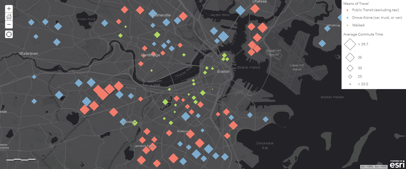
With these two expressions, you can start to identify some patterns. You notice that residents in Allston and East Boston are spending lots of time commuting by public transit, while Charlestown, Somerville, and Dorchester residents are spending lots of time driving themselves. This shows that the former neighborhoods could benefit from improved infrastructure, while the latter neighborhoods could use some new infrastructure. These changes could help take cars off the road, improve traffic congestion within the city, and improve quality of life for residents by cutting down their commute times.
This example is just one way to leverage Arcade to perform calculations with your data without having to change the schema of existing layers. Arcade provides plenty of other operations to help you perform more complex calculations to identify trends in your data and help you tell your story.

Commenting is not enabled for this article.