Humans have a profound impact on the environment. By better understanding our impacts we allow the opportunity to change and protect or natural resources. The Coastal Eutrophication App was built to map and show trends in water quality for all countries of the world. In providing this information countries have foundational resources to understand hot spots (repetitive anomalies) implement a water quality monitoring plan and begin to determine sources of potential pollution.

Eutrophication is a process driven by enrichment of waters by nutrients, especially compounds of nitrogen or phosphorus, leading to increased growth, primary production, and biomass of algae resulting in adverse changes in the balance of organisms and water quality.
This work was done in support of Sustainable Development Goal (SDG) 14.1 – “Life Below Water”. A collaborative team including scientist from the National Ocean and Atmospheric Association (NOAA), Plymouth Marine Laboratory (PML), United Nations Environment Programe and Esri led by GEO Blue Planet have been working and reporting results for SDG 14.1.1.a for the past 4 years that are accessible here.
The Coastal Eutrophication App supplements the data by providing an interface for spatial exploration and sharing. The URL is “smart” and allows users to share their current view of interest with others that might be interested in looking at the same phenomena in the app.
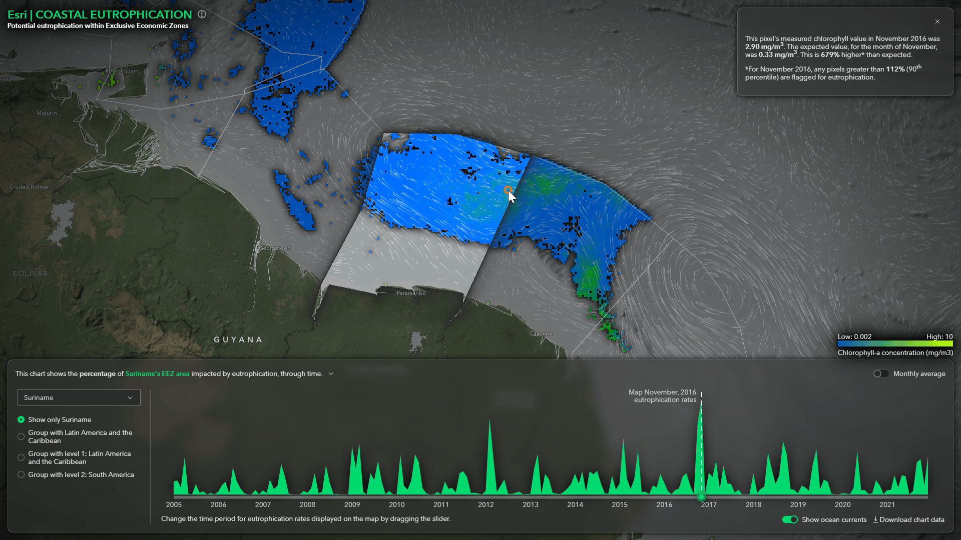
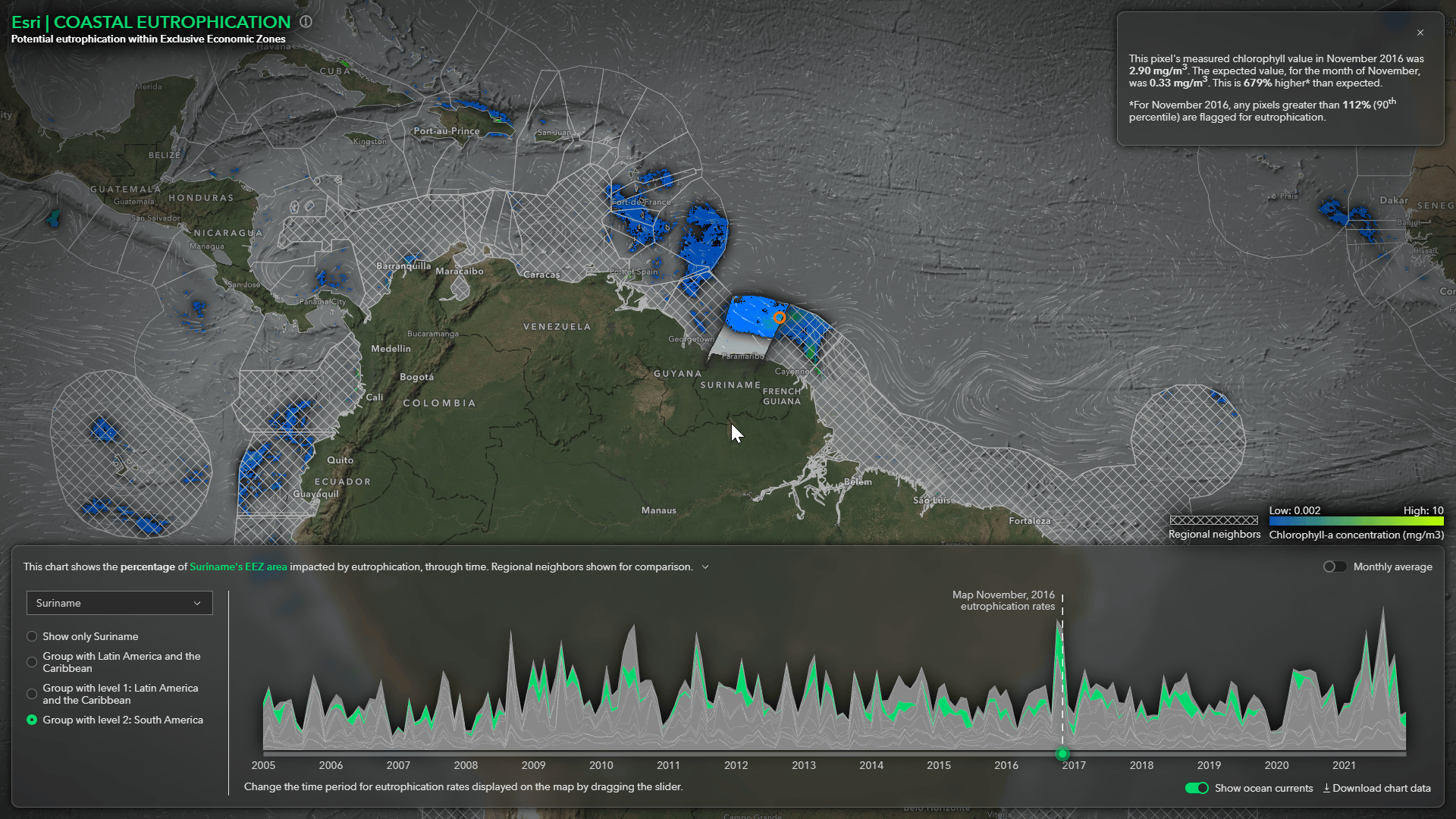
This Story Map explains the methodology that was used to preform the spatial analysis and walks you through how the pixel-based analysis was turned into monthly reporting results. Special thanks to the talented Raluca Nicola for helping aggregate the data and building the web application and to John Nelson for UI/UX support.
For more info see the chlorophyll-hub.


Article Discussion: