Not long ago I posted a blog about analyzing climate impact on wine production using multidimensional raster analysis capabilities. In that blog I primarily focus on the dimension-enabled raster function and map algebra capabilities that are fundamental for performing multidimensional analysis in ArcGIS; however, these are only part of the whole set of multidimensional raster capabilities. In this post, we will explore more through analyzing the impact of climate variables on birds.
Climate change has widespread impacts on ecosystems. Rising temperatures and shifting weather patterns affect birds’ ability to find food and reproduce, which over time affects population and diversity. Audubon’s 2019 climate change report reveals that up to two-thirds of North American birds are vulnerable to extinction due to climate change. Many studies report that extreme climate events are becoming common and are causing changes in distribution, habitats, and migrating behaviors. Furthermore, studies show that birds’ response to climate varies at different temporal scales, and the extreme weather conditions that cause birds to change their habitats are weeks of continuous heat waves, months of continuous drought, or prolonged heavy rainfall [Cohen et.]. To better analyze the effect of extreme weather variables, we will use the multidimensional raster analysis geoprocessing tools to map the extreme climate zones that may impact birds and cause their behavior to change.
What data and variables should be used?
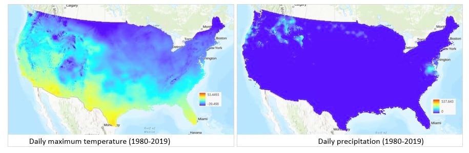
The weather variables that affect birds are temperature, rainfall, and drought, and the last two can be obtained from a precipitation variable. Daymet datasets contain both temperature and precipitation data at the daily resolution that we need, and the new version 4 was made available not long ago, so we will continue to use Daymet and define our study area as the continental United States. Since the data is stored as separate NetCDF files, we created a mosaic dataset from these files for each variable, clipped with the boundary of the United States, and created multidimensional Cloud Raster Format (CRF) files as our inputs as below. See How to create multidimensional raster data for detailed steps on how to create mosaic datasets and CRF files.
Which multidimensional analysis tools should be used?
The Image Analyst toolbox contains many multidimensional raster analysis tools. In this blog we will primarily use the Aggregate Multidimensional Raster, Generate Multidimensional Anomaly, Generate Trend Raster, and Find Argument Statistics tools.
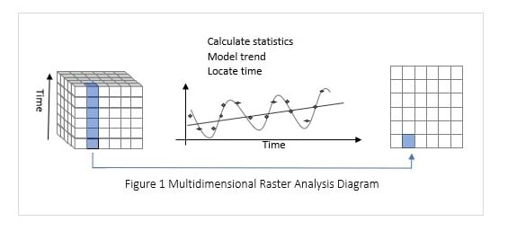
The input for these tools is a multidimensional raster, also called an image cube. The cube can be viewed as either multiple horizontal 2D slices or many vertical 1D dimension arrays. Our climate data is the second case, and the dimension is time, so we’ll call it pixel time series (Figure 1). These multidimensional raster analysis tools analyze each pixel time series and output a raster, which can be a 2D raster or multidimensional raster. Let’s examine how each of the tools works. Feel free to skip to the next step if you are already familiar with these tools.
Aggregate Multidimensional Raster aggregates pixel time series along a given time interval. The tool supports many aggregation methods. We will primarily use Mean and Percentile to aggregate temperature data from daily to weekly or monthly. Note that the Percentile option is a new feature added in ArcGIS Pro 2.8.
Compute Multidimensional Anomaly computes the deviation for each slice to the total mean, median, or z-score.
Find Argument Statistics is very useful for analyzing climate data. You can find dates, at each pixel location, at which the time series reaches the highest or lowest values. In this blog, we will use a feature that finds the duration, in consecutive weeks, that temperature exceeds its average.
Generate Trend Raster fits each pixel time series using a line type (see Figure 1). The output is a multiband raster containing model coefficients. The first band is the slope that describes a linear trend, and it provides an intuitive way to map and visualize the trend that exists in the climate data. The harmonic trend can be described by other coefficients in the model.
With basic knowledge about the data and tools we will use, we are ready to start. We will use ArcPy to describe the processing steps and use ArcGIS Pro to visualize our results.
Analyze and map extreme weather
What are extreme temperatures and precipitation values?
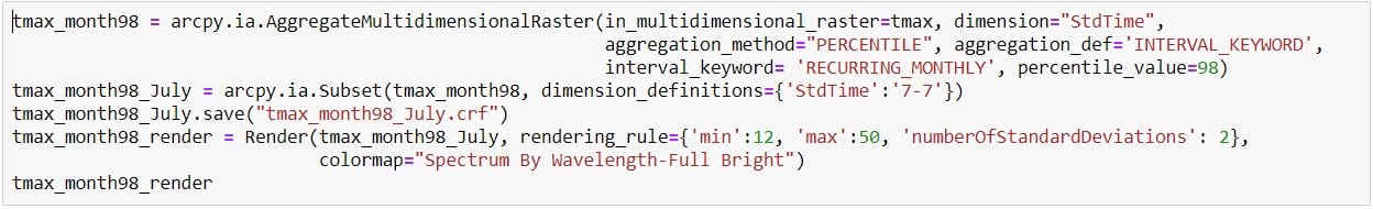
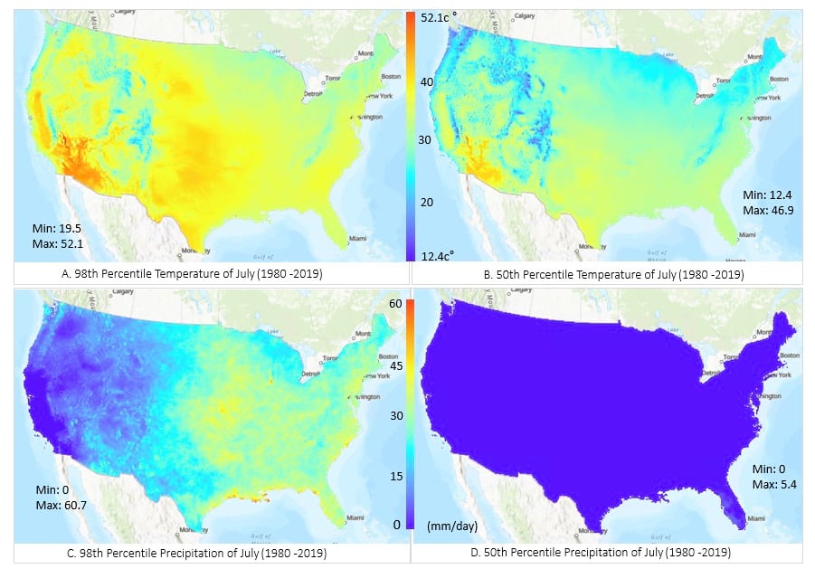
Extreme weather for birds is described by Cohen as 98th percentile temperature for heat, 98th percentile precipitation for high rainfall, and 2nd percentile precipitation for drought. We’ll create maps that describe these weather conditions. Since temperatures and precipitation values vary significantly by month, we will calculate for each month, so we’ll take data from January of each year and calculate the 98th percentile of January data across 40 years. The Aggregate Multidimensional Raster tool can do that easily. The ArcPy code below uses this tool to create a multidimensional raster of 12 slices; each is the 98th percentile temperature of a month. Here we used PERCENTILE for the aggregation method and RECURRING_MONTHLY for the interval. Using same method, we calculated the 98th percentile precipitation data. We also calculated the 50th percentile of temperature and 50th percentile of precipitation so that we can see how different the extremes are from their median values. We then selected the month of July, the hottest month across all states, to display.
You can see that 98th percentile temperature (A) ranges from 19.5 to 52.1, which is higher than the median (B), ranging from 12.4 to 46.9. The 98th percentile precipitation (C) is also higher than the median there (D); the average is extremely low across the United States, except for Florida. July in the western United States is a dry season, so precipitation is much lower than that of the eastern United States. The map does not include droughts, as 2nd percentile precipitation values are all 0 across the United States.
How often has extreme weather occurred?
Extreme weather can also be described by anomaly. The z-score-based anomaly measures how many standard deviations a given observation is away from the mean. It is more effective for detecting extremes and convenient for comparing temperature and precipitation than using anomaly based on absolute difference. We use a z-score of 2.32 to describe the extreme temperature and precipitation as 98th percentile is equivalent to a 2.32 z-score for normal distribution data.
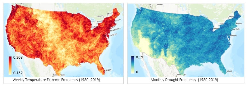
First, we aggregated daily data by week; here we used the Aggregate Multidimensional Raster Geoprocessing tool with MEAN for the aggregation method and WEEKLY as the interval. Second, we calculated anomalies using the Generate Multidimensional Anomaly tool with z-score method and a RECURRING_WEEKLY calculation interval. Different from the WEEKLY interval, RECURRING_WEEKLY calculated the average of the same week across all years as opposed to calculating the weekly average for each year. Third, we found the data where z-score exceeds or falls below the mean by 2.32, because temperatures at either extreme, high or low, will change bird habits. And finally, we used the Aggregate Multidimensional Raster tool again to count the number of weeks exceeding the criteria and calculate a frequency. We then used same method to calculate precipitation extreme frequency but applied on monthly scale.
In the resulting frequency maps, we can see that extreme temperatures occurred frequently in the western and eastern United States during the past 40 years, while the middle zone shows mild temperature variations. Precipitation extremes occurred less frequently in California, Texas, and Arizona compared to the eastern states.
How long did the extreme weather events last?
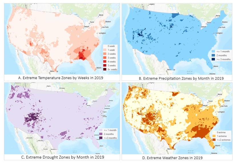
Bird habitat change occurs when extreme weather continues, and the response to temperature extremes is more sensitive on a scale of weeks, but response to precipitation is on a monthly and seasonal scale. So, it is important to know when and where such extreme weather occurred for an extended time. To calculate the duration of prolonged extreme weather, the Find Argument Statistics tool can be used. Here we focused on the year 2019; we used the weekly anomaly result from the last step, extracted the weeks of the year 2019 using the Subset function, and used the Argument Statistics tool to find the duration, in number of weeks, that anomaly consecutively exceeds the 2.32 z-score.
We can see the extreme temperature zones in Georgia and northern Florida (A). Using the same method for precipitation at a monthly scale, we created extreme rainfall (z-score is above 2 standard deviations) and drought (z-score is below 1 standard deviation) maps. The areas with extreme rainfall that lasted 3 months are very small (B); some prolonged droughts were found in Arizona and Utah (C). By overlaying the three conditions, we created one map of birds’ extreme climate zones (D), where areas in dark brown mean at least two weather extremes occurred, or temperature extremes lasted for two or more weeks. Although some areas in Arizona experienced both drought and a week of extreme heat, areas in Atlanta or northern Florida with prolonged periods of heat seem to be more of a concern, as birds are more responsive to temperature than to drought and rainfall.
What are the temperature and precipitation trends?
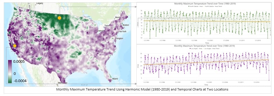
Many studies report that average temperature is increasing due to climate change, and increased temperature will lead to migration and extinction of birds. To visualize and map the temperature trend in the last 40 years, we will use the Generate Trend Raster tool. Since temperature has seasonal characteristics, we will use a harmonic model with a frequency of 1 year.

The map below is the trend map, where pixels represent the slope of the fitting curve. Pixels in purple have a positive slope, which means temperature increase, and pixels in green have a negative slope, which means temperature decrease. This map shows that most areas in the continental United States exhibit an increase trend, though the increase rate varies from region to region. The increase rates are very subtle in most areas, but more pronounced in some areas such as Los Angeles, shown as dark purple. Some areas show a decrease trend, such as North Dakota, but the decrease is extremely small. The trend rate can be observed from the temporal profile chart at the two locations.
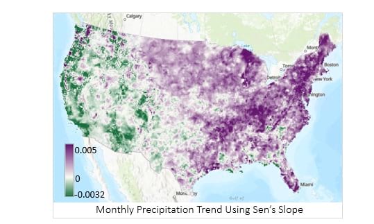
Analyzing precipitation trends is tricky; fitting them with a linear or harmonic model will produce a large RMSE. So, we use the MANN-KANDEL option to calculate Sen’s Slope. Sen’s Slope is a statistical method that summarizes the trends of any two observations; it is nonparametric but provides a general trend of the data. Purple shows more increases than decreases in the past 40 years, and green means more decreases than increases.

Summary
Using climate data and the ArcGIS multidimensional raster analysis tools, we have explored the weather variables that are related to birds. We have calculated the 98th percentile for temperature and precipitation, computed the frequencies of extreme weather events that occurred in the last 40 years, mapped the areas and duration of these extreme weather events, and finally analyzed the trend of the two weather variables. You can see that the multidimensional analysis tools make the workflow easier and straightforward. If you do not plan to write code, simply use the corresponding geoprocessing tools to achieve same workflow. The same workflow can also be implemented in ArcGIS Enterprise if you replace the geoprocessing tools with the corresponding raster analytics service tools.
In this blog, we used the results and findings from the Cohen article. Further work that might be of interest is to take the eBird observation data and use the ArcGIS Sample tool to extract the environment variables that characterize bird habitats.
Lastly, I would like to acknowledge that this blog is the continuation of collaboration with Michele Thornton from Oak Ridge National Laboratory (ORNL) and Leah Schwizer from NASA on the article for the GIS for Science book.
References
Jeremy M. Cohen et al., Avian responses to extreme weather across functional traits and temporal scales, Global Change Biology, https://doi.org/10.1111/gcb.15133


Article Discussion: