How hot is it going to get today? What about tomorrow? Should I take my jacket?
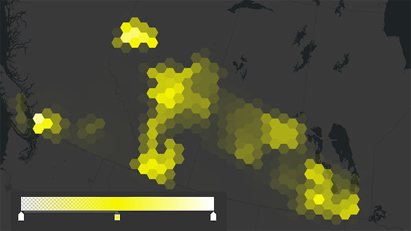
These questions are now answered on your maps with two new temperature forecast layers from the National Digital Forecast Database. They are new additions to Living Atlas and provide daily minimum and maximum and hourly apparent and expected temperature forecasts for the Contiguous United States (CONUS), Alaska, Hawaii, Guam, and Puerto Rico.
These layers were built to show you a wide range of temperatures across the forecast period. They are a snapshot of what is coming and can be leveraged by a variety of users such as emergency managers, power grid operators, or human health organizations as additional resources for their maps and forecast processes. Where is it going to be over 100°F? Is there any overnight relief from the heatwave? Which areas within my district are freezing? These are the kinds of human health impacts you can forecast with this layer.
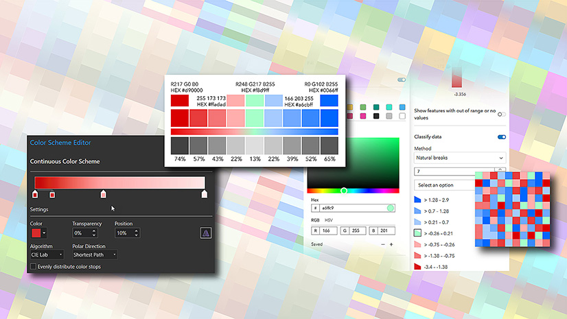
When we started developing this layer, the needs of the end user played central to the overall design. Since there are 38 temperature classes, how could all those classes be visualized in a way that makes it easy to use while also allowing a user’s intuitive color awareness to takeover?

Thoughtful Color
For these layers, the cartographic approach was to create a functional map by using traditional colors for hot/red/cold/blue and then fill in everything else in-between and beyond with carefully nuanced hues. This palette purposely uses each temperature class as a color change cue. We wanted the breaks and associated colors to make sense and ‘feel’ like what they represent, like warming yellow 70s or freezing white -40s. The idea is, once you recognize what the colors mean, you can identify what is on the map without referencing the legend.

Classified Color
How was this palette created? In ArcGIS Pro we used an Arcade expression to classify the temperature values into five-degree increment breaks so that a color could be assigned to every class. Then we used Unique Values and applied a Continuous Color Scheme to mix up the colors into a seamless gradient.
Check out how the expression works, and it could be easily modified to be 10, 20, or 50 increment breaks, whatever your own situation needs.
var DegreeRange = 5
var Temp = Floor($feature.Temp/DegreeRange, 0) * DegreeRange
When ($feature.Temp == 0, “0”, text(Temp) + ” to ” + text(Temp + DegreeRange))
We first create variables to (1) assign a degree range and (2) compute the rounded temperature value based on that range.
Then a ‘When’ statement first assigns all ‘0’ values to zero and anything that remains (not zero) gets turned into text with the rounded five-degree increment classes separated by the word ‘to’. Brilliant!

Equal Color
The cartography must present temperature information without bias. There is no hierarchy in this layer, just numerical order. The emphasis of the palette colors should be equitable in that sense. The hot oranges should not appear more prominently than the cooler teals. This took finessing with the saturation and brightness levels with the 10 color stops to make the cooler colors appear in similar intensity as hotter ones.

It ended up that this layer had a whopping 38 color classes! Here is a trick, to get the most color range out of this many classes, the ramp moves back-and-forth from light-almost-white, to dark navy-blue, to lighter yellow, to darker red.

This light-dark-light-dark gives more room for colors to move around with their 38 neighbors. You get a wider dimension of varying brightness compared to a one-way gradient. It does not work with every dataset, but when it fits it can tease out more of the data’s story.
Meaningful Color
What are those temperature points that are most important or impactful? There were three points on the color scale we thought needed to be discernable – freezing at 32°F degrees, warming transitional 50s-70s, and triple digits >=100°F.
For the freezing class, we styled it as a navy-blue ‘dividing wall.’ It features clearly on the map and is color strong yet sensible enough to act as a base from which to depart for warmer or cooler directions. Worried about the hottest forecasted areas of your city or county? Overnight freezes for early spring blossoming fruit trees? You can easily find these areas on the map now. Yes, pack that jacket.

The transitional 50s-60s needed to feel like they were those spring-like thaws before hitting those warming yellow 70s. To that, we used a turquoise color that was decently present to act as a bridge between blue and yellow. In this palette we wanted to keep the green hue at a minimum, avoiding a rainbow, so by design there is scant green and zero purple found on this map.

For the >=100°F classes, that is hotter than your normal body temperature. It is feverish and is an extremely dangerous break. It should be clear and identifiable on the map. For that purpose, anything past 100°F is red-to-deep-dark-maroon and is hot. You can easily find these pockets of high temperatures on the map and identify those areas that are dangerous for vulnerable elderly populations, young children, outdoor workers like construction and wildland fire fighters, or farmers, and livestock.

In the end we wanted this to be a meaningful temperature palette with an intuitive map visualization that was pleasing to look at. So much love and care went into designing this layer. Please enjoy.
Check out how the cartography evolved over the course of three months in 2020!

Do you want to build your own weather map specific to your organization or agency? This temperature layer can be the first start. Be sure to check out other weather-related content from the Living Atlas library including additional NDFD forecast layers like precipitation and snowfall. There are many other authoritative live feed layers to leverage, like USA Weather Watches and Warnings, Storm Reports, and the National Weather Service Wind Speed or Gust forecasts.
Please feel free to reach out with comments or questions.

Article Discussion: